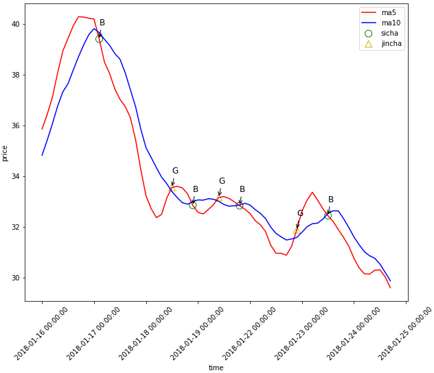
首先应该明白在matplotlib中画出图是不能直接标记的,标记只能借助annotate函数,对于散点图的图例显示问题,可以先将散点坐标集中起来,然后画图,显示图例
#显示所有列
pd.set_option('display.max_columns', None)
pd.set_option('max_colwidth',500)

import pandas as pd
import numpy as np
import matplotlib.pyplot as plt
import seaborn as sns

plt.rcParams['font.sans-serif']=['SimHei'] # 用来正常显示中文标签
plt.rcParams['axes.unicode_minus']=False # 用来正常显示负号

from sklearn.preprocessing import StandardScaler
import datetime

#读取A股指数日行情
df = DataSource('AShareEODPrices').read(start_date='2018-01-01', end_date='2018-05-01')
data = df[df['instrument'] == '000002.SZ']

dropcols=['crncy_code', 'object_id', 'opdate', 'opmode', 's_dq_tradestatus', 's_info_windcode']
data=data.drop(dropcols,axis=1)

data['ma5'] = data['s_dq_avgprice'].rolling(5).mean()
data['ma10'] = data['s_dq_avgprice'].rolling(10).mean()

# 去掉前10个为nan的行
data = data.dropna()
data = data.reset_index(drop=True)
以下为画图部分
f,ax = plt.subplots(figsize = (10,8))

plt.plot(data["ma5"],"r-")
plt.plot(data["ma10"],"b-")

ax.set_xticklabels(data["date"], rotation=45)

golden=data[list((data["ma5"]>=data["ma10"]) & (data["ma5"]<data["ma10"]).shift(1))].index
black=data[(data["ma5"]<=data["ma10"]) & (data["ma5"]>data["ma10"]).shift(1)].index


type1_x = []
type1_y = []
type2_x = []
type2_y = []

for i in black:
    #lin3 = plt.scatter(i, data['ma5'][i], color='', marker='o', edgecolors='g', s=100)

    type1_x.append(i)
    type1_y.append(data['ma5'][i])

    ax.annotate('B', xy=(i,data['ma5'][i]), xytext=(0, 20),
            xycoords='data',textcoords='offset points', fontsize=12,
                arrowprops=dict(arrowstyle="->", connectionstyle="arc3,rad=0"
            ))

plt.scatter(type1_x, type1_y, color='', marker='o', edgecolors='g', s=100,label="sicha")

for i in golden:
    type2_x.append(i)
    type2_y.append(data['ma5'][i])

    #plt.scatter(i, data['ma5'][i], color='', marker='^', edgecolors='y', s=100)
    ax.annotate('G', xy=(i,data['ma5'][i]), xytext=(0, 20),
            xycoords='data',textcoords='offset points', fontsize=12,
                arrowprops=dict(arrowstyle="->", connectionstyle="arc3,rad=0"
            ))

plt.scatter(type2_x, type2_y, color='', marker='^', edgecolors='y', s=100,label="jincha")

plt.xlabel(u"time")
plt.ylabel(u"price")

plt.legend()
plt.show()
图为: