一,利用FastClick第三方插件来解决移动端click事件300毫秒延迟情况
1,安装,npm i fastclick -S
在main.js中引入
import FastClick from "fastclick";
FastClick.attach(document.body);
2,安装stylus
npm i stylus stylus-loader --save-dev
3.关于移动端的尺寸计算,设计图为750px, 以苹果6开发(设备宽度375)
在reset.css重置样式样式表中可看到font-size大小, 在main.js引入reset.css
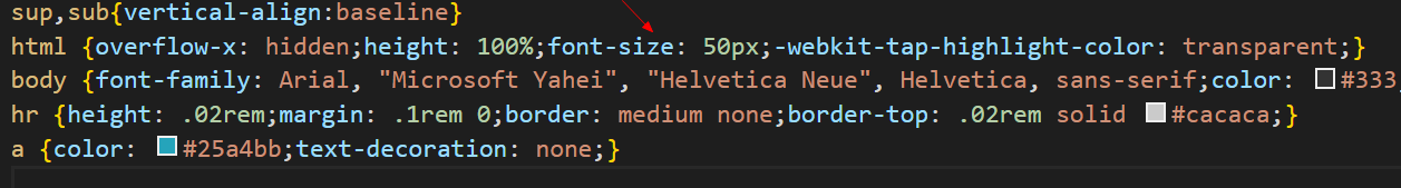
1rem = html font-size = 50px
在组件的样式表中,可用rem来样式作为尺寸单位
如果一个height为86px, 因为移动端一般用二倍图来画,所以height是43px, 再除以50, 也就是0.86rem,
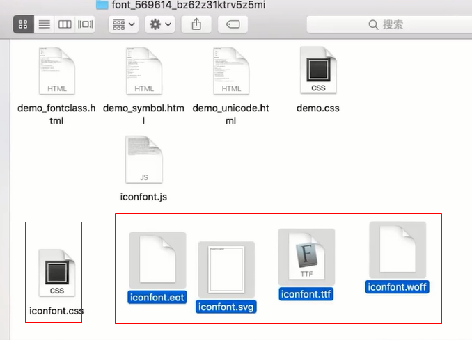
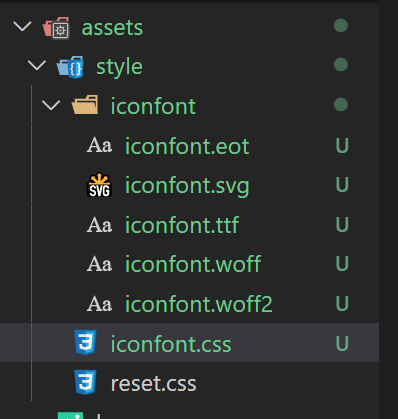
4,阿里图标本地引入
将阿里图标下载到本地,在vue项目中,assets文件-style文件夹-新建iconfont文件夹,将图标字体文件放入,在assets-stylus文件中放入iconfont.css,然后在main.js引入iconfont.css
import "./assets/style/iconfont.css";
最后,在iconfont.css中修改图标字体的路径(五个都要修改)
@font-face {font-family: "iconfont";
  src: url('./iconfont/iconfont.eot?t=1612861657067'); /* IE9 */
  src: url('./iconfont/iconfont.eot?t=1612861657067#iefix') format('embedded-opentype'), /* IE6-IE8 */
  url('data:application/x-font-woff2;charset=utf-8;base64,d09GMgABAAAAAANIAAsAAAAAB1QAAAL6AAEAAAAAAAAAAAAAAAAAAAAAAAAAAAAAHEIGVgCDHAqCCIF9ATYCJAMQCwoABCAFhG0HTht1BsgeB+XGM0sZRXL+HcHX2G/f3X0VSJJEI0PFO4npJqERSWKx0SiJ7CXwk13+y02MdiKdupif3OzO7E4Ws/wCOrmT2lz3jUrqkoC///9zTb4SX307m0tUU0Ta0d4Ax60Dimoa2SYyMZ8T8NZlHCfQNKNK1G5n/0SIV1jjAnHNZAHicy5FEaJ1oVqztIhXiFFPd74RAC/h9+MPwhFPUsmsk/ZPOyRo/iz6tAGtGAUz82pYMZ8VwioyVoFCnNfaD6E4tAppar2jrQN1dYm52sKfNozOGNkxz/7LIySZqLIy22CNCWc+i1yS4DNMkvjckCHDDzHUvVFkD7hiiSlZQDNKtu7u3kinVpSTvZsPr8yl+1bmyfsPnRAfPZr8+PGUhw8nPXgQcbMcSCait7Dv8MnjOZP2Hjh2IlfsuP/ZpLSH0yuypT2bqsT51+8rzQtuXpmf+z1nfjBduXHvzLJP8DTpHPr8GZ1H5zjpOXBTLjiIP9+0A925gzzJdp4LHsuBZAdKt9QcqhxzZ2HzYHArvD06dWok/2D65awFBZHJU0cKwAT45/uPVvNdQx5qBiDf+ugXUQjef/btm5NW/yc+qYCPbuspWf9F9zQAfEdBb8EHF7BlRRdZhlJUscs3nMXsZQcSmraJzxxj6NUcyonemYS6iRSSmmnI6maRQqxCRcsaVNVtQNOKrtUtIzYkSgPL1hKEvouQdL1B1hdBCvESKiZ9gap+IGg6iKwtW+aDJbbZRHCJhIcWYiZygzomNzHKHk9kTxPsrCikTSa2w7w45A8Wo13EIPYcM5x5cth1KaY213EnnUY0jWPT5sNEdP2K65q1gQCte5Nf5Dok2mEjBC5Cgg1ZCGNEnIH61V2Jpc+PR8g8GoHdQqmxT0bYHKxzLMQv2APpkhu9KPfyimMeWZjLRWGUjdNhnTSI0Gg4zKwfNIwQufyUEQFTrYBdifaV+9dX6l+4Bpqsq0ukyFGionoqGIrHYh3uOR7PFGybz6+W3H5GNWWaxgwZAAAA') format('woff2'),
  url('./iconfont/iconfont.woff?t=1612861657067') format('woff'),
  url('./iconfont/iconfont.ttf?t=1612861657067') format('truetype'), /* chrome, firefox, opera, Safari, Android, iOS 4.2+ */
  url('./iconfont/iconfont.svg?t=1612861657067#iconfont') format('svg'); /* iOS 4.1- */
}

.iconfont {
  font-family: "iconfont" !important;
  font-size: 16px;
  font-style: normal;
  -webkit-font-smoothing: antialiased;
  -moz-osx-font-smoothing: grayscale;
}

.iconfanhui:before {
  content: "e624";
}

.iconsousuo:before {
  content: "e632";
}

.iconarrow-down-filling:before {
  content: "e688";
}
然后在模板中引入字体图标类
<div class="header-left  ">h
      <span class="iconfont iconfanhui"></span>
    </div>
5.将主题颜色抽离成变量,以后主题颜色修改更加方便
assets文件夹-style文件夹- 新建varibles.styl文件,写入主题颜色
$bgColor = #00bcd4
在header组件中,引入该样式文件,在样式中写入该颜色变量
<style lang="stylus"  scoped>
@import '~assets/style/varibles.styl'

.header
    display :flex
    height :0.86rem
    line-height : .86rem
    background : $bgColor
    color : #fff
    .header-left
      flex :0 0 .64rem
      color : #fff
      text-align : center
      font-size: .4rem
6.移动端1px像素问题
assets文件夹-style文件夹- 新建mixins.styl文件, 写入1px的样式, 然后组件中引入
// 伪类+transform
// 原理:把原先元素的border去掉,然后利用:before或者:after重做border,并 transform的scale缩小一半,
// 原先的元素相对定位,新做的border绝对定位。

$color = blue

.border-1px-bottom, .border-1px-top,.border-1px-left,.border-1px-right
  position: relative


// 边框一像素,利用伪类设置一像素
.border-1px::after
    content: "";
    box-sizing: border-box;
    position: absolute;
    left: 0;
    top: 0;
     100%;
    height: 100%;
    border: 1px solid $color

// 下边框
.border-1px-bottom::after
    position :absolute
    left: 0
    bottom: 0
     100%
    border-bottom: 1px solid $color
    content: ' '

// 上边框
.border-1px-top::before
    position :absolute
    left: 0
    top: 0
     100%
    border-top: 1px solid $color
    content: ' '


// 左边框
.border-1px-left::before
    position :absolute
    left: 0
    top: 0
    height: 100%
    border-left: 1px solid $color
    content: ' '


// 右边框
.border-1px-right::after
    position :absolute
    right: 0
    top: 0
    height: 100%
    border-right: 1px solid $color
    content: ' '


/*设备像素比*/
/*显示屏最小dpr为1.5*/
@media (-webkit-min-device-pixel-ratio: 1.5),(min-device-pixel-ratio: 1.5)
  .border-1px-bottom::after,.border-1px-top::before
    // Y轴压缩0.7,  1.5*0.7 约等于1
    -webkit-transform: scaleY(0.7)
    transform: scaleY(0.7)

  .border-1px-left::before,.border-1px-right::after
  // X轴压缩0.7,  1.5*0.7 约等于1
    -webkit-transform: scaleX(0.7)
    transform: scalexX(0.7)

  .border-1px::after
     150%;
    height: 150%;
    transform: scale(0.7);
    transform-origin: 0 0;


@media (-webkit-min-device-pixel-ratio: 2),(min-device-pixel-ratio: 2)
  .border-1px-bottom::after,.border-1px-top::before
    // Y轴压缩0.5,  2*0.5 等于1
    -webkit-transform: scaleY(0.5)
    transform: scaleY(0.5)

  .border-1px-left::before,.border-1px-right::after
  // X轴压缩0.5,  2*0.5 等于1
    -webkit-transform: scaleX(0.5)
    transform: scaleX(0.5)

  .border-1px::after
     200%;
    height: 200%;
    transform: scale(0.5);
    transform-origin: 0 0;


@media (-webkit-min-device-pixel-ratio: 3),(min-device-pixel-ratio: 3)
  .border-1px-bottom::after,.border-1px-top::before
    -webkit-transform: scaleY(0.333)
    transform: scaleY(0.5)

  .border-1px-left::before,.border-1px-right::after
    -webkit-transform: scaleX(0.333)
    transform: scaleX(0.333)

  .border-1px::after
     300%;
    height: 300%;
    transform: scale(0.333);
    transform-origin: 0 0;

// 去除边框   //
border-none()
  &:after
    display: none
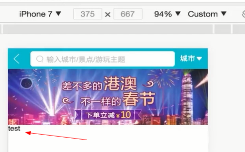
7.使用vue封装的vue-awesome-swiper轮播图插件,不是原生的swiper插件
安装,npm install vue-awesome-swiper@4.1.1 --save
npm install swiper@5 --save
在main.js全局注册
import VueAwesomeSwiper from "vue-awesome-swiper";

import "swiper/css/swiper.min.css";

Vue.use(VueAwesomeSwiper);
新建swiper组件
<template>
  <swiper ref="mySwiper" :options="swiperOptions">
    <swiper-slide>Slide 1</swiper-slide>
    <swiper-slide>Slide 2</swiper-slide>
    <swiper-slide>Slide 3</swiper-slide>

    <div class="swiper-pagination" slot="pagination"></div>
  </swiper>
</template>

<script>
export default {
  data() {
    return {
      swiperOptions: {
        pagination: {
          el: ".swiper-pagination"
        }
      }
    };
  }
};
</script>

<style scoped lang="stylus"></style>
在home父组件中引入和注册swiper组件。
<template>
  <div>
    <HomeHeader></HomeHeader>
    <HomeSwiper></HomeSwiper>
  </div>
</template>

<script>
import HomeHeader from "components/HomeHeader/HomeHeader";
import HomeSwiper from "components/Swiper/Swiper";
8, 此时有个小bug,如果在网速条件差的情况,图片还没有加载完成的时候,轮播图结构下方的结构会先占用轮播图的位置,直到轮播图加载完成后,才会到他正确的位置(称为抖动情况)
原因,当图片没加载完成,此时图片高度为0,下面的结构会撑上去,此时只需要计算宽高比,计算padding-bottom即可解决
解决方法,在swiper组件,新增一个根标签div ,计算图片的宽高比例,用样式来解决
<template>
  <div class="wrapper">
    <swiper ref="mySwiper" :options="swiperOptions">
      <swiper-slide>
        <img class="item" src="@/assets/logo.png" alt="" />
      </swiper-slide>
      <swiper-slide>
        <img class="item" src="@/assets/logo.png" alt="" />
      </swiper-slide>
      <swiper-slide>
        <img class="item" src="@/assets/logo.png" alt="" />
      </swiper-slide>

      <div class="swiper-pagination" slot="pagination"></div>
    </swiper>
  </div>
</template>

<script>
export default {
  data() {
    return {
      swiperOptions: {
        pagination: {
          el: ".swiper-pagination"
        }
      }
    };
  }
};
</script>

<style scoped lang="stylus">
.wrapper
  overflow :hidden
  100%
  height:0
  padding-bottom :31.25%
.item
  100%
</style>
#Scoped CSS
当 <style> 标签有 scoped 属性时,它的 CSS 只作用于当前组件中的元素。这类似于 Shadow DOM 中的样式封装。
vue-loader官网介绍;https://vue-loader.vuejs.org/zh/guide/scoped-css.html#%E6%B7%B7%E7%94%A8%E6%9C%AC%E5%9C%B0%E5%92%8C%E5%85%A8%E5%B1%80%E6%A0%B7%E5%BC%8F
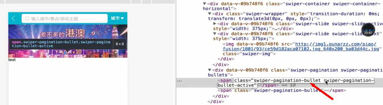
#子组件的根元素
使用 scoped 后,父组件的样式将不会渗透到子组件中。不过一个子组件的根节点会同时受其父组件的 scoped CSS 和子组件的 scoped CSS 的影响。
这样设计是为了让父组件可以从布局的角度出发,调整其子组件根元素的样式。

#深度作用选择器
如果你希望 scoped 样式中的一个选择器能够作用得“更深”,例如影响子组件,你可以使用 >>> 操作符:
<template>
  <div class="wrapper">
    <swiper ref="mySwiper" :options="swiperOptions">
      <swiper-slide>
        <img class="item" src="@/assets/logo.png" alt="" />
      </swiper-slide>
      <swiper-slide>
        <img class="item" src="@/assets/logo.png" alt="" />
      </swiper-slide>
      <swiper-slide>
        <img class="item" src="@/assets/logo.png" alt="" />
      </swiper-slide>

      <div class="swiper-pagination" slot="pagination"></div>
    </swiper>
  </div>
</template>

<script>
export default {
  data() {
    return {
      swiperOptions: {
        pagination: {
          el: ".swiper-pagination",
      loop:true
        }
      }
    };
  }
};
</script>

<style scoped lang="stylus">
.wrapper
  & >>> .swiper-pagination-bullet-active
    background: red
  overflow :hidden
  100%
  height:0
  padding-bottom :100%
  .item
    100%

</style>
10.商品图标区域布局,一个图标

  <div class="icons">
        <div class="icon">
          <div class="icon-img">
            <img
              class="icon-img-content"
              src="//s.qunarzz.com/homenode/images/touchheader/hotel.png"
              alt=""
            />
          </div>
          <p class="icon-desc">热门景点</p>
        </div>
样式布局,同理,慢速网络下对于图片下的结构抖动情况,对用padding-bottom来代替height, 一行八个图标,一个weidth占25%
<style scoped lang="stylus">

.icons
  margin-top:.1rem
  .icon
    float:left
    25%
    height :0
    padding-bottom :25%
    position : relative
    .icon-img
      position: absolute
      top: 0
      left: 0
      right: 0
      bottom: .44rem
      padding :.1rem
      box-sizing:border-box
      .icon-img-content
        display :block
        margin :0 auto
        height :100%
        100%
    .icon-desc
      position: absolute
      bottom: 0
      left: 0
      right: 0
      line-height .44rem
      height .44rem
      text-align :center
如果,图片图标很多,需要用到swiper轮播图来处理
  <div class="icons">
    <swiper>
      <swiper-slide>
        <div class="icon">
          <div class="icon-img">
            <img
              class="icon-img-content"
              src="//s.qunarzz.com/homenode/images/touchheader/hotel.png"
              alt=""
            />
          </div>
          <p class="icon-desc">热门景点</p>
        </div>
      </swiper-slide>
    </swiper>

  </div>
此时一排图片图标高度占25%,两排就占50%,而加入swiper组件后,左右滑动的高度距离只有25%, 我们需要增大他的高度为50%, 此时利用到深度选择器

样式
.icons
  margin-top:.1rem
  & >>>.swiper-container
    padding-bottom : 50%
    height :0
  .icon
    float:left
    25%
    height :0
    padding-bottom :25%
    position : relative
11. 对于图片图标轮播的页数逻辑计算以及样式抽离公共代码
图片图标的数据
 data() {
    return {
      iconList: [
        {
          id: "0001",
          imgUrl:
            "http://img1.qunarzz.com/piao/fusion/1611/54/ace00878a52d9702.png",
          desc: "景点门票"
        },
        {
          id: "0002",
          imgUrl:
            "http://img1.qunarzz.com/piao/fusion/1711/df/86cbcfc533330d02.png",
          desc: "滑雪季"
        },
        {
          id: "0003",
          imgUrl:
            "http://img1.qunarzz.com/piao/fusion/1710/a6/83f636bd75ae6302.png",
          desc: "泡温泉"
        },
        {
          id: "0004",
          imgUrl:
            "http://img1.qunarzz.com/piao/fusion/1611/35/2640cab202c41b02.png",
          desc: "动植园"
        },
        {
          id: "0005",
          imgUrl:
            "http://img1.qunarzz.com/piao/fusion/1611/d0/e09575e66f4aa402.png",
          desc: "游乐园"
        },
        {
          id: "0006",
          imgUrl:
            "http://img1.qunarzz.com/piao/fusion/1611/59/569d3c096e542502.png",
          desc: "必游榜单"
        },
        {
          id: "0007",
          imgUrl:
            "http://img1.qunarzz.com/piao/fusion/1611/17/4bd370f3eb1acd02.png",
          desc: "演出"
        },
        {
          id: "0008",
          imgUrl:
            "http://img1.qunarzz.com/piao/fusion/1611/7f/b1ea3c8c7fb6db02.png",
          desc: "城市观光"
        },
        {
          id: "0009",
          imgUrl:
            "http://img1.qunarzz.com/piao/fusion/1611/a9/ffc620dbda9b9c02.png",
          desc: "一日游"
        }
      ]
模板数据填充,每页轮播图图片的数量是8个,第九个图标需要在第二页,此时根据iconList数据去计算页数

 <div class="icons">
    <swiper>
      <!-- 轮播图页数 -->
      <swiper-slide >
        <div class="icon" v-for="(icon, index) in iconList" :key="icon.id">
          <div class="icon-img">
            <img class="icon-img-content" :src="icon.imgUrl" />
          </div>
          <p class="icon-desc">{{icon.desc}}</p>
        </div>
      </swiper-slide>
    </swiper>
计算页数,用computed
  computed: {
    // 计算轮播图每行图片的页数
    pages() {
      const pages = [];
      const { iconList } = this;
      iconList.forEach((item, index) => {
        // 计算当前图标在第几页
        const page = Math.floor(index / 8);
        // 判断第0个索引没有数据,内嵌一个数组
        if (!pages[page]) {
          pages[page] = [];
        }
        // 有数据
        pages[page].push(item);
      });

      return pages;
    }
  }
在swiper模板中填充
<div class="icons">
    <swiper>
      <!-- 轮播图页数 -->
      <swiper-slide v-for="(page, index) in pages" :key="index">
        <div class="icon" v-for="(icon, index) in page" :key="icon.id">
          <div class="icon-img">
            <img class="icon-img-content" :src="icon.imgUrl" />
          </div>
          <p class="icon-desc">{{icon.desc}}</p>
        </div>
      </swiper-slide>
    </swiper>
  </div>
优化效果,如果图片下方文字的数量过多,需要有省略情况
在mixins.styl中定义样式,然后在该组件中引入,
ellipsis()
  overflow: hidden
  white-space: nowrap
  text-overflow: ellipsis
@import '~assets/style/mixins.styl'
.icon-desc
      position: absolute
      bottom: 0
      left: 0
      right: 0
      line-height .44rem
      height .44rem
      text-align :center
      ellipsis()