一个组件它往往包含了一些常见的painting, positioning和sizing这样的小部件。
Container相当于我们常用的div,在Flutter中用的非常多,现在来看看Container容器中的一些属性。
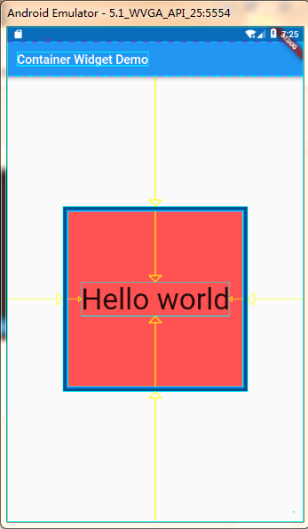
这个属性是针对容器中的child的对其方式。我们先做一个效果:建立一个Container容器,然后让容器里面的文字内容居中对齐。
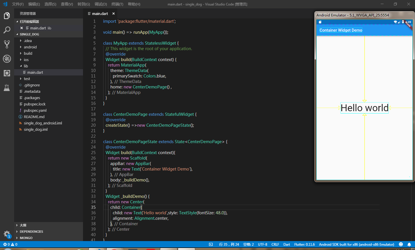
具体代码如下:
import 'package:flutter/material.dart';

void main() => runApp(MyApp());

class MyApp extends StatelessWidget {
  // This widget is the root of your application.
  @override
  Widget build(BuildContext context) {
    return MaterialApp(
      theme: ThemeData(
        primarySwatch: Colors.blue,
      ),
      home: new CenterDemoPage() ,
    );
  }
}

class CenterDemoPage extends StatefulWidget {
  @override
  createState() =>new CenterDemoPageState();
}

class CenterDemoPageState extends State<CenterDemoPage> {
  @override
  Widget build(BuildContext context){
    return new Scaffold(
      appBar: new AppBar(
        title: new Text('Container Widget Demo'),
      ),
      body: _buildDemo(),
    );
  }
  Widget _buildDemo() {
    return new Center(
      child: Container(
        child: new Text('Hello world',style: TextStyle(fontSize: 48.0)),
        alignment: Alignment.center,
      ),
    );
  }
}
这时候我们可以看见,文本居中显示在我们手机屏幕上了,出来居中对其这种方式,还有以下几种对齐方式可供选择:
- topCenter:顶部居中对齐
- topLeft:顶部左对齐
- topRight:顶部右对齐
- center:水平垂直居中对齐
- centerLeft:垂直居中水平居左对齐
- centerRight:垂直居中水平居右对齐
- bottomCenter底部居中对齐
- bottomLeft:底部居左对齐
- bottomRight:底部居右对齐
除了对Container容器中的child设置对齐方式,我们还可以对容器进行一些宽高颜色属性的操作,如下:
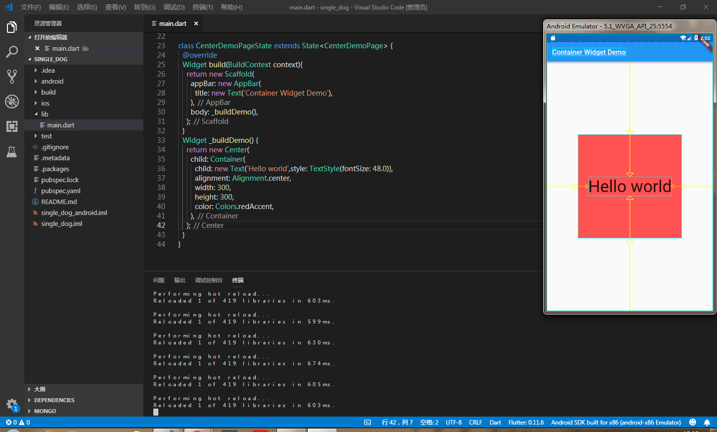
2、decoration
容器的修饰器,用于背景或者border。
如果在decoration中用了color,就把容器中设置的color去掉,不要重复设置color,设置的边框样式是让四条边框的宽度为8px,颜色为黑色
child: Container(
        child: new Text('Hello world',style: TextStyle(fontSize: 48.0)),
        alignment: Alignment.center,
         300,
        height: 300,
        decoration: BoxDecoration(
          color: Colors.redAccent,
          border: Border.all(
            color: Colors.black,
             8.0,
          ),
        ),
      ),
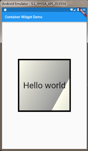
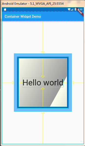
decoration里面还可以渐变色:如下
decoration: BoxDecoration(
    gradient: LinearGradient(
      begin: Alignment.topLeft,
      end: Alignment(0.8, 0.0), // 10% of the width, so there are ten blinds.
      colors: [const Color(0xFFFFFFEE), const Color(0xFF999999)], // whitish to gray
      tileMode: TileMode.repeated, // repeats the gradient over the canvas
    ),
  ),
这样渐变出来的效果就是:
3、margin
margin属性是表示Container与外部其他组件的距离。
child: new Text('Hello world',style: TextStyle(fontSize: 48.0)),
        alignment: Alignment.center,
         300,
        height: 300,
        margin: EdgeInsets.all(20.0),//表示与外部元素的距离是20px
        decoration: BoxDecoration(
          gradient: LinearGradient(
            begin: Alignment.topLeft,
            end: Alignment(0.8, 0.0), // 10% of the width, so there are ten blinds.
            colors: [const Color(0xFFFFFFEE), const Color(0xFF999999)], // whitish to gray
            tileMode: TileMode.repeated, // repeats the gradient over the canvas
          ),
          border: Border.all(
            color: Colors.black,
             8.0,
          ),
        ),
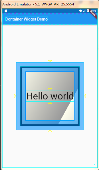
我们为了有更好的显示效果,可以在正在调试的终端下输入‘ p ’,这样你就可以清楚看到Container的布局了,如下:
当然如果你不想设置每个外边距都一样,想分别设置的话,可以使用如下:
margin: EdgeInsets.fromLTRB(left, top, right, bottom),
你可以分别对每个边距设定值。
4、padding
padding就是Container的内边距,指Container边缘与Child之间的距离。先试试让每个内边距都为20
padding: EdgeInsets.all(20.0),
效果如下:
如果不想让每个内边距一样,依据自己的需求来设置,可以使用如下方法:
margin: EdgeInsets.fromLTRB(left, top, right, bottom),
和margin的使用几乎一样。
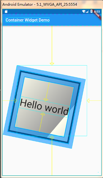
5、transform
这个属性可以让Container容易进行一些旋转之类的,用法: transform: Matrix4.rotationZ(0.2), 可以根据自己的需要调整旋转的角度,效果如下:
6、以上是使用比较多的一些属性,当然在工作中会有很多的需求,各种各样的,那就需要我们更进一步去了解,去研究更深层的属性用法。
Container Widget用法可以去官网看更多的属性用法:一键到达