<!DOCTYPE html>
<html>
<head>
<meta charset="utf-8" />
<style type="text/css">
    html{font-size:16px;}
    body{font-size:14px;}
    div{font-size:12px;}
    p{font-size:18px; 10em;}
</style>
</head>
<body>
   <div>
      <p>哈哈哈哈</p>
   </div>
</body>
</html>
本例中 p 的宽度是180px
解释:10*18=180px;
    em: 如果p本身有font-size,em就以它本身为基准
         如果p本身没有font-size,em就以有font-size样式最近的父类,即先找div有没有font-size,如果没有找body,还没有找html。
<!DOCTYPE html>
<html>
<head>
<meta charset="utf-8" />
<style type="text/css">
    html{font-size:16px;}
    body{font-size:14px;}
    div{font-size:12px;}
    p{font-size:18px; 10rem;}
</style>
</head>
<body>
   <div>
      <p>哈哈哈哈</p>
   </div>
</body>
</html>
本例中 p 的宽度是160px
解释:10*16=180px;
     rem:是以根元素为基准计算的
rem在移动端的运用
移动端设计稿常见宽度尺寸是640px和750px
运用rem实现移动端响应式布局,应该这么做:
首先在js中加入如下代码:
!function(n){var e=n.document,t=e.documentElement,i=720,d=i/100,o="orientationchange"in n?"orientationchange":"resize",a=function(){var n=t.clientWidth||320;n>720&&(n=720),t.style.fontSize=n/d+"px"};e.addEventListener&&(n.addEventListener(o,a,!1),e.addEventListener("DOMContentLoaded",a,!1))}(window);
这段代码的作用是:在不同手机上显示页面的时候,根节点html的font-size不同,这样用rem为单位的dom元素的样式才会不一样,比如:width,margin之类的。
效果如下:
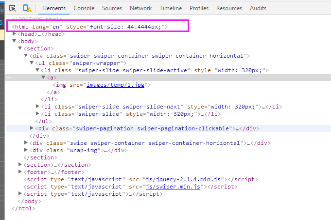
ipone4 320*480 显示结果
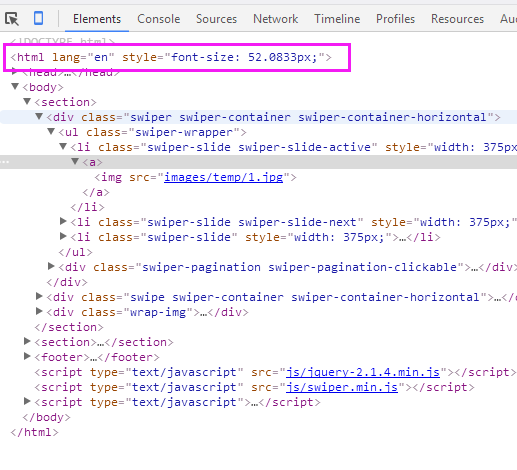
iphone6 375*627 显示结果
设计稿应该是基于iphone4或者iphone5来的,所以它的设计稿竖直放时的横向分辨率为640px,
为了计算方便,取一个100px的font-size为参照,那么body元素的宽度就可以设置为 6.4rem,
于是html的font-size=deviceWidth / 6.4。这个deviceWidth就是viewport设置中的那个deviceWidth。
根据这个计算规则,可得出本部分开始的四张截图中html的font-size大小如下:
deviceWidth = 320,font-size = 320 / 6.4 = 50px
deviceWidth = 375,font-size = 375 / 6.4 = 58.59375px
deviceWidth = 414,font-size = 414 / 6.4 = 64.6875px
deviceWidth = 500,font-size = 500 / 6.4 = 78.125px
设计稿750px同理:
deviceWidth = 320,font-size = 320 /7.5px
deviceWidth = 375,font-size = 375 / 7.5px
deviceWidth = 414,font-size = 414 /7.5px
deviceWidth = 500,font-size = 500 / 7.5px
设计稿的margin如果是20px就是20/100=0.2rem
所有设计稿上的width,height,margin,padding,都是除以100转换为rem
可以参看网易:http://3g.163.com/touch/all?version=v_standard
移动端不用rem的布局方式
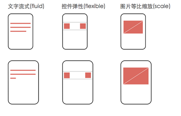
这种app是一种典型的弹性布局:关键元素高宽和位置都不变,只有容器元素在做伸缩变换。对于这类app,记住一个开发原则就好:文字流式,控件弹性,图片等比缩放。以图描述:
可以参看拉钩网:http://www.lagou.com/custom/list.html?utm_source=m_cf_cpt_baidu_pc&m=1