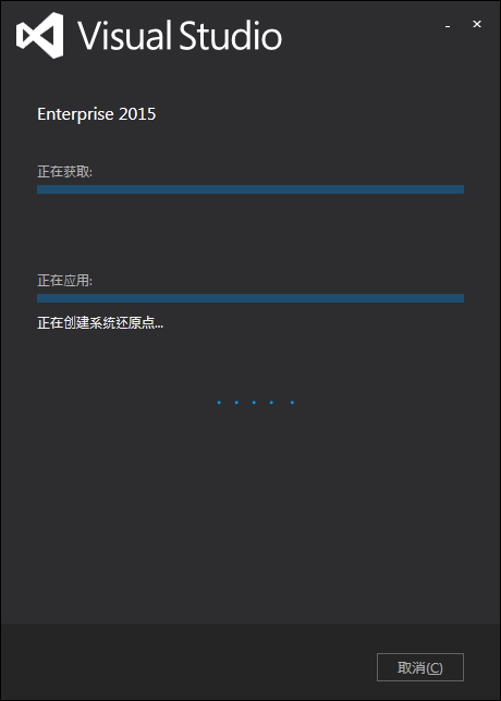
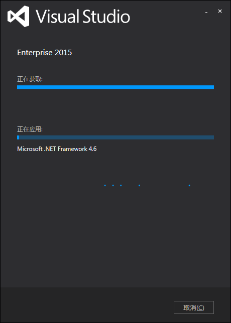
在Visual Studio 2010后续版本的安装界面中,可以发现一组小球在滑动表示安装程序正在进行:
于是尝试用CSS实现了一下。
首先需要建立用来表示小球的html结构:
    <div class="container">
        <div class="circle c1"></div>
        <div class="circle c2"></div>
        <div class="circle c3"></div>
        <div class="circle c4"></div>
        <div class="circle c5"></div>
    </div>
用5个div分别表示5个小球,并加入样式:
        .container{
            width: 500px;
            background: #000;
            height: 300px;
            position: relative;
        }
        .circle{
            width: 10px;
            height: 10px;
            border-radius: 50%;
            background: rgba(255,255,255,0.6);
            position: absolute;
            left: -10px;
            top:50%;
            margin-top: -5px;
        }
之后需要考虑小球的运动效果,于是给样式circle加入缓动样式:
        .circle{
            width: 10px;
            height: 10px;
            border-radius: 50%;
            background: rgba(255,255,255,0.6);
            position: absolute;
            left: -10px;
            top:50%;
            margin-top: -5px;
            transition:left 0.4s linear;
            animation-duration: 3s;
            animation-iteration-count: infinite;
            animation-timing-function: ease;
            backface-visibility: hidden;
        }
另外小球有先后顺序,需要使用CSS3中的keyframes来实现顺序:
        @keyframes bounce1 {
            5%{left:-3%;}
            60%{left:55%;}
            88%{left:102%;}
            100%{left:102%;}
        }
        @keyframes bounce2 {
            10%{left:-5%;}
            66%{left:52%;}
            91%{left:102%;}
            100%{left:102%;}
        }
        @keyframes bounce3 {
            15%{left:-7%;}
            72%{left:49%;}
            94%{left:102%;}
            100%{left:102%;}
        }
        @keyframes bounce4 {
            20%{left:-9%;}
            78%{left:46%;}
            97%{left:102%;}
            100%{left:102%;}
        }
        @keyframes bounce5 {
            25%{left:-11%;}
            80%{left:43%;}
            100%{left:102%;}
        }
        .c1{animation-name: bounce1;}
        .c2{animation-name: bounce2;}
        .c3{animation-name: bounce3;}
        .c4{animation-name: bounce4;}
        .c5{animation-name: bounce5;}
实现后的效果如下: