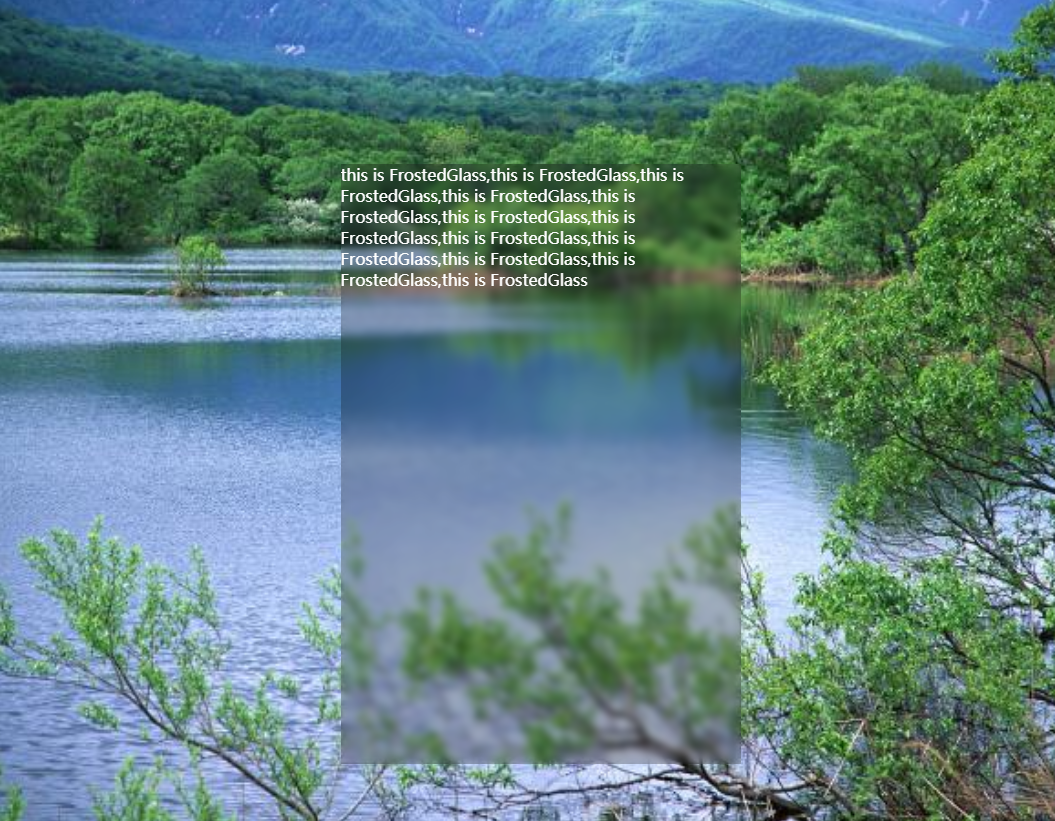
css实现毛玻璃效果,效果图
1,html代码
<div class="mainHolder">
  <div class="textHolder">
    <p>this is FrostedGlass,this is FrostedGlass,this is FrostedGlass,this is FrostedGlass,this is FrostedGlass,this is FrostedGlass,this is FrostedGlass,this is FrostedGlass,this is FrostedGlass,this is FrostedGlass,this is FrostedGlass,this is FrostedGlass</p>
  </div>
</div>
2,css
 * {
    box-sizing: border-box;
  }
  .mainHolder {
     100%;
    height: 100%;
    background-image: url(1.jpg);
    background-attachment: fixed;
    background-position: center;
    background-size: cover;
    position: relative;
  }
  .textHolder {
     400px;
    height: 600px;
    position: absolute;
    left: 33%;
    top: 20%;
    background: inherit;
    overflow: hidden;
  }
  .textHolder::before {
    content: '';
    position: absolute;
    top:0;
    right: 0;
    bottom: 0;
    left: 0;
    background: inherit;
    background-attachment: fixed;
    filter: blur(4px);
  }
  .textHolder::after {
    content: "";
    position: absolute;
    top:0;
    right: 0;
    bottom: 0;
    left: 0;
    background: rgba(0, 0, 0, 0.25);
  }
  p {
    z-index: 1;
    color: white;
    position: relative;
    margin: 0;
  }