1、css3初识
 1     <style>
 2 /*
 3         CSS3 是最新的 CSS 标准。
 4         为了提高开发速度,也为了方便各主流浏览器根据需要渐进式支持,css3按模块化进行了全新设计,这些模块可以独立发布和这实现,也为日后css的扩展奠定了基础。
 5
 6         其中最重要的 CSS3 模块包括:
 7             选择器
 8             框模型
 9             背景和边框
10             文本效果
11             2D/3D 转换
12             动画
13             多列布局
14             用户界面
15
16        浏览器私有前缀,是浏览器对于新CSS属性的一个提前支持;加前缀是兼容老版本的写法,比较新版本的浏览器都支持直接写
17         浏览器的私有前缀:
18             Gecko内核   CSS前缀为"-moz-"     如火狐浏览器
19             WebKit内核  CSS前缀为"-webkit-"    如Chrome、Safari
20             Presto内核   CSS前缀为"-o-"        如 Opera(欧朋)
21             Trident内核  CSS前缀为"-ms-"     如IE
22 */
23         .box{
24             width: 200px;
25             height: 200px;
26             border: 2px solid;
27             -moz-border-radius: 50px;
28             -webkit-border-radius: 50px;
29             border-radius: 50px;
30         }
31
32     </style>
<div class="box"></div>
2、css3新增选择器 (属性选择器)
1     <style>
2         /* div[class^="box"]{ background:red;} */
3         /* div[class$="box"]{background:pink;} */
4         /* div[class*="box"]{ background:yellow;} */
5         div[class="box"] {
6             border: 1px solid red;
7         }
8     </style>
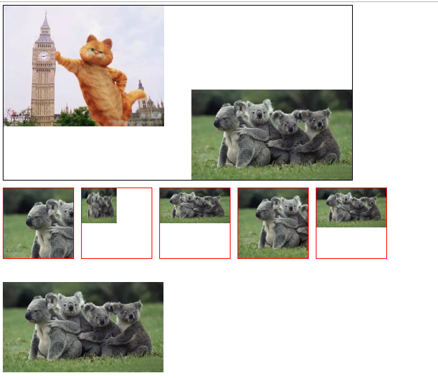
<!--
旧:
        E[attr]             只要拥有attr属性
        E[attr="val"]       必须等于var

 新增的属性选择器
      E[attr^="val"]  选择拥有attr属性且属性值为val开头的E元素
      E[attr$="val"]  选择拥有attr属性且属性值以val结束的E元素
     E[attr*="val"]   选择拥有attr属性且属性值中包含val的E元素
-->

<div class="box">box</div>
<div class="abox">abox</div>
<div class="boxa">boxa</div>
<div class="aboxa">aboxa</div>
<div class>last</div>

1     <style>
2         /* div[class^="box"]{ background:red;} */
3         /* div[class$="box"]{background:pink;} */
4         div[class*="box"]{ background:yellow;}
5         /* div[class="box"] {
6             border: 1px solid red;
7         } */
8     </style>

1     <style>
2         /* div[class^="box"]{ background:red;} */
3         div[class$="box"]{background:pink;}
4         /* div[class*="box"]{ background:yellow;} */
5         /* div[class="box"] {
6             border: 1px solid red;
7         } */
8     </style>

1     <style>
2         div[class^="box"]{ background:red;}
3         /* div[class$="box"]{background:pink;} */
4         /* div[class*="box"]{ background:yellow;} */
5         /* div[class="box"] {
6             border: 1px solid red;
7         } */
8     </style>

3、css3新增结构类型伪类选择器
 1     <style>
 2         /* li:first-child{background:red;} */
 3          /*li当第一个儿子时*/
 4
 5         /*ie8及以下不支持*/
 6         /* li:last-child{background:pink;} */
 7         /* li当最后一个儿子时 */
 8
 9         /* li:nth-child(2){background:blue;} */
10         /* li当第二个儿子时 */
11
12         /* li:nth-child(even){background:green;} */
13         /* 偶数时 */                                    /*even和odd可以用来做隔行变色*/
14         /*li:nth-child(odd){background:#ccc;}*/
15         /* 奇数时 */
16
17
18         /*n取值0 1 2 3  2n>=1  a*n+b*/
19         /* li:nth-child(3n-2){background:yellow;} */
20
21         /* li:nth-last-child(1){background:orange;} */
22         /* li:nth-last-child(odd){background:orange;}
23         li:nth-last-child(even){background:red;} */
24         li:nth-last-child(3n){background:red;}
25
26     </style>
<!--
强调结构:
        E:first-child{}  选择父元素中的第一个子元素E
        E:last-child{}  选择父元素中的最后一个子元素E
        E:nth-child(n){} 选择父元素中的第n个子元素E,n的取值:
            数字
            表达式  2n  2n+1  3n
            关键词 even(偶数)  odd(奇数)
        E:nth-last-child(n){} 选择父元素中倒数第n个子元素E
-->


<ul>
    <li>1</li>
    <li>2</li>
    <li>3</li>
    <li>4</li>
    <li>5</li>
    <li>6</li>
</ul>

 1     <style>
 2        /* .wrap h2:nth-of-type(2){
 3             background: red;
 4         } */
 5
 6         /* .wrap p:nth-of-type(odd){
 7             background: red;
 8         } */
 9         /*
10         .wrap p:nth-of-type(even){
11             background: pink;
12         }*/
13         .wrap p:nth-of-type(3n+0){
14             background: yellow;
15         }
16     </style>
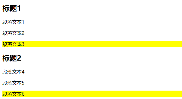
<!--
先强调类型:
    E:nth-of-type(n){} 选择父元素中类型为E的【正数第n个】子元素
        数字
        表达式  2n  2n+1  3n
        关键词 even(偶数)  odd(奇数)

    E:nth-last-of-type(n){} 选择父元素中【倒数第n个】子元素E
-->


<div class="wrap">
    <h2>标题1</h2>
    <p>段落文本1</p>
    <p>段落文本2</p>
    <p>段落文本3</p>
    <h2>标题2</h2>
    <p>段落文本4</p>
    <p>段落文本5</p>
    <p>段落文本6</p>
</div>
 1     <style>
 2         input[type=text]:enabled{
 3             color: #f00;
 4         }
 5         input[type=text]:disabled{
 6             color: #ff0;
 7         }
 8         input[type=radio]:checked{
 9             background: #f0f;
10         }
11     </style>
<form action="#">
    <input type="text" value="请输入用户名" enabled/>
    <!-- enabled    默认 -->
    <input type="text" value="请输入别名" disabled/>
    <!-- disabled作用:此文本框禁用,无法输入 -->

    <input type="radio" checked name="sex"/>
    <input type="radio" name="sex"/>
</form>

4、边框属性
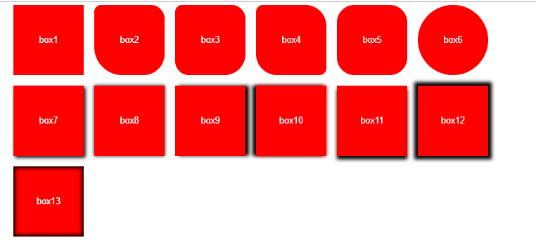
 1     <style>
 2         div{float:left;width:200px;height:200px;background:red;margin: 0 0 30px 30px; font: 25px/200px Arial; text-align: center;
 3             color: #fff; }
 4         div:nth-child(2){ border-radius: 20px 40px  60px 80px;}
 5         div:nth-child(3){ border-radius: 20px 40px  60px;}
 6         div:nth-child(4){ border-radius: 20px 60px;}
 7         div:nth-child(5){ border-radius: 50px;}
 8         div:nth-child(6){ border-radius: 50%;}
 9
10         div:nth-child(7){ box-shadow: 5px 5px 10px #000;}
11         div:nth-child(8){ box-shadow:0 0 10px #000; }
12         div:nth-child(9){ box-shadow:10px 0 10px #000;}
13         div:nth-child(10){ box-shadow:-10px 0 10px #000,0 0 10px #f00}
14         div:nth-child(11){ box-shadow:0 10px 10px #000;}
15
16         div:nth-child(12){ box-shadow:0 0 10px 10px #000;}
17
18         div:nth-child(13){ box-shadow:0 0 10px 5px #000 inset;}
19
20     </style>
<!--
border-radius: 【空格隔开】         圆角边框
   一个值: 四个角的水平和垂直半径
   两个值: 对角(左上右下  右上左下 水平和垂直)
   三个值: 左上  右上左下  右下
   四个值: 左上   右上    右下   左下
-->
<div>box1</div>
<div>box2</div>
<div>box3</div>
<div>box4</div>
<div>box5</div>
<div>box6</div>
<!--
box-shadow:             盒子阴影
    x轴偏移  y轴偏移  模糊值 颜色;
    正值:向右 向下

   x轴偏移  y轴偏移  模糊值  增强值 颜色;

    x轴偏移  y轴偏移  模糊值  增强值 颜色  inset(内阴影);
-->

<div>box7</div>
<div>box8</div>
<div>box9</div>
<div>box10</div>
<div>box11</div>
<div>box12</div>
<div>box13</div>
 1     <style>
 2         .wrap{
 3             width: 1000px;
 4             height: 500px;
 5             background-image: url(images/pic1.jpeg), url(images/pic2.jpeg);
 6             background-repeat: no-repeat;
 7             background-position: left top, right bottom;    /*让第一个图在左上角,第二个图在右下角*/
 8             border: 1px solid;
 9             margin-bottom: 20px;
10         }
11
12         .box{
13             float: left;
14             width: 200px;
15             height: 200px;
16             background: url(images/pic2.jpeg) no-repeat left top;
17             border: 2px solid red;
18             margin: 0 20px 20px 0;
19         }
20         .box2{
21             background-size: 100px 100px;
22         }
23         .box3{
24             background-size: 100% 50%;
25         }
26         .box4{
27             background-size: cover;
28         }
29         .box5{
30             background-size: contain;       /*包含*/
31         }
32
33         .box6  {
34             width: 460px;
35             height: 258px;
36             background-image: url(./images/pic2.jpeg);
37             position: absolute;
38             top: 800px;
39         }
40
41     </style>
<!--多背景-->
<div class="wrap"></div>

<div class="box box1"></div>
<div class="box box2"></div>
<div class="box box3"></div>
<div class="box box4"></div>
<div class="box box5"></div>
<div class="box6"></div>