浮动
float浮动:
1、块在一排显示
    2、内联支持宽高
    3、默认内容撑开宽度
     4、脱离文档流
    5、提升层级半层

float:left | right | none | inherit;

文档流是文档中可显示对象在排列时所占用的位置。

浮动的定义:使元素脱离文档流,按照指定方向发生移动,遇到父级边界或者相邻的浮动元素停了下来。

clear:left | right | both | none | inherit;元素的某个方向上不能有浮动元素
    clear:both;  在左右两侧均不允许浮动元素。
清除浮动方法:
1.加高
问题:扩展性不好

2.父级浮动
问题:页面中所有元素都加浮动,margin左右自动失效(floats bad !)

3.inline-block 清浮动方法:
    问题:margin左右自动失效;

4.空标签清浮动
问题:IE6 最小高度 19px;(解决后IE6下还有2px偏差)
.br清浮动
问题:不符合工作中:结构、样式、行为,三者分离的要求。

6.after伪类 清浮动方法(现在主流方法)
.clear:after{content:'';display:block;clear:both;}
.clear{zoom:1;}

after伪类: 元素内部末尾添加内容;
        :after{content"添加的内容";} IE6,7下不兼容
zoom 缩放
        a、触发 IE下 haslayout,使元素根据自身内容计算宽高。
        b、FF 不支持;
7.overflow:hidden 清浮动方法;
    问题:需要配合 宽度 或者 zoom 兼容IE6 IE7;


overflow:  scroll | auto | hidden;
    overflow:hidden;溢出隐藏(裁刀!)
IE6双边距BUG(IE6下块属性标签浮动,并且有横向margin,横向margin加倍。):
    a、IE6
    b、浮动
    c、横向margin
    d、块属性标签(加display:inline;)


IE6下 li部分兼容性问题:

    a、左右两列布局,右边右浮动IE6 IE7下折行;(左边元素浮动)
    b、IE6 IE7  li  下元素都浮动 在IE6 IE7下 li 下方会产生4px间隙问题;(加vertical-align:top;)
vertical-align 垂直对齐方式
a、加垂直对齐方式的同排元素都要加垂直对齐方式;
b、垂直对齐方式可以解决元素下方间隙问题;


图片下方间隙问题
    a、display:block; (改变标签本身特性)
    b、overflow:hidden; (必须知道图片高度)
    d、vertical-align (暂时最完美的方案)
day01-浮动
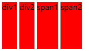
<!DOCTYPE HTML>
<html>
<head>
<meta http-equiv="Content-Type" content="text/html; charset=utf-8">
<title>无标题文档</title>
<style>
div,span{height:100px;background:red; display:inline-block;}
/*
inline-block

1.使块元素在一行显示

2.使内嵌支持宽高

3.换行被解析了

4.不设置宽度的时候宽度由内容撑开

5.在IE6,7下不支持块标签

*/
</style>
</head>
<body>
<div class="div1">div1</div>
<div class="div2">div2</div>
<span class="span1">span1</span>
<span class="span2">span2</span>
</body>
</html>
效果:
day02-浮动
<!DOCTYPE HTML>
<html>
<head>
<meta http-equiv="Content-Type" content="text/html; charset=utf-8">
<title>无标题文档</title>
<style>
div,span{height:100px;background:red;border:1px solid #000; float:left;}
/*
inline-block

1.使块元素在一行显示

2.使内嵌支持宽高

3.换行被解析了

4.不设置宽度的时候宽度由内容撑开

5.在IE6,7下不支持块标签

浮动:
1.使块元素在一行显示

2.使内嵌支持宽高

3.不设置宽度的时候宽度由内容撑开

*/
</style>
</head>
<body>
<div class="div1">div1</div>
<div class="div2">div2</div>
<span class="span1">span1</span>
<span class="span2">span2</span>
</body>
</html>
效果:

day03-浮动
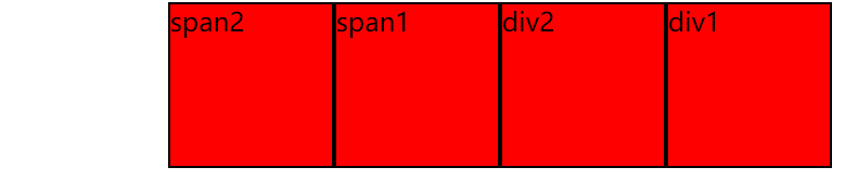
<!DOCTYPE HTML>
<html>
<head>
<meta http-equiv="Content-Type" content="text/html; charset=utf-8">
<title>无标题文档</title>
<style>
div,span{height:100px;background:red;border:1px solid #000; float:right; 100px;}
/*
inline-block

1.使块元素在一行显示

2.使内嵌支持宽高

3.换行被解析了

4.不设置宽度的时候宽度由内容撑开

5.在IE6,7下不支持块标签

浮动: left/right/none
1.使块元素在一行显示

2.使内嵌支持宽高

3.不设置宽度的时候宽度由内容撑开

*/
</style>
</head>
<body>
<div class="div1">div1</div>
<div class="div2">div2</div>
<span class="span1">span1</span>
<span class="span2">span2</span>
</body>
</html>
效果:
day04-浮动
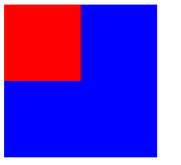
<!DOCTYPE HTML>
<html>
<head>
<meta http-equiv="Content-Type" content="text/html; charset=utf-8">
<title>无标题文档</title>
<style>
.box1{ 100px;height:100px;background:red; float:left;}
.box2{ 200px;height:200px;background:blue;}
/*
    浮动: left/right/none

    元素加了浮动,会脱离文档流 ,按照指定的一个方向移动直到碰到父级的边界或者另外一个浮动元素停止

    1.使块元素在一行显示

    2.使内嵌支持宽高

    3.不设置宽度的时候宽度由内容撑开

    4.脱离文档流

 ** 文档流是文档中可显示对象在排列时所占用的位置
*/
</style>
</head>
<body>
<div class="box1"></div>
<div class="box2"></div>
</body>
</html>
效果:
day05-浮动
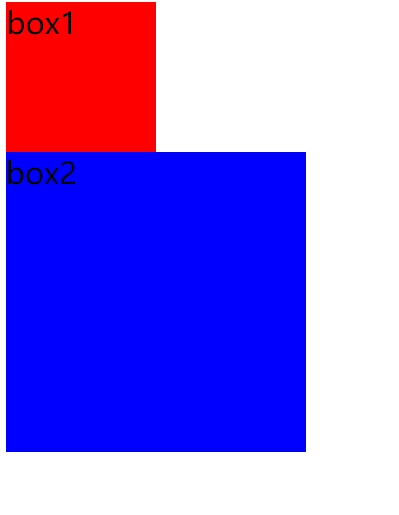
<!DOCTYPE HTML>
<html>
<head>
<meta http-equiv="Content-Type" content="text/html; charset=utf-8">
<title>无标题文档</title>
<style>
body{ font-size:20px;}
.box1{ 100px;height:100px;background:red; float:left;}
.box2{ 200px;height:200px;background:blue; clear:both;}
/*
    浮动: left/right/none

    元素加了浮动,会脱离文档流 ,按照指定的一个方向移动直到碰到父级的边界或者另外一个浮动元素停止

    1.使块元素在一行显示

    2.使内嵌支持宽高

    3.不设置宽度的时候宽度由内容撑开

    4.脱离文档流

    5.提升层级半层

 ** 文档流是文档中可显示对象在排列时所占用的位置

     clear left/right/both/none 元素的某个方向不能有浮动元素
    left    在左侧不允许浮动元素。
right    在右侧不允许浮动元素。
both    在左右两侧均不允许浮动元素。
none    默认值。允许浮动元素出现在两侧。
inherit    规定应该从父元素继承 clear 属性的值

*/
</style>
</head>
<body>
<div class="box1">box1</div>
<div class="box2">box2</div>
</body>
</html>
效果:
day06-浮动
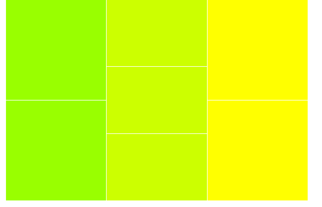
<!DOCTYPE HTML>
<html>
<head>
<meta http-equiv="Content-Type" content="text/html; charset=utf-8">
<title>无标题文档</title>
<style>
body{margin:0;}
.box{900px;margin:0 auto;}
.left{300px;float:left;}
.left div{height:298px; background:#9F0;border:1px solid #fff;}
.center{300px;float:left;}
.center div{ height:198px;background:#CF0;border:1px solid #fff;}
.right{300px; float:right;}
.right div{ height:298px;background:#FF0;border:1px solid #fff;}

</style>
</head>
<body>
<div class="box">
    <div class="left">
        <div></div>
        <div></div>
    </div>
    <div class="center">
        <div></div>
        <div></div>
        <div></div>
    </div>
    <div class="right">
        <div></div>
        <div></div>
    </div>
</div>
</body>
</html>
效果:
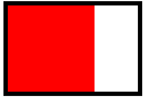
day07-清浮动
<!DOCTYPE HTML>
<html>
<head>
<meta http-equiv="Content-Type" content="text/html; charset=utf-8">
<title>无标题文档</title>
<style>
.box{ 300px;margin:0 auto;border:10px solid #000; float:left;}
.div{ 200px;height:200px;background:red;float:left;}
/*
    清浮动
    1.给父级也加浮动
*/
</style>
</head>
<body>
<div class="box">
    <div class="div"></div>
</div>
</body>
</html>
效果:
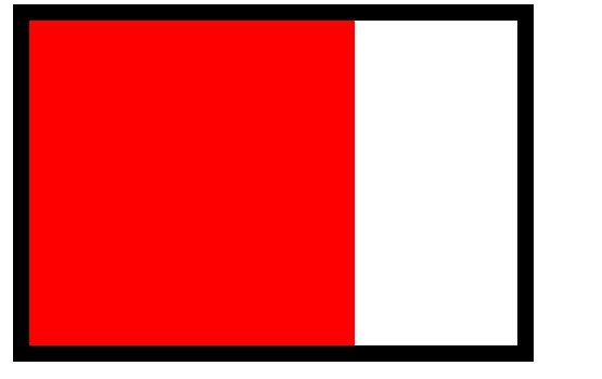
day08-清浮动
<!DOCTYPE HTML>
<html>
<head>
<meta http-equiv="Content-Type" content="text/html; charset=utf-8">
<title>无标题文档</title>
<style>
.box{ 300px;margin:0 auto;border:10px solid #000; display:inline-block;}
.div{ 200px;height:200px;background:red;float:left;}
/*
    清浮动
    1.给父级也加浮动
    2.给父级加display:inline-block
*/
</style>
</head>
<body>
<div class="box">
    <div class="div"></div>
</div>
</body>
</html>
效果:
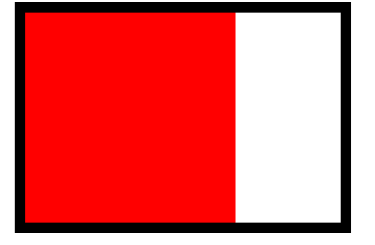
day09-清浮动
<!DOCTYPE HTML>
<html>
<head>
<meta http-equiv="Content-Type" content="text/html; charset=utf-8">
<title>无标题文档</title>
<style>
.box{ 300px;margin:0 auto;border:10px solid #000;}
.div{ 200px;height:200px;background:red;float:left;}
.clear{ height:0px;font-size:0;clear:both;}
/*
    清浮动
    1.给父级也加浮动
    2.给父级加display:inline-block
    3.在浮动元素下加<div class="clear"></div>
    .clear{ height:0px;font-size:0;clear:both;}
*/
</style>
</head>
<body>
<div class="box">
    <div class="div"></div>
    <div class="clear"></div>
</div>
</body>
</html>
效果:

day10-IE6下的最小高度问题
<!DOCTYPE HTML>
<html>
<head>
<meta http-equiv="Content-Type" content="text/html; charset=utf-8">
<title>无标题文档</title>
<style>
body{ margin:0;background:#000;}
.box{height:5px;background:red; font-size:0;}
/*
    在IE6下高度小于19px的元素,高度会被当做19px来处理

    解决办法:font-size:0;
*/
</style>
</head>
<body>
<div class="box"></div>
</body>
</html>
效果:

day11-清浮动
<!DOCTYPE HTML>
<html>
<head>
<meta http-equiv="Content-Type" content="text/html; charset=utf-8">
<title>无标题文档</title>
<style>
.box{ 300px;margin:0 auto;border:10px solid #000;}
.div{ 200px;height:200px;background:red;float:left;}
/*
    清浮动
    1.给父级也加浮动
    2.给父级加display:inline-block
    3.在浮动元素下加<div class="clear"></div>
    .clear{ height:0px;font-size:0;clear:both;}
    4.在浮动元素下加<br clear="all"/>
*/
</style>
</head>
<body>
<div class="box">
    <div class="div"></div>
    <br clear="all"/>
</div>
</body>
</html>
效果:
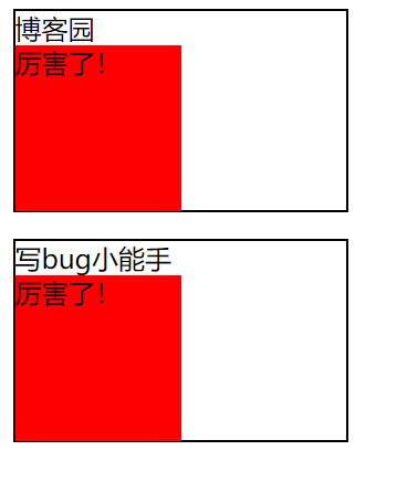
day12-after 在每个 <p> 元素的内容之后插入新内容:
<!DOCTYPE HTML>
<html>
<head>
<meta http-equiv="Content-Type" content="text/html; charset=utf-8">
<title>无标题文档</title>
<style>
p{200px;border:1px solid #000;}
p:after{content:"厉害了!";
 background:red; display:block;100px;height:100px;}
/*
    IE6,7下不支持after伪类
*/
</style>
</head>
<body>
<p>博客园</p>
<p>写bug小能手</p>
</body>
</html>
效果:
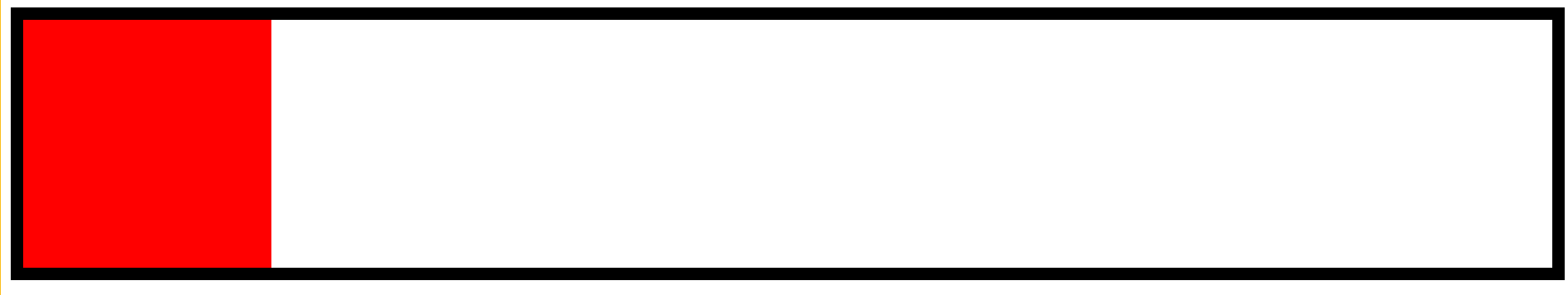
day13-清浮动
<!DOCTYPE HTML>
<html>
<head>
<meta http-equiv="Content-Type" content="text/html; charset=utf-8">
<title>无标题文档</title>
<style>
.box{margin:0 auto;border:10px solid #000;}
.div{ 200px;height:200px;background:red;float:left;}
.clear{zoom:1;}
.clear:after{content:""; display:block;clear:both;}
/*
    清浮动
    1.给父级也加浮动
    2.给父级加display:inline-block
    3.在浮动元素下加<div class="clear"></div>
    .clear{ height:0px;font-size:0;clear:both;}
    4.在浮动元素下加<br clear="all"/>

    5. 给浮动元素的父级加{zoom:1;}
    :after{content:""; display:block;clear:both;}

    **在IE6,7下浮动元素的父级有宽度就不用清浮动

    haslayout 根据元素内容的大小 或者父级的父级的大小来重新的计算元素的宽高

  display: inline-block
  height: (任何值除了auto)
  float: (left 或 right)
   (任何值除了auto)
  zoom: (除 normal 外任意值)
*/
</style>
</head>
<body>
<div class="box clear">
    <div class="div"></div>
</div>
</body>
</html>
如图:
day14-overflow
<!DOCTYPE HTML>
<html>
<head>
<meta http-equiv="Content-Type" content="text/html; charset=utf-8">
<title>无标题文档</title>
<style>
.box{300px;height:300px;border:1px solid #000; font-size:12px;line-height:30px;overflow:hidden;}
h3{100px;height:30px;background:red;margin:0;}
/*
    overflow 溢出
        auto 溢出显示滚动条
        scroll 默认就显示滚动条
        hidden 溢出隐藏
*/
</style>
</head>
<body>
<div class="box">
    haslayout 是Windows Internet Explorer渲染引擎的一个内部组成部分。在InternetExplorer中,一个元素要么自己对自身的内容进行计算大小和组织,要么依赖于父元素来计算尺寸和组织内容。为了调节这两个不同的概念,渲染引擎采用了 hasLayout 的属性,属性值可以为true或false。当一个元素的 hasLayout属性值为true时,我们说这个元素有一个布局(layout)
要想更好的理解 css, 尤其是 IE 下对 css 的渲染,haslayout 是一个非常有必要彻底弄清楚的概念。大多IE下的显示错误,就是源于 haslayout。如果它设置成了true,它就不得不去渲染它自己,因此元素不得不扩展去包含它的流出的内容。例如浮动或者很长很长的没有截断的单词,如果haslayout没有被设置成true,那么元素得依靠某个祖先元素来渲染它。这就是很多的ie bugs诞生的地方。
</div>
<h3>写bug小能手</h3>
</body>
</html>
如图:

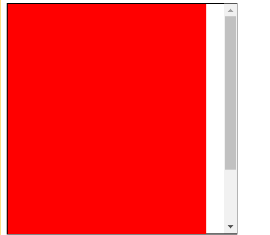
day15-overflow
<!DOCTYPE HTML>
<html>
<head>
<meta http-equiv="Content-Type" content="text/html; charset=utf-8">
<title>无标题文档</title>
<style>
.box{ 300px;height:300px;border:1px solid #000;overflow:auto;}
.div1{ 260px;height:400px;background:Red;float:left;}
</style>
</head>
<body>
<div class="box">
    <div class="div1"></div>
</div>
</body>
</html>
如图:
16.小练习
<!DOCTYPE HTML>
<html>
<head>
<meta http-equiv="Content-Type" content="text/html; charset=utf-8">
<title>无标题文档</title>
<style>
body,ul,dl,dd{margin:0;padding:0; font-family:"宋体";}
li{ list-style:none;}
a{ text-decoration:none;color:#4f6c84;}
img{ border:none; vertical-align:top;}
.clear{zoom:1;}
.clear:after{ content:"";display:block;clear:both;}
.wrap{445px;margin:30px auto;padding:12px 8px 0 7px; background:url(img/bg.gif) no-repeat 220px 0;}
.left{212px;float:left;}
.leftTop .pic{124px; background:url(img/picBg.gif) no-repeat right 0;padding-right:5px;float:left;}
.leftTop .pic a{border:1px solid #c3cfd9; display:block;padding:3px; height:86px;}
.leftTop dl{float:left;60px;padding-left:5px; font-size:12px; line-height:20px;color:#7190a6;}
.leftBottom{padding-top:10px;}
.leftBottom li{font-size:12px; line-height:20px;padding-left:10px; background:url(img/liBg.gif) no-repeat 0 7px;}
.right{220px;float:right;}
.right li{100px;float:left;padding-left:10px;}
.right a{ display:block;}
.right img{border:1px solid #c3cfd9;padding:3px;}
.right strong{ display:block;padding-top:3px;font:normal 12px/24px "宋体"; text-align:center;}
</style>
</head>
<body>
<div class="wrap clear">
    <div class="left">
        <div class="leftTop clear">
            <div class="pic">
                <a href="#">
                    <img src="img/pic.gif" />
                </a>
            </div>
            <dl>
                <dt><a href="#">潜伏</a></dt>
                <dd>导演:姜伟</dd>
                <dd>主演:姚晨 孙红雷</dd>
            </dl>
        </div>
        <ul class="leftBottom">
            <li><a href="#">海清张嘉译演绎房奴生活《蜗居》</a></li>
            <li>
                <a href="#">琼瑶经典言情剧集锦</a>
                <a href="#">梦露电影知多少</a>
            </li>
        </ul>
    </div>
    <ul class="right">
        <li>
            <a href="#">
                <img src="img/pic2.gif" />
                <strong>将爱情进行到底</strong>
            </a>
        </li>
        <li>
            <a href="#">
                <img src="img/pic2.gif" />
                <strong>将爱情进行到底</strong>
            </a>
        </li>
    </ul>
</div>
<!--
<div class="pic">
    <a href="#">
        <img/>
    </a>
</div>
<h3><a href="#">将爱情进行到底</a></h3>-->
</body>
</html>
效果: