转载: https://css-tricks.com/line-clampin/
You want X lines of text. Anything after that, gracefully cut off. That's "line clamping" and it is a perfectly legit desire. When you can count on text being a certain number of lines, you can create stronger and more reliable grids from the elements that contain that text, as well as achieve some symmetric aesthetic harmony.
There are a couple of ways to get it done, none of them spectacular.
In case that explanation wasn't clean, imagine you have some HTML like this:
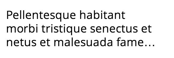
<div class="module">
  <p>Pellentesque habitant morbi tristique senectus et netus et malesuada fames ac turpis egestas. Vestibulum tortor quam, feugiat vitae, ultricies eget, tempor sit amet, ante. Donec eu libero sit amet quam egestas semper. Aenean ultricies mi vitae est. Mauris placerat eleifend leo.</p>
</div>
And you want to limit it to exactly three lines in a container. Like this:
In all these examples, let's assume we have a "module".
.module {
  width: 250px;
  overflow: hidden;
}#Weird WebKit Flexbox Way
David DeSandro showed us this little ditty a few years ago.
.line-clamp {
  display: -webkit-box;
  -webkit-line-clamp: 3;
  -webkit-box-orient: vertical;
}
On one hand, this is awesome and exactly what we need. CSS is the perfect place for this. It's a real need and it should be this simple.
On the other hand... it's weird. why does it need to be a flexbox thing (the old version at that)? It doesn't work without that. And it's extremely fragile. Let's say you want the module (or the paragraph) to have some padding. You can't because the padding will expose extra lines. That's what we get with half-baked non-standardized properties.
#The Fade Out Way
The root of this technique is just setting the height of the module in a predictable way. Let's say you set the line-height to 1.2em. If we want to expose three lines of text, we can just make the height of the container 3.6em (1.2em × 3). The hidden overflow will hide the rest.
But it can be a bit awkward to just cut the text off like that. Ideally, we would add ellipsis, but we can't reliably position them. So instead we'll fade out the text achieving the same kind of communication ("there is more...").
To fade out the last line, we make a box (a pseudo element will work great) and overlay a transparent-to-background-color gradient over the top. Making it nearly as wide as the container is best in case the last line is short. Because we know the line-height, we can make the pseudo element box exactly one line tall.
.fade {
  position: relative;
  height: 3.6em; /* exactly three lines */
}
.fade:after {
  content: "";
  text-align: right;
  position: absolute;
  bottom: 0;
  right: 0;
  width: 70%;
  height: 1.2em;
  background: linear-gradient(to right, rgba(255, 255, 255, 0), rgba(255, 255, 255, 1) 50%);
}#The Opera Overflow Way
Like WebKit, Opera has their own way to handle this. They apply ellipsis on the line you wish to. Of course the clock is ticking for Presto (Opera's rendering engine pre-Blink) so this isn't particularly useful. Perhaps it can still inform a future implementation though.
.last-line {
  height: 3.6em; /* exactly three lines */
  text-overflow: -o-ellipsis-lastline;
}#The Clamp.js Way
Where there is a will there is a way (with JavaScript). I think that's a saying. Joseph J. Schmitt has an excellent library-free JavaScript thingy called Clamp.js for making this happen in a cross-browser way.
var module = document.getElementById("clamp-this-module");

$clamp(module, {clamp: 3});
Make sure you target the element with the text directly inside of it. Originally I tried putting the ID on the module, which worked in Chrome/Safari, but failed in Firefox. Putting it on the <p> made it work in both (Thx Merri).
#The Demos
#Update: More Good Ways!
- There is an exceptionally clever all-CSS way to do this posted on the Mobify blog.
- Vesa Piittinen created an alternative method to Clamp.js.
Unlike Clamp.js it retains all the text within the clamped element and uses text-overflow to do the magic.
- FT Labs also has created a JavaScript plugin to do the job. It's nice in that you don't have to specify the number of lines, it just happens when the text overflows the container, so the design decision stay in the CSS.
- Succinct:
A tiny jQuery plugin for truncating multiple lines of text.
Both of these examples have been added to the main Pen.