Problem:
Describe the worst interface that you have ever worked with and critique it relative to the concepts introduced in this chapter. Describe the best interface that you have ever worked with and critique it relative to the concepts introduced in this chapter.
Answer:
Interface design:
The golden rules that deals with an interface design are,
• Place the user in control.
• Reduce the user’s memory load.
• Make the interface consistent.
There are the observations that make an interface to satisfy the user’s requirements.
Also, the interface must follow these rules to make the user’s work more reliable and comfortable.
The interface has the constraints and the limitations of the process to make the users understandable.
Each interface must have the opinion that, this interface may be the best or the worst by the user’s perception.
One of the worst interfaces is the automatic teller machine of the bank.
• The ATM is the automatic teller machine, that every bank provides a facility to withdraw the money for the people.
• In some cases, it may be the worst interface while withdrawing a money, or setting up a password, or any balance regarding queries.
• This case, sometimes the operations are stopped and it leads to inconvenient to the user.
• It fails on the first golden rule; it doesn’t place the user in control.
• In automatic teller machine, the menu option of the bank – the with-drawls of funds do not have a certain safety measure.
• When it happens, it can make possible to seize again some new operations.
• The interface also fails on the third golden rule; it doesn’t make the interface consistent.
• The ATM always does not provide the much easier of interaction to the user.
• Also, it does not provide any indicators (graphical icons etc.,) that enable the user to know the context of the works at hand.
• So, it makes discomfort to the user in such kind of interface design.
Therefore, the automatic teller machine is one of the worst interfaces.
One of the best interfaces is the online banking through the web-page.
• The online banking is nothing that the E-banking or the internet banking.
• The operations of the banking facilities show the user to show the easiest way of operations.
• In some cases, it shows inconvenience to the user but it makes the user in control.
• It answers all the requests of the user when compared to other sites.
• The online banking provides the user to do the transactions much easier, and it is reliable to the user wherever the user will be.
• The balance and the transactions can be updated time to time; it will make the user to pay the transactions faster.
• It follows the third golden rule of the interface, to make the interface consistent.
• The input mechanisms are constrained to a limited set that is used consistently throughout the application.
• Mechanisms for navigating from task to task to a limited set that is used consistently throughout the applications.
• It reduces the memory load of the user to make the transactions easier through the online banking and also in the operations of the investments.
• So, it makes comfort to the user in such kind of interface design.
Therefore, the online banking web-page is one of the best interfaces.
Problem:
Develop two additional design principles that “place the user in control.”
Answer:
592-12-2P SA Code: 4467
SR Code: 4578
Two Additional design principles in “place the user in control”. Those are
1. Display descriptive and helpful message: Design messages that are descriptive and helpful. Avoid displaying message that contains obscure system information.
2. Accommodate users with different skill levels: - The focus of user interface design is the novice or casual user. However these users may eventually become expert users who will get frustrated if you do not provide shortcuts.
To accommodate these expert users you should provide content menus, shortcuts, summary help, and allows removal of some of the visual vies.
Problem:
Develop two additional design principles that “reduce the user’s memory load.”
Answer:
Two Additional design principles in “reduce the user’s memory load”. Those are
1. The user should see all valid actions for a selected object. These may be provided in context menus, menu bar, toolbar or push buttons.
2. For complex tasks provide reminders to help the user stay on track. This is especially important if the user defers the completion of a complex task. When the user returns to complete the task provide a dialog that allows the users to review the status of the partially completed task.
Problem:
Develop two additional design principles that “make the interface consistent.”
Answer:
Two Additional design principles in “make interface consistent”. Those are
1. Common presentation: The operating environment provides a level of common presentation. There include the window title, menu bar which are always in the same position. Radio buttons, check bones and lists that look the same irrespective of their position.
2. Common interaction: Components should always behave the same. For example, when a set a radio buttons are presented one should always be checked. When a radio button, in a group, is selected all other radio buttons in the group should be set off the user should never be able to select more that one radio button with the group.
Problem:
Consider one of the following interactive applications (or an application assigned by your instructor):
a. A desktop publishing system
b. A computer-aided design system
c. An interior design system (as described in Section 15.3.2)
d. An automated course registration system for a university
e. A library management system
f. An Internet-based polling booth for public elections
g. A home banking system
h. An interactive application assigned by your instructor
Develop a user model, design model, mental model, and an implementation model, for any one of these systems.
Answer:
4633-11-5P SA: 4475
SR: 6376
Taken interactive application is a home banking system.
This is an application where, implementation of bank business at home by means of electronic communications, such as a telephone or computer occurs.
User model:
In the context of user interface design, user model describes an actor who interacts with a system and it shows how an end-user performs some specific work- related tasks.
Design Model:
A design model of the entire system incorporates data, architectural, interface, and procedural representation of the home banking system.
Mental model:
It gives the image of the web – based home banking system. It gives an overall design of the web system.
Implementation model:
The implementation model combines the outward manifestation of the computer based system coupled with all supporting information (the look and feel of the interface), coupled with all supporting information (books, manuals, videotapes, help files) that describes interface syntax and semantics. The implementation model must accurately reflect syntactic and semantic information about the interface.
In banking system all policies, loans, and user information is added in this model.
Problem:
Perform a detailed task analysis for any one of the systems listed in Problem 15.5. Use either an elaborative or object-oriented approach.
Answer:
Let us consider an interior design system to perform a detailed task analysis. We use an elaborative approach of task analysis, where stepwise elaboration of the task is given. This approach assists in understanding the human activities the user interface must accommodate.
An interior design system comprises of various major activities. They are:
• Furniture Layout
• Fabric and material selection
• Wall and window coverings selection
• Presentation
• Costing and shopping
Each of these major tasks can be elaborated into sub-tasks.
The task furniture layout can be further divided into the following sub tasks.
1. Draw a floor plan based on room dimensions
2. Place windows and doors at appropriate locations
3. (i) Use furniture templates to draw scaled furniture outlines on floor plan
(ii) Use accent templates to draw scaled accents on floor plan.
4. Move furniture outlines and accent outlines to get best placement
5. Label all furniture and accent outlines
6. Draw dimensions to show location
7. Draw perspective rendering view for customer
Sub-tasks of fabric and material selection are:
1. List out the furniture
2. List out the accents
3. List the customer desires for placement
Sub-tasks of Wall and window coverings selection are:
1. Choose a model, pattern, and design
2. Select a color
3. Try different patterns and colors
Sub-tasks of presentation include:
1. Move things
2. Consider the number of alternative placements
3. Decide on the best pattern
4. Draw a rendering (a 3-D picture) of the room
Sub-tasks that come under costing and shopping are:
1. List out the entire items
2. Estimate the minimum and maximum expected costs
3. Estimate cost of labor
4. Find the best market places to buy the items
Problem:
Add at least five additional questions to the list developed for content analysis in Section 15.3.3.
Answer:
The additional questions for content analysis are as follows
• Where are audio prompts used and for what purpose?
• Are content object generated dynamically?
• Are there constraints on the placement of graphical objects?
• Are there screen size limitations that dictate placement of content?
• Is there a mechanism for magnification of screen content?
Problem:
Continuing Problem 15.5, define interface objects and actions for the application you have chosen. Identify each object type.
Answer:
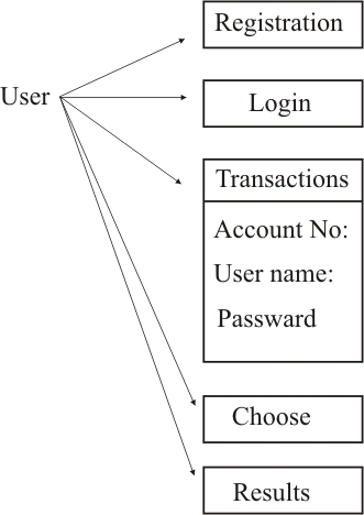
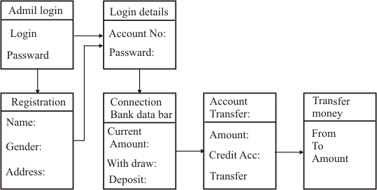
Let us consider a home banking system. In order to define interface objects and actions for the application, we have to first identify the list of tasks that occur in the system.
Following are the tasks that are implemented in a home banking system.
• Access the home banking system
• Enter the login ID and password
• Check account number and name
• Check account type and balance
• Review statement
• View alerts and messages
• Transfer money between accounts
• View amount credited
• Pay bill
• Transfer money to the payment account
From the tasks listed, nouns (objects) and verbs (actions) are isolated to create a list of objects and actions.
Objects are:
Home banking system, login ID, password, account number, name, account type, balance, statement, alerts, messages, money, accounts, amount credited, bill, payment account.
Actions are:
Access, enter, check, review, view, transfer, and pay.
Once the objects and actions have been defined and elaborated iteratively, they are categorized by type. Target, source and application are the three types of objects that are identified.
A source object (e.g., a report icon) is dragged and dropped onto a target object (e.g., a printer icon). An application object refers application-specific data that are not directly manipulated as part of screen interaction. For example, a mailing list is used to store names for a mailing. The list itself might be sorted, merged or purged, but it is not dragged and dropped via user interaction.
Here, majority of the objects noted are application objects. They are:
Home banking system, login ID, password, account number, name, account type, balance, statement, alerts, messages, amount credited, and bill.
However, money is a source object which is dragged and dropped onto target objects, account and payment account.
Problem:
Develop a set of screen layouts with a definition of major and minor menu items for the system you chose in Problem 15.5.
Answer: Major Menu items: The functions containing multiple sub functions are considered as Major Menu items. Minor Manu items: The functions that perform a specific task are considered as Minor Menu items.
A home banking system requires three screen layouts.
1. Login screen: It is used to authenticate the user and acts as door to enter into the system.
2. Operative Accounts Summary Screen: It is used to display account details and perform operations related to the account by the users.
3. Loan Details screens: It is used to display loan details and perform operations related to the cards by the user.
1. Screen layout of Login screen:
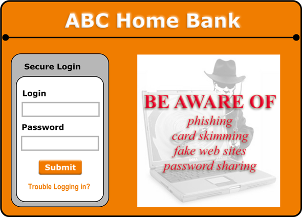
The login does not contain any major or minor menus. The only functionality of the login screen is to authenticate the user.
The screen layout has two columns. Left column contains provisions to enter user’s Login, Password, Submit button and a link “Trouble Logging in?”. The right column contains a warning logo and message related to the security.
2. Screen layout of Operative Accounts Summary screen:
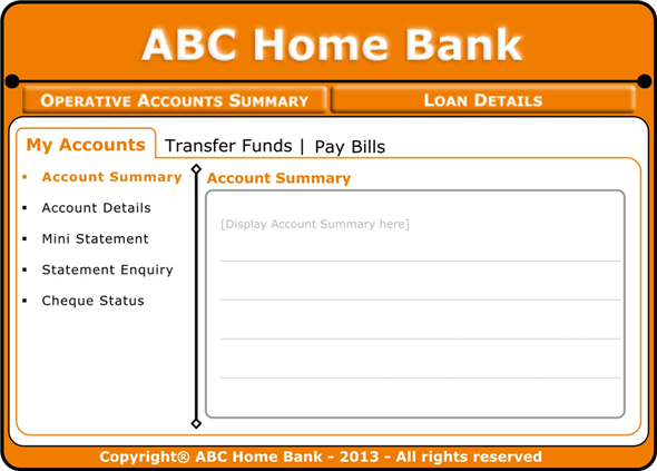
The screen layout contains options to navigate between the two pages “Operative Accounts Summary” and “Loan Details” in the starting row after title.
The screen layout of Operative Accounts Summary contains major and minor menu items to perform various operations related to the account.
When a major menu item is selected, a tabbed layout (sub screen) will be displayed with two columns. Left column contains list of minor menu items and right column is allocated to perform operations of minor menu item which is selected.
The details of major and minor menu items are given below.
Major menu items:
• My Account
• Transfer Funds
• Pay Bills
Minor menu items: Each of the major menu items contains minor menu items.
• Minor menu items of My Account
o Account summary
o Mini statement
o Statement enquiry
o Cheque status
• Minor menu items of Transfer Funds
o My own ABC account
o Other ABC account
o Other bank account
o VISA credit card transfer
• Minor menu items of Pay Bills
o Direct Pay
o View Bills and Pay
o Add New Biller
o Payment History
3. Screen layout of Loan Details screen:
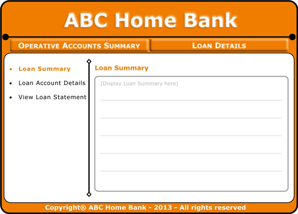
This screen layout also contains options to navigate between the two pages “Operative Accounts Summary” and “Loan Details” in the starting row after title.
The screen layout of Loan Details does not contain any major items. It contains minor menu items to perform various operations related to the user loans with two columns. Left column contains list of minor menu items and right column is allocated to perform operations of minor menu item which is selected.
The details of minor menu items are given below.
Minor menu items:
• Loan summary
• Loan account details
• View loan statement
Problem:
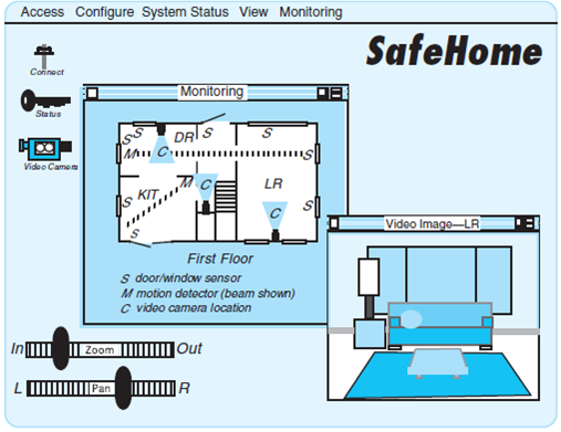
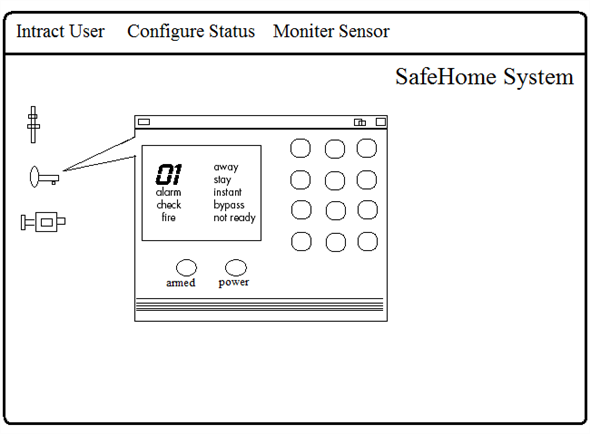
Develop a set of screen layouts with a definition of major and minor menu items for the SafeHome system. You may elect to take a different approach than the one shown for the screen layout in Figure 15.3.
FIGURE 15.3 Preliminary screen layout
Answer:
Major and minor menu items for safe home system:
For design a SafeHome system screen layout, we can consider the major and menu items as follows
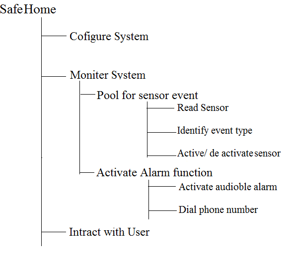
Screen layout 1:
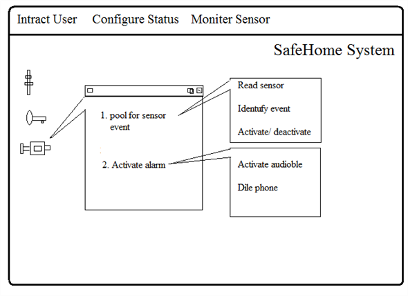
Screen layout 2:
Problem:
Describe your approach to user help facilities for the task analysis design model and task analysis you have performed as part of Problems 15.5, 15.7, and 15.8.
Answer: Problem:
Provide a few examples that illustrate why response time variability can be an issue.
Answer:
592-12-12P SA Code: 4475
SR Code: 4578
When response time is unpredictable, the user becomes impatient and re-attempts the command requested or tries another command. In some cases, this can create queuing problems (for commands) and in extreme cases, cause loss of data or even a system failure. Research has shown that users can tolerate up to 50% variation in response rates for applications they are familiar with. For unfamiliar application users become anxious after 15-30 seconds unexpected delays (the half-life of their short term memory.
While compared to the web, response time times with a GUI system are fairly stable, if not nearly instantaneous. Web response times can be variable, and often aggravatingly slow. Line transmission speeds, system loads, and page content can have a dramatic impact. Long response times can upset and frustrate users.
For example, mean response time is 4seconds; a 2-second deviation is permissible. Variations should range from 3 to 5 seconds. Variation should never exceed 20 percent, however, because lower response time variability has been found to yield better performance, but small variations may be tolerated.
Problem:
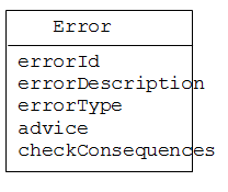
Develop an approach that would automatically integrate error messages and a user help facility. That is, the system would automatically recognize the error type and provide a help window with suggestions for correcting it. Perform a reasonably complete software design that considers appropriate data structures and algorithms.
Answer:
The algorithm below constructs and displays the message in a window to the user in case an error has occurred. This algorithm is called when an error occurs in the execution of a program. The message is accompanied with a beep sound.
Algorithm DisplayErrorMessage(int errorId)
String Message=”An error has occurred.”
If(errorDescription!= null || errorDescription!= empty)
Message+= errorDescription
Else
Message+= “Error No:” + errorId
If(advice != null || advice != empty)
Message+= ”We advice that “+ advice
If(checkConsequences!=null ||checkConsequences!= empty)
Message+= ”Please check that” + checkConsequences
Display the Message in a window.
Produce a beep sound.
If errorType= fatal
Close the program.
End DisplayErrorMessage
Error class for an error message and user help facility is given below:-
Problem:
Develop an interface evaluation questionnaire that contains 20 generic questions that would apply to most interfaces. Have 10 classmates complete the questionnaire for an interactive system that you all use. Summarize the results and report them to your class.
Answer:
Solution: CHAPTER15: USER INTERFACE DESIGN
15.1 This should be not difficult! Many of the early interactive systems had abominable interfaces. In the modern context, have your students focus on Web-based application interfaces. Many web applications sacrifice ease-of-use for flash.
15.2 Examples might be:
Catch potential interaction errors before they do "undoable" damage.
Allow the user to customize screen layout as well as commands.
Make use of breakaway menus so that common functions are always readily available.
15.3 Examples might be:
If the user desires, display shortcut command sequences on the screen at all times.
Provide the facilities for "hints" when a WebApp requires password input
15.4 Examples might be:
Use color consistently, e.g., red for warning messages, blue for informational content.
Provide keyword driven on-line help.
15.5 Answers will vary
15.6 If your students get bogged down in task analysis, the old I-P-O stand-by will work. Ask: What does the user input? How is it processed and how is the processing evidenced via the interface? What is produced as output?
15.7 Answers will vary
15.8 Answers will vary
15.9 Answers will vary
15.10 Answers will vary
15.11 Answers will vary
15.12 When response time is unpredictable, the user becomes impatient and re-attempts the command requested or tries another command. In some cases, this can create queuing problems (for commands) and in extreme cases, cause loss of data or even a system failure. Research has shown that users can tolerate up to 50% variation in response rates for applications they are familiar with. For unfamiliar applications users become anxious after 15-30 second unexpected delays (the half-life of their short term memory).
15.13 Answers will vary
15.14 The Internet is a good source of usability questionnaires if you wish to give your students some examples to work form (most have many more than 20 questions so your students will need to prioritize their choices).