CSS3 过渡(transition)
transition:过渡,就是由一种状逐渐态变成另外一状态!
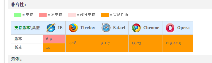
兼容性:
transition:transition-property transition-duration transition-timing-function transition-delay;
下面我们来解读属性:
transition-property,可以设置某种属性过渡如:width height background opacity 等等,也可以设置成all 或者 none;
还可以指定我们的css属性列表;
transition-duration:过渡在指定的时间内完成;

transition-timing-function:
linear:匀速
ease-in:加速运动
ease-out:减速运动
ease-in-out:先加后减
cubic-bezier:贝塞尔曲线;
我们先做一个简单的实例(width的transition)
.demo{
    width:100px;
    height:50px;
    background:green;
    transition:width 2s linear 1s;
    -moz-transition:width 2s linear 1s;
    -webkit-transition:width 2s linear 1s;
    -o-transition:width 2s linear 1s;
}
.demo:hover{
    width:200px;
}
多属性的改变;
.demo{
    width:100px;
    height:50px;
    background:green;
    transition:all 2s linear 1s;
    -moz-transition:all 2s linear 1s;
    -webkit-transition:all 2s linear 1s;
    -o-transition:all 2s linear 1s;
}
.demo:hover{
    width:200px;
    height:200px;
    background:red;
}
也可以这么写:(先变width,再变高度,再改变背景色)
.demo{
    width:100px;
    height:50px;
    background:green;
    transition:width 2s linear ,height 2s linear 2s,background 2s linear 4s;
    -moz-transition:width 2s linear ,height 2s linear 2s,background 2s linear 4s;
    -webkit-transition:width 2s linear ,height 2s linear 2s,background 2s linear 4s;
    -o-transition:width 2s linear ,height 2s linear 2s,background 2s linear 4s;
}
.demo:hover{
    width:200px;
    height:200px;
    background:red;
}
这里再分享一篇:较好的总结性文章:
https://isux.tencent.com/css3-transition.html