如图:
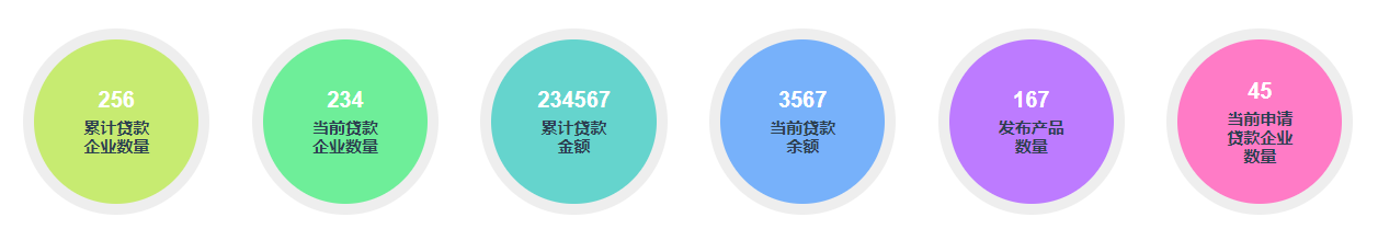
<div class="statisticDataList">
            <div
              v-for="(item, index) in statisticData"
              :key="index"
              class="list-item"
              :style="{ background: colorList[index] }"
            >
              <div
                style="
                  margin-bottom: 5px;
                  color: #fff;
                  font-weight: bold;
                  font-size: 20px;
                "
              >
                {{ item.count }}
              </div>
              <div style=" 70px; font-weight: bold; font-size: 15px">
                {{ item.type }}
              </div>
            </div>
          </div>
.statisticDataList {
    width: 100%;
    height: 100px;
    .list-item {
      width: 12%;
      height: 0;
      padding: 6%;
      text-align: center;
      background: #057af3;
      border: #eee solid 10px;
      border-radius: 50%;
      box-shadow: #898787;
    }
  }
主要是利用padding撑开高度,padding如果是百分比就是相对于父级的宽度。这里如果是padding-top、或者padding-bottom都可以,但是文字不会居中。