echarts配置项太多了,还是一点点积累吧~~~~~
当然前提条件还是得老老实实看echarts官方文档 :https://echarts.baidu.com/
今天主要就介绍下我在工作中通过echarts实现的微信小程序的折线图
Demo地址:https://gitee.com/v-Xie/echartsDemo.git
效果嘛如下:
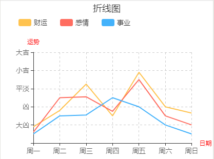
通过此图分析得出需要实现以下几点:(主要配置代码请看后面部分)
1.标题(折线图)-title
需:颜色,文本,位置
2.图例(财运,感情,事业)-legend
需:图例颜色,图标形状,图标文本,各图标间隔
3.横纵坐标
需: 》》横坐标-xAxis
刻度【周一,周二...周日】,-axisLabel
分割线 -splitLine
》》纵坐标-yAxis:
刻度【大吉,...凶】,-axisLabel
分割线 -splitLine
4.数据项-series
开发吧:
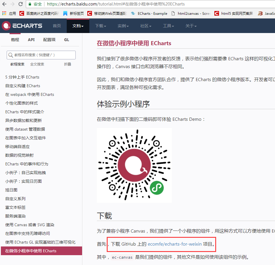
首先下载echarts
进行中:
目录
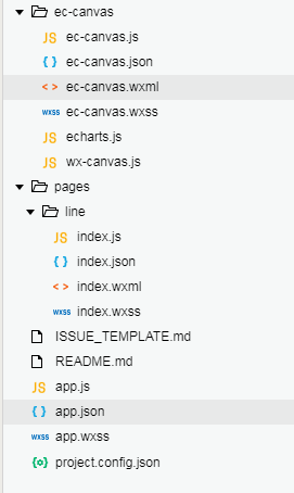
line/index.wxml
<!--index.wxml-->
<view class="container">
<view class='echart_wrap'>
<ec-canvas id="mychart" canvas-id="mychart-line" ec="{{ ec }}"></ec-canvas>
</view>
</view>
line/index.json
{
"usingComponents": {
"ec-canvas": "../../ec-canvas/ec-canvas"
}
}
line/index.js中
// 引入echarts.js
import * as echarts from '../../ec-canvas/echarts';
var Chart=null;
const app = getApp();
Page({
data: {
ec: {
onInit: function (canvas, width, height) {
chart = echarts.init(canvas, null, {
width,
height: height
});
canvas.setChart(chart);
return chart;
},
lazyLoad: true // 延迟加载
},
},
onLoad: function (options) {
this.echartsComponnet = this.selectComponent('#mychart');
//如果是第一次绘制
if (!Chart) {
this.init_echarts(); //初始化图表
} else {
this.setOption(Chart); //更新数据
}
},
onReady() {
},
//初始化图表
init_echarts: function () {
this.echartsComponnet.init((canvas, width, height) => {
// 初始化图表
const Chart = echarts.init(canvas, null, {
width,
height: height
});
this.setOption(Chart)
// 注意这里一定要返回 chart 实例,否则会影响事件处理等
return Chart;
});
},
setOption: function (Chart) {
Chart.clear(); // 清除
Chart.setOption(this.getOption()); //获取新数据
},
// 图表配置项
getOption() {
var self = this;
var option = {
title: {//标题
text: '折线图',
left: 'center'
},
renderAsImage: true, //支持渲染为图片模式
color: ["#FFC34F", "#FF6D60", "#44B2FB"],//图例图标颜色
legend: {
show: true,
itemGap: 25,//每个图例间的间隔
top: 30,
x: 30,//水平安放位置,离容器左侧的距离 'left'
z: 100,
textStyle: {
color: '#383838'
},
data: [//图例具体内容
{
name: '财运',//图例名字
textStyle: {//图例文本样式
fontSize: 13,
color: '#383838'
},
icon: 'roundRect'//图例项的 icon,可以是图片
},
{
name: '感情',
textStyle: {
fontSize: 13,
color: '#383838'
},
icon: 'roundRect'
},
{
name: '事业',
textStyle: {
fontSize: 13,
color: '#383838'
},
icon: 'roundRect'
}
]
},
grid: {//网格
left: 30,
top:100,
containLabel: true,//grid 区域是否包含坐标轴的刻度标签
},
xAxis: {//横坐标
type: 'category',
name: '日期',//横坐标名称
nameTextStyle: {//在name值存在下,设置name的样式
color: 'red',
fontStyle: 'normal'
},
nameLocation:'end',
splitLine: {//坐标轴在 grid 区域中的分隔线。
show: true,
lineStyle: {
type: 'dashed'
}
},
boundaryGap: false,//1.true 数据点在2个刻度直接 2.fals 数据点在分割线上,即刻度值上
data: ['周一', '周二', '周三', '周四', '周五', '周六', '周日'],
axisLabel: {
textStyle: {
fontSize: 13,
color: '#5D5D5D'
}
}
},
yAxis: {//纵坐标
type: 'value',
position:'left',
name: '运势',//纵坐标名称
nameTextStyle:{//在name值存在下,设置name的样式
color:'red',
fontStyle:'normal'
},
splitNumber: 5,//坐标轴的分割段数
splitLine: {//坐标轴在 grid 区域中的分隔线。
show: true,
lineStyle: {
type: 'dashed'
}
},
axisLabel: {//坐标轴刻度标签
formatter: function (value) {
var xLable = [];
if (value == 20) {
xLable.push('大凶');
}
if (value == 40) {
xLable.push('凶');
}
if (value == 60) {
xLable.push('平淡');
}
if (value == 80) {
xLable.push('小吉');
}
if (value == 100) {
xLable.push('大吉');
}
return xLable
},
textStyle: {
fontSize: 13,
color: '#5D5D5D',
}
},
min: 0,
max: 100,
},
series: [{
name: '财运',
type: 'line',
data: [18, 36, 65, 30, 78, 40, 33],
symbol: 'none',
itemStyle: {
normal: {
lineStyle: {
color: '#FFC34F'
}
}
}
}, {
name: '感情',
type: 'line',
data: [12, 50, 51, 35, 70, 30, 20],
// data: ["80", "20", "50", "70", "80", "60", "70"],
symbol: 'none',
itemStyle: {
normal: {
lineStyle: {
color: '#FF6D60'
}
}
}
}, {
name: '事业',
type: 'line',
data: [10, 30, 31, 50, 40, 20, 10],
// data: ["50", "30", "40", "70", "90", "30", "20"],
symbol: 'none',
itemStyle: {
normal: {
lineStyle: {
color: '#44B2FB'
}
}
}
}],
}
return option;
},
});