阅读目录
- 方法一:position加margin
- 方法二: diaplay:table-cell
- 方法三:position加 transform
- 方法四:flex;align-items: center;justify-content: center
- 方法五:display:flex;margin:auto
- 方法六:纯position
- 方法七:兼容低版本浏览器,不固定宽高
- 总结
这种css布局平时用的比较多,也是面试题常出的一个题,网上一搜一大丢,不过还是想自己总结一下。
这种方法比较多,本文只总结其中的几种,以便加深印象。
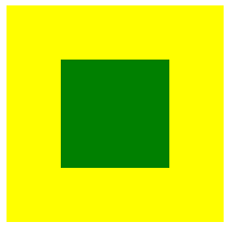
效果图都为这个:
方法一:position加margin

/**html**/
<div class="wrap">
    <div class="center"></div>
</div>

/**css**/
.wrap {
     200px;
    height: 200px;
    background: yellow;
    position: relative;
}
.wrap .center {
     100px;
    height: 100px;
    background: green;
    margin: auto;
    position: absolute;
    left: 0;
    right: 0;
    top: 0;
    bottom: 0;
}
兼容性:主流浏览器均支持,IE6不支持
方法二: diaplay:table-cell
<!-- html -->
<div class="wrap">
     <div class="center"></div>
</div>

/*css*/
.wrap{
     200px;
    height: 200px;
    background: yellow;
    display: table-cell;
    vertical-align: middle;
    text-align: center;
}
.center{
    display: inline-block;
    vertical-align: middle;
     100px;
    height: 100px;
    background: green;
}
兼容性:由于display:table-cell的原因,IE67不兼容
方法三:position加 transform
|
1
2
3
4
5
6
7
8
9
10
11
12
13
14
15
16
17
18
19
20
21
22
|
<!-- html --><div class="wrap"> <div class="center"></div></div>/* css */.wrap { position: relative; background: yellow; 200px; height: 200px;}.center { position: absolute; background: green; top:50%; left:50%; -webkit-transform:translate(-50%,-50%); transform:translate(-50%,-50%); 100px; height: 100px;} |
兼容性:ie9以下不支持 transform,手机端表现的比较好。
方法四:flex;align-items: center;justify-content: center
<!-- html -->
<div class="wrap">
    <div class="center"></div>
</div>

/* css */
.wrap {
    background: yellow;
     200px;
    height: 200px;
    display: flex;
    align-items: center;
    justify-content: center;
}

.center {
    background: green;
     100px;
    height: 100px;
}
移动端首选
方法五:display:flex;margin:auto
<!-- html -->
<div class="wrap">
    <div class="center"></div>
</div>

/* css */
.wrap {
    background: yellow;
     200px;
    height: 200px;
    display: flex;
}

.center {
    background: green;
     100px;
    height: 100px;
    margin: auto;
}
移动端首选
方法六:纯position
|
1
2
3
4
5
6
7
8
9
10
11
12
13
14
15
16
17
18
19
20
21
22
23
24
25
26
27
28
29
30
31
32
33
|
<!-- html --><div class="wrap"> <div class="center"></div></div>/* css */.wrap { background: yellow; width: 200px; height: 200px; position: relative;}/**方法一**/.center { background: green; position: absolute; width: 100px; height: 100px; left: 50px; top: 50px; }/**方法二**/.center { background: green; position: absolute; width: 100px; height: 100px; left: 50%; top: 50%; margin-left:-50px; margin-top:-50px;} |
兼容性:适用于所有浏览器
方法六中的方法一计算公式如下:
子元素(conter)的left值计算公式:left=(父元素的宽 - 子元素的宽 ) / 2=(200-100) / 2=50px;
子元素(conter)的top值计算公式:top=(父元素的高 - 子元素的高 ) / 2=(200-100) / 2=50px;
方法二计算公式:
left值固定为50%;
子元素的margin-left= -(子元素的宽/2)=-100/2= -50px;
top值也一样,固定为50%
子元素的margin-top= -(子元素的高/2)=-100/2= -50px;
方法七:兼容低版本浏览器,不固定宽高
|
1
2
3
4
5
6
7
8
9
10
11
12
13
14
15
16
17
18
19
20
21
22
23
24
25
26
27
28
29
30
31
32
|
<!-- html --><div class="table"> <div class="tableCell"> <div class="content">不固定宽高,自适应</div> </div></div>/*css*/.table { height: 200px;/*高度值不能少*/ width: 200px;/*宽度值不能少*/ display: table; position: relative; float:left; background: yellow;} .tableCell { display: table-cell; vertical-align: middle; text-align: center; *position: absolute; padding: 10px; *top: 50%; *left: 50%;}.content { *position:relative; *top: -50%; *left: -50%; background: green;} |
暂时总结上面的七种,这种方法太多,其实只要习惯了其中的一两种也就够用了。
总结
如果是移动端,那么用方法四和方法五是比较方便的。而且支持不固定宽高的情况,快、准、狠
也就是用 flex; align-items: center; justify-content: center;
|
1
2
3
4
5
6
7
8
9
10
11
12
13
14
15
16
17
18
19
20
|
<!-- html --><div class="wrap"> <div class="center"></div></div>/* css */.wrap { background: yellow; width: 200px; height: 200px; display: flex; align-items: center; justify-content: center;}.center { background: green; width: 100px; height: 100px;} |
或者 display:flex;margin:auto;
|
1
2
3
4
5
6
7
8
9
10
11
12
13
14
15
16
17
18
19
|
<!-- html --><div class="wrap"> <div class="center"></div></div>/* css */.wrap { background: yellow; width: 200px; height: 200px; display: flex;}.center { background: green; width: 100px; height: 100px; margin: auto;} |
如果是PC端,要考虑兼容性的话。方法六是不错滴,也就是纯position。
<!-- html -->
<div class="wrap">
    <div class="center"></div>
</div>

/* css */
.wrap {
    background: yellow;
     200px;
    height: 200px;
    position: relative;
}
/**方法一**/
.center {
    background: green;
    position: absolute;
     100px;
    height: 100px;
    left: 50px;
    top: 50px;

}
/**方法二**/
.center {
    background: green;
    position: absolute;
     100px;
    height: 100px;
    left: 50%;
    top: 50%;
  margin-left:-50px;
  margin-top:-50px;
}
如果PC端的中间的元素高度不固定,那么就用方法七即可,代码就不复制了
这种css元素垂直的如果真的要总结起来,应该有十几二十几种。不过也没必要全部掌握吧,只要大概了解一些,用起来没有副作用就行。
有误之处,欢迎指出
如果您觉得文章有用,也可以给咸鱼老弟发个微信小额红包鼓励,
让我可以有钱买书,吃顿饱饭,喝碗清汤
文字居中:
很多时候,我们需要让元素居中显示:1. 一段文本的水平居中,2. 一张图片的水平居中,3. 一个块级元素的水平居中;4. 单行文本的竖直居中,5. 不确定高度的一段文本竖直居中,6. 确定高度的块级元素竖直居中等等。现在分别对其进行总结下(这篇文章也在 imooc 里发表过手记,可是因为板式的原因不太容易读懂。):
1. 让元素水平居中,使用 text-align: center;
<div class="text-center">水平居中</div>

.text-center {
     200px;
    height: 100px;
    text-align: center;  /* 让文本水平居中 */
    color: #fff;
    background-color: #f54;
}

2. 让图片水平居中,父元素使用 text-align: center;
<div class="img-center">
    <img src="fenjing.jpg" alt="蓝天白云青山绿水">
</div>

.img-center {
     200px;
    height: 120px;
    text-align: center; /* 让图片水平居中 */
    background-color: #f54;
}

说明:
图片是行内元素,从一开始我视频学习的时候,有一个老师好像说过图片是行内块级元素(inline-block),听起来好像很有道理的,因为图片可以使用 text-align: center; 将其水平居中显示,并且还能设置宽和高,很长时间以来没有怀疑过!后来喜欢上了“溯本求源”,才发现了原来不是那么回事:
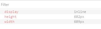
在 ie, edge, chrome, firefox, opera 中对于 img 的默认显示方式是: display: inline;
ie:
edge:
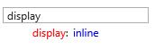
chrome:

firefox:

opera:
img 是 inline,还是比较容易想得通,像文本一样可以通过 text-align: center; 设置为水平居中
3. 块级元素水平居中,使用 margin-right: auto; margin-left: auto;
<div class="parent-box">
    <div class="child-box">块级元素水平居中</div>
</div>

.parent-box {
     250px;
    height: 150px;
    background-color: #f98;
}
.child-box {
     200px;
    height: 100px;
    background-color: #f00;
    margin-left: auto;
    margin-right: auto;
}

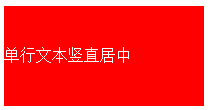
4. 单行文本的垂直居中,让 line-height 和 height 相等。
<div class="text-middle">单行文本竖直居中</div>

.text-middle {
     200px;
    height: 100px;
    line-height: 100px;
    background-color: #f00;
    color: #fff;
}
注意:
这里说的 height 和 line-height 相等,有一个注意事项:
当 box-sizing: content-box; 时(这也是默认的值)。将 height 和 line-height 的值设置为一样就行了;当 box-sizing: border-box; 时, line-height 的值要从 height 里减去 padding-top, padding-bottom, border-top, border-bottom 四个的值,也就是和分配给内容的有效高度相等。
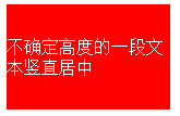
5. 不确定高度的一段文本竖直居中,这里不适用高度,使用 padding-top: ...; padding-bottom: ...; padding-top 和 padding-bottom 值相同.
<div class="text-middle-padding">不确定高度的一段文本竖直居中</div>

.text-middle-padding {
     150px;
    padding-top: 30px;
    padding-bottom: 30px;
    color: #fff;
    background-color: #f00;
}
说明:对于高度确定的元素,它的文本的行数不确定的情况下,怎么让文本垂直居中呢?在后面会提到。
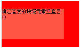
6. 确定高度的块级元素竖直居中,使用 position: absolute; top: 50%; margin-top: ...;(margin-top的值为自身高度的值的一半的负值);
<div class="parent-box">
    <div class="child-box">确定高度的块级元素竖直居中</div>
</div>

.parent-box {
  position: relative;
   250px;
  height: 150px;
  background-color: #f00;
}
.child-box {
    position: absolute;
    top: 50%;
     200px;
    height: 100px;
    margin-top: -50px;
    background-color: #f54;
}
7. 绝对定位实现水平垂直居中,使用 position: absolute; top: 0; right: 0; bottom: 0; left: 0; margin: auto;
<div class="parent-box">
    <div class="child-box">绝对定位实现水平垂直居中居中</div>
</div>

.parent-box {
    position: relative;
     250px;
    height: 150px;
    background-color: #f00;
}
.child-box {
    position: absolute;
    top: 0;
    right: 0;
    bottom: 0;
    left: 0;
     200px;
    height: 100px;
    margin: auto;
    background-color: #f54;
}
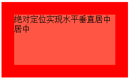
说明:对于块儿级元素的垂直居中,推荐这么做,这也是我比较喜欢的方法。
需要注意的地方是,对父元素要使用 position: relative; 对子元素要使用 position: absolute; top: 0; right: 0; bottom: 0; left: 0; margin: auto; 缺一不可。如果只需要垂直居中,right: 0; 和 left: 0; 可以省略不写,margin: auto; 可以换成 margin-top: auto; margin-bottom: auto;;如果只需要水平居中,top: 0; bottom: 0; 可以省略不写,margin: auto; 可以换成 margin-rihgt: auto; margin-left: auto; 。
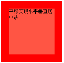
8. 平移实现水平垂直居中法:通过使用 transform: translate(-50%,-50%); 添加厂商前缀 -webkit- 兼容 Safari 和 Chrome
<div class="parent-box">
    <div class="child-box">平移实现水平垂直居中法</div>
</div>

.parent-box {
     200px;
    height: 200px;
    background-color: #f00;
}
.child-box {
    position: relative;
    top: 50%;
    left: 50%;
     150px;
    height: 150px;
    background-color: #f54;
    -webkit-transform: translate(-50%,-50%);
            transform: translate(-50%,-50%);
}
9. 让浏览器计算子元素的宽高并让其水平垂直居中:通过使用定位position: absolute; top:...; right: ...; bottom: ...; left: ...; 四个方向上的值缺一不可。
<div class="parent-box">
    <div class="child-box">让浏览器计算子元素的宽高并让其水平垂直居中</div>
</div>

.parent-box {
    position: relative;
     200px;
    height: 200px;
    background-color: #f00;
}
.child-box {
    position: absolute;
    top: 20%;
    right: 20%;
    bottom: 20%;
    left: 20%;
    background-color: #f54;
}
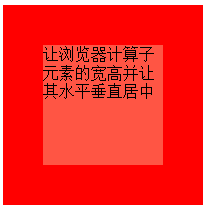
对于子元素,上下左右的定位值可以用 px 作为单位,也可以用 % 作为单位。
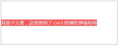
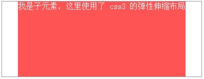
10. css3伸缩布局实现元素水平垂直居中,通过使用 display:flex; align-items: center; justify-content: center;
<div class="parent-box">
    <div class="child-box">我是子元素,这里使用了 css3 的弹性伸缩布局</div>
</div>

.parent-box {
     400px;
    height: 150px;
    display: flex;
    justify-content: center; /* 让子元素水平居中 */
    align-items: center; /* 让子元素垂直居中 */
    border: 1px solid #999;
}
.child-box {
    background-color: #fe5454;
    color: #fff;
}
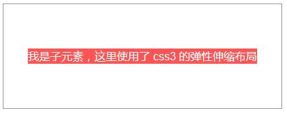
说明:
ie 10 及以上版本浏览器支持,chrome, firefox, opera, edge 均支持,不需要添加厂商前缀。
另外:这里也解释了第5点中“对于高度确定的元素,它的文本的行数不确定的情况下,怎么让文本垂直居中呢?”的问题,使用这里提到的 css3 弹性布局方式。对付元素使用 display: flex; justify-content: center; align-items: center; 来解决。
注意:
1. 如果不添加 justify-content: center; 子元素不会水平居中;
2. 如果不添加 align-items: center; 子元素会铺满父元素的高度,而不是我们希望的只有包含住文本的高度!
记忆方法:
我们知道:text-align: justify; 能将文本按照两端对其的方式对文本进行布局,这个处理的是水平方向上的问题。联想记忆,justify-content 也是处理水平方向上的事情,所以 justify-contnet: center; 就是让元素水平居中了。
扩展:
需求:我们经常做分页时,需要将分页的列表项置于水平居中的位置,就像下面的 dom 一样:
<ul class="pagination">
<li><a href="#">«</a></li>
<li><a href="#">1</a></li>
<li><a href="#">2</a></li>
<li><a href="#">3</a></li>
<li><a href="#">4</a></li>
<li><a href="#">5</a></li>
<li><a href="#">»</a></li>
</ul>
解决方法:
可以为父元素 ul 添加 text-align: center; 同时给子元素 li 添加 display: inline-block;
完整的代码:
<ul class="pagination">
<li><a href="#">«</a></li>
<li><a href="#">1</a></li>
<li><a href="#">2</a></li>
<li><a href="#">3</a></li>
<li><a href="#">4</a></li>
<li><a href="#">5</a></li>
<li><a href="#">»</a></li>
</ul>
ul.pagination {
    margin-top: 20px;
    text-align: center;
    font-size: 0; /* 设置 font-size 的大小为 0,目的是让显示方式为 inline-block 的子元素去除外边距(外边距是由于 html 的空格所导致的) */
}
ul.pagination li { display: inline-block; }
ul.pagination li a {
    display: inline-block;
    padding: 7px 14px;
    border- 1px 0 1px 1px;
    border-style: solid;
    border-color: #f1f2f3;
    font-size: 15px;  /* 这里一定要设置 font-size,别指望去继承了,因为如果不设置,将会继承 ul 的大小 0 */
    transition: all .3s ease 0;
}
ul.pagination li:first-child a {
    border-top-left-radius: 5px;
    border-bottom-left-radius: 5px;
}
ul.pagination li:last-child a {
    border-right: 1px solid #f1f2f3;
    border-top-right-radius: 5px;
    border-bottom-right-radius: 5px;
}
ul.pagination li a:hover {
    background-color: #fe5454;
    color: #fff;
    border-color: #fe5454;
}