HTML代码
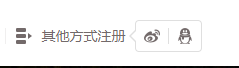
<div class="lf otherLogin">
        <span>其他方式注册</span>
                    <div class="otherItem clearfix">
                        <div class="lf qq">
                            <img src="./images/login_weibo.png" srcset="./images/login_weibo@2x.png 2x" alt="">
                        </div>
                        <div class="lf weibo">
                            <img src="./images/login_qq.png"srcset="./images/login_qq@2x.png 2x" alt="">
                        </div>
                    </div>
                </div>
CSS代码
.otherLogin{
    padding-left: 26px;
    background: -webkit-image-set(url(./../images/login_other.png) 1x,url(./../images/login_other@2x.png) 2x) no-repeat left center;
    background: -moz-image-set(url(./../images/login_other.png) 1x,url(./../images/login_other@2x.png) 2x) no-repeat left center;
    background: -ms-image-set(url(./../images/login_other.png) 1x,url(./../images/login_other@2x.png) 2x) no-repeat left center;
    background: -o-image-set(url(./../images/login_other.png) 1x,url(./../images/login_other@2x.png) 2x) no-repeat left center;
    background: image-set(url(./../images/login_other.png) 1x,url(./../images/login_other@2x.png) 2x) no-repeat left center;
    background-size: 16px 16px;
    margin-left: 10px;
    cursor: pointer;
    position: relative;
}
.otherItem{
    position: absolute;
    top: 24px;
    right: -76px;
}
.otherItem{
    border:1px solid #DFDFDF;
    border-radius: 4px;
    display: none;
}
.otherLogin:hover .otherItem{
    display: block;
}
.otherItem::before,.otherItem::after{
    content: '';
    position: absolute;
    border: solid transparent;
    0;
    height:0;
}
.otherItem::after {
    border- 5px;
    border-right-color: #fff;
    top: 10px;
    left: -10px;
}
.otherItem::before{
    border- 6px;
    border-right-color: #DFDFDF;
    top: 9px;
    left:-13px;
}
最后效果图是:
CSS的伪类的作用还是很多的,可以试试,玩一下