前端第二篇---前端基础之CSS
目录
一.css介绍
二.css语法
三.css的几种引入方式
四.css选择器
五.css属性相关
六、盒子模型
拓展
一.css介绍
CSS(Cascading Style Sheet,层叠样式表)定义如何显示HTML元素。
当浏览器读到一个样式表,它就会按照这个样式表来对文档进行格式化(渲染)。
二.css语法
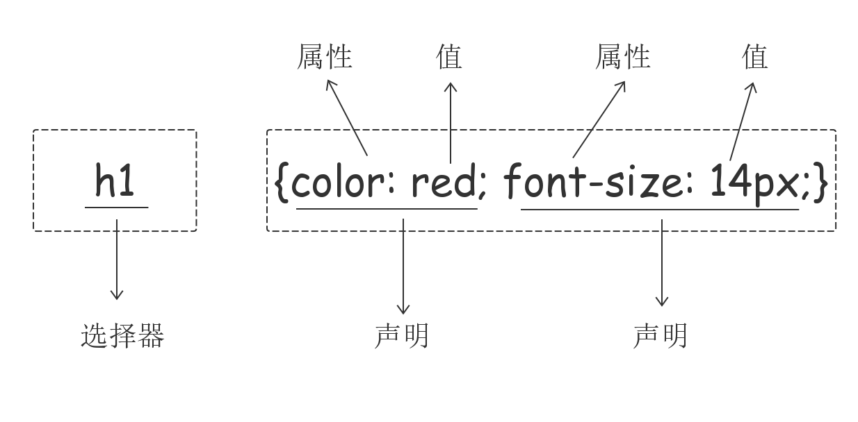
2.1css实例
每一个CSS样式由两个组成部分:选择器和声明。声明又包括属性和属性值。每个声明之后用分号结束。
2.2 CSS注释
/*这是注释*/
三.css的几种引入方式
3.1 行内样式
行内样式是在标记的style属性中设定CSS样式。不推荐大家使用。
<p style="color: red">helloword</p>
3.2内部样式
嵌入式是将CSS样式集中写在网页的<head></head>标签对的<style></style>标签对中。格式如下
<head>
    <meta charset="UTF-8">
    <title>Title</title>
    <style>
        p{
            background-color: red;
        }
    </style>
</head>
3.3外部样式
外部样式就是将css写在一个单独的文件中,然后在页面进行引入即可。推荐使用此方式。
<link href="mystyle.css" rel="stylesheet" type="text/css"/>
四.css选择器
4.1基本选择器
①元素选择器
p {color: "red";}
②ID选择器
#i1 {
  background-color: red;
}
③类选择器
.c1 {
  font-size: 14px;
}
p.c1 {
  color: red;
}
注意:
样式类名不要用数字开头(有的浏览器不认)。
标签中的class属性如果有多个,要用空格分隔。
④通用选择器
* {
  color: white;
}
4.2组合选择器
①后代选择器
/*li内部的a标签设置字体颜色*/
li a {
  color: green;
}
②儿子选择器
/*选择所有父级是 <div> 元素的 <p> 元素*/
div>p {
  font-family: "Arial Black", arial-black, cursive;
}
③毗邻选择器
/*选择所有紧接着<div>元素之后的<p>元素*/
div+p {
  margin: 5px;
}
④弟弟选择器
/*i1后面所有的兄弟p标签*/
#i1~p {
  border: 2px solid royalblue;
}


E,F   多元素选择器,同时匹配所有E元素或F元素,E和F之间用逗号分隔      :div,p { color:#f00; }

E F   后代元素选择器,匹配所有属于E元素后代的F元素,E和F之间用空格分隔 :li a { font-weight:bold;}

E > F   子元素选择器,匹配所有E元素的子元素F            :div > p { color:#f00; }

E + F   毗邻元素选择器,匹配所有紧随E元素之后的同级元素F  :div + p { color:#f00; }

E ~ F   普通兄弟选择器(以破折号分隔)                 :.div1 ~ p{font-size: 30px; }
4.3属性选择器
/*用于选取带有指定属性的元素。*/
p[title] {
  color: red;
}
/*用于选取带有指定属性和值的元素。*/
p[title="213"] {
  color: green;
}
/*找到所有title属性以hello开头的元素*/
[title^="hello"] {
  color: red;
}

/*找到所有title属性以hello结尾的元素*/
[title$="hello"] {
  color: yellow;
}

/*找到所有title属性中包含(字符串包含)hello的元素*/
[title*="hello"] {
  color: red;
}

/*找到所有title属性(有多个值或值以空格分割)中有一个值为hello的元素:*/
[title~="hello"] {
  color: green;
}
4.4伪类选择器
a:link(没有接触过的链接),用于定义了链接的常规状态。

        a:hover(鼠标放在链接上的状态),用于产生视觉效果。

        a:visited(访问过的链接),用于阅读文章,能清楚的判断已经访问过的链接。

        a:active(在链接上按下鼠标时的状态),用于表现鼠标按下时的链接状态。

        伪类选择器 : 伪类指的是标签的不同状态:

                   a ==> 点过状态 没有点过的状态 鼠标悬浮状态 激活状态

        a:link {color: #FF0000} /* 未访问的链接 */

        a:visited {color: #00FF00} /* 已访问的链接 */

        a:hover {color: #FF00FF} /* 鼠标移动到链接上 */

        a:active {color: #0000FF} /* 选定的链接 */ 格式: 标签:伪类名称{ css代码; }
<!DOCTYPE html>
<html lang="en">
<head>
    <meta charset="UTF-8">
    <title>Title</title>

    <style>

       .top{
           background-color: rebeccapurple;
            100px;
           height: 100px;
       }
        .bottom{
            background-color: green;
             100px;
            height: 100px;
        }

        .outer:hover .bottom{
            background-color: yellow;
        }

        注意:一定是outer:hover  控制outer里某一个标签,否则无效

        .top:hover .bottom{
            background-color: yellow;
        }
    </style>
</head>
<body>


<div class="outer">
    <div class="top">top</div>
    <div class="bottom">bottom</div>
</div>


</body>
</html>
注意:一定是outer:hover 控制outer里某一个标签,否则无效
4.5伪元素选择器
before
/*在每个<p>元素之前插入内容*/
p:before {
  content:"*";
  color:red;
}
after
/*在每个<p>元素之后插入内容*/
p:after {
  content:"[?]";
  color:blue;
}
before和after多用于清除浮动。
first-letter
常用的给首字母设置特殊样式:
p:first-letter {
  font-size: 48px;
  color: red;
}
4.6分组和嵌套
4.6.1分组
当多个元素的样式相同的时候,我们没有必要重复地为每个元素都设置样式,我们可以通过在多个选择器之间使用逗号分隔的分组选择器来统一设置元素样式。
div, p {
  color: red;
}
代码为div标签和p标签统一设置字体为红色。
通常,我们会分两行来写,更清晰:
div,
p {
  color: red;
}
4.6.2嵌套
多种选择器可以混合起来使用,比如:.c1类内部所有p标签设置字体颜色为红色。
.c1 p {
  color: red;
}
4.7选择器的优先级
4.7.1 CSS继承
继承是CSS的一个主要特征,它是依赖于祖先-后代的关系的。继承是一种机制,它允许样式不仅可以应用于某个特定的元素,还可以应用于它的后代。例如一个body定义了的字体颜色值也会应用到段落的文本中。
body {
  color: red;
}
此时页面上所有标签都会继承body的字体颜色。然而CSS继承性的权重是非常低的,是比普通元素的权重还要低的0。
我们只要给对应的标签设置字体颜色就可覆盖掉它继承的样式。
p {
  color: green;
}
此外,继承是CSS重要的一部分,我们甚至不用去考虑它为什么能够这样,但CSS继承也是有限制的。有一些属性不能被继承,如:border, margin, padding, background等。
4.7.2 选择器的优先级
我们上面学了很多的选择器,也就是说在一个HTML页面中有很多种方式找到一个元素并且为其设置样式,那浏览器根据什么来决定应该应用哪个样式呢?
其实是按照不同选择器的权重来决定的,具体的选择器权重计算方式如下图:
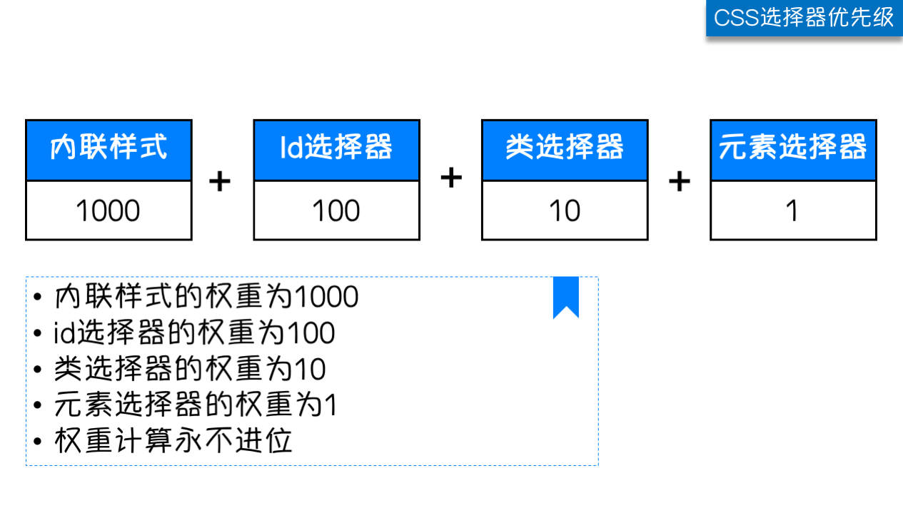
除此之外还可以通过添加 !import方式来强制让样式生效,但并不推荐使用。因为如果过多的使用!import会使样式文件混乱不易维护
万不得已可以使用!import
五.css属性相关
5.1字体属性
- 文字字体
font-family 可以把多个字体名称作为一个“回退”系统来保存。如果浏览器不支持第一个字体,则会尝试一个。浏览器会使用它可识别的第一个值。
body {
  font-family: "Microsoft Yahei", "微软雅黑", "Arial", sans-serif
}
- 字体大小
p {
  font-size: 14px;
}
如果设置成inherit表示继承父元素的字体大小值。
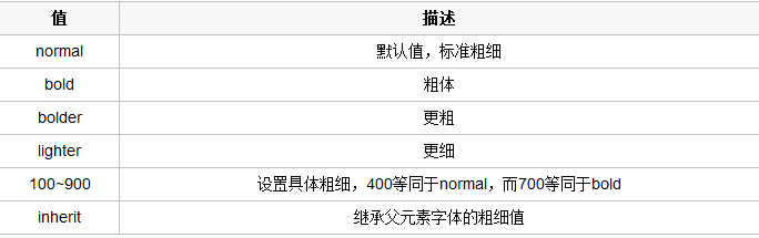
- 字重(粗细)
font-weight用来设置字体的字重(粗细)
-
文本颜色
颜色属性被用来设置文字的颜色。

颜色是通过CSS最经常的指定:

十六进制值 - 如: #FF0000
一个RGB值 - 如: RGB(255,0,0)
颜色的名称 - 如:  red
还有rgba(255,0,0,0.3),第四个值为alpha, 指定了色彩的透明度/不透明度,它的范围为0.0到1.0之间。
5.2文字属性
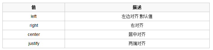
- 文字对齐
text-align 属性规定元素中的文本的水平对齐方式
-
文字装饰
text-decoration 属性用来给文字添加特殊效果
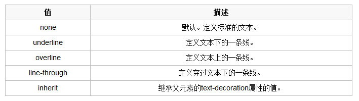
常用的为去掉a标签默认的自划线:
a {
  text-decoration: none;
}
-
首行缩进
将段落的第一行缩进 32像素:
p {
  text-indent: 32px;
}
5.3背景属性
/*背景颜色*/
background-color: red;
/*背景图片*/
background-image: url('1.jpg');
/*
 背景重复
 repeat(默认):背景图片平铺排满整个网页
 repeat-x:背景图片只在水平方向上平铺
 repeat-y:背景图片只在垂直方向上平铺
 no-repeat:背景图片不平铺
*/
background-repeat: no-repeat;
/*背景位置*/
background-position: right top(20px 20px);
支持简写:
background:#ffffff url('1.png') no-repeat right top;
使用背景图片的一个常见案例就是很多网站会把很多小图标放在一张图片上,然后根据位置去显示图片。减少频繁的图片请求。
一个有趣的例子:
<!DOCTYPE html>
<html lang="en">
<head>
    <meta charset="UTF-8">
    <meta name="viewport" content="width=device-width, initial-scale=1.0">
    <meta http-equiv="X-UA-Compatible" content="ie=edge">
    <title>滚动背景图示例</title>
    <style>
        * {
            margin: 0;
        }
        .box {
            width: 100%;
            height: 500px;
            background: url("https://www.luffycity.com/static/img/width-bank.1c9d1b0.png") no-repeat center center;
            background-attachment: fixed;
        }
        .d1 {
            height: 500px;
            background-color: tomato;
        }
        .d2 {
            height: 500px;
            background-color: steelblue;
        }
        .d3 {
            height: 500px;
            background-color: mediumorchid;
        }
    </style>
</head>
<body>
    <div class="d1"></div>
    <div class="box"></div>
    <div class="d2"></div>
    <div class="d3"></div>
</body>
</html>
5.4边框
边框属性
- border-width
- border-style
- border-color
#i1 {
  border- 2px;
  border-style: solid;
  border-color: red;
}
通常使用简写方式:
#i1 {
  border: 2px solid red;
}
边框样式
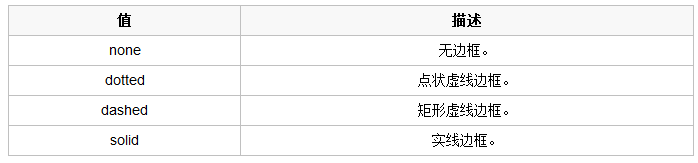
除了可以统一设置边框外还可以单独为某一个边框设置样式,如下所示:
#i1 {
  border-top-style:dotted;
  border-top-color: red;
  border-right-style:solid;
  border-bottom-style:dotted;
  border-left-style:none;
}
5.5display属性
用于控制HTML元素的显示效果。

display:"none"与visibility:hidden的区别:
visibility:hidden: 可以隐藏某个元素,但隐藏的元素仍需占用与未隐藏之前一样的空间。也就是说,该元素虽然被隐藏了,但仍然会影响布局。
display:none: 可以隐藏某个元素,且隐藏的元素不会占用任何空间。也就是说,该元素不但被隐藏了,而且该元素原本占用的空间也会从页面布局中消失。
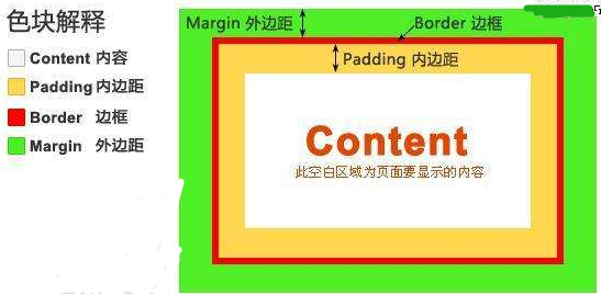
六、盒子模型
- Content(内容): 盒子的内容,显示文本和图像。
- padding(内边距): 用于控制内容与边框之间的距离;
- Border(边框): 围绕在内边距和内容外的边框。
- margin(外边距): 用于控制元素与元素之间的距离;margin的最基本用途就是控制元素周围空间的间隔,从视觉角度上达到相互隔开的目的。
6.1margin外边距
.margin-test {
  margin-top:5px;
  margin-right:10px;
  margin-bottom:15px;
  margin-left:20px;
}
推荐使用简写:
.margin-test {
  margin: 5px 10px 15px 20px;
}
顺序:上右下左
常见居中:
.mycenter {
  margin: 0 auto;
}
6.2padding内填充
.padding-test {
  padding-top: 5px;
  padding-right: 10px;
  padding-bottom: 15px;
  padding-left: 20px;
}
推荐使用简写:
.padding-test {
  padding: 5px 10px 15px 20px;
}
顺序:上右下左
补充padding的常用简写方式:
- 提供一个,用于四边;
- 提供两个,第一个用于上-下,第二个用于左-右;
- 如果提供三个,第一个用于上,第二个用于左-右,第三个用于下;
- 提供四个参数值,将按上-右-下-左的顺序作用于四边
6.3float
在 CSS 中,任何元素都可以浮动。
浮动元素会生成一个块级框,而不论它本身是何种元素。
关于浮动的两个特点:
- 浮动的框可以向左或向右移动,直到它的外边缘碰到包含框或另一个浮动框的边框为止。
- 由于浮动框不在文档的普通流中,所以文档的普通流中的块框表现得就像浮动框不存在一样。
三种取值
left:向左浮动
right:向右浮动
none:默认值,不浮动
先来了解一下block元素和inline元素在文档流中的排列方式。

  block元素通常被现实为独立的一块,独占一行,多个block元素会各自新起一行,默认block元素宽度自动填满其父元素宽度。block元素可以设置width、height、margin、padding属性;

  inline元素不会独占一行,多个相邻的行内元素会排列在同一行里,直到一行排列不下,才会新换一行,其宽度随元素的内容而变化。inline元素设置width、height属性无效

常见的块级元素有 div、form、table、p、pre、h1~h5、dl、ol、ul 等。
常见的内联元素有span、a、strong、em、label、input、select、textarea、img、br等
所谓的文档流,指的是元素排版布局过程中,元素会自动从左往右,从上往下的流式排列。

脱离文档流,也就是将元素从普通的布局排版中拿走,其他盒子在定位的时候,会当做脱离文档流的元素不存在而进行定位。

      假如某个div元素A是浮动的,如果A元素上一个元素也是浮动的,那么A元素会跟随在上一个元素的后边(如果一行放不下这两个元素,那么A元素会被挤到下一行);如果A元素上一个元素是标准流中的元素,那么A的相对垂直位置不会改变,也就是说A的顶部总是和上一个元素的底部对齐。此外,浮动的框之后的block元素元素会认为这个框不存在,但其中的文本依然会为这个元素让出位置。 浮动的框之后的inline元素,会为这个框空出位置,然后按顺序排列。
<!DOCTYPE html>
<html lang="en">
<head>
    <meta charset="UTF-8">
    <title>Title</title>
    <style>
        *{
            margin: 0;
        }

        .r1{
            width: 300px;
            height: 100px;
            background-color: #7A77C8;
            float: left;
        }
        .r2{
            width: 200px;
            height: 200px;
            background-color: wheat;
            /*float: left;*/

        }
        .r3{
            width: 100px;
            height: 200px;
            background-color: darkgreen;
            float: left;
        }
    </style>
</head>
<body>

<div class="r1"></div>
<div class="r2"></div>
<div class="r3"></div>


</body>
</html>
6.4父级坍塌现象
<!DOCTYPE html>
<html lang="en">
<head>
    <meta charset="UTF-8">
    <title>Title</title>
<style type="text/css">
         * {
             margin:0;padding:0;
         }
        .container{
            border:1px solid red;width:300px;
        }
        #box1{
            background-color:green;float:left;width:100px;height:100px;
        }
        #box2{
            background-color:deeppink; float:right;width:100px;height:100px;
        }
         #box3{
             background-color:pink;height:40px;
         }
</style>
</head>
<body>

        <div class="container">
                <div id="box1">box1 向左浮动</div>
                <div id="box2">box2 向右浮动</div>
        </div>
        <div id="box3">box3</div>
</body>
</body>
</html>
例子如上:.container和box3的布局是上下结构,上图发现box3跑到了上面,与.container产生了重叠,但文本内容没有发生覆盖,只有div发生覆盖现象。这个原因是因为第一个大盒子里的子元素使用了浮动,脱离了文档流,导致.container没有被撑开。box3认为.container没有高度(未被撑开),因此跑上去了。
-
固定高度
给.container设置固定高度,一般情况下文字内容不确定多少就不能设置固定高度,所以一般不能设置“.container”高度(当然能确定内容多高,这种情况下“.container是可以设置一个高度即可解决覆盖问题。
或者给.container加一个固定高度的子div:
<div class="container">
                <div id="box1">box1 向左浮动</div>
                <div id="box2">box2 向右浮动</div>
                <div id="empty" style="height: 100px"></div>
</div>
<div id="box3">box3</div>
- 清除浮动(推荐)---clear
clear属性规定元素的哪一侧不允许其他浮动元素。
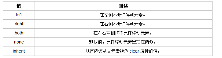
但是需要注意的是:clear属性只会对自身起作用,而不会影响其他元素。
<!DOCTYPE html>
<html lang="en">
<head>
    <meta charset="UTF-8">
    <title>Title</title>
    <style>
        *{
            margin: 0;
        }

        .r1{
            width: 300px;
            height: 100px;
            background-color: #7A77C8;
            float: left;
        }
        .r2{
            width: 200px;
            height: 200px;
            background-color: wheat;
            float: left;
            clear: left;

        }
        .r3{
            width: 100px;
            height: 200px;
            background-color: darkgreen;
            float: left;
        }
    </style>
</head>
<body>

<div class="r1"></div>
<div class="r2"></div>
<div class="r3"></div>


</body>
</html>
把握住两点:1、元素是从上到下、从左到右依次加载的。
2、clear: left;对自身起作用,一旦左边有浮动元素,即切换到下一行来保证左边元素不是浮动的,依据这一点解决父级塌陷问题。
思考:
<!DOCTYPE html>
<html lang="en">
<head>
    <meta charset="UTF-8">
    <title>Title</title>
    <style>
        *{
            margin: 0;
        }

        .r1{
            width: 300px;
            height: 100px;
            background-color: #7A77C8;
            float: left;
        }
        .r2{
            width: 200px;
            height: 200px;
            background-color: wheat;
            float: left;
            clear: both;

        }
        .r3{
            width: 100px;
            height: 200px;
            background-color: darkgreen;
            float: left;
        }
    </style>
</head>
<body>

<div class="r1"></div>
<div class="r2"></div>
<div class="r3"></div>


</body>
</html>
解决父级塌陷:
    .clearfix:after {             <----在类名为“clearfix”的元素内最后面加入内容;
    content: ".";                 <----内容为“.”就是一个英文的句号而已。也可以不写。
    display: block;               <----加入的这个元素转换为块级元素。
    clear: both;                  <----清除左右两边浮动。
    visibility: hidden;           <----可见度设为隐藏。注意它和display:none;是有区别的。
                                       visibility:hidden;仍然占据空间,只是看不到而已;
    line-height: 0;               <----行高为0;
    height: 0;                    <----高度为0;
    font-size:0;                  <----字体大小为0;
    }

    .clearfix { *zoom:1;}         <----这是针对于IE6的,因为IE6不支持:after伪类,这个神
                                       奇的zoom:1让IE6的元素可以清除浮动来包裹内部元素。


整段代码就相当于在浮动元素后面跟了个宽高为0的空div,然后设定它clear:both来达到清除浮动的效果。
之所以用它,是因为,你不必在html文件中写入大量无意义的空标签,又能清除浮动。
<div class="head clearfix"></div>
-
overflow溢出属性

- overflow(水平和垂直均设置)
- overflow-x(设置水平方向)
- overflow-y(设置垂直方向
6.5定位(position)
1 static
static 默认值,无定位,不能当作绝对定位的参照物,并且设置标签对象的left、top等值是不起作用的的。
2 position: relative/absolute
relative: 相对定位。
相对定位是相对于该元素在文档流中的原始位置,即以自己原始位置为参照物。有趣的是,即使设定了元素的相对定位以及偏移值,元素还占有着原来的位置,即占据文档流空间。对象遵循正常文档流,但将依据top,right,bottom,left等属性在正常文档流中偏移位置。而其层叠通过z-index属性定义。
注意:position:relative的一个主要用法:方便绝对定位元素找到参照物。
absolute: 绝对定位。
定义:设置为绝对定位的元素框从文档流完全删除,并相对于最近的已定位祖先元素定位,如果元素没有已定位的祖先元素,那么它的位置相对于最初的包含块(即body元素)。元素原先在正常文档流中所占的空间会关闭,就好像该元素原来不存在一样。元素定位后生成一个块级框,而不论原来它在正常流中生成何种类型的框。
重点:如果父级设置了position属性,例如position:relative;,那么子元素就会以父级的左上角为原始点进行定位。这样能很好的解决自适应网站的标签偏离问题,即父级为自适应的,那我子元素就设置position:absolute;父元素设置position:relative;,然后Top、Right、Bottom、Left用百分比宽度表示。
另外,对象脱离正常文档流,使用top,right,bottom,left等属性进行绝对定位。而其层叠通过z-index属性定义。
示例代码:
<!DOCTYPE html>
<html lang="en">
<head>
    <meta charset="UTF-8">
    <title>Title</title>
    <style>
        *{
            margin: 0;
        }
        .outet{
            /*position: relative;*/

        }
        .item{
            width: 200px;
            height:200px ;
        }
        .r1{
            background-color: #7A77C8;
        }
        .r2{
            background-color: wheat;
            /*position: relative;*/
            position: absolute;
            top: 200px;
            left: 200px;
        }
        .r3{
            background-color: darkgreen;
        }
    </style>
</head>
<body>

<div class="item r1"></div>
<div class="outet">

    <div class="item r2"></div>
    <div class="item r3"></div>
</div>


</body>
</html>
总结:参照物用相对定位,子元素用绝对定位,并且保证相对定位参照物不会偏移即可。
3 position:fixed
fixed:对象脱离正常文档流,使用top,right,bottom,left等属性以窗口为参考点进行定位,当出现滚动条时,对象不会随着滚动。而其层叠通过z-index属性 定义。 注意点: 一个元素若设置了 position:absolute | fixed; 则该元素就不能设置float。这 是一个常识性的知识点,因为这是两个不同的流,一个是浮动流,另一个是“定位流”。但是 relative 却可以。因为它原本所占的空间仍然占据文档流。
在理论上,被设置为fixed的元素会被定位于浏览器窗口的一个指定坐标,不论窗口是否滚动,它都会固定在这个位置。
示例代码:
<!DOCTYPE html>
<html lang="en">
<head>
    <meta charset="UTF-8">
    <title>Title</title>
    <style>
        *{
            margin: 0;
        }
        .back{
            background-color: wheat;
            width: 100%;
            height: 1200px;
        }
        span{
            display: inline-block;
            width: 80px;
            height: 50px;
            position: fixed;
            bottom: 20px;
            right: 20px;
            background-color: rebeccapurple;
            color: white;
            text-align: center;
            line-height: 50px;

        }
    </style>
</head>
<body>


<div class="back">
    <span>返回顶部</span>
</div>
</body>
</html>
6.6z-index
#i2 {
  z-index: 999;
}
设置对象的层叠顺序,数值大的会覆盖在数值小的标签之上。z-index 仅能在定位元素上奏效。
<!DOCTYPE html>
<html lang="en">
<head>
  <meta charset="UTF-8">
  <meta http-equiv="x-ua-compatible" content="IE=edge">
  <meta name="viewport" content="width=device-width, initial-scale=1">
  <title>自定义模态框</title>
  <style>
    .cover {
      background-color: rgba(0,0,0,0.65);
      position: fixed;
      top: 0;
      right: 0;
      bottom: 0;
      left: 0;
      z-index: 998;
    }

    .modal {
      background-color: white;
      position: fixed;
      width: 600px;
      height: 400px;
      left: 50%;
      top: 50%;
      margin: -200px 0 0 -300px;
      z-index: 1000;
    }
  </style>
</head>
<body>

<div class="cover"></div>
<div class="modal"></div>
</body>
</html>
6.8脱离文档流
所谓的文档流,指的是元素排版布局过程中,元素会自动从左往右,从上往下的流式排列。
脱离文档流,也就是将元素从普通的布局排版中拿走,其他盒子在定位的时候,会当做脱离文档流的元素不存在而进行定位。
假如某个div元素A是浮动的,如果A元素上一个元素也是浮动的,那么A元素会跟随在上一个元素的后边(如果一行放不下这两个元素,那么A元素会被挤到下一行);如果A元素上一个元素是标准流中的元素,那么A的相对垂直位置不会改变,也就是说A的顶部总是和上一个元素的底部对齐。此外,浮动的框之后的block元素元素会认为这个框不存在,但其中的文本依然会为这个元素让出位置。 浮动的框之后的inline元素,会为这个框空出位置,然后按顺序排列。
<!DOCTYPE html>
<html lang="en">
<head>
    <meta charset="UTF-8">
    <title>Title</title>
    <style>
        *{
            margin: 0;
        }

        .r1{
            width: 300px;
            height: 100px;
            background-color: #7A77C8;
            float: left;
        }
        .r2{
            width: 200px;
            height: 200px;
            background-color: wheat;
            /*float: left;*/

        }
        .r3{
            width: 100px;
            height: 200px;
            background-color: darkgreen;
            float: left;
        }
    </style>
</head>
<body>

<div class="r1"></div>
<div class="r2"></div>
<div class="r3"></div>


</body>
</html>
6.7非完全脱离文档流
左右结构div盒子重叠现象,一般是由于相邻两个DIV一个使用浮动一个没有使用浮动。一个使用浮动一个没有导致DIV不是在同个“平面”上,但内容不会造成覆盖现象,只有DIV形成覆盖现象。
<!DOCTYPE html>
<html lang="en">
<head>
    <meta charset="UTF-8">
    <title>Title</title>
    <style>
        *{
            margin: 0;
        }

        .r1{
            width: 100px;
            height: 100px;
            background-color: #7A77C8;
            float: left;
        }
        .r2{
            width: 200px;
            height: 200px;
            background-color: wheat;

        }
    </style>
</head>
<body>

<div class="r1"></div>
<div class="r2">region2</div>


</body>
</html>
>>>>解决方法:要么都不使用浮动;要么都使用float浮动;要么对没有使用float浮动的DIV设置margin样式。
拓展
顶部导航菜单
<!DOCTYPE HTML>
<html>
<head>
  <meta charset="UTF-8">
  <meta http-equiv="x-ua-compatible" content="IE=edge">
  <meta name="viewport" content="width=device-width, initial-scale=1">
  <title>li标签的float示例</title>
  <style>
    /*清除浏览器默认外边距和内填充*/
    * {
      margin: 0;
      padding: 0;
    }
    a {
      text-decoration: none; /*去除a标签默认的下划线*/
    }

    .nav {
      background-color: black;
      height: 40px;
      width: 100%;
      position: fixed;
      top: 0;
    }

    ul {
      list-style-type: none; /*删除列表默认的圆点样式*/
      margin: 0; /*删除列表默认的外边距*/
      padding: 0; /*删除列表默认的内填充*/
    }
    /*li元素向左浮动*/
    li {
      float: left;
    }

    li > a {
      display: block; /*让链接显示为块级标签*/
      padding: 0 15px; /*设置左右各15像素的填充*/
      color: #b0b0b0; /*设置字体颜色*/
      line-height: 40px; /*设置行高*/
    }
    /*鼠标移上去颜色变白*/
    li > a:hover {
      color: #fff;
    }

    /*清除浮动 解决父级塌陷问题*/
    .clearfix:after {
      content: "";
      display: block;
      clear: both;
    }
  </style>
</head>
<body>
<!-- 顶部导航栏 开始 -->
<div class="nav">
  <ul class="clearfix">
    <li><a href="">玉米商城</a></li>
    <li><a href="">MIUI</a></li>
    <li><a href="">ioT</a></li>
    <li><a href="">云服务</a></li>
    <li><a href="">水滴</a></li>
    <li><a href="">金融</a></li>
    <li><a href="">优品</a></li>
  </ul>
</div>
<!-- 顶部导航栏 结束 -->
</body>
</html>
圆形头像
<!DOCTYPE HTML>
<html>
<head>
  <meta charset="UTF-8">
  <meta http-equiv="x-ua-compatible" content="IE=edge">
  <meta name="viewport" content="width=device-width, initial-scale=1">
  <title>圆形的头像示例</title>
  <style>
    * {
      margin: 0;
      padding: 0;
      background-color: #eeeeee;
    }
    .header-img {
      width: 150px;
      height: 150px;
      border: 3px solid white;
      border-radius: 100%;
      overflow: hidden;
    }
    .header-img>img {
      max-width: 100%;
    }
  </style>
</head>
<body>

<div class="header-img">
  <img src="https://q1mi.github.io/Blog/asset/img/head_img.jpg" alt="">
</div>

</body>
</html>
抽屉作业
实现效果
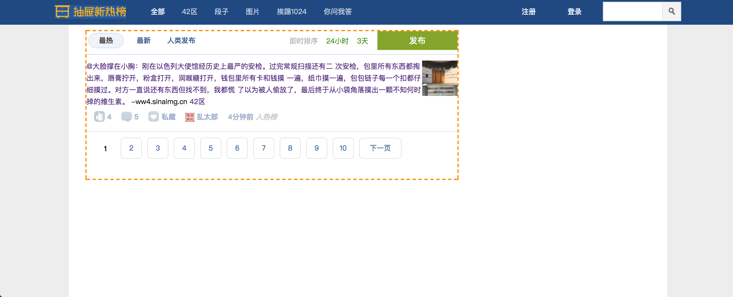
<!DOCTYPE html>
<html lang="en">
<head>
    <meta charset="UTF-8">
    <title>Title</title>

    <link rel="stylesheet" href="yuan_css.css">

</head>
<body>


<div class="head-box">
    <div class="head-content">

        <a href="/" class="logo"></a>

        <div class="action-menu">

                    <a href="#" class="tb active">全部</a>
                    <a href="#" class="tb">42区</a>
                    <a href="#" class="tb">段子</a>
                    <a href="#" class="tb">图片</a>
                    <a href="#" class="tb">挨踢1024</a>
                    <a href="#" class="tb">你问我答</a>
        </div>

        <div class="key-search">

                <form action="/" method="post">
                    <input type="text" class="search-txt" autocomplete="off">

                    <a href="#" class="i" >
                        <span class="ico"></span>
                    </a>
                </form>

        </div>

        <div class="action-nav">

                <a href="#" class="register-btn">注册</a>
                <a href="#" class="login-btn">登录</a>
        </div>

    </div>
</div>


<div class="main-content-box">

    <div class="main-content">

        <div class="content-L">

            <div class="top-area">

                <div class="child-nav">
                    <a href="#"  class="hotbtn active" >最热</a>
                    <a href="#"  class="newbtn"    >最新</a>
                    <a href="#"  class="personbtn" >人类发布</a>
                </div>


                <div class="sort-nav">
                    <a href="#"  class="sortbtn active" >即时排序</a>
                    <a href="#"  class="newbtn" >24小时</a>
                    <a href="#"  class="newbtn" >3天</a>
                </div>

                <a href="#" class="publish-btn">
                    <span class="n2">发布</span>
                </a>

            </div>

            <div class="content-list">


                  <div class="item">

                            <div class="news-pic">
                                <img src="images/news.jpg" alt="抽屉新热榜">
                            </div>

                            <div class="news-content">
                                <div class="part1">
                                        <a href="#" class="show-content" target="_blank">
                                                @大脸撑在小胸:刚在以色列大使馆经历史上最严的安检。过完常规扫描还有二
                                        次安检,包里所有东西都掏出来,唇膏拧开,粉盒打开,润喉糖打开,钱包里所有卡和钱摸
                                        一遍,纸巾摸一遍,包包链子每一个扣都仔细摸过。对方一直说还有东西但找不到,我都慌
                                        了以为被人偷放了,最后终于从小袋角落摸出一颗不知何时掉的维生素。
                                        </a>

                                        <span class="content-source">-ww4.sinaimg.cn</span>
                                        <a href="#" class="n2">
                                            <span class="content-kind">42区</span>
                                        </a>
                                </div>

                                 <div class="part2">


                                        <a href="#" class="recommend" title="推荐">
                                            <span class="hand-icon icon-recommend"></span>
                                            <b>4</b>
                                        </a>

                                        <a href="#" class="discuss">
                                            <span class="hand-icon icon-discuss"></span>
                                            <b>5</b>
                                        </a>


                                        <a href="#" class="collect" title="加入私藏">
                                            <span class="hand-icon icon-collect"></span>
                                            <b>私藏</b>
                                        </a>


                                        <a href="#" class="user-a">
                                            <span>
                                                <img src="images/13.png">
                                            </span>
                                            <b>乱太郎</b>
                                        </a>


                                    <span class="left time-into">
                                        <a class="time-a" href="#" target="_blank">
                                            <b>4分钟前</b>
                                        </a>
                                        <i>入热榜</i>
                                    </span>


                                    <span class="share-site-to">

                                        <i>分享到</i>
                                        <span class="share-icon">
                                            <a class="icon-sina"    title="分享到新浪微博" href="#" ></a>
                                            <a class="icon-douban"  title="分享到豆瓣"    href="#" ></a>
                                            <a class="icon-qqzone"  title="分享到QQ空间"  href="#" ></a>
                                            <a class="icon-tenxun"  title="分享到腾讯微博" href="#" ></a>
                                            <a class="icon-renren"  title="分享到人人网"   href="#" ></a>
                                        </span>
                                    </span>

                                </div>
                            </div>

                  </div>


            </div>

            <div class="page-area">

                 <ul>

                     <li><span class="current_page">1</span></li>
                     <li><a href="#" class="page-a">2</a></li>
                     <li><a href="#" class="page-a">3</a></li>
                     <li><a href="#" class="page-a">4</a></li>
                     <li><a href="#" class="page-a">5</a></li>
                     <li><a href="#" class="page-a">6</a></li>
                     <li><a href="#" class="page-a">7</a></li>
                     <li><a href="#" class="page-a">8</a></li>
                     <li><a href="#" class="page-a">9</a></li>
                     <li><a href="#" class="page-a">10</a></li>
                     <li><a href="#" class="page-a page-next">下一页</a></li>
                 </ul>
            </div>

        </div>

        <div class="content-R"></div>

    </div>

    <div class="footer-box">
            <div class="foot-nav">

                <a href="#" target="_blank">关于我们</a>
                <span>|</span>
                <a href="#" target="_blank">联系我们</a>
                <span>|</span>
                <a href="#" target="_blank">服务条款</a>
                <span>|</span>
                <a href="#" target="_blank">隐私政策</a>
                <span>|</span>
                <a href="#" target="_blank">抽屉新热榜工具</a>
                <span>|</span>
                <a href="#" target="_blank">下载客户端</a>
                <span>|</span>
                <a href="#" target="_blank">意见与反馈</a>
                <span>|</span>
                <a href="#" target="_blank">友情链接</a>
                <span>|</span>
                <a href="#" target="_blank">公告</a>
                <a href="#">
                    <img src="images/ct_rss.gif" width="36" height="14">
                </a>
            </div>

            <div class="foot-nav2">

                <a target="_blank" href="#">
                    <img class="foot_e" src="images/footer1.gif" width="36" height="14">
                </a>
                <span class="foot_d">旗下站点</span>
                <span class="foot_a">©2016chouti.com</span>
                <a target="_blank" href="#" class="foot_b">京ICP备09053974号-3 京公网安备 110102004562</a>
                <div style="margin-top:6px;">版权所有:北京格致璞科技有限公司</div>

            </div>

    </div>


</div>


</body>
</html>
*{
 margin: 0;
 padding: 0;
      }

body{
    font-size: 12px;
}

a{
  text-decoration: none;
}

/*===================================================head-box开始*/

.head-box{
   height: 44px;
    100%;
   background-color: #204982;
   position: fixed;
   top:0;
   left: 0;

}

.head-content{

     1064px;
    height: 44px;
    background-color: #204982;
    margin: 0 auto;
    line-height: 44px;
    position: relative;

}


.logo{

    float: left;
    background: url("images/logo.png") no-repeat 0 0;
     121px;
    height: 23px;
    margin-top: 11px;

}


.action-menu{
    float: left;
    margin-left: 30px;
}

.action-menu a.tb{

            color: #c0cddf;
            padding: 0 13px 0 16px;
            /*float: left;*/

            /*display: inline-block;*/
            margin-left: -4px;

        }

.action-menu a.tb:hover {
    color: #fff;
    background-color: darkgray;

}


 .action-menu a.active, .action-menu a.active:hover {
                color: #fff;
                background-color: #204982;

            }

 .action-nav {
        position: absolute;
        top: 0;
        right: 144px;

    }

 .action-nav a {
        color: #fff;
        margin: 0 5px;
        padding: 0 20px;
    }

 .key-search{
         margin-top: 5px;
         float: right;
    }


 .key-search a.i, .search-txt {
        float: left;
    }

.search-txt {

        color: #333;
        line-height: 25px;
        padding: 2px 2px 2px 5px;
        height: 25px;
         91px;

    }

.key-search a.i {
    border: 1px solid #e0e0e0;
    background-color: #f4f4f4;
     30px;
    height: 31px;
    border-left: 0;
}

.key-search a.i span{
    background: url("images/icon.png") no-repeat 0 -197px;
    float: left;
    height: 12px;
     11px;
    margin-left: 10px;
    margin-top: 9px;
}


/*===================================================head-box结束*/

/*===================================================main-content开始*/


.main-content-box {
        background-color: #ededed;
        padding-top: 44px;
        height: 100%;
    }

.main-content {
         960px;
        margin: 0 auto;
        height: auto!important;
        overflow: hidden;

        min-height: 713px;
        padding: 6px 28px;
        background-color: #fff;
        /*overflow: hidden;取消后看看效果*/
    }


.clearfix:after{
    content: '';
    display: block;
    clear: both;;
}

.content-L {
         630px;
        margin-top: 3px;
        float: left;
        border: dashed 2px darkorange;
    }

/*===================================================top-area*/
 .top-area {
            overflow: hidden;
            border-bottom: 1px solid #ccdcef;
        }

.child-nav, .sort-nav, .publish-btn {
    float: left;
    padding-bottom: 10px;
}


.child-nav .hotbtn {
    margin-left: 3px;
}

.child-nav a {
    display: inline-block;
     60px;
    height: 26px;
    line-height: 26px;
    margin-top: 3px;
    color: #369;
    font-weight: 700;
    text-align: center;
}

.child-nav .active {
    background: url('images/tip.png') no-repeat 0 -299px;
    color: #333;
    text-decoration: none;
}


.sort-nav {
    margin-left: 144px;
    margin-top: 8px;
}

.sort-nav .active {
    color: #b4b4b4;
}

.sort-nav a {
    margin-left: 10px;
    color: #390;
    text-align: center;
}

.publish-btn {
    background-color: #84a42b;
    border: 1px solid #8aab30;
    color: #fff;
    display: inline-block;
    height: 30px;
    line-height: 30px;
    text-align: center;
     134px;
    float: right;
    font-size: 14px;
    /*_position: relative;*/
    padding: 0px;
}

/*===================================================content-list*/
.content-list .item {
    padding-top: 10px;
    border-bottom: 1px solid #dce7f4;
    }

.content-list .item .news-pic {
    float: right;
}

.news-content .part1 {
        line-height: 20px;
    }

.news-content .part2 {
    padding-top: 6px;
    color: #ccc;
    margin-bottom: 12px;
}


/*=====hand-icon*/

.hand-icon {
    background: url("images/icon_18_118.png") no-repeat 0 0;
}

.part2 .icon-recommend {
    display: inline-block;
    background-position: 0 -40px;
      18px;
    height: 18px;
}

.part2 .icon-recommend:hover{
    background-position: 0 -20px;
}


.part2 .icon-discuss {
    display: inline-block;
    background-position: 0 -100px;
     18px;
    height: 18px;
    vertical-align: -1px;
}

.part2 .icon-discuss:hover{
    background-position: 0 -80px;
}


.part2 .icon-collect {
    display: inline-block;
    background-position: 0 -160px;
     18px;
    height: 18px;
}

.part2 .icon-collect:hover{
    background-position: 0 -120px;
}

.part2 a {
    margin-left: 13px;
    color: #99aecb;
}

.part2 b,.part2 .time-into i,.share-site-to i {
    vertical-align: 4px;
    font-weight: 800;
}


/*=====share-site-to*/

.share-site-to{
      float: right;
      display: none;
            }

.share-site-to .share-icon a {
        background: url("images/share_icon.png") no-repeat 0 0;
         13px;
        height: 13px;
        display: inline-block;

        margin-right: 2px;
        margin-top: 2px;
        opacity: .3;
    }


.share-site-to .share-icon a.icon-sina {
    background-position: 0 -90px;
     17px;
    height: 14px;
}


.share-site-to .share-icon a.icon-douban {
    background-position: 0 -105px;
}

.share-site-to .share-icon a.icon-qqzone {
    background-position: 0 -120px;
     16px;
    height: 14px;
}

.share-site-to .share-icon a.icon-tenxun {
    background-position: 0 -136px;
}

.share-site-to .share-icon a.icon-renren {

    background-position: 0 -151px;

}

.share-site-to .share-icon a:hover{
        opacity: .9;
    }
.part2:hover .share-site-to{
    display: block;
}

.share-site-to .share-icon {
    vertical-align: 2px;
}

/*===================================================page-area*/

.page-area ul li{
    display: inline-block;
}

.page-area{
    margin-left: 10px;
    padding-top: 10px;
    padding-bottom: 30px;
}

.page-area ul li a ,.page-area ul li span{
    float: left;
    color: #369;
    height: 34px;
    line-height: 34px;
    text-align: center;
     34px;
    border: 1px solid #e1e1e1;
    border-radius: 15%;
    margin-left: 5px;
}

.page-area ul li .page-next{
    70px;
}

.page-area ul li a:hover{
   color: #fff;
   background-color: #2459a2;
}

.page-area ul li span.current_page{
   border: none;
   color: black;
   font-weight:900;
}

/*===================================================footer-box**===================================================*/

.footer-box{
        margin: 0 auto;
         1020px;
        background-color: #fff;
        border-top:1px solid #dce7f4;;
    }

.footer-box .foot-nav {
        padding-top: 15px;
        text-align: center;
        border-top: 1px solid #ccdcef;
        /*position: relative;*/
    }

.footer-box .foot-nav2 {
    margin-top: 6px;
    margin-bottom: 15px;
    text-align: center;
}

.foot_b {
        color: #999;
        font-size: 12px;
    }