1.首先讲一下如何用hist画二维直方图
1 x=[-568179 -766698 -935586 -826865 -393971 -771826 -1529945 -1910695 -1694740 -926367 -306998 -844840 -1828334 -2062815 -2297296 -1498824 -411346 -827922 -1826636 -1844777 -1862918 -1881060 -746534 -100479 -845832 -1832756 -1941081 -2049406 -2157732 -1028398 0 -802745 -1824638 -1686159 -1547681 -1409202 -1270724 -165930 -803741 -1819421 -1710223 -1601026 -1491829 -1382632 -356414 -794668 -1818215 -1734260 -1650305 -1566350 -1482395 -444268 -807800 -1823406 -1748938 -1674470 -1600002 -1525535 -398300 -908544 -1855524 -1808266 -1761009 -1713752 -1666495 -720079 -755299 -1806467 -1742401 -1678336 -1614271 -1550206 -508257 -883998 -1849926 -1821497 -1747566 -1673635 -1599705 -612050 -889367 -1860197 -1946094 -1824594 -1703094 -1581594 -604819 -855354 -1848651 -2070691 -2070691 -1876658 -1557872 -565488 -618422 -1510190 -2195288 -1876658 -2174975 -1348638 -494450
2     ]
3 [a,b]=hist(x,30);
4 a=a;%/length(x);
5 bar(b,a);
结果是:

可以发现这个画出来的是标准的直方图,统计出来的信息是数据落在某个区间中的个数。有时候我们想要得到每个节点所对应的值,横坐标是节点个数,纵坐标是节点所对应的值。此时我们可以使用plot
1 x=[数据不变]
2 plot_x=1:1:101;
3 plot(plot_x,x,'-b*')
4 xlabel('MRF Node');
5 ylabel('Initial\_Bconf');
6 title('Different Initial\_Bconf For Different MRF Nodes');
结果是:

说到这里,我突然发现我想要在这个坐标系中加一个y轴。也就是双y轴坐标系
在matlab中可以用plotyy
 1 bconf=[-568179 -766698 -935586 -826865 -393971 -771826 -1529945 -1910695 -1694740 -926367 -306998 -844840 -1828334 -2062815 -2297296 -1498824 -411346 -827922 -1826636 -1844777 -1862918 -1881060 -746534 -100479 -845832 -1832756 -1941081 -2049406 -2157732 -1028398 0 -802745 -1824638 -1686159 -1547681 -1409202 -1270724 -165930 -803741 -1819421 -1710223 -1601026 -1491829 -1382632 -356414 -794668 -1818215 -1734260 -1650305 -1566350 -1482395 -444268 -807800 -1823406 -1748938 -1674470 -1600002 -1525535 -398300 -908544 -1855524 -1808266 -1761009 -1713752 -1666495 -720079 -755299 -1806467 -1742401 -1678336 -1614271 -1550206 -508257 -883998 -1849926 -1821497 -1747566 -1673635 -1599705 -612050 -889367 -1860197 -1946094 -1824594 -1703094 -1581594 -604819 -855354 -1848651 -2070691 -2070691 -1876658 -1557872 -565488 -618422 -1510190 -2195288 -1876658 -2174975 -1348638 -494450
 2        ]
 3 msd = [764579.978893 1566061.459336 1397173.470554 1505894.919705 1938788.840738 1560933.670996 802814.336384 422064.792030 638019.347159 1406392.514834 2025761.008413 1487919.901993 504425.214908 0.000000 35463.383173 833934.942435 1921412.940221 1504837.294317 506123.854317 0.000000 0.000000 451698.979188 1586225.592030 2232280.587306 1486927.656531 500003.436458 0.000000 0.000000 175027.053875 1304361.636900 2332759.919705 1530014.724723 508121.677196 0.000000 0.000000 0.000000 1062035.260517 2166829.666716 1529018.752472 513338.064945 0.000000 0.000000 0.000000 950127.380221 1976345.487823 1538091.693432 514544.310111 0.000000 0.000000 0.000000 850364.830701 1888491.347749 1524959.068044 509352.949077 0.000000 0.000000 0.000000 807224.184059 1934458.922214 1424215.026421 477235.717491 0.000000 0.000000 0.000000 666264.597934 1612680.207675 1577460.303911 526292.799705 0.000000 0.000000 0.000000 782553.690775 1824502.611365 1448761.472030 482833.465978 0.000000 0.000000 0.000000 733054.257860 1720709.029668 1443391.983321 472562.824945 0.000000 0.000000 0.000000 751165.883838 1727939.956605 1477405.731661 484108.855055 0.000000 0.000000 0.000000 774887.002362 1767271.818303 1714337.372251 822568.954244 137471.082509 0.000000 157784.000886 984121.237196 1838309.854613
 4        ]
 5  node =1:1:101;
 6 % [AX,h1,h2] = plotyy(t,z1,t,z2,'semilogy','plot');
 7 [AX,h1,h2] = plotyy(node,bconf,node,msd,'plot','plot');
 8 set(h1,'linestyle',':','marker','x','color','b');%曲线的线型
 9 %set(h1,'linestyle','-','marker','o','color','g');
10 set(h2,'linestyle',':','marker','x','color','r');
11 set(get(AX(1),'Ylabel'),'string','Initial\_Bconf');%x坐标轴名称
12 set(get(AX(2),'Ylabel'),'string','MSD');
13 set(get(AX(2), 'Ylabel'),'Color','red');
14 % set(AX(1),'yTick',[0:10:350])
15 % set(AX(2),'yTick',[0:10:350])
16 xlabel('MRF Node');
17 title('Different Initial\_Bconf For Different MRF Nodes');
18 set(gca,'ycolor','b');%改变y坐标轴颜色
结果就是:

那此时发现右边的绿色y轴很不对称,想调成红色的,此时可以采用如下方法:
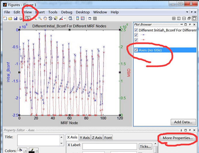
生成的图片编辑器重点击view下的小箭头,选中图、右键选择show properity editor,然后点击View下拉菜单中有个plot browser,在右边看到Axes点击一下该行,选中它,然后点击一下右下角的more properties。
此时得到如下界面:

红色圈圈那里可以修改另一边的y轴的颜色。当然里面还有很多可以调的,俺的最终结果图:

转载请注明。