1.先上效果图,大家来看看
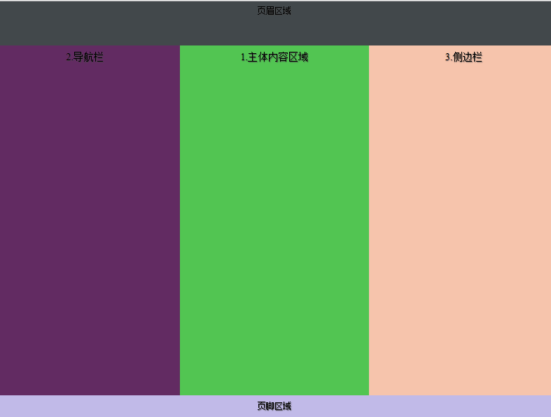
2.代码如下:
<!doctype html>
<meta charset='utf-8' content='text/html' />
<head>
<title>应用网页模板</title>
<style content='text/css'>
*  {
 margin:0px;
 padding:0px;
 -moz-box-sizing:border-box;
 -webkit-box-sizing:border-box;
 box-sizing:border-box;
 }
html,body  {
 width:100%;
 background:#fff;
   }
body {
 min-width:100%;
  }
header,section,nav,article,aside,footer {
 display:block;
 text-align:center;
 text-shadow:1px 1px 1px #444;
 font-size:1.2em;
          }
header {
 background-color:hsla(200,10%,20%,0.9);
 min-height:100px;
 min-width:100%;
 padding:10px 20px;
  }
footer {
 background-color:hsla(250,50%,80%,0.9);
 min-width:100%;
 padding:1%;
 min-height:60px;
  }
section {
 min-width:100%;
 min-height:800px;
  }
section nav {
 background-color:hsla(300,60%,20%,.9);
 padding:1%;
 width:220px;
 }
section article {
 background-color:hsla(120,50%,50%,.9);
 padding:1%;
  }
section aside {
 background-color:hsla(20,80%,80%,.9);
 padding:1%;
 width:220px;
  }
body {
 display:flex;
 display:-ms-flex;
 -ms-flex-flow:column wrap;
 flex-flow:column wrap;
  }
section {
 display:-ms-flex;
 display:flex;
 -ms-flex:1;
 flex:1;
 -ms-flex-flow:row wrap;
 flex-flow:row wrap;
 -ms-flex-align:stretch;
 align-items:stretch;
  }
nav {
 flex:1;
 -ms-flex-order:0;
 order:0;
 }
article {
 -ms-flex:1;
 flex:1;
 -ms-flex-order:2;
 order:2;
  }
aside {
 flex:1;
 -ms-flex-order:3;
 order:3;
  }
</style>

</head>

<body>
<header>页眉区域</header>
<section>
 <article>1.主体内容区域</article>
    <nav>2.导航栏</nav>
    <aside>3.侧边栏</aside>
</section>
<footer>页脚区域</footer>
</body>