效果图 动画后
动画后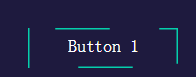
html
<!DOCTYPE html>
<html >
  <head>
    <meta charset="UTF-8">
    <title>Animated SVG Hover Buttons</title>
    <link rel="stylesheet" href="css/style.css">
  </head>
  <body>
    <div id="workarea">
              <div class="position">

                <!--start button, nothing above this is necessary -->
                <div class="svg-wrapper">
                  <svg height="40" width="150" xmlns="http://www.w3.org/2000/svg">
                    <rect id="shape" height="40" width="150" />
                    <div id="text">
                      <a href=""><span class="spot"></span>Button 1</a>
                    </div>
                  </svg>
                </div>
                <!--Next button -->
                <div class="svg-wrapper" >
                  <svg height="40" width="150" xmlns="http://www.w3.org/2000/svg" >
                    <rect id="shape" height="40" width="150" />
                    <div id="text">
                      <a href=""><span class="spot"></span>Button 2</a>
                    </div>
                  </svg>
                </div>
                <!--Next button -->
                <div class="svg-wrapper">
                  <svg height="40" width="150" xmlns="http://www.w3.org/2000/svg">
                    <rect id="shape" height="40" width="150" />
                    <div id="text">
                      <a href=""><span class="spot"></span>Button 3</a>
                    </div>
                  </svg>
                </div>
                <!--End button -->

              </div>
    </div>
  </body>
</html>
css
* {
  margin: 0;
  padding: 0;
}

html,
css {
  width: 100%;
  height: 100%;
}

.position {
  margin-left: auto;
  margin-right: auto;
  text-align: center;
  margin-top: 15%;
}

#workarea {
  position: absolute;
  width: 100%;
  height: 100%;
  background-color: #1e1a3e;
  font-family: Raleway;
}

#personal {
  color:white;
  text-decoration:none;
  position:absolute;
  bottom:15px;
  right:2%;
}


.spot {
  position: absolute;
  width: 100%;
  height: 100%;
  top: 0;
  left: 0;
}
.svg-wrapper {
  margin-top: 0;
  position: relative;
  width: 150px;
  /*make sure to use same height/width as in the html*/
  height: 40px;
  display: inline-block;
  border-radius: 3px;
  margin-left: 5px;
  margin-right: 5px
}
#shape {
  stroke-width: 4px;/*线的宽度*/
  fill: transparent;/*填充颜色*/
  stroke: #009FFD;/*线的颜色*/
  stroke-dasharray:85 400;/*创建虚线宽度,间距*/
  stroke-dashoffset:-220;/*线从哪个位置开始*/
  transition: 1s all ease;/*动画*/
}
#text {
  margin-top: -35px;
  text-align: center;
}

#text a {
  color: white;
  text-decoration: none;
  font-weight: 100;
  font-size: 1.1em;
}
.svg-wrapper:hover #shape {
  stroke-dasharray: 50 0;
  stroke-width: 3px;
  stroke-dashoffset: 0;
  stroke: #06D6A0;
}