transition属性是CSS3属性;顾名思义英文为过渡的意思;主要有四个值与其一一对应;分别是property(CSS属性名称),duration过渡的时长,timimg-function转速曲线函数(其对应着多个已经设置好的值如:ease,ease-in-out 等),delay延时单位为毫秒(延迟多少秒开始过渡);

首先我们写个简单的div;
<!DOCTYPE html>
<html>

    <head>
        <meta charset="utf-8" />
        <title>HTML标签</title>
        <link rel="stylesheet" type="text/css" href="css/index.css"/>
    </head>

    <body>


            <div class="CsOuterdiv">

            </div>
    </body>

</html>


/*作者:Alide 2017年11月15日*/
@font-face {
    font-family:MyfirstFont;
    src: url(../css/font/Lucia_BT.ttf);
}
html,
body {
    position: relative;
    width: 100%;
    min-width: 1300px;
    height: 100%;
    min-height: 700px;
    margin: 0px;
    padding: 0px;
    background-color: #F9F9F9;
    -webkit-user-select: none;
    -moz-user-select: none;
    -ms-user-select: none;
    user-select: none;
}
.CsOuterdiv {
    position: relative;
    width: 300px;
    height:200px;
    background-color: deepskyblue;
    /*transition: all 2s ease-in-out 1s;*/
}
.CsOuterdiv:hover{
    /* 500px;*/
    /*height: 600px;*/
    /*background-color: blue;*/
}
一般情况下我们为了简便可以用简写:transition的默认值为all 0 ease 0;所以我们在书写CSS代码的时候也要按照这种顺序来。
假设我们有这样的需求,如下;希望通过鼠标hover事件,同时改变该元素的块高背景色;那我们该怎么实现我们的代码呢?
设想代码: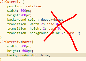 这种情况下,
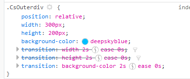 看到他只会对最后一个设置的值有过渡效果;那该怎么写呢?【还有一种方法:就是用逗号隔开transition:width 2s ease 3s,height 5s ease 3s;】
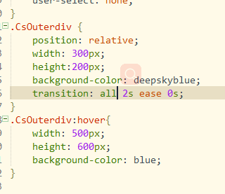
ok这样我们就可以实现多个CSS属性同时变换咯。
对就是把前面的宽高背景图改为all,即可,其次我们在观察ease的时候可以看到它是被
 可以自己调节速度。ok,明天见!