Python第三方库之openpyxl(7)
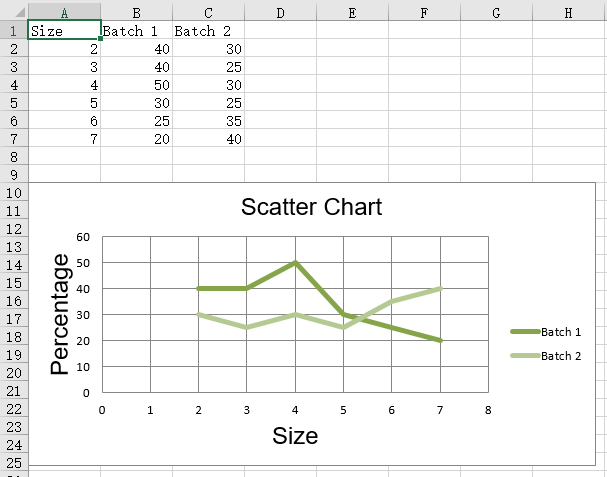
散点图
散点或xy图表类似于一些折线图。主要的区别在于,一个系列的值被绘制在另一个值上。当值未排序时,这是有用的。
from openpyxl import Workbook
from openpyxl.chart import (
    ScatterChart,
    Reference,
    Series,
)

wb = Workbook()
ws = wb.active

rows = [
    ['Size', 'Batch 1', 'Batch 2'],
    [2, 40, 30],
    [3, 40, 25],
    [4, 50, 30],
    [5, 30, 25],
    [6, 25, 35],
    [7, 20, 40],
]

for row in rows:
    ws.append(row)

chart = ScatterChart()
chart.title = "Scatter Chart"
chart.style = 13
chart.x_axis.title = 'Size'
chart.y_axis.title = 'Percentage'

xvalues = Reference(ws, min_col=1, min_row=2, max_row=7)
for i in range(2, 4):
    values = Reference(ws, min_col=i, min_row=1, max_row=7)
    series = Series(values, xvalues, title_from_data=True)
    chart.series.append(series)

ws.add_chart(chart, "A10")

wb.save("scatter.xlsx")
运行结果