百度云盘 传送门 密码:anap
文章全屏动画切换效果


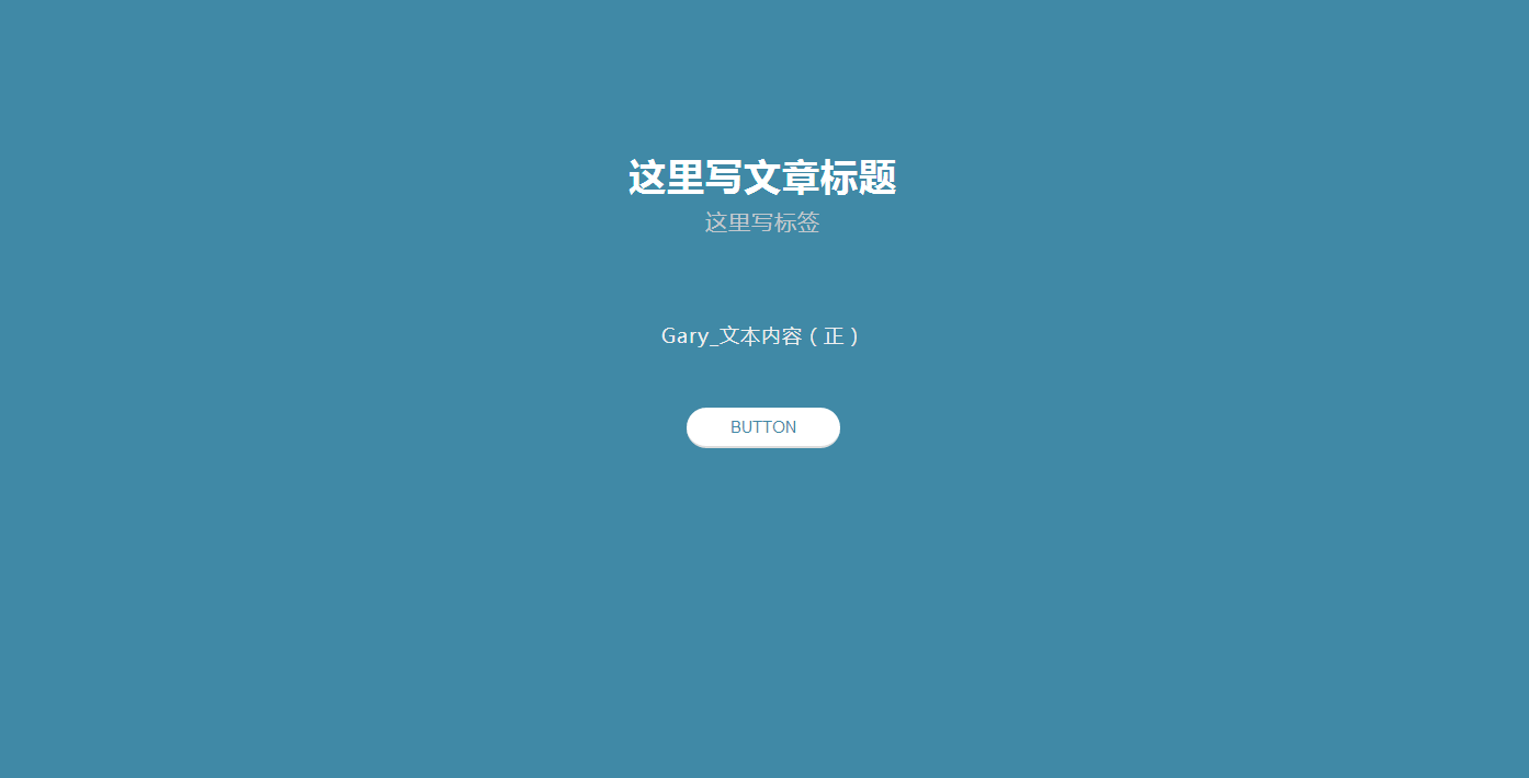
<!doctype html>
<html lang="zh">
<head>
<meta charset="UTF-8">
<meta http-equiv="X-UA-Compatible" content="IE=edge,chrome=1">
<meta name="viewport" content="width=device-width, initial-scale=1.0">
<title>jQuery文章章节全屏动画切换效果</title>
<link rel="stylesheet" type="text/css" href="css/default.css">
<link rel="stylesheet" type="text/css" href="css/styles.css">
</head>
<body><script src="/demos/googlegg.js"></script>
<main>
   <section class="main">
      <div class="container mainContent">
        <div class="zzsc">
            <h1>这里写文章标题 <span>这里写标签</span></h1>
        </div>
         <p>Gary_文本内容(正)</p>

         <button class="about">Button</button>
      </div>
   </section>
  </main>

  <section class="aboutSection">
   <div class="container aboutContent">

      <h1>副标题</h1>

      <p>Gary_文本内容(副)</p>


      <button class="home">返回</button>

   </div>
  </section>

<script src="js/jquery-2.1.1.min.js" type="text/javascript"></script>
<script>
$(function () {
    'use strict';
    var main = $('.main'), about = $('.aboutSection');
    $('.about').click(function () {
        main.animate({
            'height': '0',
            'top': '50vh',
            'padding': '0'
        }, 300).animate({
            'width': '2px',
            'left': '50%'
        }, 900).fadeOut(200, function () {
            about.fadeIn(200);
            about.animate({
                'width': '100%',
                'left': '0'
            }, 900);
            about.animate({
                'min-height': '100vh',
                'top': '0',
                'padding-top': '50px',
                'padding-bottom': '50px'
            }, 300);
        });
    });
    $('.home').click(function () {
        about.animate({
            'min-height': '0',
            'height': '0',
            'top': '50vh',
            'padding': '0'
        }, 300).animate({
            'width': '2px',
            'left': '50%'
        }, 900).fadeOut(200, function () {
            main.fadeIn(200).animate({
                'width': '100%',
                'left': '0'
            }, 900).animate({
                'height': '100vh',
                'top': '0',
                'padding-top': '100px',
                'padding-bottom': '100px'
            }, 300);
        });
    });
});
</script>
</body>
</html>
*{
   -webkit-box-sizing: border-box;
   -moz-box-sizing: border-box;
   box-sizing: border-box;
   outline: none;
}

body
{
   text-align: center;
   /*font-family: 'Open Sans', sans-serif;*/
   -webkit-font-smoothing: antialiased;
   color: #fff;
   padding: 0;
   margin: 0;
}

.container
{
    80%;
   margin: 0 auto;
}

body h1
{
   font-size: 40px;
   font-weight: 300;
   letter-spacing: 1px;
   word-spacing: 2px;
   text-align: center
}

body p
{
   line-height: 1.8em;
   font-size: 18px;
   color: #eee;
   letter-spacing: 1px;
   font-weight: 300;
   margin: 50px auto;
}

button
{
   /*font-family: 'Open Sans',  sans-serif;*/
   padding: 9px 40px;
   border: none;
   background: #fff;
   font-size: 15px;
   -webkit-border-radius: 40px;
   -moz-border-radius: 40px;
   border-radius: 40px;
   border-bottom: 2px solid #ddd;
   color: #4089A6;
   font-weight: 400;
   text-transform: uppercase;
   cursor: pointer
}

button.home
{
   color: #3bb17c
}

section
{
   padding: 30px 0;
   margin: 0;
   position: absolute;
   overflow: hidden;
   height: 100vh;
   top: 0;
   left: 0;
}

section.main
{
   background: #4089A6;
   height: 100vh;
   z-index: 99;
   border-top: 1px solid #4089A6;
   border-bottom: 1px solid #4089A6;
}

section.aboutSection
{
   background: #3bb17c;
   height: 2px;
   padding: 0;
   top: 50vh;
   left: 50%;
    5px;
   display: none;
   border-top: 1px solid #3bb17c;
   border-bottom: 1px solid #3bb17c;
}


@media screen and (max- 830px)
{
   section {
      overflow-y: scroll;
   }
}
[class^="icon-"], [class*=" icon-"] {
    font-family: 'icomoon';
    speak: none;
    font-style: normal;
    font-weight: normal;
    font-variant: normal;
    text-transform: none;
    line-height: 1;

    /* Better Font Rendering =========== */
    -webkit-font-smoothing: antialiased;
    -moz-osx-font-smoothing: grayscale;
}

body, html { font-size: 100%;     padding: 0; margin: 0;}

/* Reset */
*,
*:after,
*:before {
    -webkit-box-sizing: border-box;
    -moz-box-sizing: border-box;
    box-sizing: border-box;
}

/* Clearfix hack by Nicolas Gallagher: http://nicolasgallagher.com/micro-clearfix-hack/ */
.clearfix:before,
.clearfix:after {
    content: " ";
    display: table;
}

.clearfix:after {
    clear: both;
}

body{
    background: #f9f7f6;
    color: #404d5b;
    font-weight: 500;
    font-size: 1.05em;
    font-family: "Microsoft YaHei","宋体","Segoe UI", "Lucida Grande", Helvetica, Arial,sans-serif, FreeSans, Arimo;
}
a{color: #2fa0ec;text-decoration: none;outline: none;}
a:hover,a:focus{color:#74777b;}

.htmleaf-container{
    margin: 0 auto;
    text-align: center;
    overflow: hidden;
}
.htmleaf-content {
    font-size: 150%;
    padding: 1em 0;
}

.htmleaf-content h2 {
    margin: 0 0 2em;
    opacity: 0.1;
}

.htmleaf-content p {
    margin: 1em 0;
    padding: 5em 0 0 0;
    font-size: 0.65em;
}
.bgcolor-1 { background: #f0efee; }
.bgcolor-2 { background: #f9f9f9; }
.bgcolor-3 { background: #e8e8e8; }/*light grey*/
.bgcolor-4 { background: #2f3238; color: #fff; }/*Dark grey*/
.bgcolor-5 { background: #df6659; color: #521e18; }/*pink1*/
.bgcolor-6 { background: #2fa8ec; }/*sky blue*/
.bgcolor-7 { background: #d0d6d6; }/*White tea*/
.bgcolor-8 { background: #3d4444; color: #fff; }/*Dark grey2*/
.bgcolor-9 { background: #ef3f52; color: #fff;}/*pink2*/
.bgcolor-10{ background: #64448f; color: #fff;}/*Violet*/
.bgcolor-11{ background: #3755ad; color: #fff;}/*dark blue*/
.bgcolor-12{ background: #3498DB; color: #fff;}/*light blue*/
/* Header */
.zzsc{
    padding: 1em 190px 1em;
    letter-spacing: -1px;
    text-align: center;
}
.zzsc h1 {
    font-weight: 600;
    font-size: 2em;
    line-height: 1;
    margin-bottom: 0;
    font-family: "Microsoft YaHei","宋体","Segoe UI", "Lucida Grande", Helvetica, Arial,sans-serif, FreeSans, Arimo;
}
.zzsc h1 span {
    font-family: "Microsoft YaHei","宋体","Segoe UI", "Lucida Grande", Helvetica, Arial,sans-serif, FreeSans, Arimo;
    display: block;
    font-size: 60%;
    font-weight: 400;
    padding: 0.8em 0 0.5em 0;
    color: #c3c8cd;
}
/*nav*/
.htmleaf-demo a{color: #1d7db1;text-decoration: none;}
.htmleaf-demo{ 100%;padding-bottom: 1.2em;}
.htmleaf-demo a{display: inline-block;margin: 0.5em;padding: 0.6em 1em;border: 3px solid #1d7db1;font-weight: 700;}
.htmleaf-demo a:hover{opacity: 0.6;}
.htmleaf-demo a.current{background:#1d7db1;color: #fff; }
/* Top Navigation Style */
.htmleaf-links {
    position: relative;
    display: inline-block;
    white-space: nowrap;
    font-size: 1.5em;
    text-align: center;
}

.htmleaf-links::after {
    position: absolute;
    top: 0;
    left: 50%;
    margin-left: -1px;
     2px;
    height: 100%;
    background: #dbdbdb;
    content: '';
    -webkit-transform: rotate3d(0,0,1,22.5deg);
    transform: rotate3d(0,0,1,22.5deg);
}

.htmleaf-icon {
    display: inline-block;
    margin: 0.5em;
    padding: 0em 0;
     1.5em;
    text-decoration: none;
    color: #fff;
}

.htmleaf-icon span {
    display: none;
}

.htmleaf-icon:before {
    margin: 0 5px;
    text-transform: none;
    font-weight: normal;
    font-style: normal;
    font-variant: normal;
    font-family: 'icomoon';
    line-height: 1;
    speak: none;
    -webkit-font-smoothing: antialiased;
}
/* footer */
.htmleaf-footer{ 100%;padding-top: 10px;}
.htmleaf-small{font-size: 0.8em;}
.center{text-align: center;}
/****/
.related {
    color: #fff;
    background: #333;
    text-align: center;
    font-size: 1.25em;
    padding: 0.5em 0;
    overflow: hidden;
}

.related > a {
    vertical-align: top;
     calc(100% - 20px);
    max- 340px;
    display: inline-block;
    text-align: center;
    margin: 20px 10px;
    padding: 25px;
    font-family: "Microsoft YaHei","宋体","Segoe UI", "Lucida Grande", Helvetica, Arial,sans-serif, FreeSans, Arimo;
}
.related a {
    display: inline-block;
    text-align: left;
    margin: 20px auto;
    padding: 10px 20px;
    opacity: 0.8;
    -webkit-transition: opacity 0.3s;
    transition: opacity 0.3s;
    -webkit-backface-visibility: hidden;
}

.related a:hover,
.related a:active {
    opacity: 1;
}

.related a img {
    max- 100%;
    opacity: 0.8;
    border-radius: 4px;
}
.related a:hover img,
.related a:active img {
    opacity: 1;
}
.related h3{font-family: "Microsoft YaHei", sans-serif;}
.related a h3 {
    font-weight: 300;
    margin-top: 0.15em;
    color: #fff;
}
/* icomoon */
.icon-htmleaf-home-outline:before {
    content: "e5000";
}

.icon-htmleaf-arrow-forward-outline:before {
    content: "e5001";
}

@media screen and (max- 50em) {
    .zzsc {
        padding: 3em 10% 4em;
    }
    .zzsc h1 {
        font-size:2em;
    }
}


@media screen and (max- 40em) {
    .zzsc h1 {
        font-size: 1.5em;
    }
}

@media screen and (max- 30em) {
    .zzsc h1 {
        font-size:1.2em;
    }
}
实现过程
CSS
鼠标按钮
button
{
   /*font-family: 'Open Sans',  sans-serif;*/
   padding: 9px 40px;
   border: none;
   background: #fff;
   font-size: 15px;
   -webkit-border-radius: 40px;
   -moz-border-radius: 40px;
   border-radius: 40px;
   border-bottom: 2px solid #ddd;
   color: #4089A6;
   font-weight: 400;
   text-transform: uppercase;
   cursor: pointer
}
border-radius:向 div 元素添加圆角边框
border-bottom:设置下边框的样式
border-bottom-width:规定下边框的宽度2px
border-bottom-style:规定下边框的样式solid实线
border-bottom-color:规定下边框的颜色为#ddd
text-transform:可以轻易地实现英文字母大小写转换
capitalize; 单词首个字母大写
uppercase; 全部大写
lowercase; 全部小写
cursor :规定要显示的光标的类型(形状)
pointer 光标呈现为指示链接的指针(一只手)
crosshair 光标呈现为十字线
十字线效果。。。。。。
letter-spacing: 1px;
设置 h1 和 h2 元素的字母间距为1px
word-spacing: 2px;
规定段落中的字间距是 2px
设计思路很简单,首先先定义在标准浏览器下的固定宽度(假如标准浏览器的分辨率为1024px,那么我们设置宽为980px),然后用Media Query来监测浏览器的尺寸变化,当浏览器的分辨率小于1024px的时候,则通过Media Query预设的样式表来将页面的宽度设置为百分比显示,这样子页面的结构元素就会根据浏览器的的尺寸来进行相对应的调整。同理,当浏览器的可视区域改变到某个值(假如为650px)的时候,页面的结构元素根据Media Query预设的层叠样式表来进行相对应的调整。看看我们的例子:

/* 当浏览器的可视区域小于980px */
@media screen and ( max- 980px ) {
#wrap { 90%; margin:0 auto;}
#content { 60%;padding: 5%;}
#sidebar { 30%;}
#footer {padding: 8% 5%;margin-bottom: 10px;}
}
/* 当浏览器的可视区域小于650px */
@media screen and ( max- 650px ) {
#header {height: auto;}
#searchform {position: absolute;top: 5px;right: 0;}
#content { auto; float: none; margin: 20px 0;}
#sidebar { 100%; float: none; margin: 0;}
}
DOM
为文章添加样式
   <section class="main">
      <div class="container mainContent">
        <div class="zzsc">
            <h1>这里写文章标题 <span>这里写标签</span></h1>
        </div>
         <p>Gary_文本内容(正)</p>

         <button class="about">Button</button>
      </div>
   </section>
  </main>

  <section class="aboutSection">
   <div class="container aboutContent">

      <h1>副标题</h1>

      <p>Gary_文本内容(副)</p>


      <button class="home">返回</button>

   </div>
  </section>
Js响应事件
<script>
$(function () {
    'use strict';
    var main = $('.main'), about = $('.aboutSection');
    $('.about').click(function () {
        main.animate({
            'height': '0',
            'top': '50vh',
            'padding': '0'
        }, 300).animate({
            'width': '2px',
            'left': '50%'
        }, 900).fadeOut(200, function () {
            about.fadeIn(200);
            about.animate({
                'width': '100%',
                'left': '0'
            }, 900);
            about.animate({
                'min-height': '100vh',
                'top': '0',
                'padding-top': '50px',
                'padding-bottom': '50px'
            }, 300);
        });
    });
    $('.home').click(function () {
        about.animate({
            'min-height': '0',
            'height': '0',
            'top': '50vh',
            'padding': '0'
        }, 300).animate({
            'width': '2px',
            'left': '50%'
        }, 900).fadeOut(200, function () {
            main.fadeIn(200).animate({
                'width': '100%',
                'left': '0'
            }, 900).animate({
                'height': '100vh',
                'top': '0',
                'padding-top': '100px',
                'padding-bottom': '100px'
            }, 300);
        });
    });
});
</script>
animate() 方法执行 CSS 属性集的自定义动画 传送门
通过CSS样式将元素从一个状态改变为另一个状态。CSS属性值是逐渐改变的,这样就可以创建动画效果
fadeOut() 方法使用淡出效果来隐藏被选元素,假如该元素是隐藏的 传送门
speed
可选。规定元素从可见到隐藏的速度。默认为 "normal"。

可能的值:

毫秒 (比如 1500)
"slow"
"normal"
"fast"
在设置速度的情况下,元素从可见到隐藏的过程中,会逐渐地改变其透明度(这样会创造淡出效果)。

callback
可选。fadeOut 函数执行完之后,要执行的函数。

如需学习更多有关 callback 的内容,请访问我们的 jQuery Callback 这一章。

除非设置了 speed 参数,否则不能设置该参数。
fadeIn() 方法使用淡入效果来显示被选元素,假如该元素是隐藏的 传送门
speed
可选。规定元素从隐藏到可见的速度。默认为 "normal"。

可能的值:

毫秒 (比如 1500)
"slow"
"normal"
"fast"
在设置速度的情况下,元素从隐藏到可见的过程中,会逐渐地改变其透明度(这样会创造淡入效果)。

callback
可选。fadeIn 函数执行完之后,要执行的函数。

如需学习更多有关 callback 的内容,请访问我们的 jQuery Callback 这一章。

除非设置了 speed 参数,否则不能设置该参数。
(Javascript这怪迷糊,留着以后用O(∩_∩)O~)