ntroduction
In practical applications, many signals are nonstationary. This means that their frequency-domain representation (their spectrum) changes over time.
You can divide almost any time-varying signal into time intervals short enough that the signal is essentially stationary in each section. Time-frequency analysis is most commonly performed by segmenting a signal into those short periods and estimating the spectrum over sliding windows.
Using Time-Frequency Analysis to Identify Numbers in a DTMF Signal
Example,
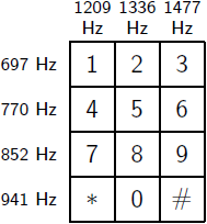
Consider the signaling system of a digital phone dial. The signals produced by such a system are known as dual-tone multi-frequency (DTMF) signals. The sound generated by each dialed number consists of the sum of two sinusoids − or tones − with frequencies taken from two mutually exclusive groups. Each pair of tones contains one frequency of the low group (697 Hz, 770 Hz, 852 Hz, or 941 Hz) and one frequency of the high group (1209 Hz, 1336 Hz, or 1477Hz) and represents a unique symbol.
visualize the signal in time and in frequency domain over the 650 to 1500 Hz band.
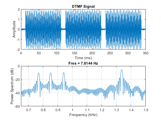
The time-domain plot of the signal confirms the presence of three bursts of energy, corresponding to three pushed buttons.
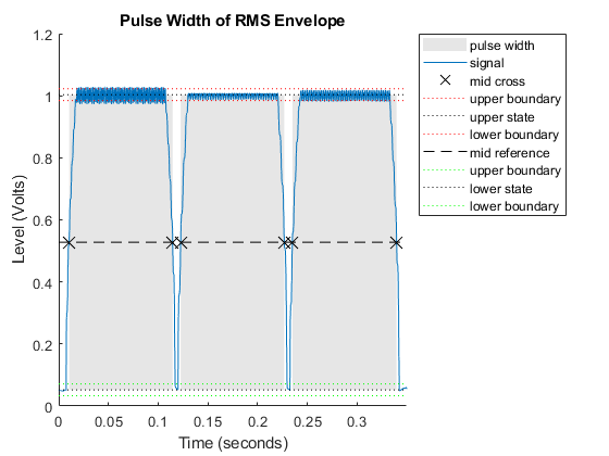
Here you can see three pulses, each one approximately 100 milliseconds long. However, you cannot tell which numbers were dialed. A frequency-domain plot helps you figure this out because it shows the frequencies present in the signal.
Locate the frequency peaks by estimating the mean frequency in four different frequency bands.
f = [meanfreq(tones,Fs,[700 800]), ...
     meanfreq(tones,Fs,[800 900]), ...
     meanfreq(tones,Fs,[900 1000]), ...
     meanfreq(tones,Fs,[1300 1400])];
round(f)

ans = 1×4
770 852 941 1336
By matching the estimated frequencies to the diagram of the telephone pad, you can say that the dialed buttons were '5', '8', and '0'. However, the frequency-domain plot does not provide any type of time information that would allow you to figure out the order in which they were dialed. The combination could be '580','508','805','850', '085', or '058'. To solve this puzzle, use the pspectrum function to compute the spectrogram and observe how the frequency content of the signal varies with time.
Compute the spectrogram over the 650 to 1500 Hz band and remove content below the −10 dB power level to visualize only the main frequency components. To see the tone durations and their locations in time use 0% overlap.
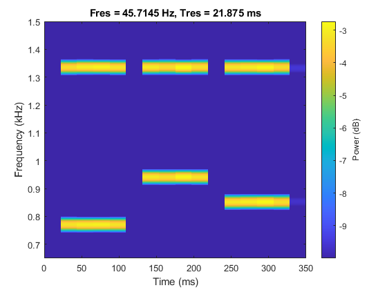
The colors of the spectrogram encode frequency power levels. Yellow colors indicate frequency content with higher power; blue colors indicate frequency content with very low power. A strong yellow horizontal line indicates the existence of a tone at a particular frequency. The plot clearly shows the presence of a 1336 Hz tone in all three dialed digits, telling you that they are all on the second column of the keypad. From the plot you can see that the lowest frequency, 770 Hz, was dialed first. The highest frequency, 941 Hz, was next. The middle frequency, 852 Hz, came last. Hence, the dialed number was 508.
Trading Off Time and Frequency Resolution to Get the Best Representation of Your Signal
Longer segments provide better frequency resolution; shorter segments provide better time resolution.
Reference
1. MathWorks