安装Echarts
# 最新稳定版
$ cnpm install echarts --save
代码:
父组件:
<template>
  <div>
    <basic-bar></basic-bar>
  </div>
</template>

<script>
import BasicBar from './BasicBar'

export default {
  name: 'home',
  components: {
    BasicBar
  }
}
</script>
子组件(官方代码):
<template>
  <div>
    <div ref="chart1" style="100%;height:400px;text-align: center;"></div>
  </div>
</template>

<script>
export default {
  name: 'BasicBar',
  data () {
    return {
      option: {
        xAxis: {
          type: 'category',
          data: ['Mon', 'Tue', 'Wed', 'Thu', 'Fri', 'Sat', 'Sun']
        },
        yAxis: {
          type: 'value'
        },
        series: [{
          data: [120, 200, 150, 80, 70, 110, 130],
          type: 'bar'
        }]
      }
    }
  },
  mounted () {
    var echarts = require('echarts')
    echarts.init(this.$refs.chart1).setOption(this.option, true)
  }
}
</script>

<style scoped>

</style>
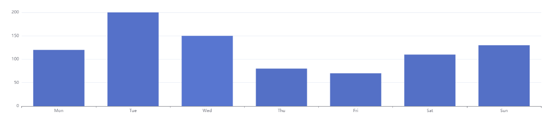
效果:
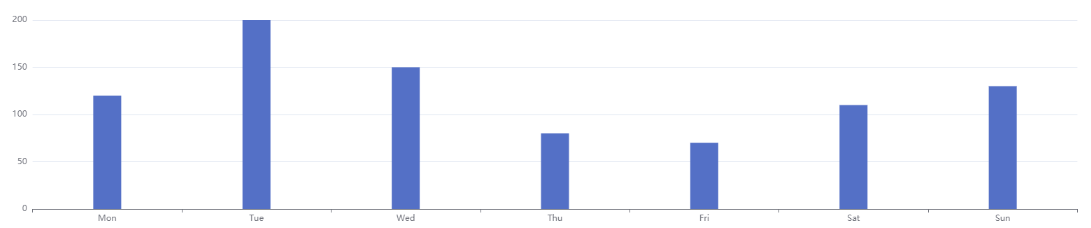
由于Bar的宽度太宽,我们可以在series中设置barWidth属性来控制Bar的宽度
series: [{
          data: [120, 200, 150, 80, 70, 110, 130],
          type: 'bar',
          barWidth: 40
        }]
效果如下:
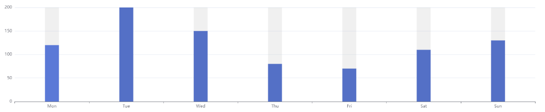
带背景色的柱状图:在series中添加showBackground属性来控制是否显示Bar的背景色
series: [{
          data: [120, 200, 150, 80, 70, 110, 130],
          type: 'bar',
          barWidth: 40,
          showBackground: true,
      backgroundStyle: {
         color: 'rgba(180, 180, 180, 0.2)'
      }
}]
效果如下:
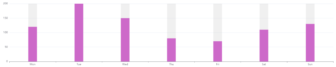
在series中添加itemStyle属性控制Bar的颜色:
series: [{
          data: [120, 200, 150, 80, 70, 110, 130],
          type: 'bar',
          barWidth: 40,
          showBackground: true,
          itemStyle: {
            normal: {
              // 配置柱状图颜色
              color: function () {
                return '#CD69C9'
              }
            }
          }
        }]
效果如下:
在series中添加itemStyle属性控制是否显示文字,文字显示的位置,文字的大小以及样式
itemStyle: {
  normal: {
    // 配置柱状图颜色
    color: function () {
      return '#CD69C9'
    },
    // 显示数值
    label: {
      show: true, // 开启显示
      position: 'top', // 在上方显示
      textStyle: { // 数值样式
        color: 'red',
        fontSize: 18
      }
    }
  }
}
效果:
在series中添加itemStyle属性控制鼠标悬停在Bar上的样式
series: [{
          data: [120, 200, 150, 80, 70, 110, 130],
          type: 'bar',
          barWidth: 40,
          showBackground: true,
          itemStyle: {
            normal: {
              // 配置柱状图颜色
              color: function () {
                return '#CD69C9'
              },
              // 显示数值
              label: {
                show: true, // 开启显示
                position: 'top', // 在上方显示
                textStyle: { // 数值样式
                  color: 'red',
                  fontSize: 18
                }
              }

            },
            // 鼠标悬停时
            emphasis: {
              shadowBlur: 10,
              shadowOffsetX: 0,
              shadowColor: 'rgba(0, 0, 0, 0.5)'
            }
          }
        }]
效果如下:

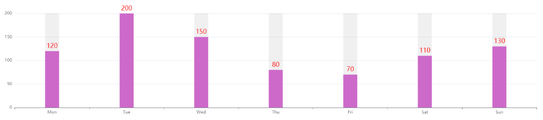
控制y轴是否显示:
yAxis: {
          type: 'value',
          axisLine: {
            show: true
          }
        },
效果如下:
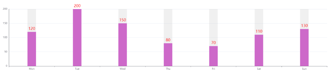
控制x轴和y轴文字的颜色和大小:
xAxis: {
          type: 'category',
          data: ['Mon', 'Tue', 'Wed', 'Thu', 'Fri', 'Sat', 'Sun'],
          axisLabel: {
            textStyle: {
              color: '#999',
              fontSize: 18
            }
          }
        },
        yAxis: {
          type: 'value',
          axisLine: {
            show: true
          },
          axisLabel: {
            textStyle: {
              color: '#999',
              fontSize: 18
            }
          }
        },
效果如下:
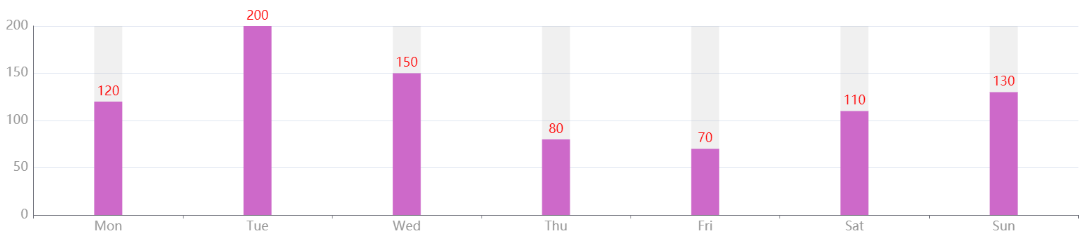
控制柱状图的宽度
<template>
  <div>
    <div ref="chart1" style="100%;height:400px;text-align: center;"></div>
  </div>
</template>
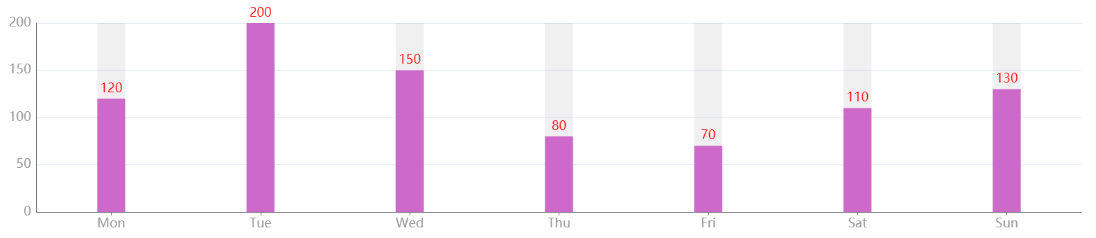
坐标轴刻度与标签对齐:给xAxis添加属性axisTick;
xAxis: {
          type: 'category',
          data: ['Mon', 'Tue', 'Wed', 'Thu', 'Fri', 'Sat', 'Sun'],
          axisLabel: {
            textStyle: {
              color: '#999',
              fontSize: 18
            }
          },
          axisTick: {
            alignWithLabel: true
          }
        },
效果如下:
最终代码:
<template>
  <div>
    <div ref="chart1" style="100%;height:400px;text-align: center;"></div>
  </div>
</template>

<script>
export default {
  name: 'BasicBar',
  data () {
    return {
      option: {
        xAxis: {
          type: 'category',
          data: ['Mon', 'Tue', 'Wed', 'Thu', 'Fri', 'Sat', 'Sun'],
          axisLabel: {
            textStyle: {
              color: '#999',
              fontSize: 18
            }
          },
          axisTick: {
            alignWithLabel: true
          }
        },
        yAxis: {
          type: 'value',
          axisLine: {
            show: true
          },
          axisLabel: {
            textStyle: {
              color: '#999',
              fontSize: 18
            }
          }
        },
        series: [{
          data: [120, 200, 150, 80, 70, 110, 130],
          type: 'bar',
          barWidth: 40,
          showBackground: true,
          backgroundStyle: {
            color: 'rgba(180, 180, 180, 0.2)'
          },
          itemStyle: {
            normal: {
              // 配置柱状图颜色
              color: function () {
                return '#CD69C9'
              },
              // 显示数值
              label: {
                show: true, // 开启显示
                position: 'top', // 在上方显示
                textStyle: { // 数值样式
                  color: 'red',
                  fontSize: 18
                }
              }

            },
            // 鼠标悬停时
            emphasis: {
              shadowBlur: 10,
              shadowOffsetX: 0,
              shadowColor: 'rgba(0, 0, 0, 0.5)'
            }
          }
        }]
      }
    }
  },
  mounted () {
    var echarts = require('echarts')
    echarts.init(this.$refs.chart1).setOption(this.option, true)
  }
}
</script>

<style scoped>

</style>