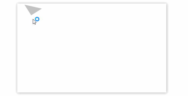
css绘制三角形
<style>
	.triangle-box{
        margin: 50px auto;
        height: 300px;
         500px;
        box-shadow: 1px 1px 10px rgba(0,0,0,0.3);
        position: relative;
    }
    .triangle{
        position: absolute;
        top: 10px;
        left: 20px;
        border- 30px;
        border-color: #c2c2c2 transparent transparent transparent;
        border-style: solid;
        transition: all 0.5s;
        -webkit-transition: all 0.2s;
        /*设置旋转重心*/
        transform-origin: 30px 15px;
    }
    .triangle:hover{
        transform: rotateZ(180deg);
    }
</style>
<div class="triangle-box">
    <span class="triangle"></span>
</div>
知识点
border
- border-color: #c2c2c2 transparent transparent transparent;
transparent:透明
transition:all 0.2s
动画效果,all指的是所有属性,如width、transform等
transform-origin: 30px 15px;
修改坐标原点位置
transform:rotateZ(180deg);
沿着Z轴旋转180°
css制作下拉菜单
<style>
    *{
        padding: 0; margin: 0;
        list-style: none;
    }
    a{
        text-decoration: none;
        color: white;
    }
    .nav-box{
        height: 50px;
    }
    /*一级导航*/
    ul.nav{
        display: flex;
        height: 100%;
    }
    ul.nav>li{
        background-color: #ccc;
        box-sizing: border-box;
         150px;
        height: 100%;
        line-height: 50px;
        text-align: center;
        position: relative;
    }
    .nav>li:hover{
        background-color: #c3c3c3;
        cursor: pointer;
        font-weight: bold;
    }
    ul.nav>li>a{
        display: block;
        height: 100%;
         100%;
        z-index: 10;
    }
    /*二级导航*/
    ul.sub-nav{
        position: absolute;
         100%;
        display: none;
        z-index: 100;
        border-radius: 2px;
        box-shadow: 0 2px 4px rgba(0,0,0,0.25);
        transition: all 2s;
    }
    ul.sub-nav>li{
        background-color: #c1c1c1;
        box-sizing: border-box;
        border-top: 1px solid white;
    }
    @keyframes moveUp {
        from{
            top: 55px;
            opacity: 0;
        }
        to{
            top: 50px;
            opacity: 1;
        }
    }
    /*显示二级导航,关键的地方*/
    ul.nav>li>a:hover+ul,ul.sub-nav:hover{
        display: block;
        animation: moveUp .3s ease;
    }

</style>
<div class="nav-box">
    <ul class="nav">
        <li>index</li>
        <li>
            <a href="javascript:void(0);">contact</a>
            <ul class="sub-nav">
                <li>111</li>
                <li>222</li>
            </ul>
        </li>
        <li>about</li>
    </ul>
</div>
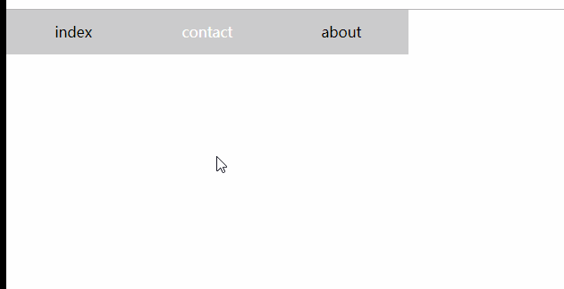
知识点
父相子绝,子元素附属于父级元素
li.item{position: relative;}
li.item>ul{position:absolute;}
关键点
当鼠标移动到contact时,触发a的hover事件,显示二级菜单;
当鼠标移动到二级菜单时,触发二级菜单【ul】的hover事件,显示自身;注意这里有个临界值,父级容器和子集必须有重叠的地方,可以在子元素中使用padding-top来填充,来实现表面上分离的效果。
动画
二级菜单从隐藏【display:none】到显示,需要一个动画。
注意:对于display:none的元素不能使用transition动画,否则无效果,必须使用animation属性来定义
左侧导航栏

<style>
    *{
        padding: 0; margin: 0;
        list-style: none; text-decoration: none;
    }
    body,html{
        height: 100%;
    }
    body{
        display: flex; flex-direction: column;
    }
    .header{
        display: flex; justify-content: center; align-items: center;
        height: 80px;
        background-color: #d1d1d1;
    }
    .main{
        display: flex;
        height: 100%;
    }
    /*左侧导航栏, 外侧隐藏溢出,固定宽度*/
    .side{
         200px;
        height: 100%;
        background-color: #20222A;
        overflow: hidden;
        position: relative;
    }
    /*中间,使用绝对定位,不指定宽度*/
    .side-scroll{
        height: 100%;
        position: absolute;
        overflow-x: hidden;
        overflow-y: scroll;
    }
    /*.side-scroll::-webkit-scrollbar{*/
    /*    display:none;*/
    /*}*/
    /*内容指定宽度*/
    ul.side-nav{
         200px;
    }
    /*a*/
    .side-nav a{
        color: white; display: flex;
        height: 56px; 100%;
        justify-content: left; align-items: center;
        box-sizing: content-box;
        padding-left: 30px;
    }
    /*一级li*/
    ul.side-nav>li{
        /*height: 56px;*/
        box-sizing: border-box;
        display: flex;
        flex-direction: column;
        align-items: center;
    }

    /*右侧内容*/
    .content-box{
        height: 100%; flex: 1;
    }
</style>
<div class="header">
    header
</div>
<div class="main">
    <div class="side">
        <div class="side-scroll">
            <ul class="side-nav">
                <li>
                    <a href="javascript:void(0);">主页</a>
                </li>
                <li>
                    <a href="javascript:void(0);">组件</a>
                    <ul class="nav-child">
                        <li><a href="javascript:void(0);">控制台</a></li>
                        <li><a href="javascript:void(0);">主页一</a></li>
                        <li><a href="javascript:void(0);">主页二</a></li>
                    </ul>
                </li>
            </ul>
        </div>
    </div>
    <div class="content-box">
content
    </div>
</div>
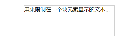
文本溢出
显示省略号
<style>
    *{
        font-size: 18px;
    }
    div{
        margin: 90px;  300px; height: 5em; border: 1px solid #ccc;
        overflow: hidden; text-overflow: ellipsis; white-space: nowrap;
    }
</style>
<div>
    用来限制在一个块元素显示的文本的行数。 为了实现该效果,它需要组合其他的WebKit属性。常见结合属用来限制在一个块元素显示的文本的行数。
    为了实现该效果,它需要组合其他的WebKit属性。常见结合属
</div>
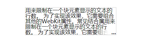
- 只能单行显示
- 多行显示,使用定位,伪元素,兼容除ie6-7
<style>
    *{
        font-size: 18px;
    }
    div{
        margin: 90px;  300px; height: 5em; line-height: 1; position: relative;
        border: 1px solid #ccc;
        overflow: hidden; text-overflow: ellipsis;
    }
    div:after{
        content: '...';
        position: absolute; right: 0; bottom: 0; padding-left: 3em;
        font-weight: bold;
        background: -webkit-linear-gradient(left, transparent, #fff 62%);
        background: -o-linear-gradient(right, transparent, #fff 62%);
        background: -moz-linear-gradient(right, transparent, #fff 62%);
        background: linear-gradient(to right, transparent, #fff 62%);
    }
</style>
<div>
    用来限制在一个块元素显示的文本的行数。 为了实现该效果,它需要组合其他的WebKit属性。常见结合属用来限制在一个块元素显示的文本的行数。
    为了实现该效果,它需要组合其他的WebKit属性。常见结合属
</div>