在图像上直方图和条形图相似,但是直方图是用来统计数据在某个值上的数量。
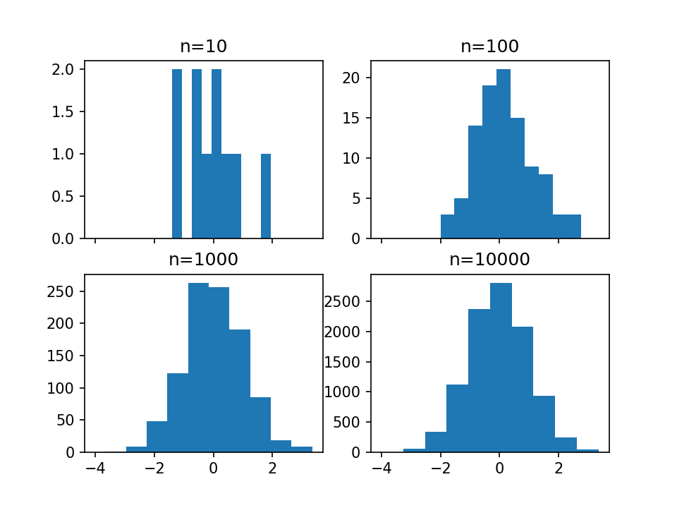
 1 # 创建2*2的图像分块,并获取每个分块
 2 fig, ((ax1, ax2), (ax3, ax4)) = plt.subplots(2, 2, sharex=True)
 3 axs = [ax1,ax2,ax3,ax4]
 4
 5 # 分别用正态分布得到10,100,1000,10000个点
 6 for n in range(0,len(axs)):
 7     sample_size = 10**(n+1)
 8     sample = np.random.normal(loc=0.0, scale=1.0, size=sample_size)
 9     axs[n].hist(sample)
10     axs[n].set_title('n={}'.format(sample_size))
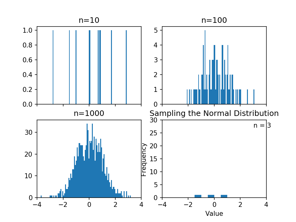
 1 # 调整bins到100,增加横坐标的数量
 2 fig, ((ax1, ax2), (ax3, ax4)) = plt.subplots(2, 2, sharex=True)
 3 axs = [ax1,ax2,ax3,ax4]
 4
 5 for n in range(0,len(axs)):
 6     sample_size = 10**(n+1)
 7     sample = np.random.normal(loc=0.0, scale=1.0, size=sample_size)
 8    #通过修改bins更改横坐标的数量
 9     axs[n].hist(sample, bins=100)
10     axs[n].set_title('n={}'.format(sample_size))
1 plt.figure()
2 Y = np.random.normal(loc=0.0, scale=1.0, size=10000)
3 X = np.random.random(size=10000)
4 plt.scatter(X,Y)

1 # use gridspec to partition the figure into subplots
2 import matplotlib.gridspec as gridspec
3
4 plt.figure()
 #通过把图分成3*3的9块区域,来自定义子图
5 gspec = gridspec.GridSpec(3, 3)
6
7 top_histogram = plt.subplot(gspec[0, 1:])
8 side_histogram = plt.subplot(gspec[1:, 0])
9 lower_right = plt.subplot(gspec[1:, 1:])
对中间的图进行绘制
1 Y = np.random.normal(loc=0.0, scale=1.0, size=10000)
2 X = np.random.random(size=10000)
3 lower_right.scatter(X, Y)
4 top_histogram.hist(X, bins=100)
5 s = side_histogram.hist(Y, bins=100, orientation='horizontal')
1 # 对上面和左侧的图进行绘制
2 top_histogram.clear()
3 top_histogram.hist(X, bins=100, normed=True)
4 side_histogram.clear()
5 side_histogram.hist(Y, bins=100, orientation='horizontal', normed=True)
6 # flip the side histogram's x axis
7 side_histogram.invert_xaxis()
1 # 改变坐标的限制
2 for ax in [top_histogram, lower_right]:
3     ax.set_xlim(0, 1)
4 for ax in [side_histogram, lower_right]:
5     ax.set_ylim(-5, 5)

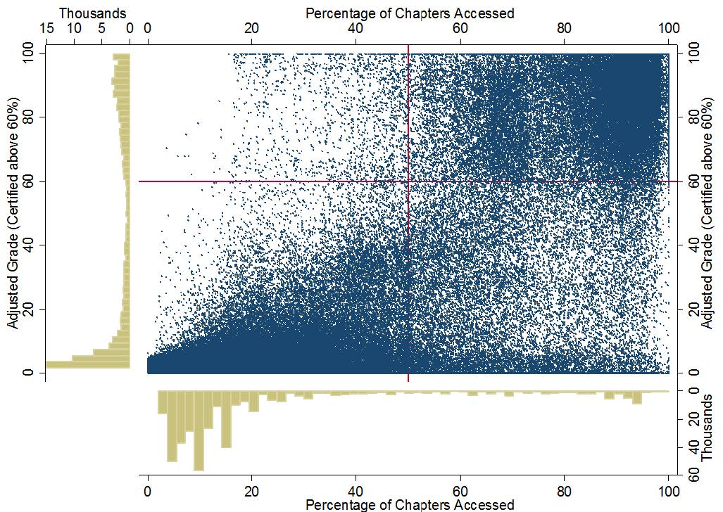
1 %%HTML
2 <img src='http://educationxpress.mit.edu/sites/default/files/journal/WP1-Fig13.jpg' />