1.chrome 远程计算机或设备将不接受连接
解决:https://blog.csdn.net/man_zuo/article/details/82945850 可行
2.浏览器滚动条隐藏还可以滚动
解决:
#app {
100%;
height: 100%;
overflow-x: hidden;
}
#app::-webkit-scrollbar {
display: none;
}
3.页面中的div随着页面放大而放大,缩小及缩小
解决:
注意:需jq.js,变量fz_num 参数无用
<body>
    <div class="container">
        <div class="content">
            <div class="phone h5body" id="h5body">
                <div class="phone-app">
                    <iframe src="http://192.168.1.45:8080/" frameborder="0" style="overflow-y:hidden;"
                        class="h5body-container" id="h5body-container"></iframe>
                </div>
            </div>
        </div>
    </div>
</body>
<script>
    /**
     * 自适应手机屏幕高度
     * @type {[type]}
     */
    function resizePhone() {
        //兼容老版电脑
        //   $("#h5phone-fontsize").css("fontSize", "10px");
        var minwidth = 300,
            minheight = (minwidth + minwidth * 0.1) / 0.557;
        var fz_num = parseInt($("#h5phone-fontsize").css("fontSize"));
        if ($("body").hasClass("fullmode")) {
            var height = $(".content").height(),
                width = (height / 4) * 2.4;
            $("#h5body").css({
                 width,
                "margin-left": -width / 2
            });
            $(".container").height("100%");
        } else {
            if (+fz_num === 12 && $(".content").height() < minheight) {
                var paddingLeft = (paddingRight = minwidth * 0.05),
                    bgwidth = minwidth + 2 * paddingLeft,
                    bgheight = winHeight - 40,
                    paddingTop = 0.04 * bgheight,
                    paddingBottom = 0.16 * bgheight,
                    right = -23 + 0.001 * bgwidth,
                    h5body = {
                        height: bgheight - paddingTop - paddingBottom,
                         bgwidth - 2 * paddingLeft,
                        "margin-left": -bgwidth / 2,
                        padding: paddingTop +
                            "px " +
                            paddingRight +
                            "px " +
                            paddingBottom +
                            "px " +
                            paddingLeft +
                            "px "
                    };
                $(".container").height(bgheight);
            } else {
                var winHeight = $(".content").height(),
                    bgheight = winHeight - 0,
                    paddingTop = 0.052 * bgheight,
                    paddingBottom = 0.082 * bgheight,
                    bgwidth = 0.48 * bgheight,
                    paddingLeft = 0.055 * bgwidth,
                    paddingRight = 0.054 * bgwidth,
                    right = -23 + 0.001 * bgwidth,
                    h5body = {
                        height: bgheight - paddingBottom,
                         bgwidth - 2 * paddingLeft,
                        "margin-left": -bgwidth / 2,
                        padding: paddingTop +
                            "px " +
                            paddingRight +
                            "px " +
                            paddingBottom +
                            "px " +
                            paddingLeft +
                            "px ",
                        top: 120
                    };
                $(".container").height("100%");
            }
            $("#h5body")
                .css(h5body)
                .show();
        }
    }

    resizePhone();
    var resizeTimeout = null;
    $(window).resize(function () {
        if (resizeTimeout) {
            clearTimeout(resizeTimeout);
        }
        resizeTimeout = setTimeout(function () {
            resizePhone();
        }, 0);
    });</script>
4.根据设备不同,跳入不同的页面(pc跳pc页面,移动跳移动端页面);
解决:
注意不要让页面出现白屏一闪的情况;
把相关js放到head里
(function () {
    var ua = navigator.userAgent.toLocaleLowerCase();
    var pf = navigator.platform.toLocaleLowerCase();
    var isAndroid = (/android/i).test(ua) || ((/iPhone|iPod|iPad/i).test(ua) && (/linux/i).test(pf)) ||
        (/ucweb.*linux/i.test(ua));
    var isIOS = (/iPhone|iPod|iPad/i).test(ua) && !isAndroid;
    var isWinPhone = (/Windows Phone|ZuneWP7/i).test(ua);

    var mobileType = {
        pc: !isAndroid && !isIOS && !isWinPhone,
        ios: isIOS,
        android: isAndroid,
        winPhone: isWinPhone
    };
    if (mobileType.pc) {
        window.location = "transverse/transverse.html"
    }

})();
通过chrome的检查工具network中的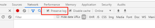 preserve log(保存日志,否则只显示每次响应的链接,页面刷新,请求记录不消失)
来记录页面显示时间;
同时学习一下network的小知识https://segmentfault.com/a/1190000012057767?utm_source=tag-newest
5.调试APP里的前端页面主要是为了查看页面跳转链接是否正确(host地址)
解决:下载一个代理软件,本人用的是Fiddler;
使用教程:https://www.cnblogs.com/woaixuexi9999/p/9247705.html;
本地配置:C:WindowsSystem32driversetc
6.苹果浏览器对时间转换中不兼容
遇到new Date("2019-12-27 10:50:00:000")打印不出来
解决把-改为/,并且去掉毫秒:
new Date("2019/12/27 10:50:00");
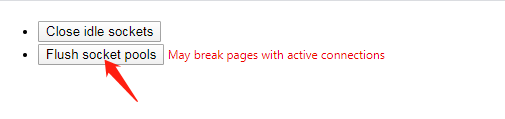
7.清除接口连接ip地址缓存:(chrome)
注意本地hosts ip地址 后的域名不可过长,可能会失效
打开浏览器chrome://net-internals/#sockets,清除即可;

8.h5页面在ios7p,8p...情况下键盘收回后会留下空白
解决:记录初始化页面的记录页面初始滚动条到顶部的高度
var htmlScrollHeight = $(document).scrollTop();
$('input').blur(function () {
//输入框失去焦点时,使页面滚动条到顶部的高度恢复到初始值,页面就会滑动下来
$('html,body').animate({ scrollTop: htmlScrollHeight }, 1000);
});