一、背景相关
背景颜色
background-color :颜色名称/rgb值/十六进制值

背景图片
background-image :url('')

背景图片平铺方式
background-repeat : repeat-x(仅水平重复) repeat-y(仅垂直重复) no-repeat(不重复)

设置背景图片位置
background-position :  数字+单位/center/top/bottom/left/right 同上。 例如:50px 50px

背景图片是否滚动
background-attachment :  fixed(不滚动) scroll(滚动)

dmeo:

设置页面的body背景:
<!DOCTYPE html>
<html lang="en">
<head>
</head>
<style>
    body{ background-color: aquamarine;
         background-image: url("cool.jpeg");
         background-repeat:repeat-y ;
         background-position: top;
         background-attachment: fixed;

    }
</style>
<body>
</body>
</html>
二、边框、边距
- 边框:border
用法:
border: 1px solid red; 表示边框宽度(border-width)为1px,边框样式(border-style)为实线,边框颜色(border-color)为红色
其中常用的边框样式有:solid 实线 dashed 虚线 dotted 点线
border表示全部设置,单独设置边框上/下/左/右边框将border替换为border-top、border-bottom、border-left、border-right。
- 外面距:margin
用法:
margin 属性接受任何长度单位,可以是像素、英寸、毫米或 em。
margin 可以设置为 auto。更常见的做法是为外边距设置长度值。下面的声明在 h1 元素的各个边上设置了 1/4 英寸宽的空白:
使用margin:0px auto;可以将定宽的块元素设置为居中显示
h1 {margin : 0.25in;}
下面的例子为 h1 元素的四个边分别定义了不同的外边距,所使用的长度单位是像素 (px):
h1 {margin : 10px 0px 15px 5px;}
分别设置外边距,这些值的顺序是从上外边距 (top) 开始设置上、右、下、左:
margin: top right bottom left
单独设置外边距:
margin-top|margin-right|margin-bottom|margin-left:单位
另外,还可以为 margin 设置一个百分比数值:
p {margin : 10%;}
还可以单独设置上下、左右,例如设置上下边距0,左右编辑10px:
p {margin : 0 10px;}
百分数是相对于父元素的 width 计算的。上面这个例子为 p 元素设置的外边距是其父元素的 width 的 10%。
margin 的默认值是 0,所以如果没有为 margin 声明一个值,就不会出现外边距。但是,在实际中,浏览器对许多元素已经提供了预定的样式,外边距也不例外。例如,在支持 CSS 的浏览器中,外边距会在每个段落元素的上面和下面生成“空行”。因此,如果没有为 p 元素声明外边距,浏览器可能会自己应用一个外边距。当然,只要你特别作了声明,就会覆盖默认样式。
- 内边距:padding (与外边距类似)
三、字体
字体大小 font-size:数字+单位
水平居中:text-align:center
垂直居中:line-height: 数字+单位(高度设置为和标签的高度一样)
字体样式:font-style:normal(正常) italic(斜体) oblique (粗体)
字体加粗:font-weight:数字+单位/normal(默认值。定义标准的字符)、bold(更粗的字体)、bolder(比bold粗)、lighter(更细的字体)
字体种类:font-family:字体名字("times"、"courier"、"arial"、"宋体")
demo:
<!DOCTYPE html>
<html lang="en">
<head>
    <meta charset="UTF-8">
    <title>wd</title>
</head>
<body>
<div style="font-family: 宋体 ;
            height: 40px;
            border:1px solid red;
            font-size: large;
            color: aquamarine;
            text-align:center;
            line-height: 40px">hello word
</div>
</body>
</html>
四、浮动
效果:让多个元素堆叠在一起
left:元素向左浮动
right:元素向右浮动
none:默认值不浮动
inherit: 规定应该从父元素继承 float 属性的值
当子标签浮动起来将父标签遮盖时候,使用,将所有标签都显示。
五、position
positon:将标签分层,固定位置
值:
fixd:生成绝对定位的元素,相对于浏览器窗口进行定位(位置随浏览器窗口滚动而滚动)。元素的位置通过 "left", "top", "right" 以及 "bottom" 属性进行定位。
应用场景:比如网页中的“返回顶部”按钮、或者菜单栏永远在顶部
demo:
<!DOCTYPE html>
<html lang="en">
<head>
    <meta charset="UTF-8">
    <title>Title</title>
</head>
<body>
<div style="background-color: aqua;
            height: 38px;
            position: fixed ;top: 0;right: 0;left: 0;
            text-align: center;
            line-height: 38px">菜单</div>
<div style="background-color:#dddddd;height: 2000px">内容</div>
</body>
</html>

菜单栏永远在顶部demo
返回顶部代码:
<!DOCTYPE html>
<html lang="en">
<head>
    <meta charset="UTF-8">
    <title>Title</title>
</head>
<body>
<div style=" 50px;height: 50px;background-color: green;color: white;position: fixed;
    bottom: 20px;
    right: 20px;
    ">
    返回顶部
</div>
    <div style="height: 5000px;background-color: brown">


    </div>
</body>
</html>
absolute:绝对定位,绝对于浏览器窗口定位(位置不会改变),元素的位置通过 "left", "top", "right" 以及 "bottom" 属性进行定位,通常与relative一起使用。
relative:相对定位,与absolute进行定位,relative为父标签,子标签absolute相对与relative进行定位
absolute+relative应用:是一个标签相对于另一个标签进行绝对定位。
<!DOCTYPE html>
<html lang="en">
<head>
    <meta charset="UTF-8">
    <title>Title</title>
</head>
<body>
<div style=" border:1px solid red;
             height: 300px;
              300px;
             margin: 0 auto;
             position: relative">
    <div style="background-color: black;
                height: 50px;
                 50px;
                position: absolute;
                right: 0px;
                bottom: 10px;">
    </div>
</div>
</body>
</html>

relative+absolute应用
tips:通过opacity可设置div的透明度,值为0.0-1.0(透明-不透明)
Z-index:当有多层样式,可通过Z-index设置优先级,优先级(值越大)越高,层次越在最上面。
应用场景:网页遮罩层
其它常用标签
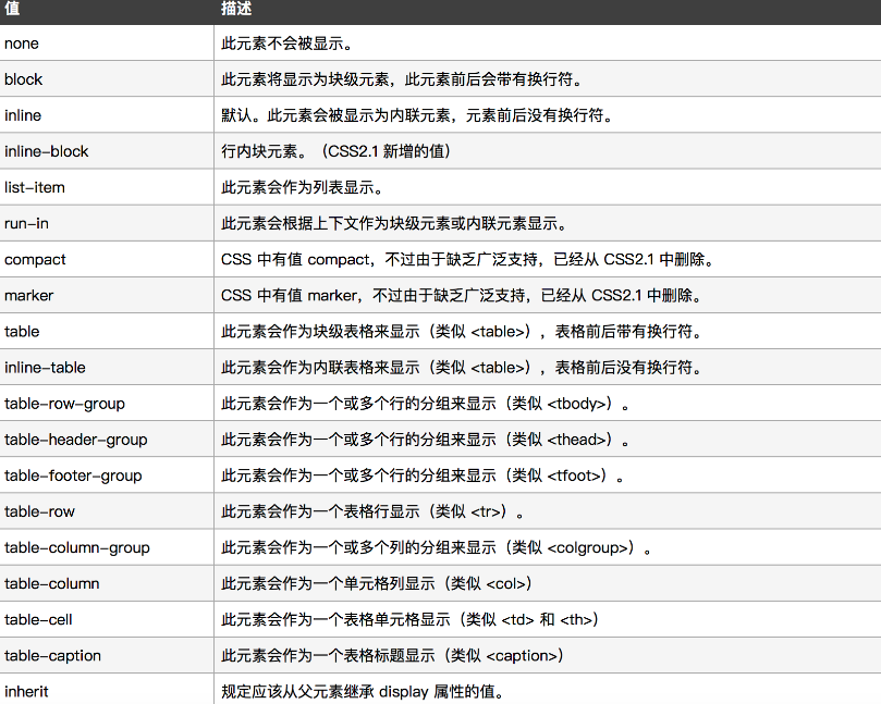
- display:改变标签属性(块级/行内)
常用值:
block:使标签具有块级标签属性
inline:使标签具有行内标签属性
inline-block:使用标签既有行内标签属性又有块级标签属性
none:不显示标签
其他值如下:
tips:如果是行内标签无法设置高度、宽度、边距。
- overflow:设置内容溢出时,出现滚动条或者隐藏
值:
hidden:隐藏溢出的内容
auto:溢出内容出现滚动条
<body>
<div style=" 500px ; height:300px;overflow: auto">
    <img src="timg.jpeg">
</div>
</body>
- hover:设置当鼠标指针浮动在元素上时显示样式
.pg-a:hover{
            background-color: cornflowerblue;
        }


<!DOCTYPE html>
<html lang="en">
<head>
    <meta charset="UTF-8">
    <style>
        .pg-menu{
            height: 48px;
            background-color: darkblue;
        }
        .pg-a{
            display: inline-block;
            color: white;
            font-family: "微软雅黑";
            line-height: 48px;
            height: 48px;
            width: 60px;
            padding: 0 10px;
        }
        .pg-a:hover{
            background-color: cornflowerblue;
        }
    </style>
    <title>Title</title>
</head>
<body style="margin: 0 auto">
<div class="pg-menu">
    <a class="pg-a">全部</a>
    <a class="pg-a">操作</a>
    <a class="pg-a">仪表盘</a>
    <a class="pg-a">资产</a>
</div>
</body>
</html>

菜单按钮变色
css样式案例
1、background-image应用之显示各种小图标
通过固定div大小然后调整background-position来显示一张图片上的不同的图标。
<!DOCTYPE html>
<html lang="en">
<head>
    <meta charset="UTF-8">
    <title>Title</title>
    <style>
        .w {
            background-image: url(icon_18_118.png);
            width: 19px;
            height: 20px;
            background-repeat: no-repeat;
            border: 1px solid red;
            background-position-y: -39px;
        }
    </style>
</head>
<body>
<div class="w">
</div>
</body>
</html>
2、登录框图标应用
通过position分层将登录框和登录图片分两层实现
<head>
    <meta charset="UTF-8">
    <title>Title</title>
    <style>
        .pg-username{
            width: 150px;
            height: 30px;
            position: relative;
            background: darkgray;
            padding-left: 25px;

        }
        .username-image{
            display: inline-block;
            width: 26px;
            height: 27px;
            position: absolute;
            background-image: url(images/username_wev8.png);
            background-repeat: no-repeat;
            top: 5px;
        }
        .passwd-image{
            display: inline-block;
            width: 26px;
            height: 27px;
            position: absolute;
            background-image: url(images/password_wev8.png);
            background-repeat: no-repeat;
            top: 5px;
        }
    </style>
</head>
<body>
    <div style="position: relative ; 100px;height: 40px">
        <input type="text" class="pg-username">
        <span class="username-image"></span>
    </div>
    <div style="position: relative ; 100px;height: 40px">
        <input type="text" class="pg-username">
        <span class="passwd-image"></span>
    </div>
</body>
</html>
后台页面布局
1.float模型布局(不推荐)
顶部菜单在上面,菜单栏float在左边,内容float在右边,通过设置最小宽度来固定页面,缺点当出现滚动条时候,左侧菜单和上面菜单将会逐渐消失。
<!DOCTYPE html>
<html lang="en">
<head>
    <meta charset="UTF-8">
    <title>Title</title>
    <style>
        .left{
            float: left;
        }
        .right{
            float: right;
        }
        .pg-header{
            background-color: aqua;
            height: 48px;
            min-width: 500px;
        }
        .pg-menue{
            background-color: darkblue;
            width: 5%;
            height: 700px;
        }
        .pg-contetx{
            background-color:#dddddd ;
            width: 95%;
            overflow: auto;
        }
    </style>
</head>
<body style="margin: 0 auto">
    <div class="pg-header"></div>
    <div>
        <div class="pg-menue left"></div>
        <div class="pg-contetx right">
            <div>内容</div>
            <div>内容</div>
            <div>内容</div>
            <div>内容</div>
            <div>内容</div>
            <div>内容</div>
            <div>内容</div>
            <div>内容</div>
            <div>内容</div>
        </div>
    </div>
</body>
</html>
2.position布局(推荐)
使用position固定位置,弥补float菜单消失缺点,内容多使用overflow。
<!DOCTYPE html>
<html lang="en">
<head>
    <meta charset="UTF-8">
    <title>Title</title>
    <style>
        .pg-header{
           background-color: #1c5a9c;
            height: 48px;
        }
        .pg-menu{
            position: absolute;
            top:48px;
            left: 0;

            background-color: #3388ff;
            width: 80px;
            bottom: 0;
        }
        .pg-context{
            position: absolute;
            left: 81px;
            background-color: #dddddd;
            bottom: 0;
            right: 0;
            top:48px;
            overflow: auto;
        }
    </style>
</head>
<body style="margin: 0 auto">
    <div class="pg-header"></div>
    <div class="pg-menu"></div>
    <div class="pg-context"></div>
</body>
</html>
3.布局应用之头像菜单,图标菜单
<!DOCTYPE html>
<html lang="en">
<head>
    <meta charset="UTF-8">
    <title>Title</title>
    <link rel="stylesheet" href="font-awesome-4.7.0/css/font-awesome.min.css">
    <style>
        .left {
            float: left;
        }

        .right {
            float: right
        }

        .pg-header {
            background-color: cornflowerblue;
            height: 48px;
            min-width: 500px;

        }

        .pg-menue {
            background-color: blue;
            width: 100px;
            height: 700px;
            position: absolute;
            top: 48px;
            left: 0;

        }

        .pg-contetx {
            background-color: #dddddd;
            position: absolute;
            top: 48px;
            right: 0;
            left: 100px;
            overflow: auto;
        }

        .header-img {
            height: 40px;
            width: 40px;
            border-radius: 50%;
            margin-top:4px;
            margin-left:16px;

        }

        .header-logo {
            color: white;
            font-size: large;
            line-height: 48px;
        }

        .img-outer {
            height: 48px;
            width: 200px;
        }

        .img-inner {
            height: 48px;
            width: 150px;

        }

        .img-inner:hover .img-a{
            background-color: darkblue;
        }

        .my-munue {
            position: absolute;
            top: 45px;
            z-index: 100;
            display: none;
            color: white;
        }

        .img-inner:hover .my-munue {
            display: block;
        }
        .img-a{
            position: relative;
            width: 80px;
            height: 48px;
        }
        .fa:hover {

            color: #DDDDDD;
            text-shadow: 0px 0px 5px #dddddd,
            0px 0px 10px #dddddd,
            0px 0px 15px #dddddd;
            transition-duration: 1s;}

    </style>
</head>
<body style="margin: 0 auto ;background-color: #dddddd">
<div class="pg-header">
    <div class="img-outer right">
        <div class="img-inner">
            <div class="img-a">
                <img src="images/1111.jpg" class="header-img">
                <div class="my-munue">
                    <div>我的资料</div>
                    <div>设置</div>
                    <div>修改密码</div>
                </div>
            </div>
        </div>
    </div>
    <div>
    <div class="right">
        <div style="margin-top: 16px ">
            <i class="fa fa-user-o" aria-hidden="true"></i>
            <span>5</span>
        </div>
    </div>

        <span class="header-logo left">logo</span>
    </div>
    <div>
        <div class="pg-menue "></div>
        <div class="pg-contetx ">
            <div>内容</div>
            <div>内容</div>
            <div>内容</div>
            <div>内容</div>
            <div>内容</div>
            <div>内容</div>
            <div>内容</div>
            <div>内容</div>
            <div>内容</div>
        </div>
    </div>
</div>
</body>
</html>