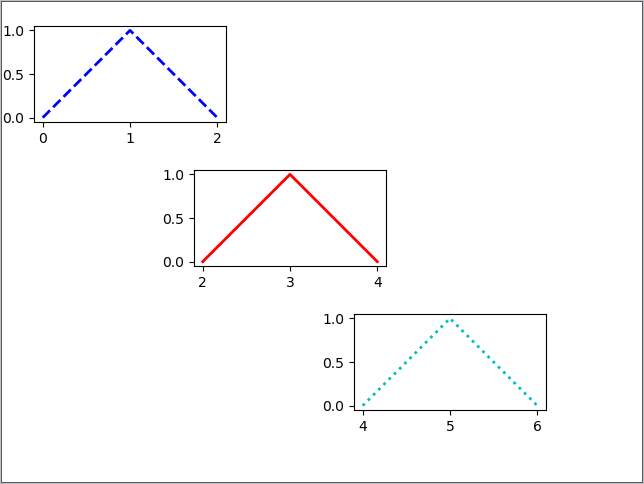
1、向画布当中的任意位置添加任意数量的坐标轴
 1 import  matplotlib.pyplot as plt
 2 import numpy as np
 3
 4 # 左、下分别表示坐标轴的左侧边缘和底部边缘距离画布的距离
 5 # 宽、高分别表示坐标轴的宽度和高度
 6 plt.axes([0.05,0.7,.3,.3],      # 左,下,宽,高
 7          frameon=True,          # True表示绘制坐标轴的四条轴脊,也就是四条边框
 8          aspect="equal")        # 控制图像的宽高比例
 9 plt.plot(np.arange(3),          # X坐标轴刻度
10          [0,1,0],               # 曲线值
11          color="blue",          # 曲线的颜色
12          linewidth=2,           # 曲线宽度
13          linestyle="--")        # 曲线样式
14
15 plt.axes([0.3,0.4,.3,.3],
16          frameon=True,
17          aspect="equal")
18 plt.plot(2+np.arange(3),
19          [0,1,0],
20          color="red",
21          linewidth=2,
22          linestyle="-")
23
24 plt.axes([0.55,0.1,.3,.3],
25          frameon=True,
26          aspect="equal")
27 plt.plot(4+np.arange(3),
28          [0,1,0],
29          color="c",
30          linewidth=2,
31          linestyle=":")
32
33 plt.show()
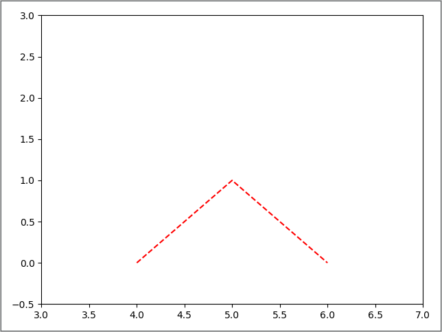
2、使用axis()绘制坐标轴
1 import  matplotlib.pyplot as plt
2 import numpy as np
3
4 plt.axis([3,7,-0.5,3])
5 plt.plot(4+np.arange(3),[0,1,0],color="r",linestyle="--")
6 plt.show()
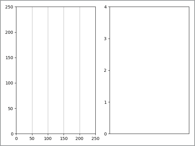
3、使用两种方法控制坐标轴的刻度显示
(1) 使用set_xticks和set_xticks控制
 1 import  matplotlib.pyplot as plt
 2
 3 ax1 = plt.subplot(121)
 4 ax1.set_xticks(range(0,251,50))
 5 ax1.set_yticks(range(0,251,50))
 6 plt.grid(True,axis="x")
 7
 8 ax2 = plt.subplot(122)
 9 ax2.set_xticks([])
10 ax2.set_yticks(range(0,5,1))
11 plt.grid(True,axis="x")
12
13 plt.show()
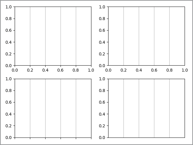
(2) 调用函数setp()
 1 import  matplotlib.pyplot as plt
 2
 3 ax1 = plt.subplot(221)
 4 # 若要设置Y轴的刻度和刻度线则把get_xticklabels()改成get_yticklabels()
 5 plt.setp(ax1.get_xticklabels(),     # 设置X轴刻度标签
 6          visible=True)              # X轴刻度标签可显示
 7 plt.setp(ax1.get_xticklines(),      # 设置X轴刻度线
 8          visible=True)              # X轴刻度线可显示
 9 plt.grid(True,axis="x")
10
11 ax2 = plt.subplot(222)
12 plt.setp(ax2.get_xticklabels(),
13          visible=True)              # X轴刻度标签可显示
14 plt.setp(ax2.get_xticklines(),
15          visible=False)             # X轴刻度线不可显示
16 plt.grid(True,axis="x")
17
18 ax3 = plt.subplot(223)
19 plt.setp(ax3.get_xticklabels(),
20          visible=False)             # X轴刻度标签不可显示
21 plt.setp(ax3.get_xticklines(),
22          visible=True)              # X轴刻度线可显示
23 plt.grid(True,axis="x")
24
25 ax4 = plt.subplot(224)
26 plt.setp(ax4.get_xticklabels(),
27          visible=False)              # X轴刻度标签不可显示
28 plt.setp(ax4.get_xticklines(),
29          visible=False)              # X轴刻度线不可显示
30 plt.grid(True,axis="x")
31
32 plt.show()
4、棉棒图的定制化展示
 1 import  matplotlib.pyplot as plt
 2 import numpy as np
 3
 4 x = np.linspace(0.5,2*np.pi,20)
 5 y = np.random.randn(20)
 6
 7 # 获得实例,前两个实例的属性值的改变用setp,stemlines是实例列表
 8 markerline,stemlines,baseline = plt.stem(x,y)
 9
10 plt.setp(markerline,        # X,Y的组合点,如(1,3)
11          color="c",         # 数据点的颜色
12          marker="D")        # 数据点的表示类型
13 plt.setp(stemlines,         # 数据点到基线(红色横线)的实例
14          linestyle="-.")    # 样式
15 baseline.set_linewidth(20)  # 基线实例(红色的横线)并设置宽度
16
17 plt.show()
