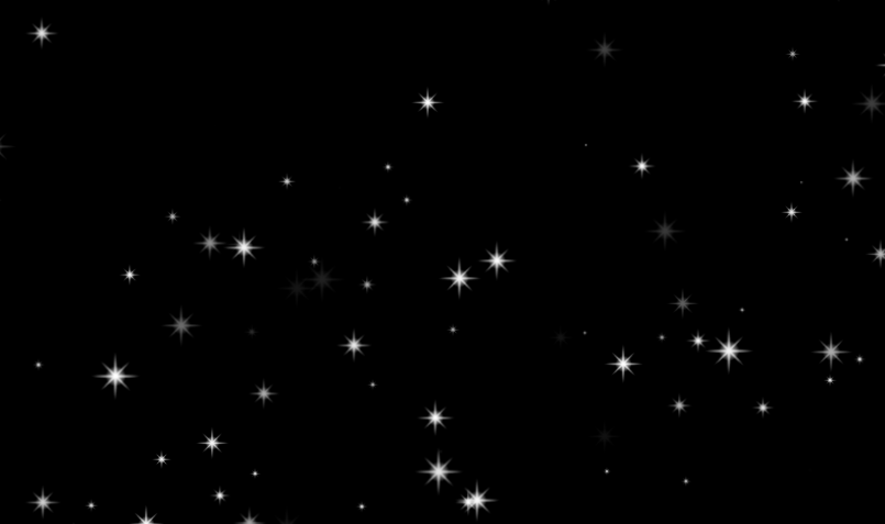
本次主要是来实现上面的星空效果:在黑色的背景下面,有大小不一的星星在闪烁,当鼠标悬浮时,星星放大并旋转。
首先,我们需要一个大的夜空容器和放星星的容器:
<!DOCTYPE html>
<html lang="en">
<head>
    <meta charset="UTF-8">
    <title></title>
    <style>
        *{
            margin: 0;
            padding: 0;
            list-style: none;
        }

        body{
            background-color: #000;
        }

        span{
            width: 30px;
            height: 30px;
            background: url("images/star.png") no-repeat;
            position: absolute;
            background-size:100% 100%;
           }
    </style>
</head>
<body>
<span></span>
</body>
</html>
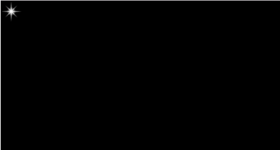
此时在大背景下有一颗星星,但该星星是固定的,我们需要通过css添加闪烁的效果:
span{
    animation: flash 1s alternate infinite;
}

@keyframes flash {
    0%{opacity: 0;}
    100%{opacity: 1;}
}
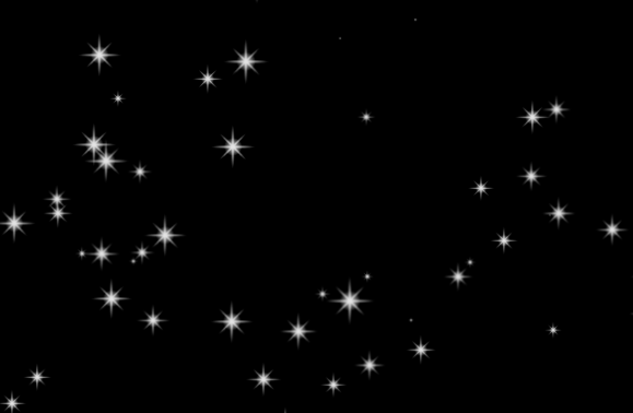
目标是在不同的地方显示随机大小的星星,所以,我们需要做以下几步操作:
- 计算出星星可显示位置
- 循环生成多个星星,即span
- 利用随机数生成星星的定位值,使其在不同位置显示
- 利用随机数计算星星的缩放比,在界面中显示不同大小的星星
<script>
    window.onload = function () {
        //屏幕的尺寸
        var screenW = document.documentElement.clientWidth;
        var screenH = document.documentElement.clientHeight;

        //动态创建多个星星
        for(var i=0; i<150; i++){
            var span = document.createElement('span');
            document.body.appendChild(span);

            //位置随机
            var x = parseInt(Math.random() * screenW);
            var y = parseInt(Math.random() * screenH);
            span.style.left = x + 'px';
            span.style.top = y + 'px';

             //大小随机
            var scale = Math.random() * 1.5;
            span.style.transform = 'scale('+ scale + ', ' + scale + ')';
        }
    }
</script>
此时界面中已经出现了上面的效果,但是此时所有星星的闪烁频率是相同的,因为在用css3写样式的时候,我们只定义了相同的执行时间,所以我们可以给不同的星星的动画添加不同的延迟时间,这样视觉上就不会出现所有的一起闪烁的效果了。
var rate = Math.random() * 1.5;
span.style.animationDelay = rate + 's';
最后就是添加鼠标悬浮事件了,当鼠标悬浮时,星星旋转并放大,我们也可以用css实现。
span:hover{
    transform: scale(3, 3) rotate(180deg) !important;
    transition: all 1s;
  }
至此,我们就完成了最开始想要的效果了,完整代码如下:
<!DOCTYPE html>
<html lang="en">
<head>
    <meta charset="UTF-8">
    <title></title>
    <style>
        *{
            margin: 0;
            padding: 0;
            list-style: none;
        }

        body{
            background-color: #000;
        }

        span{
            width: 30px;
            height: 30px;
            background: url("images/star.png") no-repeat;
            position: absolute;
            background-size:100% 100%;
            animation: flash 1s alternate infinite;
        }

        @keyframes flash {
            0%{opacity: 0;}
            100%{opacity: 1;}
        }

        span:hover{
            transform: scale(3, 3) rotate(180deg) !important;
            transition: all 1s;
        }
    </style>
</head>
<body>
<span></span>
<script>
    window.onload = function () {
        // 屏幕的尺寸
        var screenW = document.documentElement.clientWidth;
        var screenH = document.documentElement.clientHeight;

        // 2. 动态创建多个星星
        for(var i=0; i<150; i++){
            var span = document.createElement('span');
            document.body.appendChild(span);

            //位置随机
            var x = parseInt(Math.random() * screenW);
            var y = parseInt(Math.random() * screenH);
            span.style.left = x + 'px';
            span.style.top = y + 'px';

            //大小随机
            var scale = Math.random() * 1.5;
            span.style.transform = 'scale('+ scale + ', ' + scale + ')';

            //频率随机
            var rate = Math.random() * 1.5;
            span.style.animationDelay = rate + 's';
        }
    }
</script>
</body>
</html>
下载完整详细代码:点这里