一、页面布局
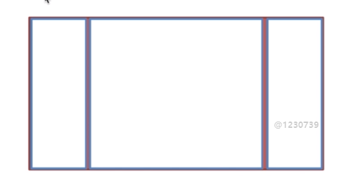
题目:假设高度已知,请写出三栏布局,其中,左栏、右栏宽度各位300px,中间自适应
  1 <!DOCTYPE html>
  2 <html lang="en">
  3 <head>
  4     <meta charset="UTF-8">
  5     <title>layout</title>
  6     <style type="text/css">
  7         *{
  8             margin: 0;
  9             padding: 0;
 10         }
 11         .layout{
 12             margin-top: 20px;
 13         }
 14         .layout div{
 15             height: 100px;
 16         }
 17     </style>
 18 </head>
 19 <body>
 20 <!--浮动布局-->
 21     <section class="layout float">
 22         <style type="text/css">
 23             .layout.float .left{
 24                 float: left;
 25                 left: 0;
 26                 width: 300px;
 27                 background: red;
 28             }
 29             .layout.float .right{
 30                 float: right;
 31                 right: 0;
 32                 width: 300px;
 33                 background: blue;
 34             }
 35             .layout.float .center{
 36                 margin: 0 300px;
 37                 background: yellow;
 38             }
 39         </style>
 40         <div class="left"></div>
 41         <div class="right"></div>
 42         <div class="center">
 43             测试一下float布局效果~
 44         </div>
 45     </section>
 46 <!--绝对布局-->
 47     <section class="layout absolute">
 48         <style type="text/css">
 49             .layout.absolute .left{
 50                 position: absolute;
 51                 left: 0;
 52                 width: 300px;
 53                 background: red;
 54             }
 55             .layout.absolute .right{
 56                 position: absolute;
 57                 right: 0;
 58                 width: 300px;
 59                 background: blue;
 60             }
 61             .layout.absolute .center{
 62                 position: absolute;
 63                 left: 300px;
 64                 right: 300px;
 65                 background: yellow;
 66             }
 67         </style>
 68         <div class="left"></div>
 69         <div class="right"></div>
 70         <div class="center">
 71             测试一下absolute布局效果~
 72         </div>
 73     </section>
 74 <!--flexBox布局-->
 75     <section class="layout flex">
 76         <style type="text/css">
 77             .layout.flex{
 78                 display: -webkit-flex;
 79                 display: flex;
 80                 margin-top: 140px;
 81             }
 82             .layout.flex .left{
 83                 width: 300px;
 84                 background: red;
 85             }
 86             .layout.flex .right{
 87                 width: 300px;
 88                 background: blue;
 89             }
 90             .layout.flex .center{
 91                 flex: 1;
 92                 background: yellow;
 93             }
 94
 95         </style>
 96         <div class="left"></div>
 97         <div class="center">测试一下flex布局</div>
 98         <div class="right"></div>
 99
100     </section>
101 <!--网格布局-->
102     <section class="layout gird">
103         <style type="text/css">
104             .layout.gird{
105                 display: grid;
106                 grid-template: 100px/300px 1fr 300px;
107             }
108             .layout .left{
109                 background: red;
110             }
111             .layout .right{
112                 background: blue;
113             }
114             .layout .center{
115                 background: yellow;
116             }
117         </style>
118         <div class="left"></div>
119         <div class="center">测试一下grid布局</div>
120         <div class="right"></div>
121
122     </section>
123 <!--表格布局-->
124     <section class="layout table">
125         <style>
126             .layout.table{
127                 width: 100%;
128                 display: table;
129                 height: 100px;
130             }
131             .layout .left{
132                 display: table-cell;
133                 width: 300px;
134                 background: red;
135             }
136             .layout .right{
137                 display: table-cell;
138                 width: 300px;
139                 background: blue;
140             }
141         </style>
142         <div class="left"></div>
143         <div class="center">测试一下table布局</div>
144         <div class="right"></div>
145     </section>
146 </body>
147 </html>
五种解决方案的优缺点
1、浮动
优点:兼容性好
缺点:需要清除浮动
2、绝对定位
优点:快捷,不容易出问题
缺点:绝对定位是脱离文档流的,该元素以下的元素也得是脱离文档流的,可使用性比较差
3、flex布局
现在的移动端,基本上使用flex布局,结合了浮动与绝对布局的优势
IE8不支持flex布局
4、表格布局
优点:兼容性好
缺点:操作繁琐,SEO不太友好,高度同时增高。
5、grid布局