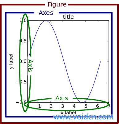
一.matplotlib数据可视化
1.https://matplotlib.org/
2.figure图形窗口;figsize窗口大小,label轴标签;title标题;lim限制;plot绘图;subplot绘制子图;show显示;
bar柱状图;legend图例;width宽度;scatter散点图;axis坐标轴;等高线图contours;image图片;动画animation
figure--画板;axes--画布;
一.坐标轴


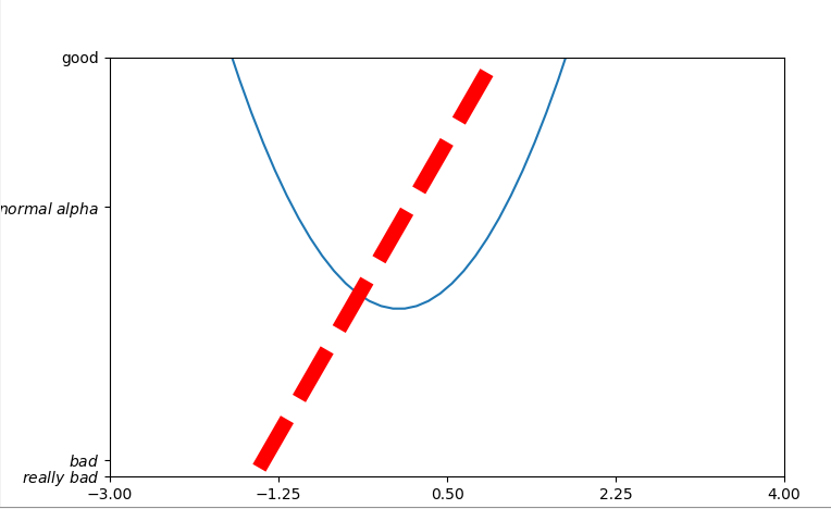
 1 import matplotlib.pyplot as plt
 2 import numpy as np
 3 x=np.linspace(-3,3,50)#生成-1到1的50个点,等差
 4 y1=2*x+1
 5 y2=x**2
 6
 7 #创建一个新的窗口,绘制第一张图
 8 plt.figure()#创建一张新的figure,以下进行操作
 9 plt.plot(x,y1)#绘制图形
10
11 #创建一个新的窗口,绘制第二张图
12 plt.figure(num=3,figsize=(8,5))#num指明是第几张figure,figsize指明figure的长宽
13 plt.plot(x,y2)#绘制图形
14 plt.plot(x,y1,color='red',linewidth=10,linestyle='--')#在同样的figure窗口再绘一个图形,指明颜色,线宽,线的表示
15
16 #设置x,y轴的范围
17 plt.xlim(-1,2)
18 plt.ylim(-2,3)
19
20 #设置x,y轴的标签(说明)
21 plt.xlabel('x lable')
22 plt.ylabel('y lable')
23
24 #设置x,y的范围以及单位轴长,以及程度标记
25 new_ticks=np.linspace(-3,4,5)#-3到4 ,共5格
26 print(new_ticks)
27 plt.xticks(new_ticks)
28 plt.yticks([-2,-1.8,1.22,3],
29            ['$really bad$',r'$bad$',r'$normal alpha$','good','really good'])
30
31 plt.show()#显示所有图形
32 ----------------------------------------------------------------
33 [-3.   -1.25  0.5   2.25  4.  ]
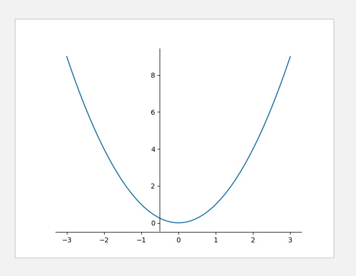
 1 import matplotlib.pyplot as plt
 2 import numpy as np
 3 x=np.linspace(-3,3,50)
 4 y=x**2
 5 plt.figure()
 6 plt.plot(x,y)
 7
 8 #gca='get current axis'得到现在的轴(四个边框)
 9 ax=plt.gca()
10 ax.spines['right'].set_color('none')#去除右边的边框
11 ax.spines['top'].set_color('none')#去除上面的边框
12 ax.xaxis.set_ticks_position('bottom')#把下边的框代替x轴
13 ax.yaxis.set_ticks_position('left')#把左边的框代替y轴
14 ax.spines['bottom'].set_position(('data',-0.5))#把下边框(x轴)放在y轴-0.5的位置
15 ax.spines['left'].set_position(('data',-0.5))#把左边框(y轴)放在x轴-0.5的位置
16
17 plt.show()
二.图例
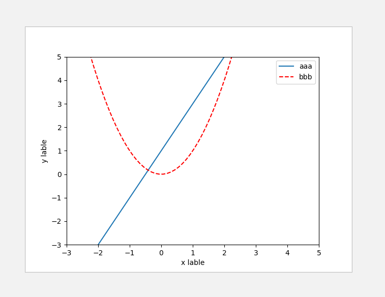
 1 # legend图例
 2 import matplotlib.pyplot as plt
 3 import numpy as np
 4 x=np.linspace(-3,3,50)
 5 y1=2*x+1
 6 y2=x**2
 7
 8 plt.figure()
 9 plt.xlim(-3,5)
10 plt.ylim(-3,5)
11 plt.xlabel('x lable')
12 plt.ylabel('y lable')
13
14 #添加图例 lable
15 l1,=plt.plot(x,y1,label='up')
16 l2,=plt.plot(x,y2,color='red',linestyle='--',label='down')
17 plt.legend(handles=[l1,l2],labels=['aaa','bbb'],loc='best')#添加图例:线、标签、位置(upper/right...)
18
19 plt.show()
三.注释
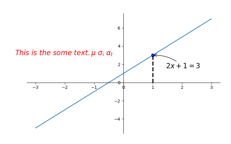
 1 import matplotlib.pyplot as plt
 2 import numpy as np
 3 x = np.linspace(-3, 3, 50)
 4 y = 2*x + 1
 5 plt.figure(num=1, figsize=(8, 5),)
 6 plt.plot(x, y,)
 7
 8 ax = plt.gca()
 9 ax.spines['right'].set_color('none')
10 ax.spines['top'].set_color('none')
11 ax.spines['top'].set_color('none')
12 ax.xaxis.set_ticks_position('bottom')
13 ax.spines['bottom'].set_position(('data', 0))
14 ax.yaxis.set_ticks_position('left')
15 ax.spines['left'].set_position(('data', 0))
16
17 x0 = 1
18 y0 = 2*x0 + 1
19 plt.plot([x0, x0,], [0, y0,], 'k--', linewidth=2.5)
20 plt.scatter([x0, ], [y0, ], s=50, color='b')
21
22 #添加文本注释
23 # method 1:
24 plt.annotate(r'$2x+1=%s$' % y0, xy=(x0, y0), xycoords='data', xytext=(+30, -30),
25              textcoords='offset points', fontsize=16,
26              arrowprops=dict(arrowstyle='->', connectionstyle="arc3,rad=.2"))
27 #文本、文本指向的坐标(x0, y0)、arrowprops方向线
28
29 # method 2:
30 plt.text(-3.7, 3, r'$This is the some text. mu sigma_i alpha_t$',
31          fontdict={'size': 16, 'color': 'r'})
32
33 plt.show()
34 ---------------------------------------------------------------
四.能见度
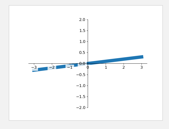
 1 #lick能见度
 2 import matplotlib.pyplot as plt
 3 import numpy as np
 4 x = np.linspace(-3, 3, 50)
 5 y = 0.1*x
 6
 7 plt.figure()
 8 plt.plot(x, y, linewidth=10, zorder=1)      # set zorder for ordering the plot in plt 2.0.2 or higher
 9 plt.ylim(-2, 2)
10 ax = plt.gca()
11 ax.spines['right'].set_color('none')
12 ax.spines['top'].set_color('none')
13 ax.spines['top'].set_color('none')
14 ax.xaxis.set_ticks_position('bottom')
15 ax.spines['bottom'].set_position(('data', 0))
16 ax.yaxis.set_ticks_position('left')
17 ax.spines['left'].set_position(('data', 0))
18
19 for label in ax.get_xticklabels() + ax.get_yticklabels():#拿出所有的label
20     label.set_fontsize(12)#设置大小
21     label.set_bbox(dict(facecolor='white', edgecolor='none', alpha=0.8, zorder=2))
22     #把label加上边框(背景颜色:white,边框颜色:无,透明度:80%,)
23 plt.show()
五.Scatter散点图
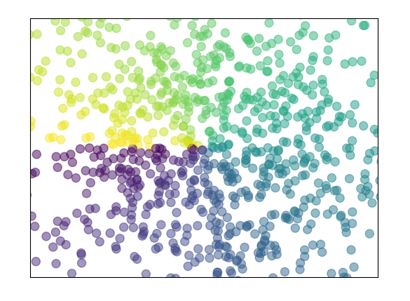
 1 import matplotlib.pyplot as plt
 2 import numpy as np
 3
 4 n = 1024    # data size
 5 X = np.random.normal(0, 1, n)#随机生成1024个数
 6 Y = np.random.normal(0, 1, n)
 7 T = np.arctan2(Y, X)    # for color later on
 8
 9 plt.scatter(X, Y, s=75, c=T, alpha=.5)#散点图
10 #size/color/alpha透明度
11 plt.xlim(-1.5, 1.5)#xlmit
12 plt.xticks(())  # ignore xticks
13 plt.ylim(-1.5, 1.5)
14 plt.yticks(())  # ignore yticks
15
16 plt.show()
六.柱状图bar
 1 import matplotlib.pyplot as plt
 2 import numpy as np
 3 n = 12
 4 X = np.arange(n)
 5 Y1 = (1 - X / float(n)) * np.random.uniform(0.5, 1.0, n)
 6 Y2 = (1 - X / float(n)) * np.random.uniform(0.5, 1.0, n)
 7
 8 plt.bar(X, +Y1, facecolor='#9999ff', edgecolor='white')#向上柱状图,主体颜色,边框颜色
 9 plt.bar(X, -Y2, facecolor='#ff9999', edgecolor='white')#向下柱状图
10
11 for x, y in zip(X, Y1):
12     # ha: horizontal alignment 横向对齐
13     # va: vertical alignment 纵向对齐
14     plt.text(x + 0.4, y + 0.05, '%.2f' % y, ha='center', va='bottom')#加注释,在离柱顶(0.4,0.05)处传入y值
15
16 for x, y in zip(X, Y2):
17     # ha: horizontal alignment
18     # va: vertical alignment
19     plt.text(x + 0.4, -y - 0.05, '-%.2f' % y, ha='center', va='top')
20
21 plt.xlim(-.5, n)
22 # plt.xticks(())
23 plt.ylim(-1.25, 1.25)
24 plt.yticks(())#y轴隐藏
25
26 plt.show()

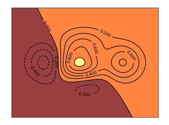
七.等高线图contours
 1 import matplotlib.pyplot as plt
 2 import numpy as np
 3
 4 def f(x,y):
 5     # the height function计算高度
 6     return (1 - x / 2 + x**5 + y**3) * np.exp(-x**2 -y**2)
 7
 8 n = 256
 9 x = np.linspace(-3, 3, n)
10 y = np.linspace(-3, 3, n)
11 X,Y = np.meshgrid(x, y)#把x,y绑定为网格
12
13 # use plt.contourf to filling contours
14 # X, Y and value for (X,Y) point
15 plt.contourf(X, Y, f(X, Y), 1, alpha=.75, cmap=plt.cm.hot)#等高线设置
16 #cmap对应颜色,热颜色'hot'/’cold‘,,8:分为8+2=10部分
17
18 # use plt.contour to add contour lines
19 C = plt.contour(X, Y, f(X, Y), 8, colors='black', linewidth=.5)#等高线的线设置
20 # adding label添加数字描线
21 plt.clabel(C, inline=True, fontsize=10)#等高线,线里面,大小
22
23 plt.xticks(())
24 plt.yticks(())
25 plt.show()
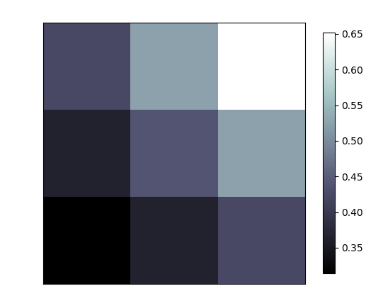
八.image图片
 1 import matplotlib.pyplot as plt
 2 import numpy as np
 3
 4 # image data
 5 a = np.array([0.313660827978, 0.365348418405, 0.423733120134,
 6               0.365348418405, 0.439599930621, 0.525083754405,
 7               0.423733120134, 0.525083754405, 0.651536351379]).reshape(3,3)
 8 #通过图片展示数据
 9
10 plt.imshow(a, interpolation='nearest', cmap='bone', origin='lower')
11 #展示图片(origin:位置。。。)
12 plt.colorbar(shrink=.92)#颜色对应参数,(压缩92%)
13
14 plt.xticks(())
15 plt.yticks(())
16 plt.show()
17 -----------------------------------------------
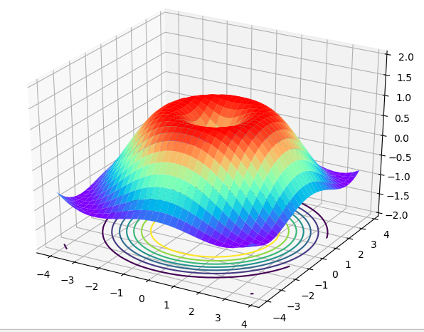
九.3d图像
 1 import numpy as np
 2 import matplotlib.pyplot as plt
 3 from mpl_toolkits.mplot3d import Axes3D#导入3d模块
 4
 5 fig = plt.figure()#定义一个窗口
 6 ax = Axes3D(fig)#在窗口中创建一个3d的图
 7 # X, Y value
 8 X = np.arange(-4, 4, 0.25)
 9 Y = np.arange(-4, 4, 0.25)
10 X, Y = np.meshgrid(X, Y)#网格
11 R = np.sqrt(X ** 2 + Y ** 2)
12 # height value高度
13 Z = np.sin(R)
14
15 ax.plot_surface(X, Y, Z, rstride=1, cstride=1, cmap=plt.get_cmap('rainbow'))
16 #(x,y,z,行跨度,列跨度,颜色彩虹)
17 ax.contour(X,Y,Z,zdir='z',offset=-2,camp='rainbow')
18 #等高线(x,y,z,从z轴压下去,放在z=-2的位置)
19
20 ax.set_zlim(-2, 2)
21
22 plt.show()
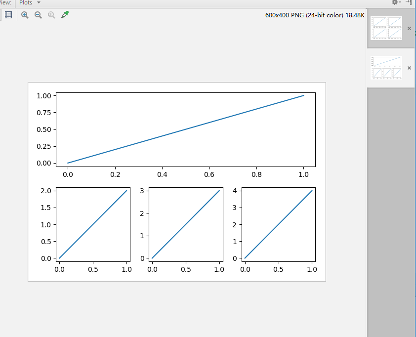
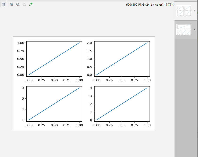
十.多合一
 1 import matplotlib.pyplot as plt
 2 plt.figure(figsize=(6, 4))#创建一个figure
 3 # plt.subplot(n_rows, n_cols, plot_num)
 4 plt.subplot(2, 2, 1)#把figure分成两行两列,第一张图
 5 plt.plot([0, 1], [0, 1])#画线
 6 plt.subplot(222)#figure两行两列,第二张图
 7 plt.plot([0, 1], [0, 2])
 8 plt.subplot(223)
 9 plt.plot([0, 1], [0, 3])
10 plt.subplot(224)
11 plt.plot([0, 1], [0, 4])
12
13 plt.tight_layout()
14 # example 2:
15 ###############################
16 plt.figure(figsize=(6, 4))
17 # plt.subplot(n_rows, n_cols, plot_num)
18 plt.subplot(2, 1, 1)
19 # figure splits into 2 rows, 1 col, plot to the 1st sub-fig
20 plt.plot([0, 1], [0, 1])
21
22 plt.subplot(234)
23 # figure splits into 2 rows, 3 col, plot to the 4th sub-fig
24 plt.plot([0, 1], [0, 2])
25
26 plt.subplot(235)
27 # figure splits into 2 rows, 3 col, plot to the 5th sub-fig
28 plt.plot([0, 1], [0, 3])
29
30 plt.subplot(236)
31 # figure splits into 2 rows, 3 col, plot to the 6th sub-fig
32 plt.plot([0, 1], [0, 4])
33
34
35 plt.tight_layout()
36 plt.show()
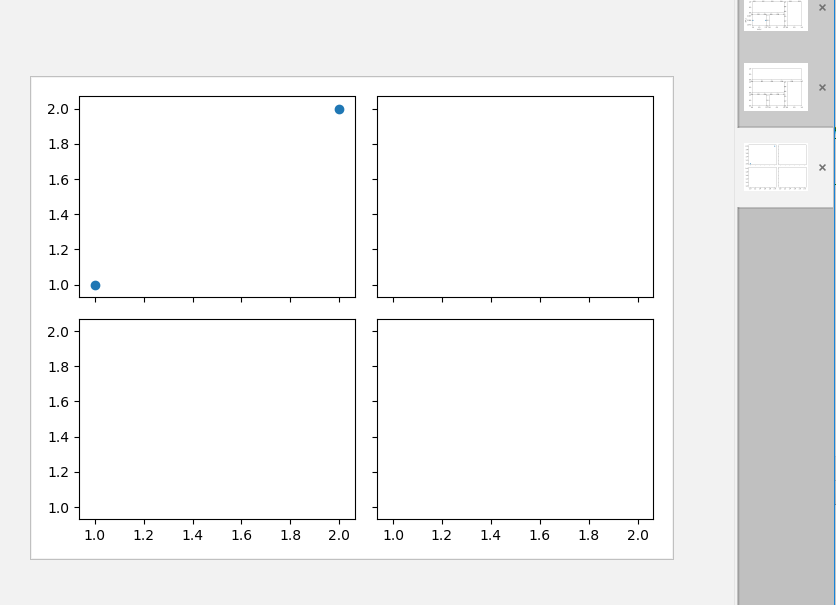
 1 import matplotlib.pyplot as plt
 2 import matplotlib.gridspec as gridspec
 3 # method 1: subplot2grid
 4 ##########################
 5 plt.figure()#创建一个figure
 6 ax1 = plt.subplot2grid((3, 3), (0, 0), colspan=3)#ax1:在整个figure(3,3),在(0,0)作图,跨度3个图
 7 #colspan行跨度,rowspan列跨度
 8 ax1.plot([1, 2], [1, 2])#在ax1上作图
 9 ax1.set_title('ax1_title')#设置标题
10 ax2 = plt.subplot2grid((3, 3), (1, 0), colspan=2)
11 ax3 = plt.subplot2grid((3, 3), (1, 2), rowspan=2)
12 ax4 = plt.subplot2grid((3, 3), (2, 0))
13 ax4.scatter([1, 2], [2, 2])#在ax4上画散点图
14 ax4.set_xlabel('ax4_x')
15 ax4.set_ylabel('ax4_y')
16 ax5 = plt.subplot2grid((3, 3), (2, 1))
17
18 # method 2: gridspec
19 #########################
20 plt.figure()
21 gs = gridspec.GridSpec(3, 3)#定义(3,3)的图
22 # use index from 0
23 ax6 = plt.subplot(gs[0, :])
24 ax7 = plt.subplot(gs[1, :2])
25 ax8 = plt.subplot(gs[1:, 2])
26 ax9 = plt.subplot(gs[-1, 0])
27 ax10 = plt.subplot(gs[-1, -2])
28
29 # method 3: easy to define structure
30 ####################################
31 f, ((ax11, ax12), (ax13, ax14)) = plt.subplots(2, 2, sharex=True, sharey=True)
32 #sharex,sharey共享x,y轴,定义一个(2,2)的figure,并给出格式(ax11, ax12), (ax13, ax14))
33 ax11.scatter([1,2], [1,2])
34
35 plt.tight_layout()
36 plt.show()
37 ---------------------------------------------------


十一.图中图
 1 #图中图
 2 import matplotlib.pyplot as plt
 3 fig = plt.figure()
 4 x = [1, 2, 3, 4, 5, 6, 7]
 5 y = [1, 3, 4, 2, 5, 8, 6]
 6
 7 # below are all percentage
 8 left, bottom, width, height = 0.1, 0.1, 0.8, 0.8#左,下的宽度,高度
 9 ax1 = fig.add_axes([left, bottom, width, height])  # main axes
10 ax1.plot(x, y, 'r')
11 ax1.set_xlabel('x')
12 ax1.set_ylabel('y')
13 ax1.set_title('title')
14
15
16 #添加另一个图
17 ax2 = fig.add_axes([0.2, 0.6, 0.25, 0.25])  # inside axes
18 #左,下,宽,高,:20%,60%,25%,25%
19 ax2.plot(y, x, 'b')
20 ax2.set_xlabel('x')
21 ax2.set_ylabel('y')
22 ax2.set_title('title inside 1')
23
24
25 #添加另一个图
26 # different method to add axes
27 ####################################
28 plt.axes([0.6, 0.2, 0.25, 0.25])
29 plt.plot(y[::-1], x, 'g')
30 plt.xlabel('x')
31 plt.ylabel('y')
32 plt.title('title inside 2')
33
34 plt.show()
35 -

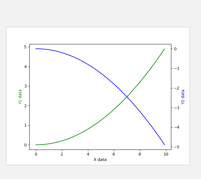
十二.次坐标轴
 1 #次坐标轴
 2 import matplotlib.pyplot as plt
 3 import numpy as np
 4
 5 x = np.arange(0, 10, 0.1)
 6 y1 = 0.05 * x**2
 7 y2 = -1 *y1
 8 fig, ax1 = plt.subplots()#创建一个figure,ax1是里面的子图
 9
10 ax2 = ax1.twinx()    # mirror the ax1   把y轴镜面反射
11 ax1.plot(x, y1, 'g-')
12 ax2.plot(x, y2, 'b-')
13
14 ax1.set_xlabel('X data')
15 ax1.set_ylabel('Y1 data', color='g')
16 ax2.set_ylabel('Y2 data', color='b')
17
18 plt.show()
十三.动画animation
 1 import numpy as np
 2 from matplotlib import pyplot as plt
 3 from matplotlib import animation#动画模块
 4
 5 fig, ax = plt.subplots()
 6
 7 x = np.arange(0, 2*np.pi, 0.01)
 8 line, = ax.plot(x, np.sin(x))
 9
10
11 def animate(i):#更新的方式
12     line.set_ydata(np.sin(x + i/10.0))  # update the data
13     return line,
14
15 def init():#初始帧
16     line.set_ydata(np.sin(x))
17     return line,
18
19 #产生动画(fig=fig,func:更新函数,frames:总共帧,init_func:初始帧,interval:频率,blit=False:无论点变化或不变化,都更新)
20 ani = animation.FuncAnimation(fig=fig, func=animate, frames=100, init_func=init,
21                               interval=20, blit=False)
22
23 plt.show()