

本质上是实现了一个eleUI select组件中的创建条目功能的组件,仅仅是将dropdown的选择框变成了label形式。支持eleUI的form表单校验,同时组件也提供了组件内自定义校验的方法。常规的用eleUI校验表单只需要在rules中正常定义:
rules: FormRules = {
    labels: [
      { required: true, type: 'array', message: '请选择标签', trigger: 'change' },
      { required: true, type: 'array', min: 3, max: 10,  message: '至少3个标签,最多添加10个标签', trigger: 'change' },
    ],
  };
eleUI表单校验的触发方式是组件内抛出一个emit事件(有change和on两种),在ElFormItem组件内会on监听这个事件,调用validate方法执行async-validator提供的校验。而form组件提供的this.$refs[formName].validate是通过遍历formItem调用每个ElFormItem组件内的validate方法。
组件默认用了size=small时的大小。
<template>
<div>
<div
class="input-content el-input--small"
@click.stop="onFocus">
<div ref="inputLabels" class="input-labels el-select__tags">
<!-- disable-transitions 必须禁用动画效果 否则在计算高度时延迟动画时长触发 -->
<el-tag
v-for="(tag, i) in value"
:key="tag"
class="tag"
size="mini"
closable
type="info"
disable-transitions
@close="onCloseTag(i)">
{{ tag }}
</el-tag>
<!-- 输入用 -->
<input
ref="input"
type="text"
class="input-label-show el-select__input"
v-model.trim="input"
@focus="onFocus"
@blur="isFocus = false"
@click.stop
@keydown.enter.prevent="onKeydownEnter" />
<div
v-if="max != 0"
class="limit-content">
{{ value.length }}/{{ max }}
</div>
</div>
<!-- 展示用 -->
<input
type="text"
class="el-input__inner"
:class="[
{ 'is-focus': isFocus },
{ 'is-error': isError },
{ 'is-success': isSuccess },
]"
:style="{ 'height': `${height}px` }"
:placeholder="currentPlaceholder" />
<!-- <div v-show="isError" class="el-form-item__error">{{ validateMessage }}</div> -->
</div>
<ul class="quick-selected-labels">
<li
v-for="tag in labelsToBeSelected"
:key="tag"
class="quick-label"
@click="onClickAddLabel(tag)">
<i class="quick-selected-icon el-icon-plus"></i>
{{ tag }}
</li>
</ul>
</div>
</template>
<script lang="ts">
import { Component, Prop, Vue, Emit, Watch } from 'vue-property-decorator';
import axios from '@/api/index';
@Component
export default class Labels extends Vue {
@Prop({ type: Array, default: (): any => [] }) value: string[];
@Prop({ type: Number, default: 0 }) min: number;
@Prop({ type: Number, default: 0 }) max: number;
@Prop(String) fieldId: string; // 领域
@Prop() initValue: any;
input: string = '';
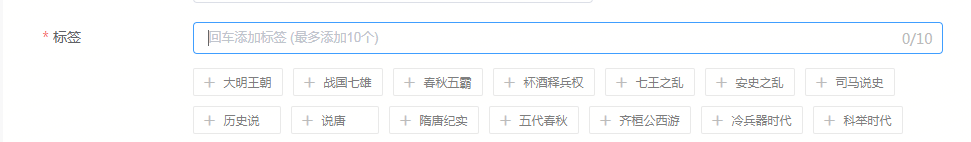
currentPlaceholder: string = '回车添加标签 (最多添加10个)';
isFocus: boolean = false;
height: number = 32; // 展示用input标签的高度
quickSelectedLabels: string[] = []; // 快速添加提供的标签
isError: boolean = false;
isSuccess: boolean = false;
validateMessage: string = ''; // 校验不通过提示信息
$refs: {
input: HTMLInputElement,
inputLabels: HTMLElement,
}
@Watch('value', { immediate: true, deep: true })
onWatchValue(val: string[]) {
if (val.length > 0 || this.input !== '') {
this.currentPlaceholder = '';
this.validate();
} else {
this.currentPlaceholder = '回车添加标签 (最多添加10个)';
}
this.resetInputHeight();
}
@Watch('input')
onWatchInput(val: string) {
if (this.value.length > 0 || this.input !== '') {
this.currentPlaceholder = '';
} else {
this.currentPlaceholder = '回车添加标签 (最多添加10个)';
}
}
@Watch('fieldId', { immediate: true })
onWatchField(val: string, oldVal: string) {
if (val === '' ||val === oldVal) return;
this.getQuickSelectedLabels(val);
this.$emit('input', []);
}
created() {
// this.getQuickSelectedLabels();
}
onFocus() {
this.isFocus = true;
this.$refs.input.focus();
}
/* 查询快速添加提供的标签 */
getQuickSelectedLabels(fieldId: string = '') {
this.quickSelectedLabels = ['接口查询出的标签或者默认的标签'];
}
/* 输入标签 */
onKeydownEnter(e: any) {
const val = this.input;
if (val === '') {
this.$message.warning('请勿输入空标签');
return;
}
const labels = [...this.value];
if (labels.includes(val)) {
this.$message.warning('重复的标签');
return;
}
this.input = '';
labels.push(val);
this.$emit('input', labels);
}
/* 删除标签 */
@Emit('input')
onCloseTag(i: number) {
let labels = [...this.value];
labels.splice(i, 1);
return labels;
}
/* 添加标签 */
@Emit('input')
onClickAddLabel(label: string) {
const labels = [...this.value];
labels.push(label);
return labels;
}
/* 计算快速选择的标签是否展示 */
get labelsToBeSelected() {
const tags: string[] = [];
this.quickSelectedLabels.forEach((tag) => {
if (!this.value.includes(tag)) {
tags.push(tag);
}
});
return tags;
}
/* 重置展示用input的高度 */
resetInputHeight() {
this.$nextTick(() => {
const initHeight = 32;
const dom = this.$refs.inputLabels;
this.height = this.value.length === 0
? initHeight
: Math.max(
dom ? (dom.clientHeight + (dom.clientHeight > initHeight ? 4 : 0)) : 0,
initHeight
);
});
}
/* elementUI 的 dispatch */
dispatch(componentName: string, eventName: string, params: any[]) {
let parent: any = this.$parent || this.$root;
const options: any = parent.$options;
let name = options.componentName;
while (parent && (!name || name !== componentName)) {
parent = parent.$parent;
if (parent) {
name = parent.$options.componentName;
}
}
if (parent) {
parent.$emit.apply(parent, [eventName].concat(params));
}
}
/* 检验 */
// @Emit('validate')
validate() {
this.dispatch('ElFormItem', 'el.form.change', [this.value]);
// const length = this.value.length;
// const min = this.min;
// const max = this.max;
// if (length === 0) {
// this.validateMessage = '请选择标签';
// this.isError = true;
// this.isSuccess = false;
// return false;
// } else if (min !== 0 && length < min) {
// this.validateMessage = `标签数量至少${min}个`;
// this.isError = true;
// this.isSuccess = false;
// return false;
// } else if (max !== 0 && length > max) {
// this.validateMessage = `标签数量至多${max}个`;
// this.isError = true;
// this.isSuccess = false;
// return false;
// }
// this.isError = false;
// this.isSuccess = true;
// return true;
}
}
</script>
<style>
.el-form-item.is-error .input-content .el-input__inner {
border-color: #f56c6c !important;
}
</style>
<style lang="css" scoped>
.input-content {
position: relative;
margin-bottom: 14px;
}
.input-content:hover .el-input__inner {
border-color: #c0c4cc;
}
.input-content:hover .is-focus {
border-color: #409eff;
}
.input-labels {
padding-right: 45px;
100%;
box-sizing: border-box;
}
.input-label-show {
flex-grow: 1;
}
.input-info {
font-size: 14px;
color: #bbb;
line-height: 14px;
}
.input-content .is-focus {
border-color: #409eff;
}
.input-content .is-error {
border-color: #f56c6c !important;
}
.is-success {
border-color: #67c23a;
}
.tag {
overflow: hidden;
position: relative;
margin-left: 4px;
margin-right: 0;
padding-right: 14px;
max- 146px;
min- 50px;
font-size: 12px;
color: #7e7e7e;
text-overflow: ellipsis;
white-space: nowrap;
background: rgba(239, 239, 239, .4);
border-radius: 2px;
box-sizing: border-box;
}
.tag:last-child {
margin-right: 0;
}
.quick-selected-labels {
overflow: hidden;
}
.quick-label {
float: left;
overflow: hidden;
position: relative;
margin: 0 10px 10px 0;
padding: 8px 10px 8px 30px;
max- 146px;
min- 88px;
height: 28px;
font-size: 12px;
color: #7e7e7e;
line-height: 11px;
text-overflow: ellipsis;
white-space: nowrap;
border: 1px solid #e9e9e9;
border-radius: 2px;
background-color: #fff;
cursor: pointer;
box-sizing: border-box;
}
.quick-label:hover {
background-color: rgba(144, 147, 153, .1);
}
.quick-selected-icon {
position: absolute;
top: 8px;
left: 10px;
12px;
height: 12px;
font-weight: 700;
color: #bbb;
}
.limit-content {
position: absolute;
top: 8px;
right: 10px;
font-family: PingFangSC-Regular;
font-size: 14px;
color: #bbb;
text-align: right;
line-height: 14px;
}
</style>
<style>
.tag .el-tag__close {
position: absolute;
top: 2px;
right: 0;
font-size: 14px;
}
</style>