代码:
<!DOCTYPE html>
<html>
<head>
<meta charset="utf-8">
<title>跳转九宫格</title>
<!--思路:画盒子16个(4+9+2+1)->九宫格格子->跳转-->
<style>
* {
margin: 0;
padding: 0;
}
#box {
600px;
height: 600px;
border-top: 1px solid #000;
border-left: 1px solid #000;
position:relative;
box-sizing: border-box;
display:inline-block;/*?*/
}
#box .table div {
box-sizing: border-box;
display: inline-block;
196px;
height: 200px;
border-right: 1px solid #000;
border-bottom: 1px solid #000;
}
#box .d1{
box-sizing: border-box;
position:absolute;
196px;
height: 200px;
background: red;
top: 0;
left: 0;
transition: top 1s,left 1s 1s,opacity 1ms 2s;
}
#box:hover .d1{
top: 200px;
left: 200px;
opacity: 0;
}
#box .d2 {
box-sizing: border-box;
position: absolute;
196px;
height: 200px;
background-color: red;
top: 200px;
left: 200px;
transition: top 1s 2s, left 1s 3s, visibility 1s 2s, opacity 1ms 4s;
visibility: hidden;
}
#box:hover .d2{
visibility: visible;
top: 0;
left: 400px;
opacity: 0;
}
#box .d3{
box-sizing: border-box;
position: absolute;
196px;
height: 200px;
background: red;
top: 0;
left:400px;
visibility: hidden;
transition: top 1s 4s,left 1s 5s,visibility 1s 4s,opacity 1ms 6s;
}
#box:hover .d3{
visibility: visible;
top: 408px;
left: 0;
opacity: 0;
}
#box .d4 {
box-sizing: border-box;
position: absolute;
196px;
height: 200px;
background-color: red;
top: 408px;
visibility: hidden;
transition: top 1s 6s,visibility 1ms 6s,opacity 1s 7s;
}
#box:hover .d4{
visibility: visible;
top: 0;
opacity: 0;
}
</style>
</head>
<body>
<div id="box">
<div class="content">
<div class="d1"></div>
<div class="d2"></div>
<div class="d3"></div>
<div class="d4"></div>
</div>
<div class="table">
<div ></div>
<div ></div>
<div ></div>
<div ></div>
<div ></div>
<div ></div>
<div ></div>
<div ></div>
<div ></div>
</div>
</div>
</body>
</html>
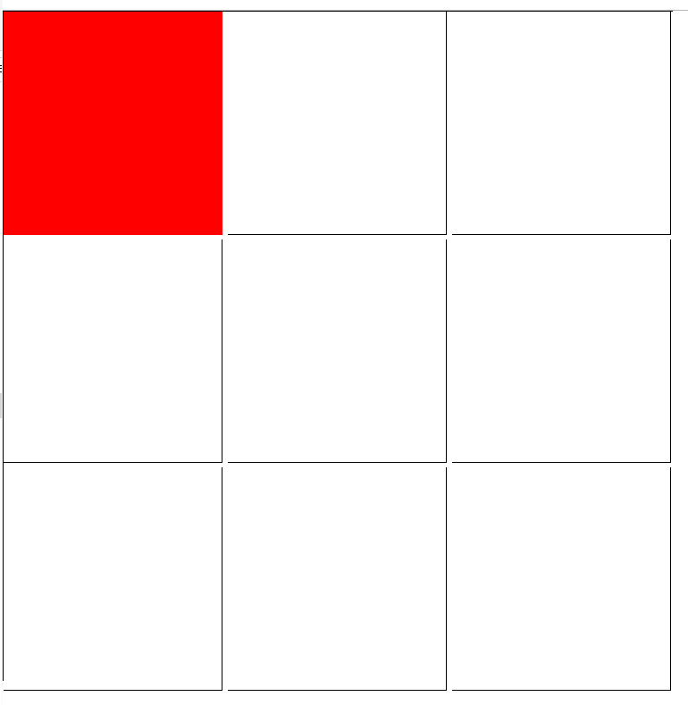
显示效果: