1:修改默认的placeholder颜色
::-webkit-input-placeholder { /* WebKit browsers */
    color: #a7a7a7;
}

:-moz-placeholder { /* Mozilla Firefox 4 to 18 */
    color: #a7a7a7;
}

:-moz-placeholder { /* Mozilla Firefox 19+ */
    color: #a7a7a7;
}

:-ms-input-placeholder { /* Internet Explorer 10+ */
    color: #a7a7a7;
}
2:复写掉ios的input样式(移动)
input[type=button],
input[type=submit] {
  -webkit-appearance: none;
  outline: none;
}
3:ios,overflow,滑动加惯性
-webkit-overflow-scrolling: touch;
4:复写checkbox和radio样式(一,适用于谷歌浏览器,或者移动端)
原理:去掉默认样式,根据:checked改变背景图
效果图:


<ul class="radioCon">
    <li>
        <label>
            <input type="radio" name="a">
            这里是第一个选项
        </label>
    </li>
    <li>
        <label>
            <input type="radio" name="a">
            这里是第二个选项
        </label>
    </li>
</ul>

input[type=radio]{
        -webkit-appearance: none;/*去掉系统自带的样式*/
        appearance: none;
         17px;
        height: 17px;
        background-image: url(default.png);/*默认显示*/
        background-repeat: no-repeat;
}
input[type=radio]:checked{
    background-image: url(checked.png);/*选中显示*/
}
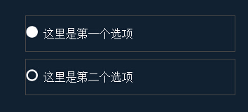
5:复写radio和checkbox的样式(二,适用于支持css:checked选择器的浏览器)
原理:隐藏元素,根据checked改变label的样式
效果图:

<ul class="radowConB">
    <li>
        <input type="radio" name="b" id="radioA">
        <label for="radioA">这里是选项1</label>
    </li>
    <li>
        <input type="radio" name="b" id="radioB">
        <label for="radioB">这里是选项1</label>
    </li>
</ul>

input[type=radio]{
    display: none;
}
label{
     100%;
    height: 100%;
    display: block;
}
input[type=radio]:checked + label{
    background-color: #424541;
}
6:关于手机横屏竖屏
css3媒体查询写法
@media (orientation: landscape) { } 横屏
@media (orientation: portrait) { }竖屏
js写法
window.addEventListener("onorientationchange" in window ? "orientationchange" : "resize", function() {
        if (window.orientation === 180 || window.orientation === 0) {
            alert('竖屏状态!');
        }
        if (window.orientation === 90 || window.orientation === -90 ){
            alert('横屏状态!');
        }

}, false);
7,移动页面适配方式之640适配,适用于有特效展示页面。核心是写viewport信息...o(╯□╰)o,写法↓
 1 <script type="text/javascript">
 2         var phoneWidth = parseInt(window.screen.width);
 3         var phoneScale = phoneWidth / 640;
 4         var ua = navigator.userAgent;
 5         if (/Android (d+.d+)/.test(ua)) {
 6             var version = parseFloat(RegExp.$1);
 7             if (version > 2.3) {
 8                 document.write('<meta name="viewport" content="width=640, initial-scale= ' + phoneScale + ' ,minimum-scale = ' + phoneScale + ', maximum-scale = ' + phoneScale + ', target-densitydpi=device-dpi">')
 9             } else {
10                 document.write('<meta name="viewport" content="width=640, initial-scale= ' + phoneScale + ' , target-densitydpi=device-dpi">')
11             }
12         } else {
13             document.write('<meta name="viewport" content="width=640, user-scalable=no, target-densitydpi=device-dpi">')
14         }
15     </script>
8,css文字两端对齐
<p>设计师<span></span></p>
<p>限量销售<span></span></p>
<p>限量销售设计<span></span></p>
css样式
p{
  width: 100%;
  text-align: justify;
}
p > span{
  display: inline-block;
   padding-left: 100%;
}
9,单行多余文字显示省略号
text-overflow:ellipsis;
white-space:nowrap;
overflow:hidden;
10,多行文本,多余文字显示省略号。移动端
overflow: hidden;
text-overflow: ellipsis;/*文本溢出包含元素时显示省略符号来代表被修剪的文本*/
display: -webkit-box;/*必须结合的属性 ,将对象作为弹性伸缩盒子模型显示 。*/
-webkit-line-clamp: 3;/*限制的行数 是一个 不规范的属性,它没有出现在 CSS 规范草案中。*/
-webkit-box-orient: vertical;/*规定框的子元素应该被水平或垂直排列。从上向下垂直排列子元素。*/
11,设置滚动条样式
//滚动条轨道
  ul::-webkit-scrollbar {
    width: 6px;
    background-color: rgba(0, 0, 0, 0.5);
  }
  //滚动条滑块
  ul::-webkit-scrollbar-thumb {
    background-color: rgba(255, 255, 255, 0.5);
  }
待发现,待解决,待更新……