网页设计中常常有一些重复性的工作需要我们去处理,为了避免不重复造轮子,我把一些常用的功能保存下来,以供日后使用。
一、菜单关闭与打开
很多情况下,为了不让菜单占用网页太多的空间,通常都是把菜单隐藏起来。当用户点击打开按钮时菜单显示,关闭时隐藏。
这样看起来很简单,当用户的要求可不止这些:
1. 点击页面除菜单和按钮以外的部分时关闭菜单;
2. 点击菜单部分菜单不能关闭。
效果图如下:
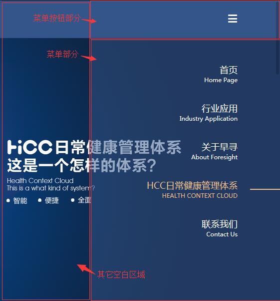
为了能理解这个功能,把代码贴上加深理解
<nav id="nav" role="navigation">
    <button type="button" class="menu" id="menu" title="展开/关闭菜单">
        <i class="iconfont icon-menu" id="iconMenu"></i>
    </button>
    <ul class="nav-list" id="navList">
        <li class="nav-item">
            <a href="index.html" title="首页">
                <span>首页</span>
                <span>Home page</span>
            </a>
        </li>
        <li class="nav-item">
            <a href="industry.html" title="行业应用">
                <span>行业应用</span>
                <span>Industry application</span>
            </a>
            <ul>
                <li>
                    <a href="industry.html#health" title="公共卫生">【公共卫生】智慧健康管理方案</a>
                </li>
                <li>
                    <a href="industry.html#aged" title="居家养老">【居家养老】智慧健康管理方案</a>
                </li>
            </ul>
        </li>
        <li class="nav-item">
            <a href="javascript:void(0)" title="关于早寻" class="active">
                <span>关于早寻</span>
                <span>About foresight</span>
            </a>
        </li>
        <li class="nav-item">
            <a href="hcc.html" title="HCC日常健康管理体系">
                <span>HCC日常健康管理体系</span>
                <span>HEALTH CONTEXT CLOUD</span>
            </a>
        </li>
        <li class="nav-item">
            <a href="contact.html" title="联系我们">
                <span>联系我们</span>
                <span>Contact us</span>
            </a>
        </li>
    </ul>
</nav>
#nav {
  z-index: 4;
  position: fixed;
  top: 0;
  right: 0;
  width: 380px;
  height: 100%;
}
#nav .menu {
  display: block;
  z-index: 5;
  width: 100%;
  height: 75px;
  text-align: center;
  background-color: transparent;
  padding-right: 85px;
  text-align: right;
}
#nav .menu i {
  display: inline-block;
  height: 75px;
  width: 75px;
  text-align: right;
  line-height: 75px;
  font-size: 20px;
  color: #fff;
}
#nav .nav-list {
  display: none;
  padding-top: 40px;
  padding-right: 85px;
  text-align: right;
  background-color: rgba(52, 85, 138, 0.5);
  height: 100%;
}
#nav .nav-list > li {
  margin-bottom: 15px;
}
#nav .nav-list > li:last-of-type {
  margin-bottom: 0;
}
#nav .nav-list > li a {
  position: relative;
  display: block;
  padding-top: 10px;
  padding-bottom: 10px;
  color: #fff;
  font-size: 18px;
}
#nav .nav-list > li a:hover,
#nav .nav-list > li a.active {
  color: #f0c18f;
}
#nav .nav-list > li a:hover:after,
#nav .nav-list > li a.active:after {
  content: "";
  position: absolute;
  top: 50%;
  right: -85px;
  width: 60px;
  height: 2px;
  background-color: #f0c18f;
  margin-top: -1px;
}
#nav .nav-list > li > a > span {
  display: block;
}
#nav .nav-list > li > a > span:first-of-type {
  font-size: 18px;
}
#nav .nav-list > li > a > span:last-of-type {
  font-size: 12px;
  text-transform: capitalize;
}
#nav .nav-list > li ul {
  display: none;
}
#nav .nav-list > li ul li a {
  display: block;
  padding-top: 5px;
  padding-bottom: 5px;
  color: #fff;
  font-size: 16px;
}
//显示和关闭导航
$("#menu").on("click", function(e){
    $("#navList").slideToggle(400);
    $(document).on("click",function(){
        $("#navList").slideUp(400);
    });
    e.stopPropagation();
});
$("#navList").on("click",function(e){
    e.stopPropagation();
});
1. 这里主要就是用到了阻止冒泡
2. stopPropagation 阻止事件冒泡到父元素,阻止任何父事件处理程序被执行
3. 如果在 "menu" 点击方法中没有 stopPropagation() 方法的话,点击事件将会被冒泡到 doucument dom ,而他的方法将会使菜单收起,所以当点击菜单按钮后,菜单展开,然后马上关闭。
4. 如果在 "navList" 点击方法中没有 stopPropagation() 方法的话,点击事件也会冒泡到 document dom,也就是说,当点击菜单部分后,菜单会马上关闭。
于是上面的代码就实现了以下几点功能:
1. 点击菜单按钮,如果菜单是关闭的,就打开菜单,如果菜单是打开的,就收起菜单;
2. 点击除了菜单按钮和菜单部分的区域时,菜单收起;
3. 点击菜单部分区域时,菜单依然保持打开状态。