<!DOCTYPE html>
<html lang="en">
<head>
    <meta charset="UTF-8">
    <title>Title</title>
    <style>
        p{
            color: rgba(100,230,30,0.8);/*0.8为透明度*/
            font-size: smaller;
            font-weight: bold;
            background-color: yellow;
        }
        .back{
            border: 1px solid red;
            width: 800px;
            height: 800px;
            background-image: url("111.jpg");
            /*background-repeat: no-repeat;*/
            background-position: 0 center;
        }

    </style>


</head>
<body>
<p>举头望明月</p>
<div class="back"></div>
</body>
</html>
背景属性
<!DOCTYPE html>
<html lang="en">
<head>
    <meta charset="UTF-8">
    <title>Title</title>
    <style>
        span{
            display: inline-block;/*改变内联元素的属性,可以设置宽高*/
            width: 18px;
            height: 20px;
            background-image: url("http://dig.chouti.com/images/icon_18_118.png?v=2.13");
            background-position: 0 -100px;
        }
    </style>

</head>
<body>
    <span></span>
    <span></span>
    <span></span>
    <span></span>
    <span></span>
</body>
</html>
1.文本
1.文本颜色:color
颜色属性被用来设置文字的颜色。
颜色是通过CSS最经常的指定:
- 十六进制值 - 如: #FF0000
- 一个RGB值 - 如: RGB(255,0,0)
- 颜色的名称 - 如: red
2.水平对齐方式
text-align 属性规定元素中的文本的水平对齐方式。
- left 把文本排列到左边。默认值:由浏览器决定。
- right 把文本排列到右边。
- center 把文本排列到中间。
- justify 实现两端对齐文本效果。
2.文本其他操作
font-size: 10px;

line-height: 200px;   文本行高 通俗的讲,文字高度加上文字上下的空白区域的高度 50%:基于字体大小的百分比

vertical-align:-4px  设置元素内容的垂直对齐方式 ,只对行内元素有效,对块级元素无效


text-decoration:none       text-decoration 属性用来设置或删除文本的装饰。主要是用来删除链接的下划线

font-family: 'Lucida Bright'

font-weight: lighter/bold/border/

font-style: oblique

text-indent: 150px;      首行缩进150px

letter-spacing: 10px;  字母间距

word-spacing: 20px;  单词间距

text-transform: capitalize/uppercase/lowercase ; 文本转换,用于所有字句变成大写或小写字母,或每个单词的首字母大写


*/
<!DOCTYPE html>
<html lang="en">
<head>
    <meta charset="UTF-8">
    <title>Title</title>
    <style>
        div{
            text-transform: capitalize;
            word-spacing: 20px;
            letter-spacing: 10px;
            text-indent: 150px;
            height: 100px;
            background-color: aquamarine;
            text-align: center;
            /*line-height: 100px;*/
        }
    </style>
</head>
<body>


<div>介绍文本属性介绍文本属性介绍文本属性介绍文本属性介绍文本属性介绍文本属性介绍文本属性介绍文本属性介绍文本属性介绍文本属性介绍文本属性介绍文本属性介绍文本属性介绍文本属性介绍文本属性介绍文本属性介绍文本属性介绍文本属性介绍文本属性</div>


<div>hello world hello world hello world hello world hello world hello world hello world</div>
</body>
</html>
3.背景属性
- background-color
- background-image
- background-repeat
- background-position
background-color: cornflowerblue

background-image: url('1.jpg');

background-repeat: no-repeat;(repeat:平铺满)

background-position: right top(20px 20px);
简写:background:#ffffff url('1.png') no-repeat right top;
4.边框属性
5.列表属性


<!DOCTYPE html>
<html lang="en">
<head>
    <meta charset="UTF-8">
    <title>Title</title>
    <style>
        ol,ul{
            list-style: circle;
        }
    </style>
</head>
<body>

<ol>
    <li>111</li>
    <li>122</li>
    <li>134</li>
</ol>

<ul>
    <li>111</li>
    <li>122</li>
    <li>134</li>
</ul>

<dl>
    <dt>河北省</dt>
    <dd>廊坊</dd>
    <dd>保定</dd>
    <dd>石家庄</dd>
</dl>
</body>
</html>
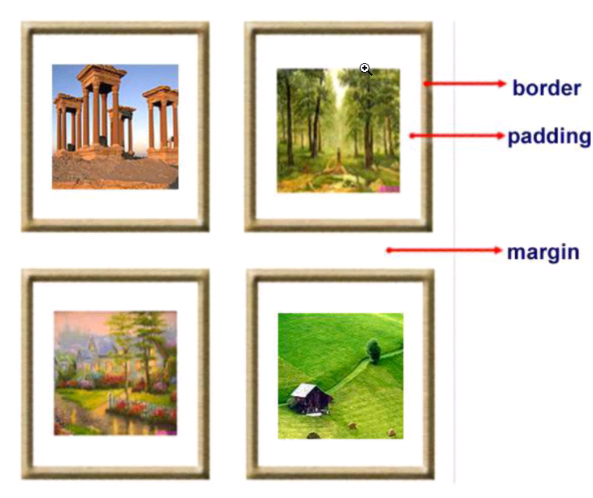
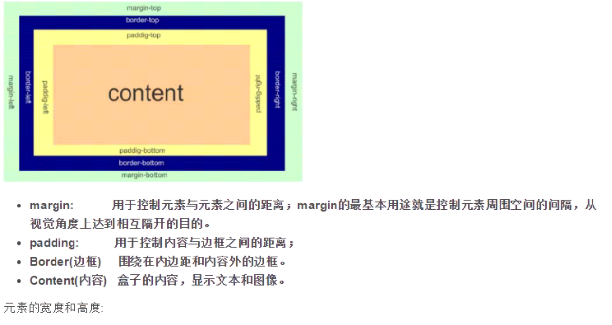
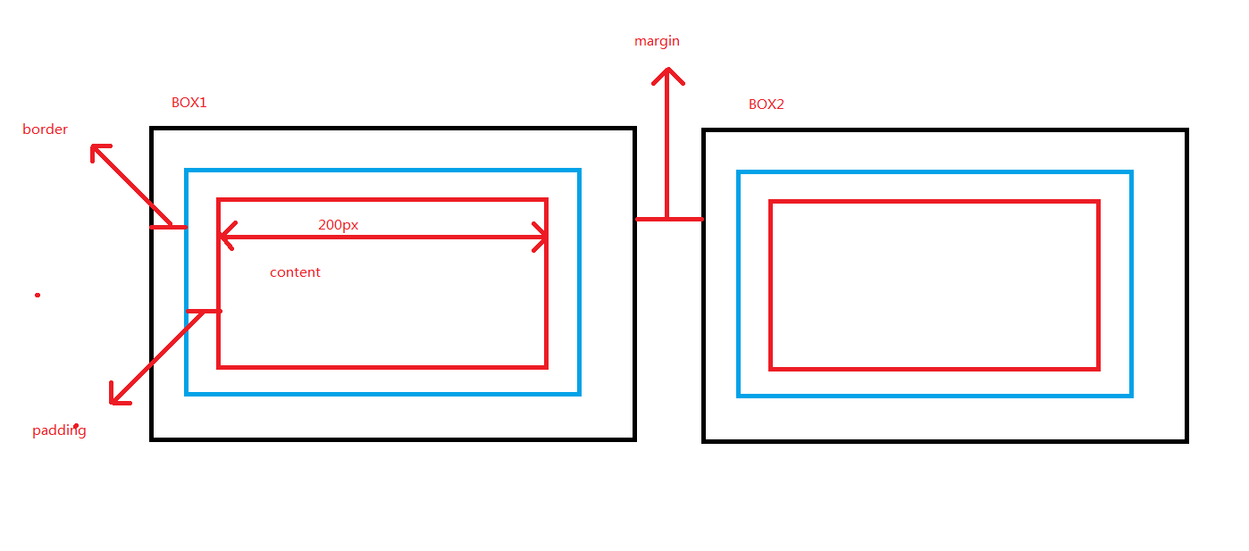
6.外边距(margin)和内边距(padding)
1.盒子模型
- margin: 用于控制元素与元素之间的距离;margin的最基本用途就是控制元素周围空间的间隔,从视觉角度上达到相互隔开的目的。
- padding: 用于控制内容与边框之间的距离;
- Border(边框): 围绕在内边距和内容外的边框。
- Content(内容): 盒子的内容,显示文本和图像。
<!DOCTYPE html>
<html lang="en">
<head>
    <meta charset="UTF-8">
    <title>Title</title>
    <style>
        .div1{
            width: 200px;
            height: 200px;
            background-color: coral;
            border: 40px solid rebeccapurple;
            padding: 40px;
            margin: 20px;
        }
        .div2{
            width: 200px;
            height: 200px;
            background-color: lightblue;
            /*border: 20px solid red;*/
            /*padding: 5px;*/
            /*margin-top: 40px;*/
        }
        .outer{
            height: 1000px;
            background-color: aquamarine;
            /*border: 1px red solid;*/
            /*padding: 1px;*/
            overflow: hidden;
        }
        .outer2{
            width: 1000px;
            height: 1500px;
            background-color: firebrick;
        }
        body{
            border: 2px solid darkcyan;
            margin: 0px;
        }
    </style>
</head>
<body>
    <div class="outer2">
        <div class="outer">
            <div class="div1">hello div1</div>
            <div class="div2"></div>
            <span>hahahah</span>
            <sapn>xxxxxxxxxx</sapn>
        </div>
    </div>


</body>
</html>
2.margin(外边距)
单边外边距属性:
margin-top:100px;
margin-bottom:100px;
margin-right:50px;
margin-left:50px;
margin:10px 20px 20px 10px;

        上边距为10px
        右边距为20px
        下边距为20px
        左边距为10px

margin:10px 20px 10px;

        上边距为10px
        左右边距为20px
        下边距为10px

margin:10px 20px;

        上下边距为10px
        左右边距为20px

margin:25px;

        所有的4个边距都是25px
居中应用
margin: 0 auto;
3.padding(内边距)
单独使用填充属性可以改变上下左右的填充。缩写填充属性也可以使用,一旦改变一切都改变。
设置同margine;
思考1:body的外边距
边框在默认情况下会定位于浏览器窗口的左上角,但是并没有紧贴着浏览器的窗口的边框,这是因为body本身也是一个盒子(外层还有html),在默认情况下, body距离html会有若干像素的margin,具体数值因各个浏览器不尽相同,所以body中的盒子不会紧贴浏览器窗口的边框了,为了验证这一点,加上
body{
    border: 1px solid;
    background-color: cadetblue;
}
>>>>解决方法:
body{
    margin: 0;
}
思考2:margin collapse(边界塌陷或者说边界重叠)
1、兄弟div:
上面div的margin-bottom和下面div的margin-top会塌陷,也就是会取上下两者margin里最大值作为显示值
2、父子div:
if 父级div中没有border,padding,inlinecontent,子级div的margin会一直向上找,直到找到某个标签包括border,padding,inline content中的其中一个,然后按此div 进行margin;
<!DOCTYPE html>
<html lang="en" style="padding: 0px">
<head>
    <meta charset="UTF-8">
    <title>Title</title>
    <style>

        body{
            margin: 0px;
        }

        .div1{
            background-color: rebeccapurple;
            width: 300px;
            height: 300px;
            overflow: hidden;

        }
        .div2{
            background-color: green;
            width: 100px;
            height: 100px;
            margin-bottom: 40px;
            margin-top: 20px;
        }
        .div3{
            background-color:teal;
            width: 100px;
            height: 100px;
            margin-top: 20px;
        }
    </style>
</head>
<body>
<div style="background-color: bisque; 300px;height: 300px"></div>

<div class="div1">

   <div class="div2"></div>
   <div class="div3"></div>
</div>

</body>

</html>
 解决方法:
overflow: hidden;
7.float属性
布局关键点:如何能够让可以调节长度的元素(标签)在一行显示
如果上一个是浮动的,那么就紧贴这
如果上一个不是浮动的,那么就保持垂直距离不变
基本浮动规则
先来了解一下block元素和inline元素在文档流中的排列方式。
block元素通常被现实为独立的一块,独占一行,多个block元素会各自新起一行,默认block元素宽度自动填满其父元素宽度。block元素可以设置width、height、margin、padding属性;
inline元素不会独占一行,多个相邻的行内元素会排列在同一行里,直到一行排列不下,才会新换一行,其宽度随元素的内容而变化。inline元素设置width、height属性无效
- 常见的块级元素有 div、form、table、p、pre、h1~h5、dl、ol、ul 等。
- 常见的内联元素有span、a、strong、em、label、input、select、textarea、img、br等
所谓的文档流,指的是元素排版布局过程中,元素会自动从左往右,从上往下的流式排列。
脱离文档流,也就是将元素从普通的布局排版中拿走,其他盒子在定位的时候,会当做脱离文档流的元素不存在而进行定位。
只有绝对定位absolute和浮动float才会脱离文档流
假如某个div元素A是浮动的,如果A元素上一个元素也是浮动的,那么A元素会跟随在上一个元素的后边(如果一行放不下这两个元素,那么A元素会被挤到下一行);如果A元素上一个元素是标准流中的元素,那么A的相对垂直位置不会改变,也就是说A的顶部总是和上一个元素的底部对齐。此外,浮动的框之后的block元素元素会认为这个框不存在,但其中的文本依然会为这个元素让出位置。 浮动的框之后的inline元素,会为这个框空出位置,然后按顺序排列。
<!DOCTYPE html>
<html lang="en">
<head>
    <meta charset="UTF-8">
    <title>Title</title>
    <style>
        *{
            margin: 0;
        }

        .r1{
            width: 300px;
            height: 100px;
            background-color: #7A77C8;
            float: left;
        }
        .r2{
            width: 200px;
            height: 200px;
            background-color: wheat;
            /*float: left;*/

        }
        .r3{
            width: 100px;
            height: 200px;
            background-color: darkgreen;
            float: left;
        }
    </style>
</head>
<body>

<div class="r1"></div>
<div class="r2"></div>
<div class="r3"></div>
注意:
当初float被设计的时候就是用来完成文本环绕的效果,所以文本不会被挡住,这是float的特性,即float是一种不切底的脱离文档流方式。无论多么复杂的布局,其基本出发点均是:“如何在一行显示多个div元素”
<!DOCTYPE html>
<html lang="en">
<head>
    <meta charset="UTF-8">
    <title>Title</title>
    <style>
        .div1{
            width: 100px;
            height: 100px;
            background-color: yellow;
            float: left;
        }
         .div2{
            width: 200px;
            height: 100px;
            background-color: rebeccapurple;
             float: left;
            clear: left;
        }
         .div3{
            width: 100px;
            height: 200px;
            background-color: green;
            float: left;
            clear: right;
        }
         .div4{
            width: 200px;
            height: 200px;
            background-color: yellow;
           float: left;
        }
    </style>
</head>
<body>
    <div class="div1"></div>
    <div class="div2"></div>
    <div class="div3"></div>
    <div class="div4"></div>
</body>
</html>

非完全脱离文档流
左右结构div盒子重叠现象,一般是由于相邻两个DIV一个使用浮动一个没有使用浮动。一个使用浮动一个没有导致DIV不是在同个“平面”上,但内容不会造成覆盖现象,只有DIV形成覆盖现象。
<!DOCTYPE html>
<html lang="en">
<head>
    <meta charset="UTF-8">
    <title>Title</title>
    <style>
        *{
            margin: 0;
        }

        .r1{
            width: 100px;
            height: 100px;
            background-color: #7A77C8;
            float: left;
        }
        .r2{
            width: 200px;
            height: 200px;
            background-color: wheat;

        }
    </style>
</head>
<body>

<div class="r1"></div>
<div class="r2">region2</div>
>>>>解决方法:要么都不使用浮动;要么都使用float浮动;要么对没有使用float浮动的DIV设置margin样式。
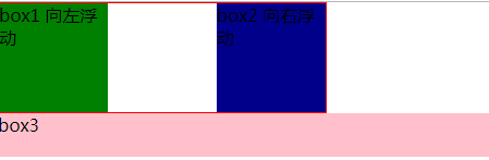
clear 清除浮动
        .clearfix:after{
            content:"";
            display: block;
            clear: both;
        }
<!DOCTYPE html>
<html lang="en">
<head>
    <meta charset="UTF-8">
    <title>Title</title>
    <style>
         * {
             margin:0;padding:0;
         }

        .container{
            border:1px solid red;
            width:300px;
            overflow: hidden;
        }
        #box1{
            background-color:green;
            width:100px;
            height:100px;
            float: left;
        }
        #box2{
            background-color:darkblue;
            width:100px;
            height:100px;
            float: right;
        }
         #box3{
             background-color:pink;
             height:40px;
         }
    </style>
</head>
<body>
    <div class="container">
        <div id="box1">box1 向左浮动</div>
        <div id="box2">box2 向右浮动</div>
    </div>
    <div id="box3">box3</div>

</body>
</html>
8.position定位
position的四种属性
1.static:默认位置
2.fixed:完全脱离文档流,固定定位(以可视窗口为参照物)
3.relative:相对定位(参照的是自己本身的位置),没有脱离文档流,没有顶上去,会保持自己的位置不动。可以使用top left进行定位
4.absolute:绝对定位:脱离了文档流(参照的是按已定位的父级标签定位,如果找不到会按body的去找)
注意!!:将定位标签设置为absolute,将他的父级标签设置为定位标签 (relative)
float和position的区别
float:半脱离文档流
position:全脱离文档流
<!DOCTYPE html>
<html lang="en">
<head>
    <meta charset="UTF-8">
    <title>Title</title>
    <style>
        *{
            margin: 0px;
        }
        .div1{
            width: 200px;
            height: 100px;
            background-color: beige;
        }
         .div2{
            width: 200px;
            height: 100px;
            background-color: rebeccapurple;
            /*position: relative;*/
             position: absolute;
            left: 100px;
            top:  100px;


        }
         .div3{
            width: 200px;
            height: 200px;
            background-color: green;
             /*position: relative;*/
             /*top:-100px;*/
             /**/
        }
         .div4{
            width: 200px;
            height: 200px;
            background-color: yellow;
        }
        .outer{
            position: relative;
        }
        .returnTop{
            width: 80px;
            height: 50px;
            position: fixed;
            bottom: 20px;
            right: 5px;
            background-color: gray;
            color: white;
            text-align: center;
            line-height: 50px;
        }
    </style>
</head>
<body>

<div style="height: 200px;background-color: aqua"></div>
<div class="outer">
    <div class="div1"></div>
    <div class="div2"></div>
    <div class="div3"></div>
    <div class="div4"></div>
</div>

<div style="height: 2000px;background-color: darkgoldenrod"></div>

<div class="returnTop">返回顶部</div>


</body>
</html>
9.display
<!DOCTYPE html>
<html lang="en">
<head>
    <meta charset="UTF-8">
    <title>Title</title>
    <style>
        .div2,p,a,span{
            width: 100px;
            height: 100px;
        }
        .div2{
            background-color: yellow;
            /*display: inline;*/
            display: none;
        }
        p{
            background-color: red;
            display: inline;
        }
        a{
             background-color: green;
             display: inline-block;
         }
        .outer{
            word-spacing: -8px;
        }
    </style>
</head>
<body>
    <div class="div2">divvvvv</div>
    <p>pppppp</p>


    <div class="outer">
        <span>spannnnnn</span>
        <a href="#">click</a>
    </div>
</body>
</html>