知识内容:
1.浮动相关
2.display属性
3.居中显示
4.盒模型和box-sizing
5.position属性
6.响应式设计
7.flex布局
8.其他
1.浮动相关
(1)float
float可以让一个元素浮动起来,可以让其向左浮动或者向右浮动
float实例:


 1 <!--__author__ = "wyb"-->
 2 <!DOCTYPE html>
 3 <html lang="en">
 4 <head>
 5     <meta charset="UTF-8">
 6     <title>文字环绕图形</title>
 7     <style>
 8         img{
 9             float: right;
10             width: 100px;
11             height: 100px;
12             margin: 5px;
13         }
14     </style>
15 </head>
16 <body>
17
18 <p style="margin: 0 auto;  333px;">
19     <img src="1.jpg" alt="">
20     This is some text. This is some text. This is some text.
21     This is some text. This is some text. This is some text.
22     This is some text. This is some text. This is some text.
23     This is some text. This is some text. This is some text.
24     This is some text. This is some text. This is some text.
25     This is some text. This is some text. This is some text.
26     This is some text. This is some text. This is some text.
27     This is some text. This is some text. This is some text.
28     This is some text. This is some text. This is some text.
29     This is some text. This is some text. This is some text.
30 </p>
31
32 </body>
33 </html>
(2)clear
clear用于控制浮动,一般是用来清除浮动,浮动会引发一些不好的后果,见下面的实例1,这些后果可以用实例2中的方法消除,即清除浮动
clear实例1:
 1 <!--__author__ = "wyb"-->
 2 <!DOCTYPE html>
 3 <html lang="en">
 4 <head>
 5     <meta charset="UTF-8">
 6     <title>clear</title>
 7     <style>
 8         .box {
 9             float: left;
10             width: 200px;
11             height: 100px;
12             margin: 1em;
13         }
14         .border1{
15             border: 1px solid red;
16         }
17         .border2 {
18             border: 1px solid darkgreen;
19         }
20     </style>
21 </head>
22 <body>
23
24 <div class="box border1">Box: 我浮起来了 浪啊</div>
25 <section class="border2" style="height: 50px; text-align: center">
26     Section: 在这个例子中, section 元素实际上是在 div 之后的(DOM结构上)。然而 div 元素是浮动到左边的,于是 section 中的文字
27     就围绕了 div ,并且 section 元素包围了整个元素。如果我们想让 section 显示在浮动元素之后呢?
28 </section>
29
30 </body>
31 </html>
clear实例2:
 1 <!--__author__ = "wyb"-->
 2 <!DOCTYPE html>
 3 <html lang="en">
 4 <head>
 5     <meta charset="UTF-8">
 6     <title>clear</title>
 7     <style>
 8         .box {
 9             float: left;
10             width: 200px;
11             height: 100px;
12             margin: 1em;
13         }
14         .border1{
15             border: 1px solid red;
16         }
17         .border2 {
18             border: 1px solid darkgreen;
19         }
20         .clear{
21             clear: left;
22         }
23     </style>
24 </head>
25 <body>
26
27 <div class="box border1">Box: 我浮起来了 浪啊</div>
28 <section class="border2 clear" style="height: 50px; text-align: center">
29     Section: 使用 clear 我们就可以将这个段落移动到浮动元素 div 下面;  用 left 清除元素的向左浮动;
30     还可以用 right 或 both 来清除向右浮动或同时清除向左向右浮动
31 </section>
32
33 </body>
34 </html>
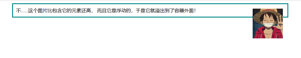
(3)清除浮动(图片溢出容器)
清除浮动实例1:
 1 <!--__author__ = "wyb"-->
 2 <!DOCTYPE html>
 3 <html lang="en">
 4 <head>
 5     <meta charset="UTF-8">
 6     <title>清除浮动</title>
 7     <style>
 8         img{
 9             float: right;
10             width: 100px;
11             height: 100px;
12             margin: 5px;
13         }
14         div{
15             margin: 0 auto;
16             width: 888px;
17             border: 3px solid darkcyan;
18             padding: 10px;
19         }
20     </style>
21 </head>
22 <body>
23
24 <div>
25     这个图片比包含它的元素还高, 而且它是浮动的,于是它就溢出到了容器外面!
26     <img src="1.jpg" alt="">
27 </div>
28
29 </body>
30 </html>
最后效果:
清除浮动实例2:
 1 <!--__author__ = "wyb"-->
 2 <!DOCTYPE html>
 3 <html lang="en">
 4 <head>
 5     <meta charset="UTF-8">
 6     <title>清除浮动</title>
 7     <style>
 8         img{
 9             float: right;
10             width: 100px;
11             height: 100px;
12             margin: 5px;
13         }
14         div{
15             margin: 0 auto;
16             width: 888px;
17             border: 3px solid darkcyan;
18             padding: 10px;
19         }
20         .clearfix {
21             overflow: auto;
22         }
23     </style>
24 </head>
25 <body>
26
27 <div class="clearfix">
28     这个图片比包含它的元素还高, 而且它是浮动的,于是它就溢出到了容器外面!
29     <img src="1.jpg" alt="">
30 </div>
31
32 </body>
33 </html>
最后效果:

清除浮动实例3
上述实例2的方法可以在现代浏览器上工作。如果想要支持IE6,就需要将实例2中的clearfix样式改成下面这个样子:
1 .clearfix {
2   overflow: auto;
3   zoom: 1;
4 }
(4)浮动布局
完全使用 float 来实现页面的布局是很常见的,下面是一个使用float实现布局的实例:
 1 <!--__author__ = "wyb"-->
 2 <!DOCTYPE html>
 3 <html lang="en">
 4 <head>
 5     <meta charset="UTF-8">
 6     <title>浮动布局</title>
 7     <style>
 8         nav {
 9             float: left;
10             width: 200px;
11             border: 3px solid darkblue;
12         }
13         section {
14             margin-left: 200px;
15             border: 3px solid darkred;
16         }
17         .container{
18             width: 888px;
19             margin: 0 auto;
20             border: 3px dotted #8628ff;
21         }
22         .clearfix{
23             overflow: auto;
24             zoom: 1;
25         }
26     </style>
27 </head>
28 <body>
29
30 <div class="container clearfix">
31     <nav>
32         nav:
33         <ul>
34             <li><a href="">首页</a></li>
35             <li><a href="">登录</a></li>
36             <li><a href="">注册</a></li>
37             <li><a href="">注册</a></li>
38             <li><a href="">注册</a></li>
39             <li><a href="">注册</a></li>
40             <li><a href="">注册</a></li>
41         </ul>
42     </nav>
43
44     <section>
45         section:
46         注意在容器上做了“清除浮动”!
47         当 nav 比非浮动的内容还要高时就需要清除浮动,否则可以不清除浮动
48     </section>
49
50     <section>
51         section:
52         this is some text.this is some text.this is some text.
53         this is some text.this is some text.this is some text.
54         this is some text.this is some text.this is some text.
55         this is some text.this is some text.this is some text.
56         this is some text.this is some text.this is some text.
57         this is some text.this is some text.this is some text.
58         this is some text.this is some text.this is some text.
59         this is some text.this is some text.this is some text.
60     </section>
61 </div>
62
63 </body>
64 </html>
2.display属性
(1)display
display 是CSS中最重要的用于控制布局的属性。每个元素都有一个默认的 display 值,这与元素的类型有关。对于大多数元素它们的默认值通常是 block 或 inline 。一个 block 元素通常被叫做块级元素。一个 inline 元素通常被叫做行内元素
(2)块级标签和内联标签
- 行内标签(内联标签):无法设置高度,宽度,padding,margin -> 例如span标签、a标签
- 块级标签:可以设置高度,宽度,padding ,margin -> 例如div标签、p标签
(3)display属性的值
- display: none; -- 让标签消失
- display: inline; -- 内联标签(行内标签)
- display: block; -- 块级标签
- display: inline-block; -- 既有inline的属性也有block属性
- 具有inline,默认自己有多少占多少
- 具有block,可以设置高度,宽度,padding margin
 1 <!--__author__ = "wyb"-->
 2 <!DOCTYPE html>
 3 <html lang="en">
 4 <head>
 5     <meta charset="UTF-8">
 6     <title>行内标签和块级标签通过display转换</title>
 7     <style>
 8         .inline{
 9             background: red;
10             display: inline;
11         }
12         .block{
13             background: red;
14             display: block;
15         }
16     </style>
17 </head>
18 <body>
19     <!--将块级标签变成行内标签-->
20     <div class="inline">div</div>
21     <!--将行内标签变成块级标签-->
22     <span class="block">span</span>
23 </body>
24 </html>
3.居中显示
(1)margin
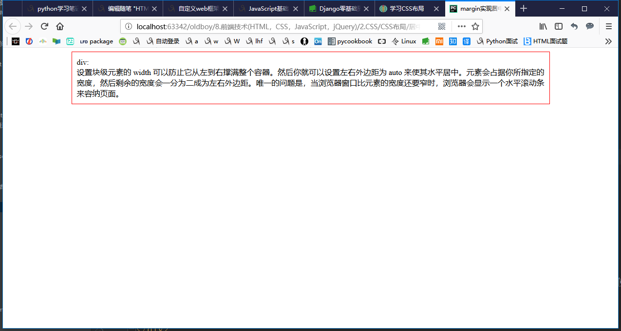
 1 <!--__author__ = "wyb"-->
 2 <!DOCTYPE html>
 3 <html lang="en">
 4 <head>
 5     <meta charset="UTF-8">
 6     <title>margin实现居中</title>
 7     <style>
 8         .container{
 9             width: 960px;
10             margin: 0 auto;
11             border: 1px solid red;
12             padding: 10px;
13         }
14     </style>
15 </head>
16 <body>
17
18 <div class="container">
19     div: <br/>
20     设置块级元素的 width 可以防止它从左到右撑满整个容器。然后你就可以设置左右外边距为 auto 来使其水平居中。元素会占据你所指定的宽度,
21     然后剩余的宽度会一分为二成为左右外边距。
22     唯一的问题是,当浏览器窗口比元素的宽度还要窄时,浏览器会显示一个水平滚动条来容纳页面。
23 </div>
24
25 </body>
26 </html>
效果:
(2)max-width
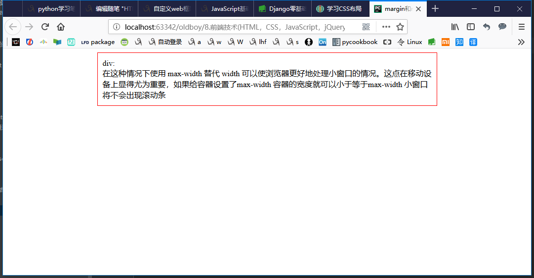
 1 <!--__author__ = "wyb"-->
 2 <!DOCTYPE html>
 3 <html lang="en">
 4 <head>
 5     <meta charset="UTF-8">
 6     <title>margin和max-width结合实现居中</title>
 7     <style>
 8         .container{
 9             max-width: 666px;
10             margin: 0 auto;
11             border: 1px solid red;
12             padding: 10px;
13         }
14     </style>
15 </head>
16 <body>
17
18 <div class="container">
19     div: <br/>
20     在这种情况下使用 max-width 替代 width 可以使浏览器更好地处理小窗口的情况。这点在移动设备上显得尤为重要,
21     如果给容器设置了max-width 容器的宽度就可以小于等于max-width 小窗口将不会出现滚动条
22 </div>
23
24 </body>
25 </html>
效果:

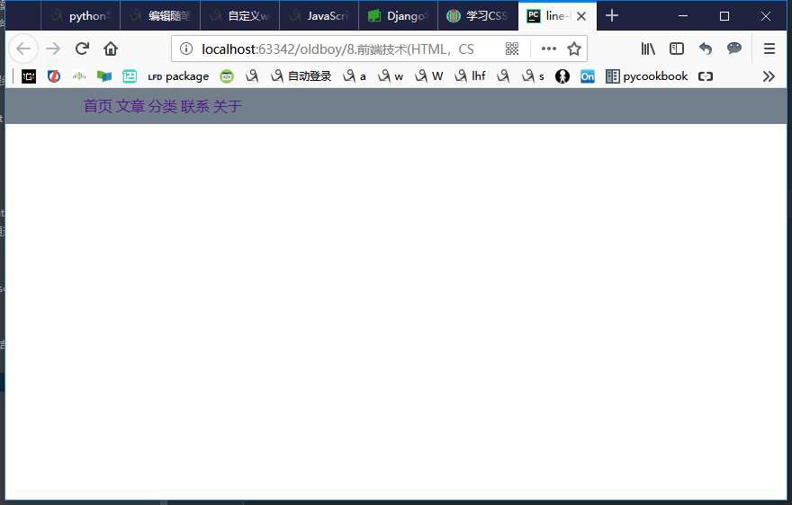
(3)line-height -> 设置垂直居中
 1 <!--__author__ = "wyb"-->
 2 <!DOCTYPE html>
 3 <html lang="en">
 4 <head>
 5     <meta charset="UTF-8">
 6     <title>line-height</title>
 7     <style>
 8         *{
 9             margin: 0;
10             padding: 0;
11         }
12         a{
13             text-decoration: none;
14         }
15         .content-box{
16             height: 40px;
17             background: #747F8C;
18         }
19         .content{
20             margin: 0 auto;
21             width: 80%;
22             /*下面实现上下居中*/
23             height: 40px;
24             line-height: 40px;
25         }
26     </style>
27 </head>
28 <body>
29 <div class="content-box">
30     <div class="content">
31         <a href="">首页</a>
32         <a href="">文章</a>
33         <a href="">分类</a>
34         <a href="">联系</a>
35         <a href="">关于</a>
36     </div>
37 </div>
38 </body>
39 </html>
效果:
(4)其他居中设置
- vertical-align: center -> 设置垂直居中
- text-align: center -> 设置水平居中
 1 <!DOCTYPE html>
 2 <html lang="en">
 3 <head>
 4     <meta charset="UTF-8">
 5     <title>vertical-align</title>
 6     <style>
 7         .outer .item {
 8              300px;
 9             height: 200px;
10             background-color: chartreuse;
11             display: inline-block;
12         }
13     </style>
14 </head>
15 <body>
16     <div class="outer">
17         <div class="item" style="vertical-align: center">ll</div>
18         <div class="item"></div>
19     </div>
20 </body>
21 </html>
 1 <!--__author__ = "wyb"-->
 2 <!DOCTYPE html>
 3 <html lang="en">
 4 <head>
 5     <meta charset="UTF-8">
 6     <title>text-align</title>
 7     <style>
 8         div{
 9             margin: 0 auto;
10              800px;
11             height: 350px;
12             border: 3px solid red;
13         }
14         .center{
15             text-align: center;
16         }
17         .left{
18             float: left;
19             border: 1px solid darkcyan;
20         }
21         .right{
22             float: right;
23             border: 1px solid darkcyan;
24         }
25         .chat{
26             display: inline-block;
27              150px;
28         }
29     </style>
30 </head>
31 <body>
32
33 <div>
34     <p class="center">这是居中的文本内容</p>
35     <p class="left chat">靠左文本内容</p>
36     <br>
37     <p class="right chat">靠右文本内容</p>
38 </div>
39
40 </body>
41 </html>
4.盒模型和box-sizing
(1)盒模型
- padding -> 内边距(控制内容与边框之间的距离)
- margin -> 外边距(控制元素与元素之间的距离)
- border -> 边框(围绕在内边距和内容外的边框)
- content -> 盒子中的内容,显示文本和图像
元素的大小由其中的内容和padding和border决定,margin是元素与元素之间的距离
注:两个挨着的margin浏览器最后会取其中的最大值
 1 <!--__author__ = "wyb"-->
 2 <!DOCTYPE html>
 3 <html lang="en">
 4 <head>
 5     <meta charset="UTF-8">
 6     <title>padding和margain</title>
 7     <style>
 8         *{
 9             padding: 0;
10             margin: 0;
11         }
12         .div{
13              200px; height: 200px;
14             background-color: red;
15             border: 10px solid seagreen;
16             padding: 20px;
17             margin: 20px;
18         }
19     </style>
20 </head>
21 <body>
22     <div class="div">hello, div</div>
23 </body>
24 </html>

(2)box-sizing
人们意识到传统的盒子模型不直接,所以新增了一个叫做 box-sizing 的CSS属性。当你设置一个元素为 box-sizing: border-box; 时,此元素的内边距和边框不再会增加它的宽度
 1 <!--__author__ = "wyb"-->
 2 <!DOCTYPE html>
 3 <html lang="en">
 4 <head>
 5     <meta charset="UTF-8">
 6     <title>box-sizing</title>
 7     <style>
 8         .container{
 9             max-width: 960px;
10             margin: 0 auto;
11         }
12         .simple {
13             width: 500px;
14             margin: 20px auto;
15             padding: 20px;
16             border: solid red 3px;
17             -webkit-box-sizing: border-box;
18             -moz-box-sizing: border-box;
19             box-sizing: border-box;
20         }
21
22         .fancy {
23             width: 500px;
24             margin: 20px auto;
25             padding: 50px;
26             border: solid blue 3px;
27             -webkit-box-sizing: border-box;
28             -moz-box-sizing: border-box;
29             box-sizing: border-box;
30         }
31     </style>
32 </head>
33 <body>
34
35 <div class="container">
36     <div class="simple">
37         div.simple: <br/>
38         我们现在一样大了
39     </div>
40
41     <div class="fancy">
42         div.fancy <br/>
43         666
44     </div>
45
46 </div>
47
48 </body>
49 </html>
如果想要页面上所有的元素都有如此表现,可以写上以下CSS代码:
1 * {
2   -webkit-box-sizing: border-box;
3      -moz-box-sizing: border-box;
4           box-sizing: border-box;
5 }
这样可以确保所有的元素都会用这种更直观的方式排版。
5.position属性(用于定位)
(1)fixed -> 固定在页面某个位置
一个固定定位(position属性的值为fixed)元素会相对于视窗来定位,这意味着即便页面滚动,它还是会停留在相同的位置
 1 <!--__author__ = "wyb"-->
 2 <!DOCTYPE html>
 3 <html lang="en">
 4 <head>
 5     <meta charset="UTF-8">
 6     <title>position_fixed</title>
 7     <style>
 8         .pg-header{
 9             position: fixed;
10             top: 0;
11             left: 0;
12             right: 0;
13             width: 100%;
14             height: 48px;
15             background-color: #2459a2;
16         }
17         .pg-body{
18             background-color: #ededed;
19             height: 3000px;
20             margin-top: 58px;
21             margin-left: 30px;
22             margin-right: 30px;
23         }
24         .return_top{
25             position: fixed;
26             right: 0;
27             bottom: 50px;
28             width: 80px;
29             height: 40px;
30             line-height: 40px;
31             background-color: #747F8C;
32         }
33     </style>
34 </head>
35 <body>
36
37 <div class="pg-header">
38     头部
39 </div>
40 <div class="pg-body">
41     内容
42 </div>
43
44 <div class="return_top">返回顶部</div>
45
46 </body>
47 </html>
(2)relative/absolute -> 联合使用进行相对定位
详细解释:https://segmentfault.com/a/1190000006924181
 1 <!--__author__ = "wyb"-->
 2 <!DOCTYPE html>
 3 <html lang="en">
 4 <head>
 5     <meta charset="UTF-8">
 6     <title>relative and absolute</title>
 7     <style>
 8         .container{
 9             position: relative;
10             width: 60%;
11             height: 200px;
12             border: 1px solid red;
13             margin: 0 auto;
14         }
15         .box{
16             position: absolute;
17             width: 70px;
18             height: 70px;
19             background: black;
20         }
21         .left_bottom{
22             left: 0;
23             bottom: 0;
24         }
25         .right_bottom{
26             right: 0;
27             bottom: 0;
28         }
29         .right_top{
30             right: 0;
31             top: 0;
32         }
33     </style>
34 </head>
35 <body>
36
37 <div class="container">
38     <div class="box left_bottom"></div>
39 </div>
40
41 <div class="container">
42     <div class="box right_bottom"></div>
43 </div>
44
45 <div class="container">
46     <div class="box right_top"></div>
47 </div>
48
49 </body>
50 </html>
6.响应式设计
“响应式设计(Responsive Design” 是一种让网站针对不同的浏览器和设备“呈现”不同显示效果的策略,这样可以让网站在任何情况下显示的很棒!
媒体查询是做此事所需的最强大的工具。让我们使用百分比宽度来布局,然后在浏览器变窄到无法容纳侧边栏中的菜单时,把布局显示成一列
响应式设计实例1:
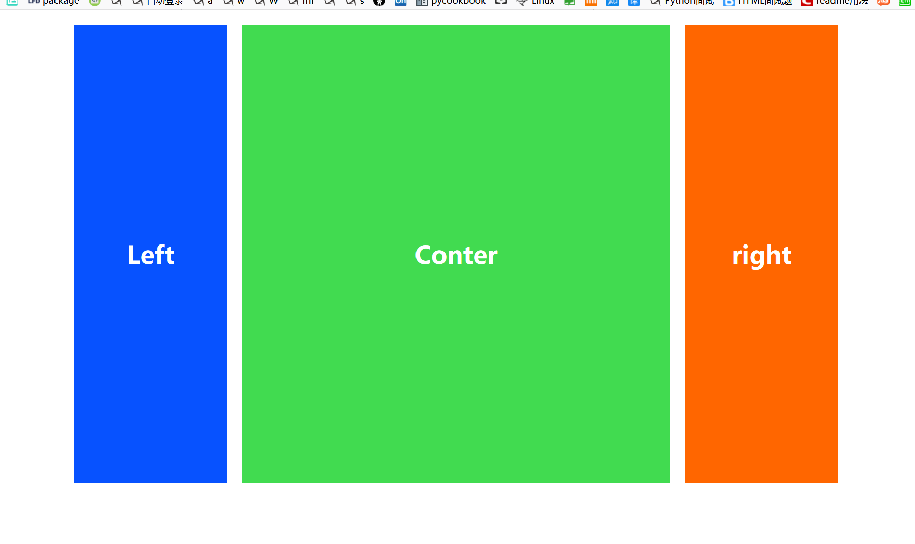
  1 <!DOCTYPE html>
  2 <html>
  3 <head lang="en">
  4     <meta charset="UTF-8">
  5     <title>自适应布局</title>
  6     <style>
  7         body{
  8             margin: 20px 0;
  9         }
 10         div#conterbody{
 11              960px;
 12             margin: auto;
 13         }
 14         div#left{
 15              740px;
 16             float: left;
 17         }
 18         p{
 19             line-height: 600px;
 20             text-align: center;
 21             font-weight: bold;
 22             font-size: 2em;
 23             margin: 0 0 20px 0;
 24             color: #ffffff;
 25         }
 26         p#left-z{
 27              200px;
 28             float: left;
 29             background-color: #0752ff;
 30         }
 31         p#left-y{
 32              520px;
 33             float: right;
 34             background-color: #41db50;
 35         }
 36         p#right{
 37              200px;
 38             float: right;
 39             background-color: #ff6600;
 40         }
 41
 42         /*大于1000px的时候*/
 43         @media screen and (min-1000px) {
 44             div#conterbody{
 45                  1000px;
 46             }
 47             div#left{
 48                  780px;
 49                 float: left;
 50             }
 51             p#left-z{
 52                  200px;
 53                 float: left;
 54                 background-color: #0752ff;
 55             }
 56             p#left-y{
 57                  560px;
 58                 float: right;
 59                 background-color: #41db50;
 60             }
 61             p#right{
 62                  200px;
 63                 float: right;
 64                 background-color: #ff6600;
 65             }
 66         }
 67         /*最大不超过999像素  最小不小于640px*/
 68         @media screen and (min-640px) and (max- 999px){
 69             div#conterbody{
 70                  640px;
 71             }
 72             div#left{
 73                  640px;
 74                 float: left;
 75             }
 76             p{
 77                 line-height: 430px;
 78             }
 79             p#left-z{
 80                  200px;
 81                 float: left;
 82             }
 83             p#left-y{
 84                 420px;
 85                 float: right;
 86             }
 87             p#right{
 88                  100%;
 89                 float: none;
 90                 clear: both;
 91                 line-height: 150px;
 92             }
 93         }
 94
 95         /*最大不超过639px*/
 96         @media screen and (max-639px){
 97             div#conterbody{
 98                  100%;
 99             }
100             div#left{
101                  100%;
102                 float: none;
103             }
104             p{
105                 line-height: 200px;
106             }
107             p#left-z{
108                 100%;
109                 float: none;
110             }
111             p#left-y{
112                 100%;
113                 float: none;
114             }
115             p#right{
116                  100%;
117                 float: none;
118                 clear: both;
119                 line-height: 200px;
120             }
121         }
122     </style>
123 </head>
124 <body>
125 <div id="conterbody">
126     <div id="left">
127         <p id="left-y">Conter</p>
128         <p id="left-z">Left</p>
129     </div>
130     <p id="right">right</p>
131 </div>
132 </body>
133 </html>
效果:
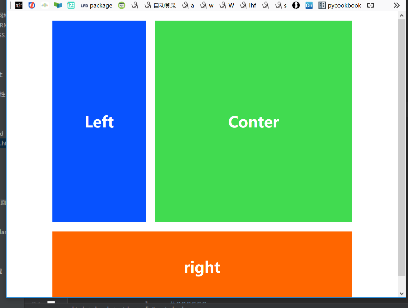
页面缩小后:

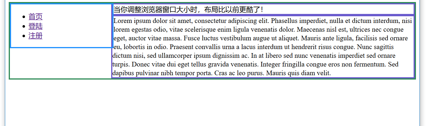
响应式设计实例2:
 1 <!--__author__ = "wyb"-->
 2 <!DOCTYPE html>
 3 <html lang="en">
 4 <head>
 5     <meta charset="UTF-8">
 6     <title>媒体查询</title>
 7     <style>
 8         div{
 9             border: 3px solid seagreen;
10         }
11         nav{
12             border: 3px solid dodgerblue;
13         }
14         section{
15             border: 3px solid slateblue;
16         }
17         /* 宽度大于等于600px时 */
18         @media screen and (min-600px) {
19             nav {
20                 float: left;
21                  25%;
22             }
23             section {
24                 margin-left: 25%;
25             }
26         }
27         /* 宽度小于等于599px时 */
28         @media screen and (max-599px) {
29             nav li {
30                 display: inline;
31             }
32         }
33     </style>
34 </head>
35 <body>
36
37 <div>
38     <nav>
39         <ul>
40             <li><a href="">首页</a></li>
41             <li><a href="">登陆</a></li>
42             <li><a href="">注册</a></li>
43         </ul>
44     </nav>
45
46     <section>
47         当你调整浏览器窗口大小时,布局比以前更酷了!
48     </section>
49
50     <section>
51         Lorem ipsum dolor sit amet, consectetur adipiscing elit. Phasellus imperdiet, nulla et
52         dictum interdum, nisi lorem egestas odio, vitae scelerisque enim ligula venenatis dolor.
53         Maecenas nisl est, ultrices nec congue eget, auctor vitae massa. Fusce luctus vestibulum
54         augue ut aliquet. Mauris ante ligula, facilisis sed ornare eu, lobortis in odio. Praesent
55         convallis urna a lacus interdum ut hendrerit risus congue. Nunc sagittis dictum nisi, sed
56         ullamcorper ipsum dignissim ac. In at libero sed nunc venenatis imperdiet sed ornare turpis.
57         Donec vitae dui eget tellus gravida venenatis. Integer fringilla congue eros non fermentum.
58         Sed dapibus pulvinar nibh tempor porta. Cras ac leo purus. Mauris quis diam velit.
59     </section>
60 </div>
61
62 </body>
63 </html>
效果:

7.flex布局 - 弹性盒子布局
(1)flexbox阅读资料
(2)flexbox布局与传统布局
- 传统的布局依赖HTML的结构,传统布局的实现与HTML的代码结构深度冗余, 当我们想要修改大体样式时(比如从三栏改成两栏)可能需要对其中一些元素进行大量修改
- 传统布局中元素定义的位置就基本上决定了它在页面中的显示位置,这样十分不灵活
- 无法在PC端和手机端之间实现响应式设计,传统布局无法实现元素在代码中的定义位置和显示位置无关
- 另外传统布局实现某些效果十分吃力
针对以上原因 W3C推出了flexbox布局 - 大道至简; 我们可以采用flexbox布局实现弹性布局,flexbox可以简便、完整、响应式地实现各种页面布局
(3)flexbox布局介绍
- 弹性盒模型又叫Flexbox,意为弹性布局,旨在通过弹性的方式来对齐 和分布容器中内容的空间,使其能适应不同屏幕,为盒装模型提供最大的灵活性。
- Flex布局主要思想是:让容器有能力让其子项目能够改变其宽度、高度(甚至是顺序),以最佳方式填充可用空间
- flexbox布局中的属性可以分为容器属性和元素属性,分别作用于flexbox布局中的容器和元素
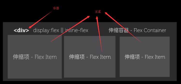
(4)flexbox中的容器和元素:
(5)flexbox中的容器属性和元素属性
容器属性:
- display: flex; 设置容器为flexbox布局
- flex-direction: row(从左往右) | row-reverse | column(从上到下) | column-reverse该属性决定主轴的方向(即项目的排列方向)
- flex-wrap: nowrap(不换行) | wrap(换行后第一行在上方) | wrap-reverse(换行后第一行在下方) 默认情况下,项目都排在一条线上。flex-wrap属性定义一条轴线排不下时如何换行
- flex-flow是flex-direction和flex-wrap的缩写, flex-flow: flex-direction||flex-wrap
- justify-content:flex-start | flex-end | center | space-between | space-around 定义伸缩项目在主轴线的对齐方式
- align-items: flex-start | flex-end | center | baseline | stretch 定义项目在交叉轴上如何对齐,可以把其想像成侧轴(垂直于主轴)的“对齐方式”
- align-content: flex-start | flex-end | center | space-between | space-around | stretch; align-content属性定义了多根轴线的对齐方式。如果项目只有一根轴线,该属性不起作用
元素属性:
- order属性定义项目的排列顺序。数值越小,排列越靠前,默认为0
- flex-grow属性定义存在剩余空间时项目的放大比例,默认为0,即如果存在剩余空间也不放大
- flex-shrink属性定义剩余空间不足时项目的缩小比例,默认为1,即如果空间不足,该项目将缩小
- flex-basis属性定义了在分配多余空间之前,项目占据的主轴空间, 浏览器根据这个属性,计算主轴是否有多余空间。默认值为auto即项目的本来大小
- flex属性是flex-grow, flex-shrink 和 flex-basis的简写,默认值为0 1 auto。后两个属性可选
- align-self属性允许单个项目有与其他项目不一样的对齐方式,可覆盖align-items属性。 默认值为auto,表示继承父元素的align-items属性,如果没有父元素,则等同于stretch
(6)flexbox兼容性:
容器属性兼容性写法:
在容器属性值前加上-webkit、-moz、-ms 实例如下:
display: -webkit-box; /* 老版本语法: Safari, iOS, Android browser, older WebKit browsers. */
display: -moz-box; /* 老版本语法: Firefox (buggy) */
display: -ms-flexbox; /* 混合版本语法: IE 10 */
display: -webkit-flex; /* 新版本语法: Chrome 21+ */
display: flex; /* 新版本语法: Opera 12.1, Firefox 22+ */
元素属性兼容性写法:
在元素属性名前加上-webkit、-moz、-ms 实例如下:
-webkit-box-flex: 1 /* OLD - iOS 6-, Safari 3.1-6 */
-moz-box-flex: 1; /* OLD - Firefox 19- */
-webkit-flex: 1; /* Chrome */
-ms-flex: 1 /* IE 10 */
flex: 1; /* NEW, Spec - Opera 12.1, Firefox 20+ */
使用工具完成兼容性前缀书写:
autoprefixer是一个以最好的方式处理浏览器前缀的后处理程序 网站链接:http://autoprefixer.github.io/
你需要做的就是使用它并且可以完全忘记有CSS前缀这东西。尽管按最新的W3C规范来写CSS而不需要关心浏览器前缀
(7)flex布局实例:
 1 <!--__author__ = "wyb"-->
 2 <!DOCTYPE html>
 3 <html lang="en">
 4 <head>
 5     <meta charset="UTF-8">
 6     <title>flex布局实例</title>
 7     <style>
 8         *{
 9             margin: 0;
10             padding: 0;
11         }
12         div{
13             outline: 3px dotted red;
14         }
15         /*导航栏和底栏*/
16         .nav{
17             height: 38px;
18         }
19         .footer{
20             padding: 10px;
21             height: 50px;
22             width: 100%;
23         }
24         .footer p {
25             text-align: center;
26         }
27         /*页面主体部分*/
28         .container{
29             /* flex可以让它里面的元素(这里是index content sidebar) 使用flex布局 */
30             display: flex;
31             height: 333px;
32             width: 80%;
33             margin: 0 auto;
34         }
35         /* flex-grow指定 元素占几份 */
36         .index{
37             flex-grow: 1;
38         }
39         .content{
40             flex-grow: 3;
41         }
42         .sitebar{
43             flex-grow: 1;
44         }
45     </style>
46 </head>
47 <body>
48
49
50 <div class="nav">导航栏</div>
51
52 <div class="container">
53     <div class="index">
54         左边栏
55     </div>
56     <div class="content">
57         内容
58     </div>
59     <div class="sitebar">
60         侧边栏
61     </div>
62 </div>
63
64 <div class="footer">
65     <span>底栏</span>
66     <p>powered by wyb</p>
67 </div>
68
69 </body>
70 </html>
8.其他
(1)CSS框架
CSS 布局很难使用,故催生了不少 CSS 框架来帮助开发者快速开发。只有在框架的功能满足你的需求时,使用框架才是个好主意。掌握CSS的工作方式是无可替代的。常用的框架如下:

(2)column属性
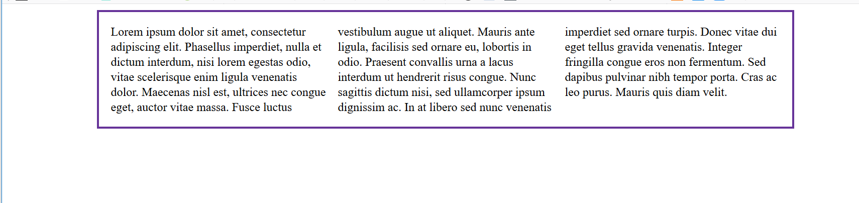
column属性可以帮助你很轻松的实现文字的多列布局,column实例如下:
 1 <!--__author__ = "wyb"-->
 2 <!DOCTYPE html>
 3 <html lang="en">
 4 <head>
 5     <meta charset="UTF-8">
 6     <title>column属性</title>
 7     <style>
 8         div{
 9             width: 888px;
10             margin: 0 auto;
11             border: 3px solid rebeccapurple;
12         }
13         .three-column {
14             padding: 1em;
15             -moz-column-count: 3;
16             -moz-column-gap: 1em;
17             -webkit-column-count: 3;
18             -webkit-column-gap: 1em;
19             column-count: 3;
20             column-gap: 1em;
21         }
22     </style>
23 </head>
24 <body>
25
26 <div class="three-column">
27     Lorem ipsum dolor sit amet, consectetur adipiscing elit. Phasellus imperdiet, nulla et dictum interdum, nisi lorem egestas odio, vitae scelerisque enim ligula venenatis dolor. Maecenas nisl est, ultrices nec congue eget, auctor vitae massa. Fusce luctus vestibulum augue ut aliquet. Mauris ante ligula, facilisis sed ornare eu, lobortis in odio. Praesent convallis urna a lacus interdum ut hendrerit risus congue. Nunc sagittis dictum nisi, sed ullamcorper ipsum dignissim ac. In at libero sed nunc venenatis imperdiet sed ornare turpis. Donec vitae dui eget tellus gravida venenatis. Integer fringilla congue eros non fermentum. Sed dapibus pulvinar nibh tempor porta. Cras ac leo purus. Mauris quis diam velit.
28 </div>
29
30 </body>
31 </html>
效果: