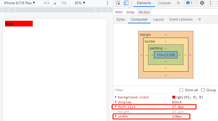
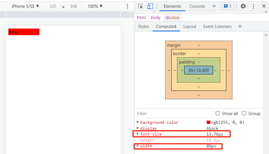
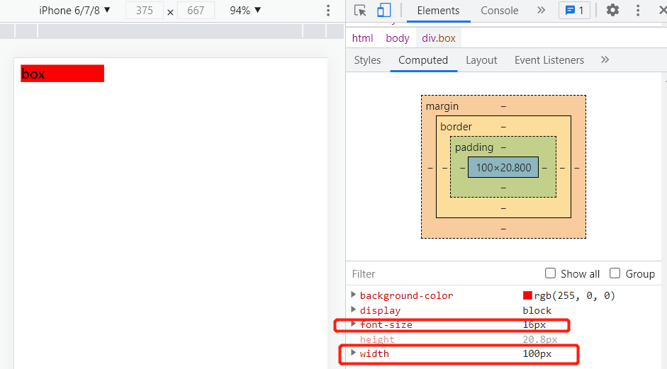
<!DOCTYPE html>
<html lang="en">
  <head>
    <meta charset="UTF-8" />
    <meta http-equiv="X-UA-Compatible" content="IE=edge" />
    <meta name="viewport" content="width=device-width, initial-scale=1.0" />
    <title>Document</title>
    <style>
      @media only screen and (max- 374px) {
        html {
          font-size: 86px;
        }
      }
      @media only screen and (min- 375px) and (max- 413px) {
        html {
          font-size: 100px;
        }
      }
      @media only screen and (min- 414px) {
        html {
          font-size: 110px;
        }
      }
      body {
        font-size: 0.16rem;
      }
      .box {
        width: 1rem;
        background-color: red;
      }
    </style>
  </head>
  <body>
    <div class="box">box</div>
  </body>
</html>
iPhone5:
iPhone6:
iPhone6Plus: