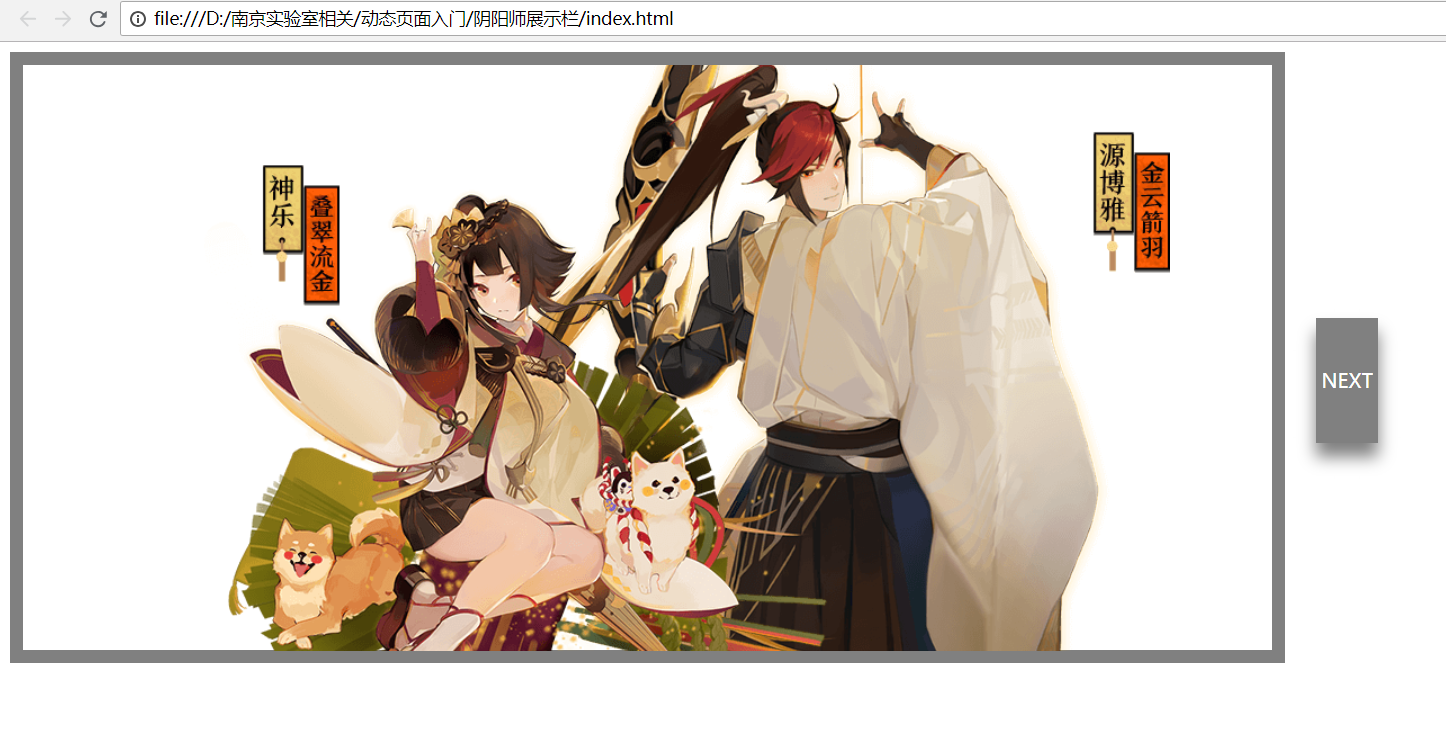
点下一张,会先向中间淡入
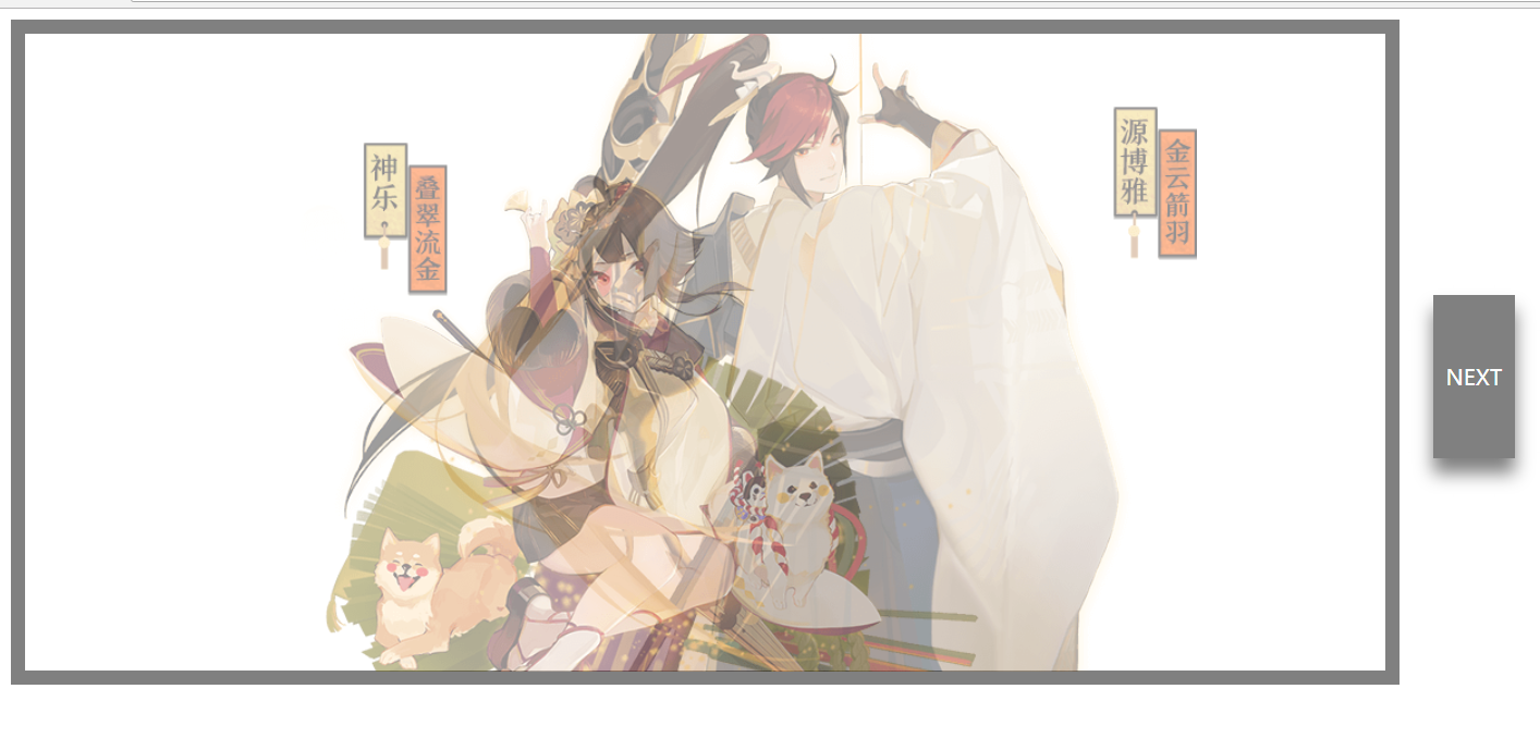
新的图片会从透明到不透明淡出
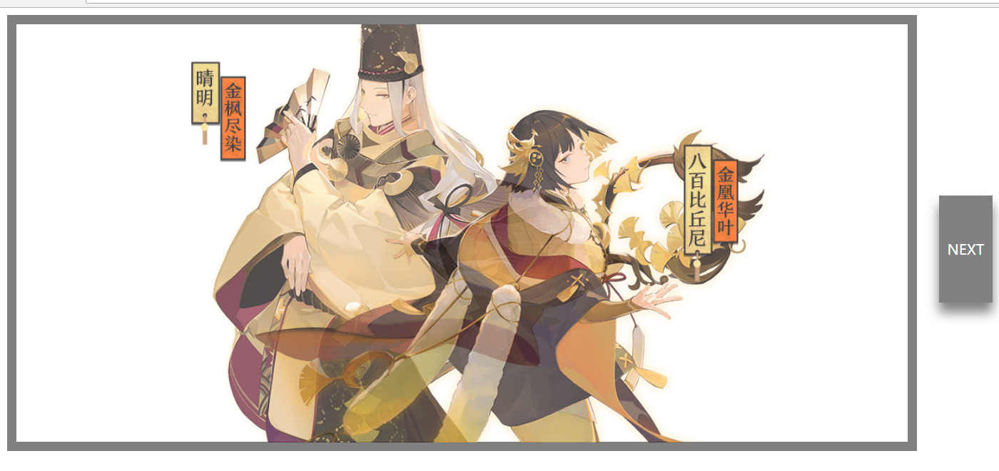

能无限切换
1、把位移,和透明写在keyframe里面就好!能省略很多代码
2、none->inline-block,会触发一次动作!刚打开页面加载的时候,也会触发动作。
3、全部写在一个地方,因为绝对定位,会有层级的关系,让它透明之后再none即可。
<!DOCTYPE html>
<html>
<head>
    <title></title>
    <link rel="stylesheet" type="text/css" href="index.css">
</head>
<body>

    <div id="container">
        <div id="first">
            <div id="left1"></div>
            <div id="right1"></div>
            <div id="left2"></div>
            <div id="right2"></div>
        </div>
    </div>

    <div id="next" class="next">
        <a href="javascript:void(0)">NEXT</a>
    </div>


    <script type="text/javascript">

        var left1 = document.getElementById('left1');
        var right1 = document.getElementById('right1');
        var left2 = document.getElementById('left2');
        var right2 = document.getElementById('right2');


        var page = 1;

        const next = document.getElementById('next');

        next.addEventListener('click',()=>{

            if(page==1){

                console.log(page);

                left1.classList.add('disppear-left');
                right1.classList.add('disppear-right');

                //不用设置none了,因为全部是Z-index层级关系,已经互相重叠了,直接透明即可
                setTimeout(()=>{

                    left2.classList.remove('disppear-left');
                    right2.classList.remove('disppear-right');

                    left2.style.display = 'inline-block';
                    right2.style.display = 'inline-block';

                    left1.style.display = 'none';
                    right1.style.display = 'none';

                },500);

                page = 2;

            }

            else{

                console.log(page);

                left2.classList.add('disppear-left');
                right2.classList.add('disppear-right');

                setTimeout(()=>{

                    left1.classList.remove('disppear-left');
                    right1.classList.remove('disppear-right');

                    left1.style.display = 'inline-block';
                    right1.style.display = 'inline-block';

                    left2.style.display = 'none';
                    right2.style.display = 'none';

                },500);

                page = 1;

            }

        });

    </script>


</body>
</html>
 #container{
     display: inline-block;
     width: 1000px;
     height: 468.9px;
     min-width: 1000px;
     min-height: 468.9px;
     border: 10px solid gray;
     position: relative;
 }

 #first{
     width: 1000px;
     height: 468.9px;
     position: relative;
 }

 #second{
     width: 1000px;
     height: 468.9px;
     position: relative;
 }

 /*透明只能通过动画*/
 @keyframes fadeOutLeft{
     from {opacity: 0.5;position: absolute;left: 50%;}
     to {opacity: 1.0;position: absolute;left: 40%;}
 }

 @keyframes fadeOutRight{
     from {opacity: 0.5;position: absolute;left: 50%;}
     to {opacity: 1.0;position: absolute;left: 60%;}
 }

 @keyframes fadeInLeft{
     from {opacity: 1.0;position: absolute;left: 40%;}
     to {opacity: 0;position: absolute;left: 50%;}
 }

 @keyframes fadeInRight{
     from {opacity: 1.0;position: absolute;left: 60%;}
     to {opacity: 0;position: absolute;left: 50%;}
 }

 #left1{
     display: inline-block;
     width: 513.9px;
     height: 468.9px;
     background-image: url(1.png);
     background-size: 100%;
     background-position: 0 80px;
     background-repeat: no-repeat;
     position: absolute;
     left: 50%;
     margin-left: -256.95px;
     z-index: 2;

     /*transition: left 1s ease-in-out;*/
     /*transition: opacity 1s ease-in-out;*/
     /*组合起来即可!不需要用transtion了,太low!问题多,forwards是动画结束后停在最后一帧和位置*/
     animation: fadeOutLeft 0.5s 1 linear forwards;
 }

 #right1{
     display: inline-block;
     width: 636.6px;
     height: 468.9px;
     background-image: url(3.png) ;
     background-size: 100%;
     background-position: 0 -40px;
     position: absolute;
     left: 50%;
     margin-left: -318.3px;
     z-index: 1;

     /*transition: left 1s ease-in-out;*/
     animation: fadeOutRight 0.5s 1 linear forwards;
     /*transition: opacity 1s ease-in-out;*/
 }

  #left2{

     display: none;
     width: 506.7px;
     height: 468.9px;
     background-image: url(4.png) ;
     background-size: 100%;
     background-position: 0 -40px;
     position: absolute;
     left: 50%;
     margin-left: -253.35px;
     z-index: 1;

     /*transition: left 1s ease-in-out;*/
     animation: fadeOutLeft 0.5s 1 linear forwards;
     /*transition: opacity 1s ease-in-out;*/
 }

 #right2{

     display: none;
     width: 597.6px;
     height: 468.9px;
     background-image: url(2.png);
     background-size: 100%;
     background-position: 0 80px;
     background-repeat: no-repeat;
     position: absolute;
     left: 50%;
     margin-left: -298.8px;
     z-index: 2;

     /*transition: left 1s ease-in-out;*/
     /*transition: opacity 1s ease-in-out;*/
     animation: fadeOutRight 0.5s 1 linear forwards;

 }

.active-left{
    animation: fadeOutLeft 0.5s 1 linear forwards;

}

.active-right{
    animation: fadeOutRight 0.5s 1 linear forwards;
}

 .disppear-left{

     animation: fadeInLeft 0.5s 1 linear forwards !important;
     opacity: 0 !important;
 }

 .disppear-right{

     animation: fadeInRight 0.5s 1 linear forwards !important;
     opacity: 0 !important;
 }

 .next{
     display: inline-block;
     height: 100px;
     width: 50px;
     /*border-radius: 20px;*/
     background-color: gray;
     text-align: center;
     line-height: 100px;
     box-shadow: 0 11px 20px 0 gray;
     position: relative;
     top: -220px;
     right: -20px;

 }

 .next:hover{
     height: 120px;
     width:60px;
     line-height: 120px;
 }

 .next a{
     color: #fff;
     text-decoration: none;

 }