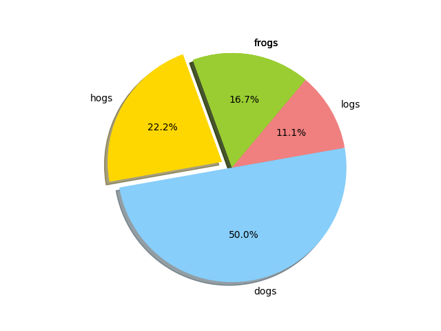
1、画饼图
import matplotlib.pyplot as plt
>>> labels = 'frogs','hogs','dogs','logs'
>>> sizes = 15,20,45,10
>>> colors = 'yellowgreen','gold','lightskyblue','lightcoral'
>>> explode = 0,0.1,0,0
>>>plt.pie(sizes,explode=explode,labels=labels,colors=colors,autopct='%1.1f%%',shadow=True,startangle=50)
>>> plt.axis('equal')
(-1.2182175697473243, 1.11360285857795, -1.1087559272917165, 1.1164320127364205)
>>> plt.show()
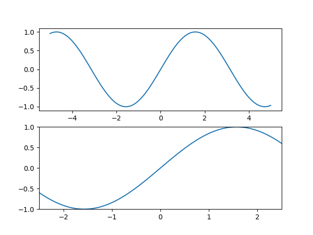
确定坐标范围
>>> import numpy as np
>>> import matplotlib.pyplot as plt
>>> from pylab import *
>>> x = np.arange(-5.0,5.0,0.02)
>>> y1 = np.sin(x)
>>> plt.figure(1)
<matplotlib.figure.Figure object at 0x000002364F153128>
>>> plt.subplot(211)
<matplotlib.axes._subplots.AxesSubplot object at 0x000002364B86CE80>
>>> plt.plot(x,y1)
[<matplotlib.lines.Line2D object at 0x000002365002DB00>]
>>> plt.subplot(212)
<matplotlib.axes._subplots.AxesSubplot object at 0x000002364D73C320>
>>> xlim(-2.5,2.5)
(-2.5, 2.5)
>>> ylim(-1,1)
(-1, 1)
>>> plt.plot(x,y1)
[<matplotlib.lines.Line2D object at 0x000002364D839F28>]
>>> plt.show()
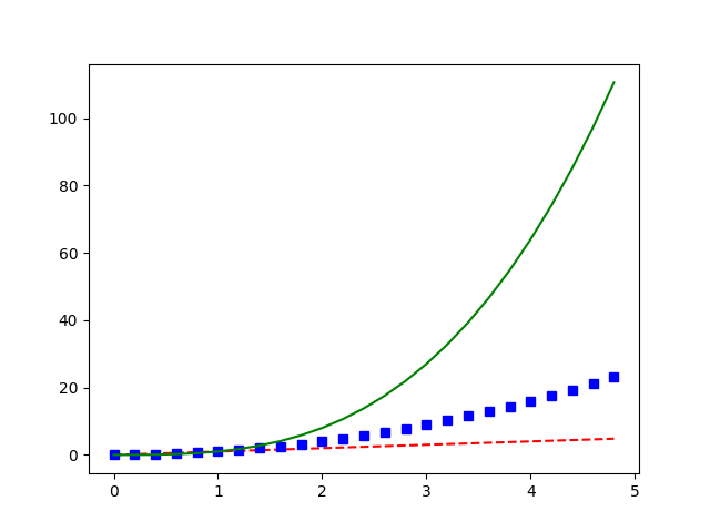
叠加图
>> import numpy as np
>>> import matplotlib.pyplot as plt
>>> t = np.arange(0.,5.,0.2)
>>> plt.plot(t,t,'r--',t,t**2,'bs',t,t**3,'g-')
[<matplotlib.lines.Line2D object at 0x00000236519F9710>, <matplotlib.lines.Line2D object at 0x00000236519F99B0>, <matplotlib.lines.Line2D object at 0x0000023651A00240>]
>>> plt.show()
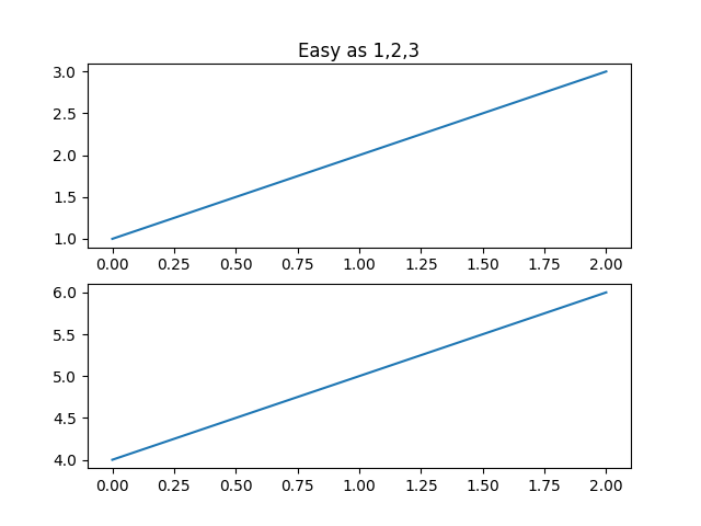
plt.figure()
>>> import matplotlib.pyplot as plt
>>> plt.figure(1)
<matplotlib.figure.Figure object at 0x0000023650018BA8>
>>> plt.subplot(211)
<matplotlib.axes._subplots.AxesSubplot object at 0x0000023650018EF0>
>>> plt.plot([1,2,3])
[<matplotlib.lines.Line2D object at 0x00000236536810F0>]
>>> plt.subplot(212)
<matplotlib.axes._subplots.AxesSubplot object at 0x000002364CFC1278>
>>> plt.plot([4,5,6])
[<matplotlib.lines.Line2D object at 0x00000236536FA208>]
>>> plt.figure(2)
<matplotlib.figure.Figure object at 0x00000236536C4128>
>>> plt.plot([4,5,6])
[<matplotlib.lines.Line2D object at 0x0000023653748588>]
>>> plt.figure(1)
<matplotlib.figure.Figure object at 0x0000023650018BA8>
>>> plt.subplot(211)
<matplotlib.axes._subplots.AxesSubplot object at 0x0000023650018EF0>
>>> plt.title('Easy as 1,2,3')
<matplotlib.text.Text object at 0x0000023653660278>
>>> plt.show()

plt.text()添加文字说明
>>> import numpy as np
>>> import matplotlib.pyplot as plt
>>> mu,sigms =100,15
>>> mu,sigma = 100,15
>>> x = mu+sigma * np.random.randn(10000)
>>> n,bins,patches = plt.hist(x,50,normed=1,facecolor='g',alpha=0.75)
>>> plt.xlabel('Smarts')
<matplotlib.text.Text object at 0x000002365371B748>
>>> plt.ylabel('Probability')
<matplotlib.text.Text object at 0x00000236536C4D30>
>>> plt.title('Histogram of IQ')
<matplotlib.text.Text object at 0x00000236519CC0F0>
>>> plt.text(60,0.25,r'$mu=100, sigma=15$')
<matplotlib.text.Text object at 0x0000023651A1A0B8>
>>> plt.axis([40,160,0,0.03])
[40, 160, 0, 0.03]
>>> plt.show()
