在微信小程序中使用ECharts
1. 下载插件
首先,下载 GitHub 上的 ecomfe/echarts-for-weixin 项目。
下载链接:ecomfe/echarts-for-weixin
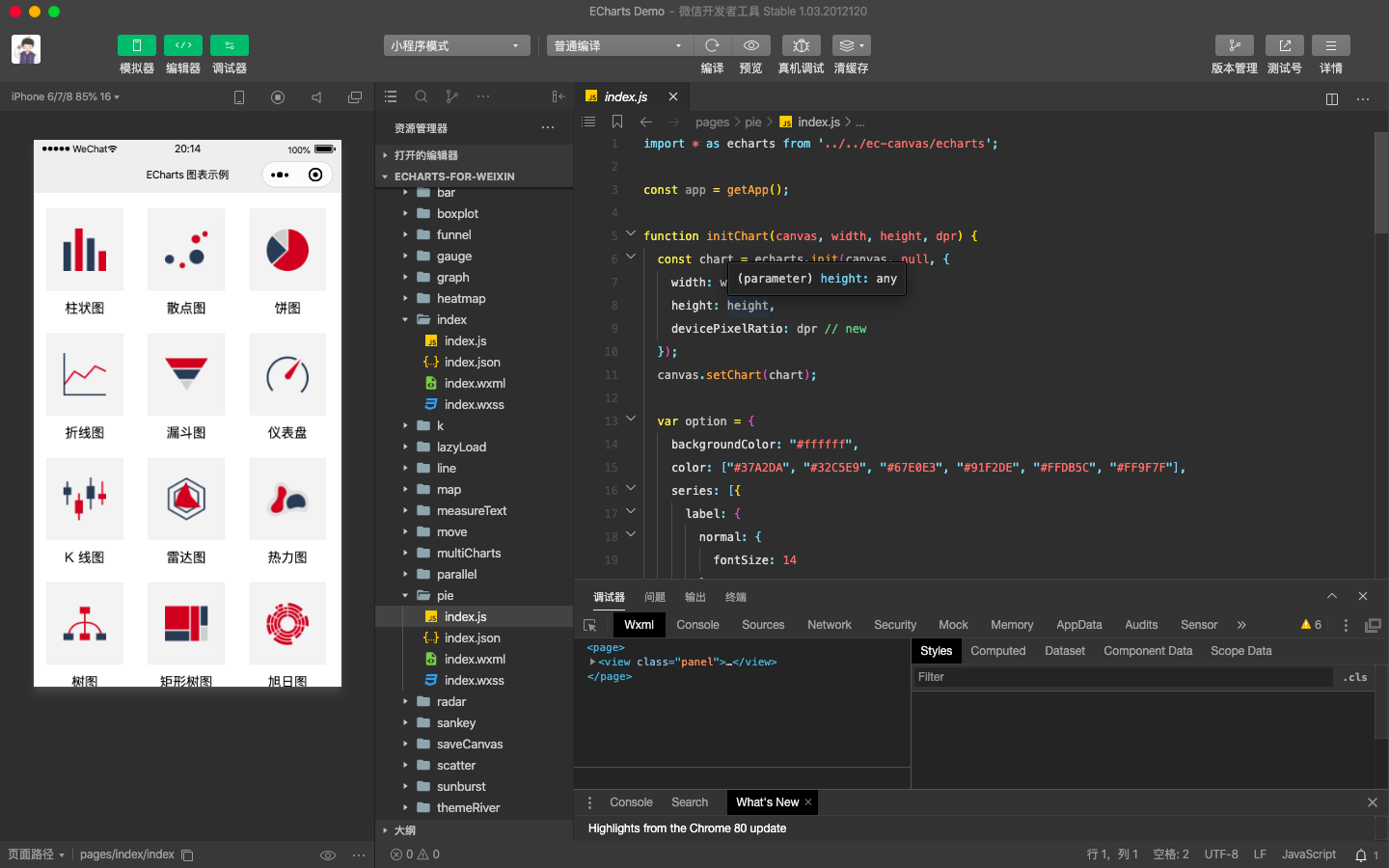
2. 运行项目可查看图表示例
3. 使用组件
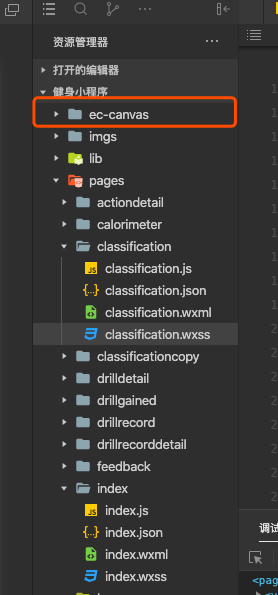
//ec-canvas是提供的组件,将文件夹ec-canvas复制到自己的项目中
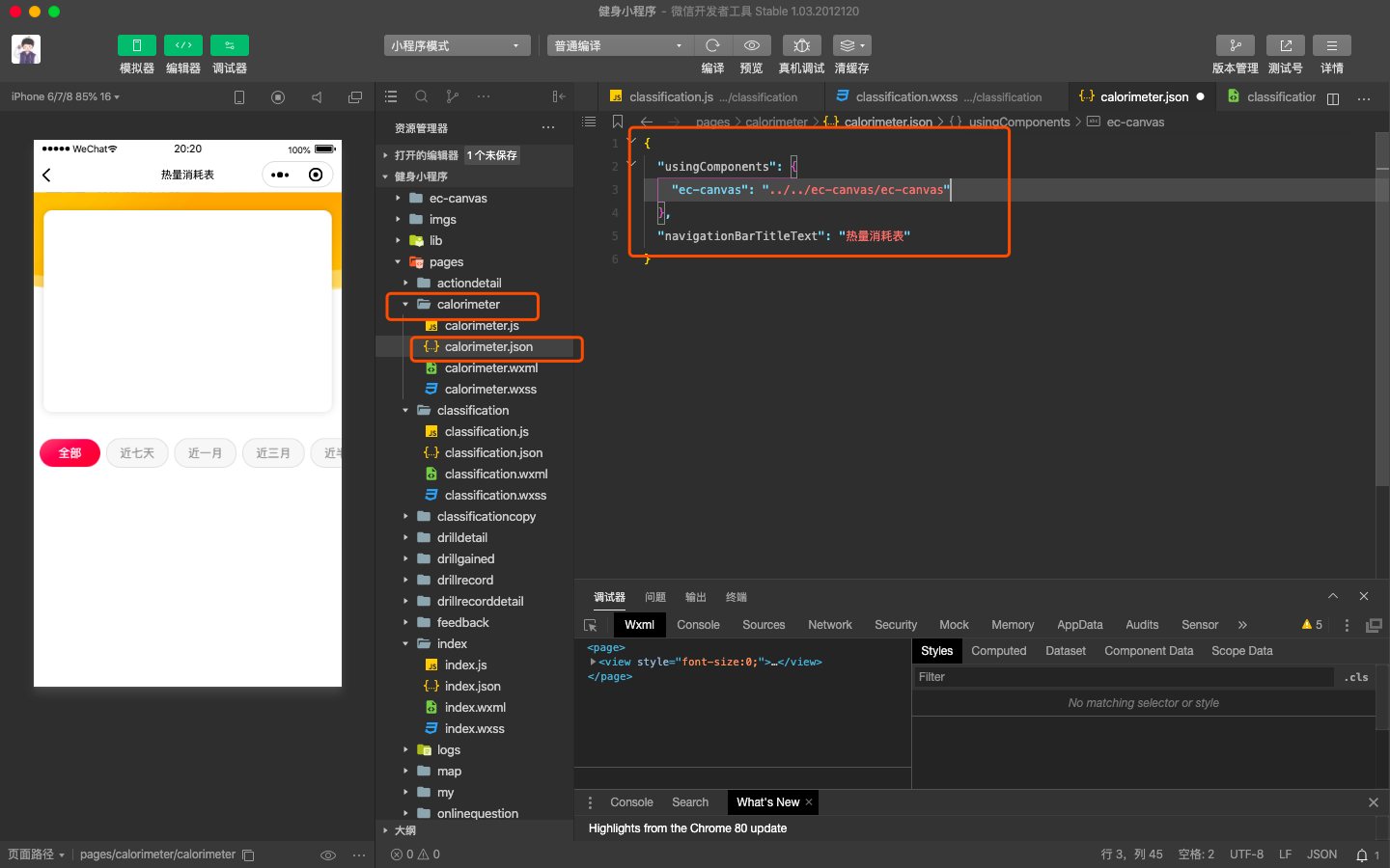
//配置要应用组件的json文件,我这里是home.json,一定注意路径要写对。
{
  "usingComponents": {
    "ec-canvas": "../../ec-canvas/ec-canvas"
  }
}
在wxml里面写上如下标签
<view class="box">
  <ec-canvas id="mychart-dom-bar" canvas-id="mychart-bar" ec="{{ ec }}"></ec-canvas>
</view>
wxss记得再加一下
.box {
	100%;
	height:100%;
	position: absolute;
	top: 0;
	bottom: 0;
	left: 0;
	right: 0;
}
js里面引入配置相关代码
// 1、引入依赖脚本
import * as echarts from '../../ec-canvas/echarts';
// 2、进行初始化数据
function initChart(canvas, width, height) {
  const chart = echarts.init(canvas, null, {
     width,
    height: height
  });
  canvas.setChart(chart);

  var option = {
    tooltip: {
        trigger: 'axis',
        axisPointer: {
            type: 'cross',
            label: {
                backgroundColor: '#6a7985'
            }
        }
    },
    legend: {
        data: ['搜索引擎']
    },
    grid: {
        left: '3%',
        right: '4%',
        bottom: '3%',
        containLabel: true
    },
    xAxis: [
        {
            type: 'category',
            boundaryGap: false,
            data: ['周一', '周二', '周三', '周四', '周五', '周六', '周日'],

			axisLine: {
				show:false,
			}
        }
    ],
    yAxis: [
        {
            type: 'value',
axisTick: {
show:false
}, // 添加 y轴阶段区分线不显示
            splitLine: {
				show:true,
				lineStyle:{
                    type:'dashed'
                }
			},
			axisLine: {
				show:false,
			}
        }
    ],
    series: [
        {
            type: 'line',
            stack: '总量',
            // label: {
            //     normal: {
            //         show: true,
            //         position: 'top'
            //     }
            // },
            asmooth: true,
            areaStyle: {
              normal: {
                color: {
                  x: 0,
                  y: 0,
                  x2: 0,
                  y2: 1,
                  colorStops: [{
                      offset: 0,
                      color: "#F53249" // 0% 处的颜色
                    }, {
                      offset: 0.7,
                      color: "rgba(245, 50, 73, 0.12)" // 100% 处的颜色
                     }],
                      globalCoord: false // 缺省为 false
                    }
                  }
            },
            data: [820, 932, 901, 934, 1290, 1330, 1320]
        }
    ]
};
  chart.setOption(option);
  return chart;
}
Page({
  data: {
    ec: {
      onInit: initChart // 3、将数据放入到里面
    }
  },

  onReady() {

  }
});
// 1、引入依赖脚本
import * as echarts from '../../ec-canvas/echarts';
// 2、进行初始化数据
function initChart(canvas, width, height) {
  const chart = echarts.init(canvas, null, {
     width,
    height: height
  });
  canvas.setChart(chart);
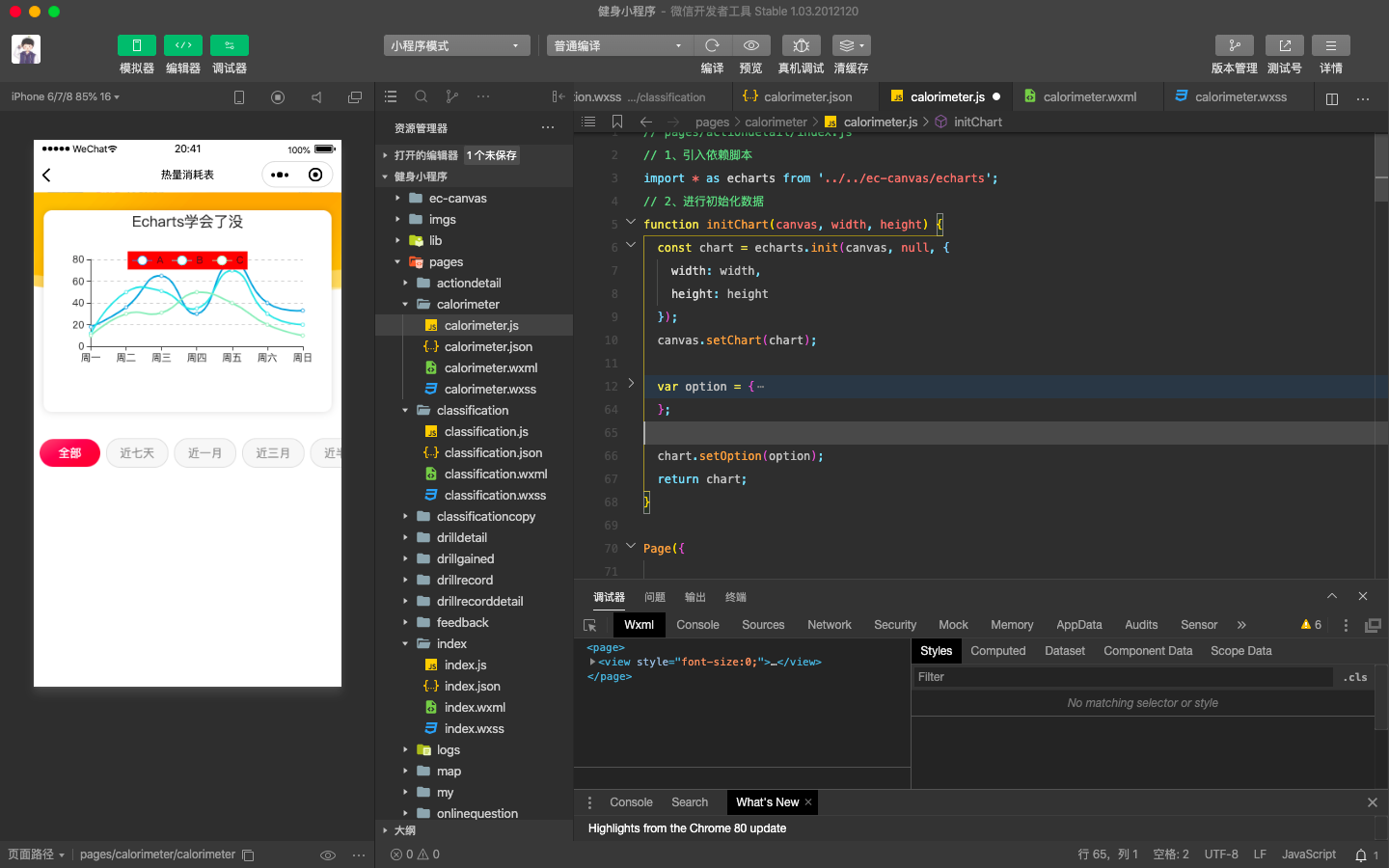
var option = {
    title: {
      text: 'Echarts学会了没',
      left: 'center'
    },
    color: ["#37A2DA", "#67E0E3", "#9FE6B8"],
    legend: {
      data: ['A', 'B', 'C'],
      top: 50,
      left: 'center',
      backgroundColor: 'red',
      z: 100
    },
    grid: {
      containLabel: true
    },
    tooltip: {
      show: true,
      trigger: 'axis'
    },
    xAxis: {
      type: 'category',
      boundaryGap: false,
      data: ['周一', '周二', '周三', '周四', '周五', '周六', '周日'],
      // show: false
    },
    yAxis: {
      x: 'center',
      type: 'value',
      splitLine: {
        lineStyle: {
          type: 'dashed'
        }
      }
      // show: false
    },
    series: [{
      name: 'A',
      type: 'line',
      smooth: true,
      data: [18, 36, 65, 30, 78, 40, 33]
    }, {
      name: 'B',
      type: 'line',
      smooth: true,
      data: [12, 50, 51, 35, 70, 30, 20]
    }, {
      name: 'C',
      type: 'line',
      smooth: true,
      data: [10, 30, 31, 50, 40, 20, 10]
    }]
  };
  chart.setOption(option);
  return chart;
}

Page({
  data: {
    ec: {
      onInit: initChart // 3、将数据放入到里面
    }
  },

  onReady() {

  }
});
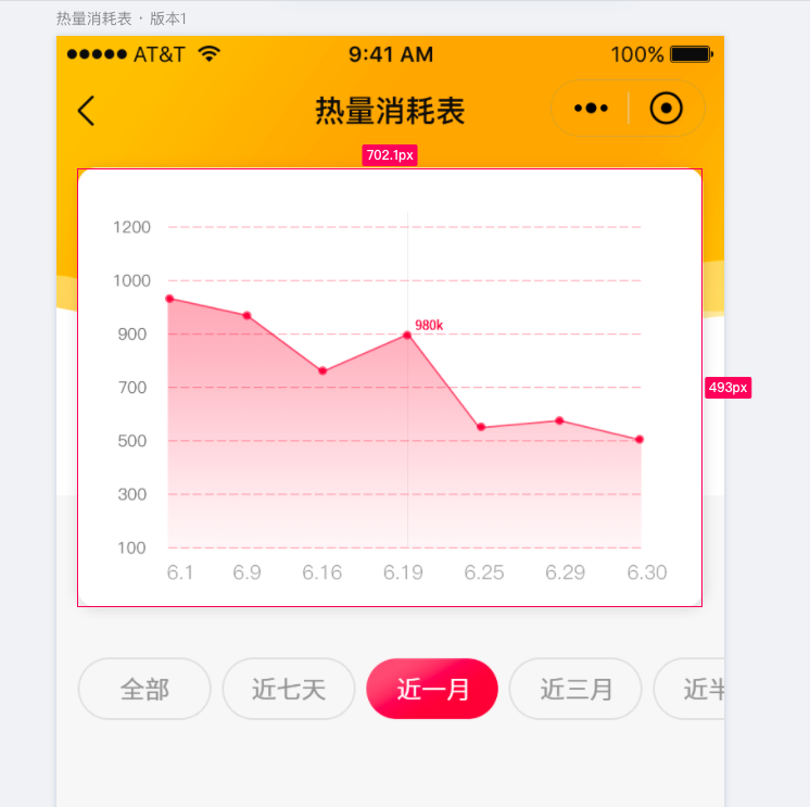
上边两套代码做好的示例图(后面那套代码,第一套在下边的截图-ui图)
做的只是一个例子大家懂怎么做就行了,至于具体需求大家在Echarts官网找对应的图形(可修改)。如下: