1 表格
Bootstrap为表格设计了漂亮的样式。
1)表格基本实例
任意 <table> 标签添加 .table。
<table class="table">
  <tr>
    <td></td>
    <td></td>
    <td></td>
    ...
 </tr>
</table>
表格基本实例代码如下:
<!DOCTYPE html>
<html>

    <head>
        <meta charset="utf-8" />
        <title></title>
        <link rel="stylesheet" href="css/index.css" />
        <meta name="viewport" content="width=device-width,initial-scale=1">
        <meta name="viewport" content="width=device-width, initial-scale=1, maximum-scale=1, user-scalable=no">

        <link rel="stylesheet" href="http://cdn.bootcss.com/bootstrap/3.3.0/css/bootstrap.min.css">

        <!-- jQuery文件。务必在bootstrap.min.js 之前引入 -->
        <script src="http://cdn.bootcss.com/jquery/1.11.1/jquery.min.js"></script>

        <!-- 最新的 Bootstrap 核心 JavaScript 文件 -->
        <script src="http://cdn.bootcss.com/bootstrap/3.3.0/js/bootstrap.min.js"></script>
    </head>

    <body>
        <div class="container">
            <h1 class="page-header">Table<small>基本实例</small></h1>

            <table class="table">
                <tr>
                    <td>姓名</td>
                    <td>年龄</td>
                    <td>地址</td>
                </tr>
                <tr>
                    <td>张三</td>
                    <td>22</td>
                    <td>北京</td>
                </tr>
                <tr>
                    <td>李四</td>
                    <td>21</td>
                    <td>广州</td>
                </tr>
            </table>

        </div>

    </body>

</html>
显示效果如下图所示:

2)条纹状表格
通过 .table-striped 类可以给 <tbody> 之内的每一行增加斑马条纹样式。
<table class="table table-striped">
  ...
</table>
显示的效果如下图所示:

3)带边框的表格
添加 .table-bordered 类为表格和其中的每个单元格增加边框。
<table class="table table-bordered">
  ...
</table>
4)鼠标悬停
通过添加 .table-hover 类可以让 <tbody> 中的每一行对鼠标悬停状态作出响应。
<table class="table table-hover">
  ...
</table>
5)紧缩表格
通过添加 .table-condensed 类可以让表格更加紧凑,单元格中的内补(padding)均会减半。
<table class="table table-condensed">
  ...
</table>
6)状态类
通过这些状态类可以为行或单元格设置颜色。
| 描述 | |
|---|---|
.active |
鼠标悬停在行或单元格上时所设置的颜色 |
.success |
标识成功或积极的动作 |
.info |
标识普通的提示信息或动作 |
.warning |
标识警告或需要用户注意 |
.danger |
标识危险或潜在的带来负面影响的动作 |
<!-- On rows -->
<tr class="active">...</tr>
<tr class="success">...</tr>
<tr class="warning">...</tr>
<tr class="danger">...</tr>
<tr class="info">...</tr>

<!-- On cells (`td` or `th`) -->
<tr>
  <td class="active">...</td>
  <td class="success">...</td>
  <td class="warning">...</td>
  <td class="danger">...</td>
  <td class="info">...</td>
</tr>
7)响应式表格
将任何 .table 元素包裹在 .table-responsive 元素内,即可创建响应式表格,其会在小屏幕设备上(小于768px)水平滚动。当屏幕大于 768px 宽度时,水平滚动条消失。
<div class="table-responsive">
  <table class="table">
    ...
  </table>
</div>
2 表单
表单提供了与用户提交信息的方式,比如用户注册会员,填写注册信息的时候回用到表单。用户登录到网站的时候,会用到用户名和密码也需要表单。搜索内容也需要表单。Bootstrap为表单元素设计了漂亮的样式。
1)普通表单
单独的表单控件会被自动赋予一些全局样式。所有设置了 .form-control 类的 <input>、<textarea> 和 <select> 元素都将被默认设置宽度属性为 100%;。 将 label 元素和前面提到的控件包裹在 .form-group 中可以获得最好的排列。
<!DOCTYPE html>
<html>
<head>
<meta charset="utf-8" />
<title></title>
<link rel="stylesheet" href="css/index.css" />
<meta name="viewport" content="width=device-width,initial-scale=1">
<meta name="viewport" content="width=device-width, initial-scale=1, maximum-scale=1, user-scalable=no">
<link rel="stylesheet" href="http://cdn.bootcss.com/bootstrap/3.3.0/css/bootstrap.min.css">
<!-- jQuery文件。务必在bootstrap.min.js 之前引入 -->
<script src="http://cdn.bootcss.com/jquery/1.11.1/jquery.min.js"></script>
<!-- 最新的 Bootstrap 核心 JavaScript 文件 -->
<script src="http://cdn.bootcss.com/bootstrap/3.3.0/js/bootstrap.min.js"></script>
</head>
<body>
<div class="container">
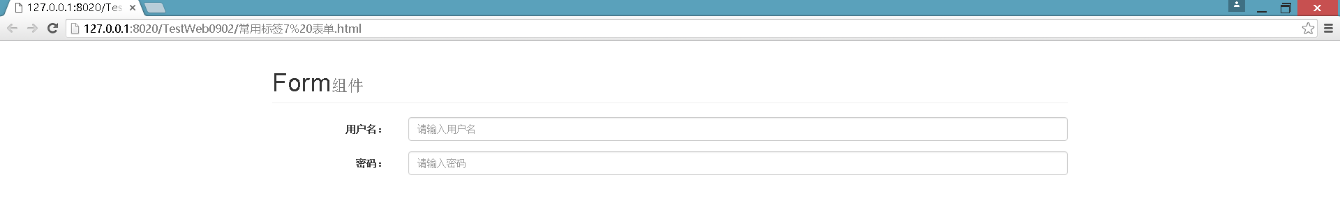
<h1 class="page-header">Form<small>组件</small></h1>
<form role="form">
<label for="username">用户名:</label><input placeholder="请输入用户名" id="username" class="form-control" type="text" name="username" maxlength="5" />
<label for="pwd">密码:</label> <input placeholder="请输入密码" id="pwd" class="form-control" type="password" name="pwd" />
</form>
</div>
</body>
</html>
添加描述标签<label>,填写描述内容。
- label 元素不会向用户呈现任何特殊效果。不过,它为鼠标用户改进了可用性。如果您在 label 元素内点击文本,就会触发此控件。就是说,当用户选择该标签时,浏览器就会自动将焦点转到和标签相关的表单控件上。
- <label> 标签的 for 属性应当与相关元素的 id 属性相同。
显示的效果如下图所示:

2)水平排列的表单
通过为表单添加 .form-horizontal 类,并联合使用 Bootstrap 预置的栅格类(col-sm-*),可以将 label 标签和控件组水平并排布局。这样做将改变 .form-group 的行为,使其表现为栅格系统中的行(row),因此就无需再额外添加 .row 了。
<!DOCTYPE html>
<html>

    <head>
        <meta charset="utf-8" />
        <title></title>
        <link rel="stylesheet" href="css/index.css" />
        <meta name="viewport" content="width=device-width,initial-scale=1">
        <meta name="viewport" content="width=device-width, initial-scale=1, maximum-scale=1, user-scalable=no">
        <link rel="stylesheet" href="http://cdn.bootcss.com/bootstrap/3.3.0/css/bootstrap.min.css">

        <!-- jQuery文件。务必在bootstrap.min.js 之前引入 -->
        <script src="http://cdn.bootcss.com/jquery/1.11.1/jquery.min.js"></script>

        <!-- 最新的 Bootstrap 核心 JavaScript 文件 -->
        <script src="http://cdn.bootcss.com/bootstrap/3.3.0/js/bootstrap.min.js"></script>
    </head>

    <body>
        <div class="container">
            <h1 class="page-header">Form<small>组件</small></h1>
            <form class="form-horizontal" role="form">

                <div class="form-group">
                    <label  class="col-sm-2 control-label" for="username">用户名:</label>
                    <div class="col-sm-10">
                        <input placeholder="请输入用户名" id="username" class="form-control" type="text" name="username" maxlength="5" />
                    </div>
                </div>
                <div class="form-group">
                    <label  class="col-sm-2 control-label" for="pwd">密码:</label>
                    <div class="col-sm-10">
                        <input placeholder="请输入密码" id="pwd" class="form-control" type="text" name="pwd" maxlength="5" />
                    </div>
                </div>
            </form>
        </div>
    </body>

</html>
显示的效果如下图所示:
参考代码:
http://v3.bootcss.com/css/#code