修改echarts环形图的牵引线及文字位置,下面代码及效果不仅如此,也包含了其它的效果哦。有问题可以留言。
根据echarts官方示例修改效果:
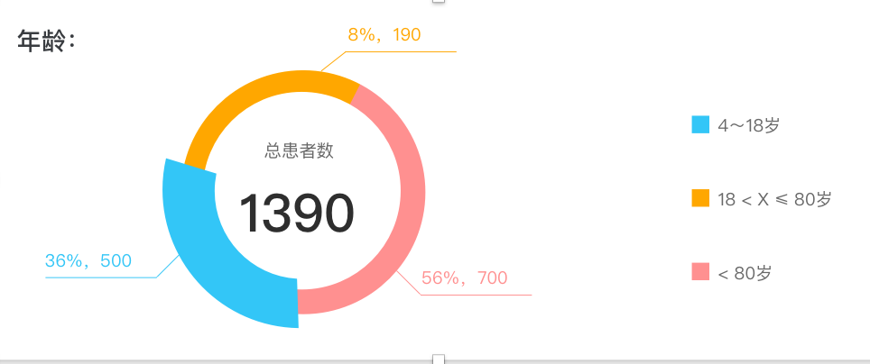
官方示例图:

修改效果图:
直接上代码:其它不多说。
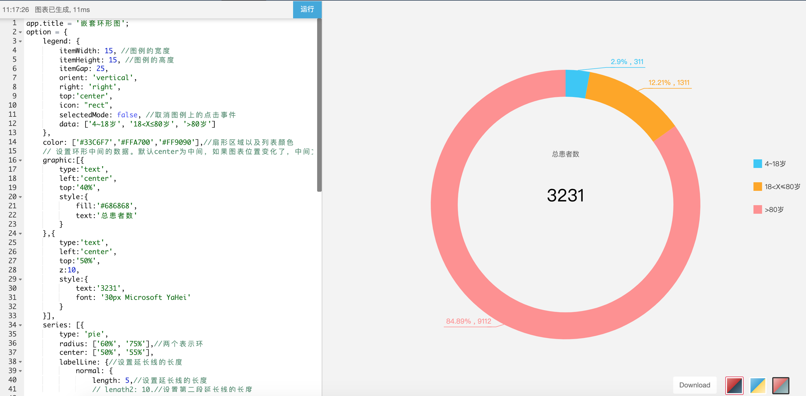
app.title = '嵌套环形图';
option = {
    legend: {
        itemWidth: 15, //图例的宽度
        itemHeight: 15, //图例的高度
        itemGap: 25,
        orient: 'vertical',
        right: 'right',
        top:'center',
        icon: "rect",
        selectedMode: false, //取消图例上的点击事件
        data: ['4~18岁', '18<X≤80岁', '>80岁']
    },
    color: ['#33C6F7','#FFA700','#FF9090'],//扇形区域以及列表颜色
    // 设置环形中间的数据。默认center为中间,如果图表位置变化了,中间文字是不变的。
    graphic:[{
        type:'text',
        left:'center',
        top:'40%',
        style:{
            fill:'#686868',
            text:'总患者数'
        }
    },{
        type:'text',
        left:'center',
        top:'50%',
        z:10,
        style:{
            text:'3231',
            font: '30px Microsoft YaHei'
        }
    }],
    series: [{
        type: 'pie',
        radius: ['60%', '75%'],//两个表示环
        center: ['50%', '55%'],
        labelLine: {//设置延长线的长度
            normal: {
                length: 5,//设置延长线的长度
                // length2: 10,//设置第二段延长线的长度
            }
        },
        label: {
            normal: {
                // formatter: '{d}%, {c}

',
                formatter: '{per|{d}%} , {c|{c}}
{hr|}
{a|}',//这里最后另一行设置了一个空数据是为了能让延长线与hr线对接起来
                padding: [0, -10],//取消hr线跟延长线之间的间隙
                rich: {
                    a: {
                        color: '#999',
                        lineHeight: 20,//设置最后一行空数据高度,为了能让延长线与hr线对接起来
                        align: 'center'
                    },
                    hr: {//设置hr是为了让中间线能够自适应长度
                        borderColor: 'auto',//hr的颜色为auto时候会主动显示颜色的
                         '105%',
                        borderWidth: 0.5,
                        height: 0.5,
                    },
                    per: {//用百分比数据来调整下数字位置,显的好看些。如果不设置,formatter最后一行的空数据就不需要
                        padding: [4, 0],
                    }
                }
            }
        },
        data: [{
                value: 311,
                name: '4~18岁'
            },
            {
                value: 1311,
                name: '18<X≤80岁'
            },
            {
                value: 9112,
                name: '>80岁'
            }
        ],
        itemStyle: {
            emphasis: {
                shadowBlur: 10,
                shadowOffsetX: 0,
                shadowColor: 'rgba(0, 0, 0, 0.5)'
            }
        }
    }]
};
运行效果图: