.btn
---------------------------------
button的背景色:
.btn-primary
.btn-success
.btn-secondary
.btn-danger
.btn-info
.btn-light
.btn-dark
.btn-link
--------------------------
button的边框颜色:
.btn-outline-primary
.btn-outline-secondary
.btn-outline-success
--------------------------------
大小:
.btn-lg
.btn-sm
-------------------------------
状态:
.active
.disabled
disabled作为类只适用于<a>标签,不适用于<button>标签,<button>标签中disabled作为一种属性使用,例如:
<button type="button" class="btn btn-lg btn-primary" disabled>Primary button</button>
<a href="#" class="btn btn-secondary btn-lg disabled" role="button" aria-disabled="true">Link</a>
-----------------------------------
可使用的元素:
<a> <input> <button>
-----------------------------------
混合使用:
.button可与checkbox、radio等混合使用,会产生特殊的效果,如:
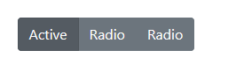

实例代码:
<div class="btn-group btn-group-toggle" data-toggle="buttons">
  <label class="btn btn-secondary active">
    <input type="radio" name="options" id="option1" autocomplete="off" checked> Active
  </label>
  <label class="btn btn-secondary">
    <input type="radio" name="options" id="option2" autocomplete="off"> Radio
  </label>
  <label class="btn btn-secondary">
    <input type="radio" name="options" id="option3" autocomplete="off"> Radio
  </label>
</div>
<div class="btn-group-toggle" data-toggle="buttons">
  <label class="btn btn-secondary active">
    <input type="checkbox" checked autocomplete="off"> Checked
  </label>
</div>
方法:
$().button('toggle') 点击button按钮,会进行状态切换
$().button('dispose') 摧毁button按钮