echarts绘制饼图时的一点特殊设置


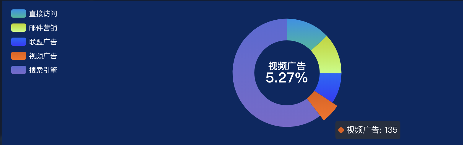
最后的效果如图,需要在中间展示的部分换行然后字体大小不同。

以下为option的设置,使用rich里面的参数来设置更多的文本样式,使用‘ ’来控制换行

let option = {
            color: color,
            backgroundColor: '#082763',
            tooltip: {},
            legend: {
                orient: 'vertical',
                left: 10,
                top: 10,
                textStyle: {
                    color: '#fff'
                },
                data: lengendData
            },
            series: [{
                name: '',
                type: 'pie',
                radius: ['45%', '75%'],
                center: ['50%', '50%'],
                avoidLabelOverlap: false,
                label: {
                    normal: {
                        show: false,
                        position: 'center'
                    },
                    emphasis: {
                        show: true,
                        position: 'center',
                        textStyle: {
                            fontSize: 20,
                            fontWeight: 'bold',
                            color: '#ffffff'
                        },
                        formatter: [`{x|{b}}`, `{y|{d}%}`].join('
'),
                        rich: {
                            x: {
                                fontSize: 16, fontWeight: 'bold'
                            },
                            y: {
                                fontSize: 24, fontWeight: 'bold'
                            }
                        }
                    }

                }, labelLine: {
                    normal: {
                        show: false
                    }
                },
                data: pieData
            }]
        };
原文地址:https://www.cnblogs.com/viola-sh/p/11327766.html