先看一小例子:
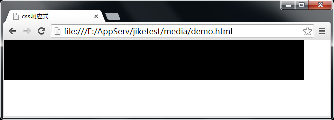
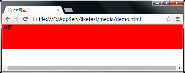
<!DOCTYPE html>
<html lang="zh">

<head>
    <meta charset="UTF-8">
    <title>css响应式</title>
    <style>
    body {
        padding: 0;
        margin: 0;
    }

    .container {
        width: 600px;
        background: red;
        height: 80px;
    }
    /*当页面最小宽度满足600px时调用*/

    @media only screen and (min- 600px) {
        .container {
            background: #000;
        }
    }
    </style>
</head>

<body>
    <div class="container">
        内容
    </div>
</body>

</html>
大于600px,显示黑色
小于600px,显示红色
<!-- 在移动端适配需要加上 -->
<meta name="viewport" content="width=device-width,initial-scale=1" />
不允许手机缩放
<meta name="viewport" content="width=device-width, initial-scale=1, maximum-scale=1, user-scalable=no" />
@media引入方式:
1、CSS中使用:
@media screen and (max- 600px) {
    选择器 {
      属性:属性值;
    }


    选择器 {
      属性:属性值;
    }

  }
2、link方法引入:
<link rel="stylesheet" href="style.css" media="screen and (min-600px)" >
Media Query 条件:
1、样式适用于宽度小于480px的
<link rel="stylesheet" media="screen and (max-device- 480px)" href="iphone.css" type="text/css" />
2、针对iphone4s
<link rel="stylesheet" media="only screen and (-webkit-min-device-pixel-ratio: 2)" type="text/css" href="iphone4.css" />
3、iPad在纵向(portrait)时采用portrait.css来渲染页面;在横向(landscape)时采用landscape.css来渲染页面
<link rel="stylesheet" media="all and (orientation:portrait)" href="portrait.css" type="text/css" />
<link rel="stylesheet" media="all and (orientation:landscape)" href="landscape.css"  type="text/css" />
4、android
 /*240px的宽度*/
  <link rel="stylesheet" media="only screen and (max-device-240px)" href="android240.css" type="text/css" />
  /*360px的宽度*/
  <link rel="stylesheet" media="only screen and (min-device-241px) and (max-device-360px)" href="android360.css" type="text/css" />
  /*480px的宽度*/
  <link rel="stylesheet" media="only screen and (min-device-361px) and (max-device-480px)" href="android480.css" type="text/css" />
IE8和之前的浏览器不支持CSS3 media queries,你可以在页面中添加css3-mediaqueries.js来解决这个问题
<!--[if lt IE 9]>
    <script src="http://css3-mediaqueries-js.googlecode.com/svn/trunk/css3-mediaqueries.js"></script>
<![endif]-->
响应布局的注意事项:
未经调整的浏览器都符合: 1em=16px,为了方便em与px进行转换计算,希望1em=10px,怎么做呢? 让16除以10就可以了,1em=16px*0.625=10px;
字体设为62.5%
html{font-size:62.5%;}
设置最小宽度和最大宽度,
min-width 和 max-width
布局尽量用百分比,不固定像素
使用怪异盒模型,避免内容大的时候撑大
box-sizing:border-box;