

5.0中的switch和之前完全不同了,漂亮不漂亮咱们另说,总之4.x上是没有这样的效果了。实现方式有两种,一种是用这个兼容包来做类似的效果,一种是用传统的checkbox来代替。我感觉兼容包的效果是不错,但少了点击后立刻开关的感觉,而且在scrollView等可以滑动的中,可能会出现操作不灵敏的问题(因为左右时你不可能确保手指没有上下滑动,所以可能会触发scrollView的滑动事件)。用传统的Checkbox虽然没有拖动的效果,但是用户按下去立刻有开关的反馈,十分干净利落。当然,本文还是讲如何用兼容包来实现,至于通过checkbox来实现的效果自行百度就好了,没太大难度。
一、导入到自己的工程中
要用这个控件还是得添加开源项目的支持,开源项目地址:
我维护的:https://github.com/shark0017/MaterialDesignLibrary
添加lib支持后我们就可以用这个控件了,放入布局文件前还是要写命名空间的。
xmlns:app="http://schemas.android.com/apk/res-auto"

  <com.gc.materialdesign.views.Switch
             android:layout_width="wrap_content"
             android:layout_height="wrap_content"
             android:layout_gravity="center_horizontal" />
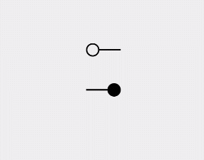
由于我没有做可视化的效果,所以在编译器中没办法实时显示状态,默认就是一个透明的view。如果大家想在编译器中看个大概的样子,可以给它通过background=“#xxxxxx”添加个背景颜色。
真实运行的效果:
二、在布局文件中设定各种属性
app:checked="true" 设定初始的状态,如果为true就是开启状态。默认是不开启
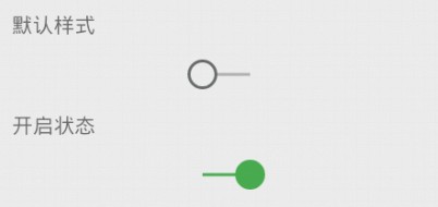
android:background="#ff0000" 设定开关的颜色,默认是绿色

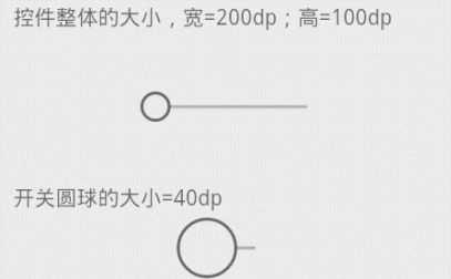
android:layout_width="200dp" 设置开关控件的整体大小,和开关圆球无关
android:layout_height="100dp"

app:thumbSize="40dp" 设定开关圆球的大小
三、通过代码进行各种设定
package com.example.hhh;

import android.os.Bundle;
import android.support.v7.app.ActionBarActivity;
import android.widget.SeekBar;
import android.widget.SeekBar.OnSeekBarChangeListener;
import android.widget.Toast;

import com.gc.materialdesign.views.Switch;
import com.gc.materialdesign.views.Switch.OnCheckListener;

public class SwitchTest extends ActionBarActivity {

    @Override
    protected void onCreate(Bundle savedInstanceState) {
        super.onCreate(savedInstanceState);
        setContentView(R.layout.switch01);

        final Switch switch = (Switch)findViewById(R.id.switch01);
        switch.setChecked(true);// 初始为开启的状态

        switch.setBackgroundColor(0xffff0000);// 颜色

        switch.setBackgroundColor(getResources().getColor(R.color.orange));// 设置颜色

        switch.setThumbSize(40);// 滑块的大小
        // 监听开关事件
        switch05.setOncheckListener(new OnCheckListener() {

            @Override
            public void onCheck(boolean isChecked) {
                // TODO 自动生成的方法存根
                System.out.println("isChecked = "+ switch.isChecked());
                Toast.makeText(SwitchTest.this, "Switch status = "+isChecked, 0).show();
            }
        });


    }
}
四、补充
5.0中还有另一种switch的样式,感觉和ios的很像,我看到有个开源库支持了这种样式,我没有去测试,但从文档中看确实很不错!可以定制的东西也很多,推荐有需求的同学去使用。
lib地址:https://github.com/kyleduo/SwitchButton

文档中的部分说明:
In xml layout file, you can configure the face of switch button using these attrs.
- onDrawable: drawable of background for status ON
- offDrawable: drawable of background for status OFF
- thumbDrawable: drawable of thumb
- thumb_margin: set inner margin between thumb and edges
- thumb_marginLeft/Top/Bottom/Right: set margin for specific edge
- thumb_width: set the width of thumb, probably used for gradient drawable
- thumb_height: set the height of thumb
- onColor: set the color of status ON, usd for flat version, the priority is below of onDrawable
- offColor: like the onColor
- thumbColor: like the onColor
- thumbPressedColor: like the thumbColor, but for pressed status
- animationVelocity: distance of animation per frame
- radius: used for color version, radius of corner of background and thumb.
- measureFactor: factor limit the minimum width equals almost (the height of thumb * measureFactor)
参考自:
http://www.th7.cn/Program/Android/201411/314138.shtml