本文章将分享一个来自前端菜鸟突发奇想的拼图游戏制作方法以及实现过程。
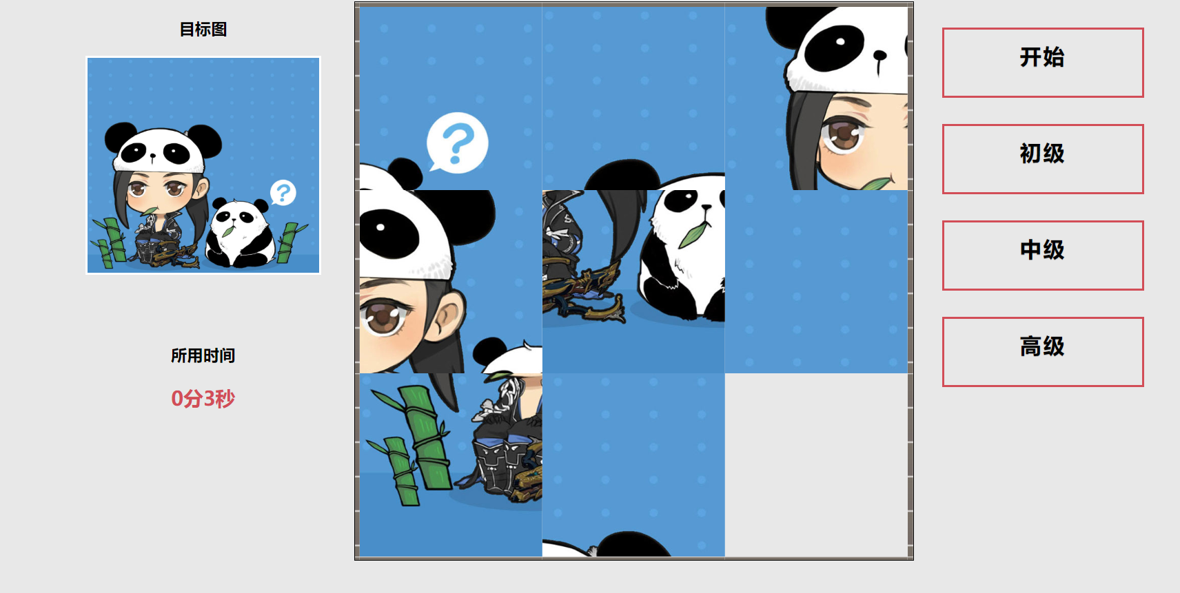
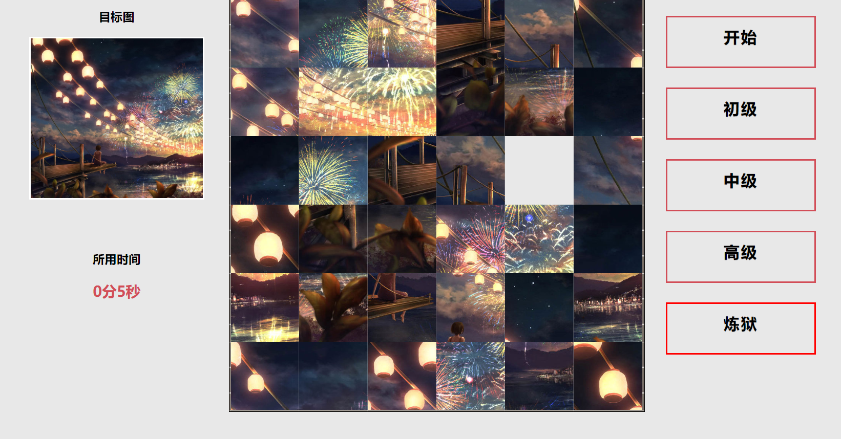
话不多说,先上图。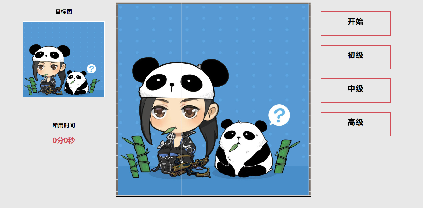
首先我们需要写好网页的基本布局(此处涉及简单的HTML和CSS知识)。
网页一共分为三个区域,左侧时间显示区,中间主要游戏区和右侧按钮菜单区。
通过三个DIV设置其style为float:left使三个div同行显示。
<div class="main">
<div class="left">
  <!-- 左侧区域 -->
</div>
<div class="center">
   <!-- 中间区域 -->
</div>
<div class="right">
    <!-- 右侧区域 -->
</div>
</div>
然后我们分别在三个div中添加不同的内容。
由于本篇文章主要讲js的设计思路,html不做过多介绍。
详情代码如下
<!DOCTYPE html>
<html lang="en">
<head>
    <meta charset="UTF-8">
    <title>拼图游戏——初级</title>
    <link rel="stylesheet" href="css/button.css">
    <script src="js/jquery.js"></script>
    <script src="js/level1.js"></script>
</head>
<body>
<div class="main">
<!-- 左侧div内容 -->
<div class="left">
<h3>目标图</h3>
<div class="pic" id="mainpic"></div>
<br><br>
<h3>所用时间</h3>
<p id="timer">0分0秒</p>
</div>
<!-- 中间div内容 -->
<div class="center">
    <table class="picbox" cellspacing="0" cellpadding="1">
    <tbody id="picbox">
    </tbody>
    </table>
</div>
<!-- 右侧div内容 -->
<div class="right">
    <a href="javascript:startgame()" class="btn btn-sm animated-button victoria-one">开始</a>
    <a href="level1.html" class="btn btn-sm animated-button victoria-two">初级</a>
    <a href="level2.html" class="btn btn-sm animated-button victoria-three">中级</a>
    <a href="level3.html" class="btn btn-sm animated-button victoria-four">高级</a>
</div>
</div>
<!-- 胜利时需要弹出的界面  start -->
<div class="wingame">
<h2>恭喜你完成拼图!</h2>
<div class="pic pic2"></div>
<p>完成耗时:<b id="timer2">0分0秒</b></p>
</div>
<!-- 胜利时需要弹出的界面  end -->
</body>
</html>
好吧,还是给大家讲解一下html页面构成,
左侧通过id="mainpic"显示当前所要完成的拼图。id="timer"是一个计时器通过setTimeout()递归来实现计时。
中间区域时一个表格,通过给表格赋予不同的背景图来使表格组成一张大的图片,再通过背景图的替换实现挪移效果。
具体代码稍后我们会详细讲到。
至于为什么没有tr和td。我们通过js动态生成,用参数的形式,这样就可以很轻松的实现四阶五阶等更复杂的拼图。
右侧为几个按钮,具体用来实现不同页面的跳转和游戏的开始。
body
{
    background-color: #E8E8E8;
}
.main
{
    margin:0 auto;
     1250px;
    height: 720px;
}
.left
{
     300px;
    height: 700px;
    float: left;;
}
.center
{
     700px;
    height: 700px;
    float: left;
}
.right
{
     250px;
    height: 700px;
    color: red;
    float: right;

}
.picbox
    {
        margin: 0 auto;
        border: 1px solid black;
         650px;
        height: 650px;
    }
    .picbpx td
    {
        padding: 0;
    }
    .border_bg
    {
        background-image:url(../img/border_bg.jpg);
         100px;
        height: 100px;
        background-repeat: repeat;
    }
    .left h3
    {
        text-align: center;;
    }
    #timer
    {
        color: #D24D57;
        text-align: center;
        font-size:23px;
        font-weight: bold;
    }
    .pic
    {
        margin: 20px auto;
        background-size: cover;
         270px;
        height: 250px;
        border: 2px solid #FFF;
    }
    .wingame
    {
        display: none;
         600px;
        height: 300px;
        background-color: rgba(80,100,120,0.5);
        position: fixed;
        top:25vh;
        left: 32vw;
    }
    .pic2
    {
         150px;
        height: 150px;
    }
    .pic2:hover
    {
        cursor:pointer;
    }
    .wingame h2
    {
        text-align: center;
    }
    .wingame p
    {
        font-size: 20px;
        text-align: center;
    }
    .wingame p b
    {
        color: rgb(200,60,60);
    }
小弟奉上css部分代码。
PS:博主菜鸟一个大神勿喷,不过接受教育批评。
欢迎大家留言讨论更好的方法。
勿喷,勿喷,勿喷。
链接: https://pan.baidu.com/s/1nVfFD6zviIQmY3xRYeiD7Q 提取码: ci4g