水平居中
- 如果它是一个行内元素 对其父元素使用 text-align:center 即可实现。
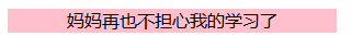
<p style = " text-align:center; 300px; background-color:pink;">妈妈再也不担心我的学习了</p>
2.如果它是一个块级元素:
A. margin 方法
  	<div style="background-color: greenyellow; ">
		<div style="margin:0 auto;  300px;background-color: gold;">
			我是一只小小鸟,飞啊飞啊,我的骄傲放纵。
		</div>
	</div>

B. table布局:水平布局,但也可以实现让某块级元素水平居中的效果。
	<table style="table-layout:fixed;border:2px solid black;100%; ">
		<colgroup>
			<col span="1" style=" 25%;">
			<col span="1" style=" 50%;">
			<col span="1" style=" 25%;">
		</colgroup>
		<tbody>
			<td style="background-color:green;">green</td>
			<td style="background-color:red;">red</td>
			<td style="background-color:blue;">blue</td>
		</tbody>
	</table>

C. flex 盒子:这里主要演示块级元素的情况,它也可在行内元素里使用。是现在比较流行的一种水平布局的方式。
行内元素中: display : inline-flex;
在webkit内核中: display : -webkit-flex;
<div style="display: flex; flex-flow: row nowrap; justify-content: center; background-color: darkgrey;  height: 50px;">
		<div style="flex:0 1 auto;  background-color: orange;">A</div>
		<div style="flex:0 1 50px;  background-color: blueviolet; ">B </div>
		<div style="flex:0 1 auto;  background-color: gray; ">C </div>
</div>

父元素:
flex-flow: flex-drection||flex-wrap;
flex-direction: row(左→右);
flex-wrap:nowrap(不折行);
justify-content(主轴对齐方式):center;
子集:
flex:flex-grow(项目放大比例) flex-shrink(项目缩小比例) flex-basis(为项目预留的空间,个人认为它可实现width的功能);
关于flex的详细学习,大家可以看这两篇文章,写的很赞哦。
https://demo.agektmr.com/flexbox/
http://www.ruanyifeng.com/blog/2015/07/flex-grammar.html?utm_source=tuicool
垂直居中
-
绝对定位的垂直居中的方法
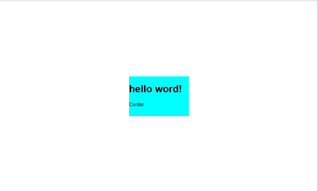
A.main { position: absolute; top: calc(50% - 4em); left: calc(50% - 6em); 12em; height: 8em; background-color: aqua; } <main> <h1>hello word!</h1> <p>Center </p> </main>这个方法固定了高度和宽度,不是由内容来决定的。现在我们对代码稍微改进一下。
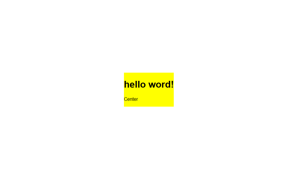
B.main{ position: absolute; top: 50%; left: 50%; transform: translate(-50%,-50%); background-color: yellow; } <main> <h1>hello word!</h1> <p>Center </p> </main>这里用transform:translate();巧妙的让main居中了,但是在过多会溢出页面。
-
不使用绝对定位时
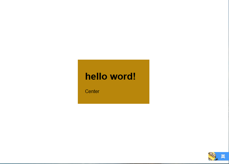
    	main {
		 12em;
		padding: 1em 1.5em;
		background-color: darkgoldenrod;
		margin: 50vh auto 0;
		transform: translateY(-50%);
	}

	<main>
		<h1>hello word!</h1>
		<p>Center </p>
	</main>
这个满足了我们让块级元素垂直居中的基本要求,但是这个技巧的实用性是有限的,它只适用于在视口居中的情况。
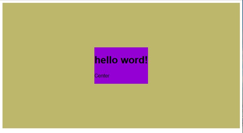
- flex
 .contain {
 	display: flex;
 	flex-flow: row nowrap;
 	justify-content: center;
 	align-content: center;
 	align-items: center;
 	height: 400px;
 	background-color: darkkhaki;
 	/*height: 100vh;*/
 }
 .son{
 	flex: 0 1 auto;
 	align-self: center;
 	background-color:darkviolet;
 }

 <div class="contain">
     <div class="son">
 	    <h1>hello word!</h1>
 	    <p>Center </p>
     </div>
 </div>
它不仅仅可以在视口中垂直居中,还可以在其他块级元素内垂直居中。
相对flex有更深的了解,可以去看一下前面的两个链接里的内容。
感谢阅读,喜欢请点赞,有问题可以留言。以上内容参考了《CSS揭秘》这本书,一本有趣的CSS书。全剧终,谢谢!